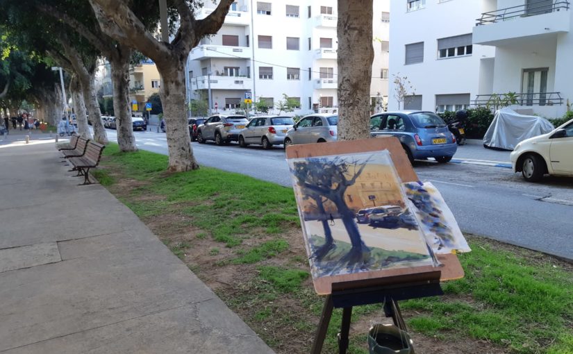
The Value of REPETITION in PAINTING – Improve Fast & Efficiently | Liron’s Podcast Episode 72

In this episode I’m talking about repetition – a valuable exercise for improving your drawing and painting skills FAST and EFFICIENTLY.

Table of Contents

1. Repetition in Painting and Drawing
2. Worse 2nd Attempt
3. Internalize
4. Loosen Up
5. Recognizing Recurring Mistakes
6. Conclusion

1. Repetition in Painting and Drawing

Repetition is a great tool for improving. It involves painting or drawing the same subject several times.

This allows for more focused learning, and unlocks some obvious (and less obvious) benefits.

2. Worse 2nd Attempt

Surprisingly enough, you may find that in your repeated efforts you actually do worse.

That’s to be expected.

The 2nd time around, working on the same subject, you lack that same spontaneity that characterized the first version.

You may also have some “arrogance” (very natural, not blaming you (;), and a feeling you “already know” the subject.

Don’t let that deter you from doing this. Even when you don’t notice, you are learning and improving.

3. Internalize

Drawing the same subject / scene several times, allows you to internalize a part of the process, and focus on a different one.

As mentioned, you may find some of your result to be worse, but other aspects may be better.

So take the good with the bad. 

Whenever you try an “extreme” technique, it tends to be accompanied by some growing pains.

Whenever I have a streak of great paintings – I am happy, but also weary of the fact it means I may not be growing.

4. Loosen Up

One side-effect of repetition, that is barely discussed, is how it sets you free and helps you loosen up.

Doing something a second time, and DELIBERATELY at that, makes you less worried about the end result. You can just paint yet ANOTHER version!

This freedom helps you loosen up without you even noticing. And it will show in some of the later attempts.

That’s especially true if you are as impatient as I am. The fear of boredom in the 2nd and 3rd iterations actually motivates me to try something different!

5. Recognizing Recurring Mistakes

That’s really the gist of this exercise. Doing repetitions of the same subject will bring to surface recurring mistakes that might have otherwise gone unnoticed.

And that’s probably the biggest benefit of doing this.

6. Conclusion

I hope this episode encourages you to give this exercise a try.

And by the way, creating a small preparatory painting for a larger piece, or even just a preparatory sketch – are also a form of repetition.

It’s up to you to decide just “how much” repetition you are interested in doing.

And with that, let’s move onto the artist corner!

Artist Corner

Today I talked about Samuel Colman, an English painter. He lived from 1780-1845, and painted mostly portraits and landscapes.

His landscapes are what really grabbed me about his art. It’s rooted in realism, with an added layer of surrealistic atmosphere

You can check out some of his works here: Samuel Colman. I also recommend doing a Google Images search.

And Here’s where you can find me

Check out my YouTube Channel – Liron Yanconsky

Or ask me questions on Instagram – @LironYanIL or Snapchat – @LironYan3

I hope you enjoyed this one. Take care, and we’ll talk again really soon,

— Liron

How I Choose Colors – Watercolor Painting Advice | Liron’s Podcast – Episode 71

Today I want to teach you how I go about choosing my colors for watercolor painting.

We will talk about both the MACRO and the MICRO.

How I Choose my Colors – Macro

Colors on a macro level means – what colors do I even have on my palette? What colors are my go-to?

Generally speaking, there are a couple of criteria I look into when choosing which colors to purchase. Here are some of them.

Primary colors – I generally work mostly with primary colors. I don’t like convenience mixtures as much, and prefer to mix my own.

So I make sure to always have 1-2 versions of every primary color in my palette – blues, reds and yellows.

Temperatures – I am in the “I care more about the values rather than a specific color” camp (gee, that’s a long name!). But one thing I do pay attention to is temperature.

I find this is important for creating a sense of depth in my works.

Lightfastness – This basically means how much resistant the paint is to light. Lower lightfastness means that with continuous exposure to light, the paint will fade / change over time.

I prefer my paints to stay the same long into the future, so I make sure to use lightfast paints as much as possible, especially when it comes to works made for clients.

Range of Values – This is crucial for me. I tend to create strong contrasts in my works. And I need paints that can mix dark values. This is why I try to use paints that have a large range of values.

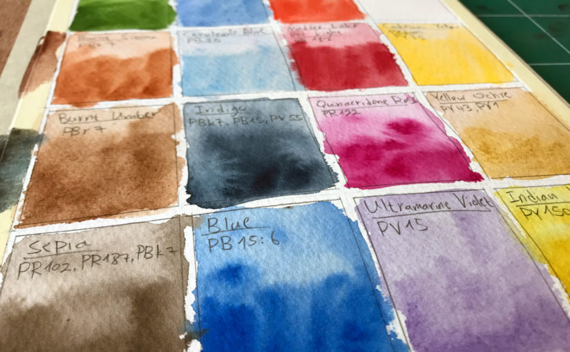
This is why I love, for example – Phthalo Blue. It can simply get so dark, which makes it very useful. Another paint in this category is Carbazole violet (and so despite it being a secondary color, I still use it for this specific merit).

Transparency – Lately I’ve come to love transparent watercolors more and more. I find they mix more easily and predictably.

This is a matter of personal taste really, so see what works for you.

These are all guidelines I use for choosing my colors on a macro level.

How I Choose my Colors – Micro

Now I’ll explain how I choose colors while working on a painting.

I get asked about this ALL THE TIME.

INTUITION

People always seem to wonder how I “knew” to use a specific paint somewhere.

The answer is simpler than people think. I developed an intuition for using different colors. This means I don’t know exactly what the end result will look like, but I do have a sense for what will work out.

Minimal Palette – One of my guiding principles are to use as few paints as I can. I find this leads to better color harmony (all mixes stem from the same 3-5 paints). But in addition to harmony, it also simplifies the work process – less decisions to make (;

Temperature – I talked about this earlier. When choosing what color to use, I almost always take temperature into account. Is this a direct warm sunlight? Then I’ll probably use yellow. Is it a mid-value? Perhaps red. A dark shadow? Blue.

These can of course be alternated. I spice up my shadows with warm colors as well. Shadows aren’t monotone.

Exaggeration – Sometimes I’ll simply exaggerate the color bias I see. So if there’s a building wall that’s slightly brown / red – I may paint it using a PURE red. It may seem like too much initially, but I find that I can very easily mute it down by glazing over it with blue, for example.

Most of this really isn’t science. Rather – it’s more of a habit, stylistic choice or trial and error.

See What Colors Work for YOU

The main advice I can give YOU, is to see what works best for you. Don’t worry about my own paints – experiment and see what looks good to your eyes, and how it works with your style.

And with that being said – let’s move onto the Artist Corner.

Artist Corner

Today’s featured artist is Manolo Jimenez. Not to be confused with the football manager of the AEK Athens team, our Manolo is a watercolor painter.

I couldn’t find much information about him, but he is a fantastic painter. His focus, from the works I’ve seen is on larger scale compositions, relative to the focal point. This means the center of focus usually takes up a small part of the painting. So it could be a large corridor in a building, with a tiny single figure, for example.

He is a member of the Association of Watercolors of Andalucia, and exhibits both in Spain and worldwide.

You can see some of his fantastic works here: Manolo Jimenez

And Here’s where you can find me

Check out my YouTube Channel – Liron Yanconsky

Or ask me questions on Instagram – @LironYanIL or Snapchat – @LironYan3

I hope you enjoyed this one. Take care, and we’ll talk again really soon,

— Liron
Let Vision Lead Your Technique

In today’s episode I want to share with you a concept I’ve been thinking about a lot lately, and that is of vision.

Vision is how we see the world. Every artist (and person for that matter) probably has a different vision of what they see.

That is why different artists create in different ways and notice different things.

Vision Leading Technique

My premise here is that there’s a way to create very clearly. To make the gap between your vision and your result as small as possible.

That is – to allow your vision lead the painting process rather then technique.

When you let technique lead the way, you may approach every painting the same way.

But every painting is different, and every scene is different.

So if you allow VISION to lead instead, you may end up with a better result.

Unique & Highly Personalized Art Style

The coolest part is this – it will probably also be more unique. Because you effectively “cleaned” your representation of reality.

This applies, by the way, to abstract art too! The reality I’m referring to can be a real physical scene, or the vision you have in your head.

I hope you found this helpful. The next time you create, try forgetting about technique, or the “correct” way of doing something. Instead – try to represent what  you see as clearly as you wish, regardless of process.

And let me know how it goes!

Artist Corner

Today I talked about Wendy Artin. I was recommended by a follower to check her work out. And I must say – it’s incredible!

She does lots of figurative work, and has some very unique processes and approach.

I actually covered her in my Painting Masters series. You can check that episode out here (:

And Here’s where you can find me

Check out my YouTube Channel – Liron Yanconsky

Or ask me questions on Instagram – @LironYanIL or Snapchat – @LironYan3

I hope you enjoyed this one. Take care, and we’ll talk again really soon,

— Liron
Freedom in Painting – My Biggest Personal Artistic Insight | Liron Yanconsky’s Podcast – Episode 59

Today I want to tell you about my biggest personal artistic insight, regarding freedom and patience in painting (and creating in general).

Freedom & Patience

A few weeks ago I sat down with one of my best friends to do our yearly plans for 2019.

We don’t do resolutions, we do actual detailed and elaborate plans. The conversation we had led me to realize there’s one thing that’s really missing in my artistic life at the moment.

And seeing as art is about 85% of my life at the moment… that’s a major problem.

What’s missing is real freedom and patience when creating.

Goal-Oriented Me

So i’m very goal oriented.

This led me to always limit my creation time (painting, sketching etc.). After all, it’s only one of my many daily tasks.

The problem is – I wasn’t allowing myself enough time to really experiment. To create with freedom, patience. Deliberate experimentation is something that was really missing.

I was missing my artistic freedom.

Freedom & Experimentation

What I want to be able to do is go on side-tangents when creating.

Maybe I’ll be working on a finished painting, and I’m about to paint a person. I’d like to have the freedom to pause, take out a piece of test paper and jot down multiple sketches and paintings of the person I’m about to paint.

Maybe I’d like to try out different ways of painting them. Wet-in-wet, wet on dry, dry brush, etc.

But I wasn’t allowing myself to do that, as I am always aware of my time constraints. And I have tons of other stuff to do. Work on content, work on my sales funnel, the Facebook ads, LinkedIn ads, Instagram stories and… a barrage of other things.

Freedom as a Major Goal For 2019

I realized that I’ll have to force myself to do this. To give myself permission to have more freedom. To experiment more freely.

And so I decided to mark that as one of my main focuses for 2019.

I want to do “quarantined” creation days, in which my only “obligation” is to paint, sketch and experiment.

I want to reach that all-time level of art, and become one of the biggest artists of our time (and perhaps not just our time).

To get there, I will have to give myself permission to do this.

What would it look like if it was easy / fun?

This is an idea I’ve been toying around with lately, when things like that challenge me. I got this from Tim Ferris’s video on asking questions better.

Whenever something like this poses a challenge for me, I ask myself: What would this look like if it was easy? Or fun?

This is something I’m still contending with, but it does help from time to time.

Conclusion

And this is it for this episode! I hope this encourages / entertains you in some way. I feel like this idea of complete freedom will allow me to reach that crazy level I’m after.

And I’m not afraid of “too much” freedom. As it turns out, I’m pretty good at being disciplined haha. It’s the opposite direction in which I need to balance myself.

So with that being said, let’s move onto the Artist Corner!

Artist Corner

Today we talked about Anastasia Kustove, a fantastic watercolor painter I recently discovered on Instagram. You can check out her work @Kustova_Anastasia.

She mostly paints views and people. Her style is fantastic, and I’ve been really enjoying seeing it develop over the last year.

I especially love seeing pictures of her work on-location, such as this one.

And this is it for today!

Here’s where you can find me

Check out my YouTube Channel – Liron Yanconsky

Or ask me questions on Instagram – @LironYanIL or Snapchat – @LironYan3

I hope you enjoyed this one. Take care, and we’ll talk again really soon,

– Liron

Plein-air After a Long Break | Liron Yanconsky’s Podcast – Episode 54

Hi there! Today I wanted to share my experience of painting plein-air after a relatively long break!

Plein-Air Painting

So there’s been about a 1-2 months period when I barely got to paint outside.

If you’ve been following me for a while, you probably know just how important I think plein-air and painting on location is.

In my opinion, it’s a crucial ingredient in turning your paintings from good to amazing. Nothing can beat that spontaneity and full visual perception of being outside, in front of your scene.

After doing it for a while, photos start to feel a little flat and boring.

But Then I Took a Small Break From Plein-Air

So as I mentioned – I took a small break. And the result fascinated me.

In the beginning, I felt a little rusty, as expected. But it’s not like I took a full break from painting. I’ve been actually painting a lot – inside.

So here’s the fascinating part – I could feel just how much sharper my instincts became. I could immediately recognize how my composition was more on point. How better prepared I was to tackle the subject.

Another interesting feeling I had was that of slowing down. I felt like I’m deliberately working slower than usual, and I still maintain the same control (and you know how sometimes with watercolors – you have to be fast!).

Conclusion

So over all this was a big experience for me. It’s something I haven’t had in a while.

I hope you enjoyed reading about it, and perhaps this resonates with you, regarding plein-air, or anything you may have taken a break from.

Let me know in a comment below – did you ever experience something similar?

And now – it’s time for the Artist Corner.

Artist Corner

Today I talked about Andy Evansen.

Andy’s an impressionistic painter based in the US. His style is fairly minimalistic, yet has a strong sense of realism.

He started painting in the mid nineties, and studied under some of the greats, such as Skip Lawrenc, Eric Wiegardt, and my favs – Alvaro Castagnet and Joseph Zbukvic.

Here is his website, where you can see some of his work: http://www.evansenartstudio.com/

And here’s where you can find me

Check out my YouTube Channel – Liron Yanconsky

Or ask me questions on Instagram – @LironYanIL or Snapchat – @LironYan3

I hope you enjoyed this one. Take care, and we’ll talk again really soon,

– Liron