Importance of PATIENCE & FOCUS for Painting | Liron’s Podcast Episode 113

In this episode I want to talk about the importance of PATIENCE and FOCUS in painting, and how they helped me with my most recent painting!

Here’s the painting I refer to:

Patience in Painting

I think patience is an IMPORTANT quality to develop when it comes to painting, and watercolor in particular.

That may seem funny, as watercolor sometimes requires speed. But this is ignoring the full picture.

Watercolor requires above all SENSITIVITY to what happens on paper. You have to be very aware of the different levels of wetness, the edges, and many more factors.

You can’t really go back or “go over” mistakes in watercolor, which makes this so important.

Sensitivity for the subject is another requirement. Simply observing it and thinking – how can I convey the message and essence of the subject in the BEST way possible?

What allows this sensitivity is patience.

Focus in Painting

I think an additional by-product of said patience was FOCUS.

I was able to stay focused for long period of time, and slowly let the painting TELL ME what it needs. It’s almost as if I didn’t ASSUME, but rather reacted.

I hope this makes sense!

This process feels very meaningful to me, and the lessons I learned will accompany me in the future.

Let me know your thoughts in a comment below, or contact me in any of the following ways! ^_^

TikTok – @Liron.Yan

YouTube – Liron Yanconsky Art

LinkedIn – Liron Yanconsky

Pinterest – Liron Yanconsky

Instagram – @LironYanIL

Twitter – @LironYan

New Watercolor Breakthrough – Holistic Shapes | Liron’s Podcast Episode 111

Hi there! In this episode of the podcast I talk about a watercolor breakthrough I anticipated I’ll be going through soon.

Watercolor Rough Patch

I’ve had a challenging 2 months or so when it comes to painting. I didn’t feel like my work is connecting the way I’m used to, and the results were hit or miss. Got some great ones, but also some subpar ones.

This isn’t necessarily bad. It usually means you’re going through growth and raising your standards.

Sergey Temerev & Looking at Shapes

I gained an interesting insight while, by pure chance, stumbling upon a video of Sergey Temerev painting a spectacular cloudy skies scene (his speciality, it seems).

Here’s an example of a similar one by Sergey Temerev (you should really look into his work – it’s SO GOOD!!).

And here’s the specific process video I watched:

While watching it I felt like there’s something I want to try when it comes to the painting process. And that thing is looking at shapes a little differently, and dividing the subjects into shapes a little differently from what I’m used to.

The result was this small painting of the Bourges Cathedral in France.

I’m highly pleased with it.

I think it will be a bit hard to explain the exact mental shift I went through, so I do plan on addressing it in a future YouTube video.

But it does seem to be connected to wet-in-wet, and making the most out of every part of every wash.

I hope that makes sense, and that you enjoyed listening / reading.

And with that, I’ll wish you lots of good health in these challenging CoronaVirus times. Stay safe and healthy!

And I’ll talk to you again soon,

— Liron

Here’s where you can reach out to me (:

TikTok – @Liron.Yan

YouTube – Liron Yanconsky Art

LinkedIn – Liron Yanconsky

Pinterest – Liron Yanconsky

Instagram – @LironYanIL

Twitter – @LironYan

3 Tips for Loose Watercolor Painting (LET GO) | Liron’s Podcast Episode 89

Today we’ll talk about how to let go, enjoy watercolor, paint loosely and get the results you want!

This episode features audio from my YouTube video on that same topic. You can watch the full vid here:

3 Tips For Loose Watercolor – Summary

1. Small Paper & Large Brush.

This allows you to have more control. A smaller paper is more forgiving, as you don’t need to fill in huge areas and have perfect control over watercolor, and getting an even wash.

On the other hand, the large brush also forces you to give up some of your control, and learn how to PAINT rather than “color” inside the lines.

With that being said, make sure you use a brush with a good tip for those tighter spots.

2. Magic Wand Grip.

Hold the brush at the very back, far from the hairs. This again forces you to give up some control and loosen up, but it also provides you with more control when it comes to the range of motion.

I like to call this the “Magic Wand” grip. I do this whenever possible, and hold the brush closer to the hairs only when I’m working on very fine details.

3. Use Pure Paints.

Instead of mixing and possible over-mixing your paints – try using them purely. This saves you time, and the result is beautiful.

When I got started in watercolor I tended to REALLY over-mix my paint in the palette, so I would always get muted, grayed out paintings.

The cure for this – NOT MIXING at all – turned out to be something I really enjoy doing. And so I’ve been doing that ever since.

I hope you found these tips useful!

Reach Out to Me

Got any questions? Want help with your paintings? Feel free to reach out to me in any of the platforms I’m on, and I’ll be happy to help (:

YouTube – Liron Yanconsky Art

LinkedIn – Liron Yanconsky

Pinterest – Liron Yanconsky

Instagram – @LironYanIL

Twitter – @LironYan

How I Choose Colors – Watercolor Painting Advice | Liron’s Podcast – Episode 71

Today I want to teach you how I go about choosing my colors for watercolor painting.

We will talk about both the MACRO and the MICRO.

How I Choose my Colors – Macro

Colors on a macro level means – what colors do I even have on my palette? What colors are my go-to?

Generally speaking, there are a couple of criteria I look into when choosing which colors to purchase. Here are some of them.

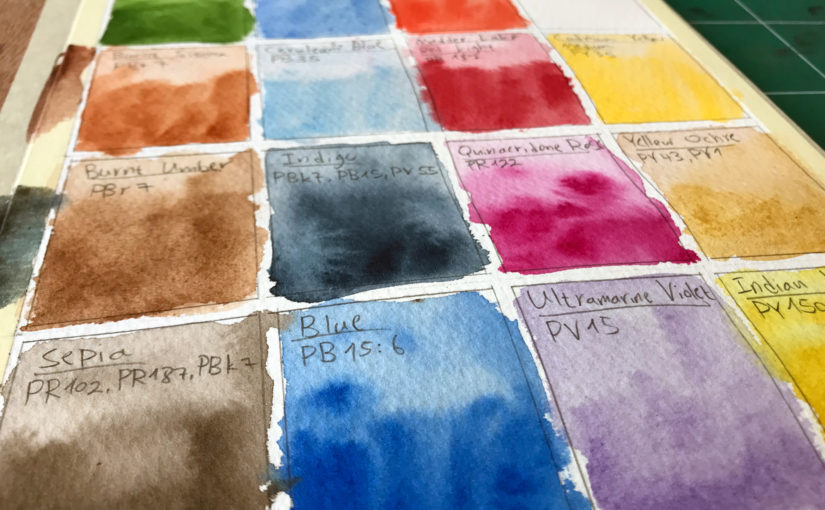
Primary colors – I generally work mostly with primary colors. I don’t like convenience mixtures as much, and prefer to mix my own.

So I make sure to always have 1-2 versions of every primary color in my palette – blues, reds and yellows.

Temperatures – I am in the “I care more about the values rather than a specific color” camp (gee, that’s a long name!). But one thing I do pay attention to is temperature.

I find this is important for creating a sense of depth in my works.

Lightfastness – This basically means how much resistant the paint is to light. Lower lightfastness means that with continuous exposure to light, the paint will fade / change over time.

I prefer my paints to stay the same long into the future, so I make sure to use lightfast paints as much as possible, especially when it comes to works made for clients.

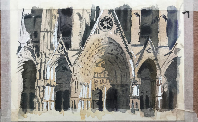
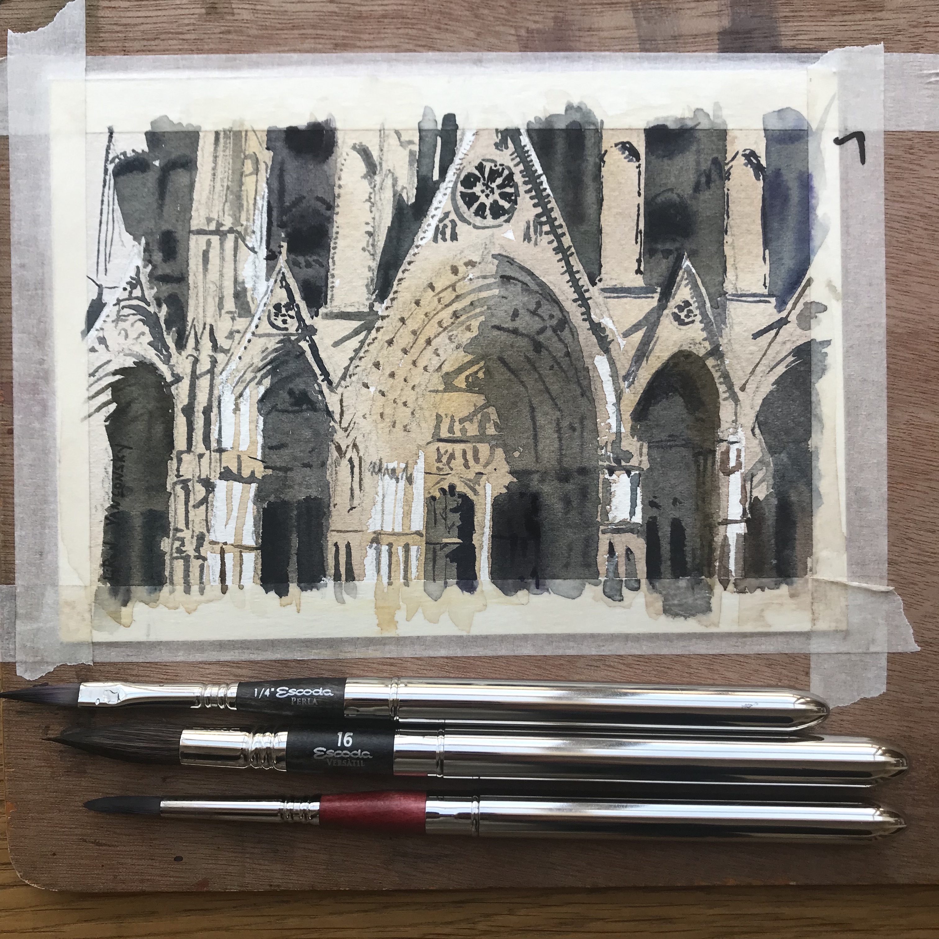
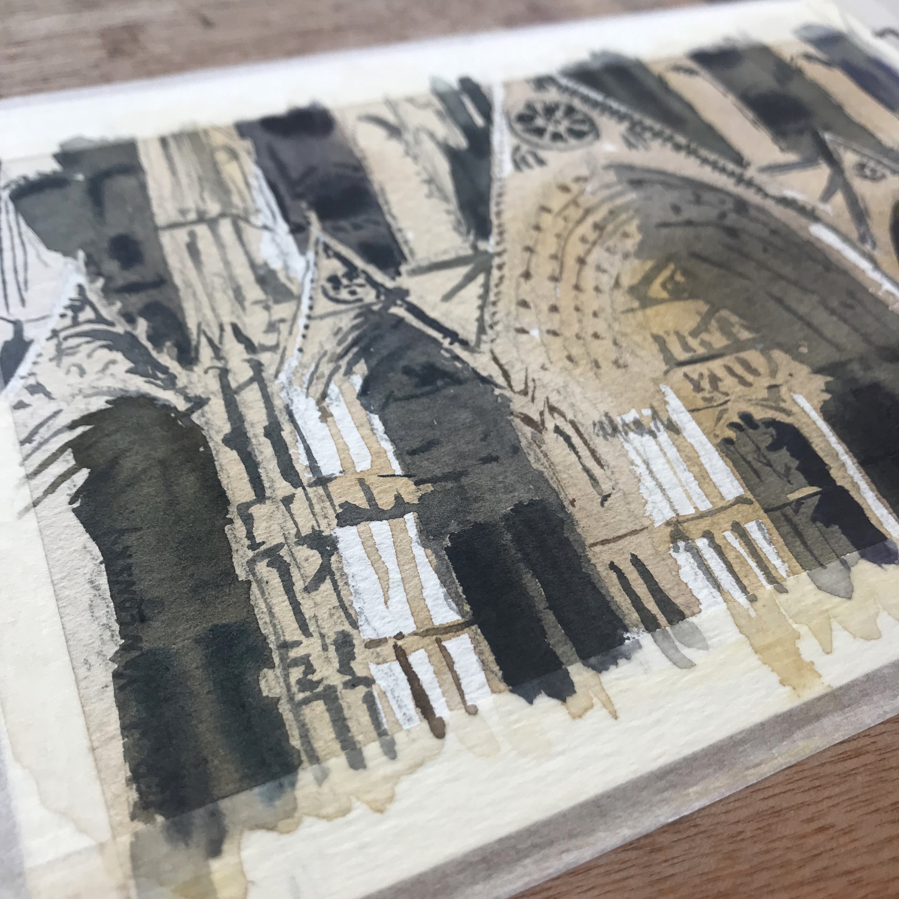
Range of Values – This is crucial for me. I tend to create strong contrasts in my works. And I need paints that can mix dark values. This is why I try to use paints that have a large range of values.

This is why I love, for example – Phthalo Blue. It can simply get so dark, which makes it very useful. Another paint in this category is Carbazole violet (and so despite it being a secondary color, I still use it for this specific merit).

Transparency – Lately I’ve come to love transparent watercolors more and more. I find they mix more easily and predictably.

This is a matter of personal taste really, so see what works for you.

These are all guidelines I use for choosing my colors on a macro level.

How I Choose my Colors – Micro

Now I’ll explain how I choose colors while working on a painting.

I get asked about this ALL THE TIME.

INTUITION

People always seem to wonder how I “knew” to use a specific paint somewhere.

The answer is simpler than people think. I developed an intuition for using different colors. This means I don’t know exactly what the end result will look like, but I do have a sense for what will work out.

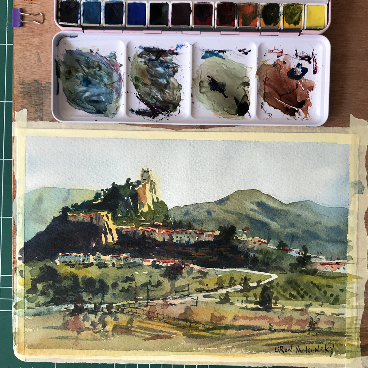
Minimal Palette – One of my guiding principles are to use as few paints as I can. I find this leads to better color harmony (all mixes stem from the same 3-5 paints). But in addition to harmony, it also simplifies the work process – less decisions to make (;

Temperature – I talked about this earlier. When choosing what color to use, I almost always take temperature into account. Is this a direct warm sunlight? Then I’ll probably use yellow. Is it a mid-value? Perhaps red. A dark shadow? Blue.

These can of course be alternated. I spice up my shadows with warm colors as well. Shadows aren’t monotone.

Exaggeration – Sometimes I’ll simply exaggerate the color bias I see. So if there’s a building wall that’s slightly brown / red – I may paint it using a PURE red. It may seem like too much initially, but I find that I can very easily mute it down by glazing over it with blue, for example.

Most of this really isn’t science. Rather – it’s more of a habit, stylistic choice or trial and error.

See What Colors Work for YOU

The main advice I can give YOU, is to see what works best for you. Don’t worry about my own paints – experiment and see what looks good to your eyes, and how it works with your style.

And with that being said – let’s move onto the Artist Corner.

Artist Corner

Today’s featured artist is Manolo Jimenez. Not to be confused with the football manager of the AEK Athens team, our Manolo is a watercolor painter.

I couldn’t find much information about him, but he is a fantastic painter. His focus, from the works I’ve seen is on larger scale compositions, relative to the focal point. This means the center of focus usually takes up a small part of the painting. So it could be a large corridor in a building, with a tiny single figure, for example.

He is a member of the Association of Watercolors of Andalucia, and exhibits both in Spain and worldwide.

You can see some of his fantastic works here: Manolo Jimenez

And Here’s where you can find me

Check out my YouTube Channel – Liron Yanconsky

Or ask me questions on Instagram – @LironYanIL or Snapchat – @LironYan3

I hope you enjoyed this one. Take care, and we’ll talk again really soon,

— Liron