Perylene Red – Daniel Smith Watercolor | The Paint Show 24

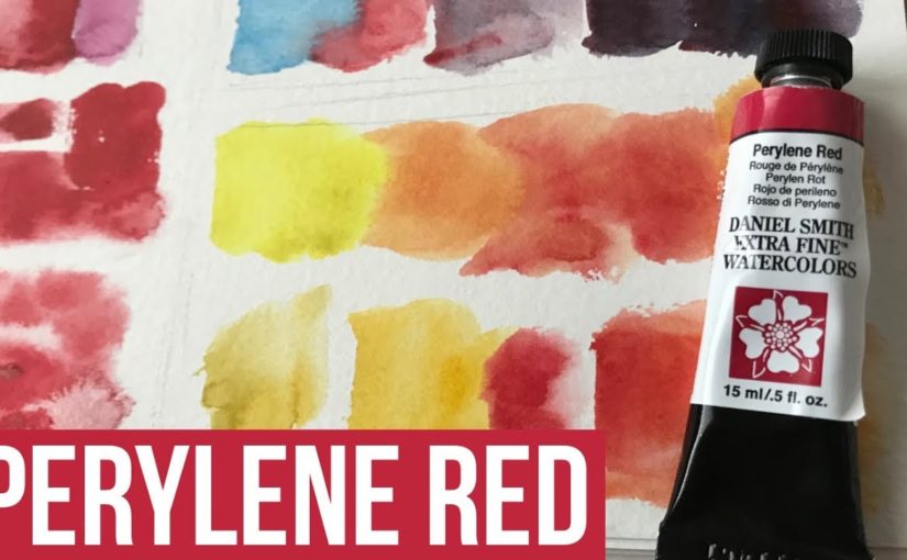
Hi there! Today I want to share with you a review I did for Perylene Red paint, as part of The Paint Show.

This paint is by the Daniel Smith brand, and I got it as part of their Primary Set.

Here’s the full video review, scroll down to read more.

Why I LOVE Perylene Red

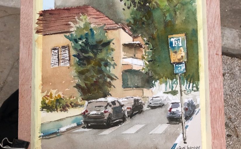
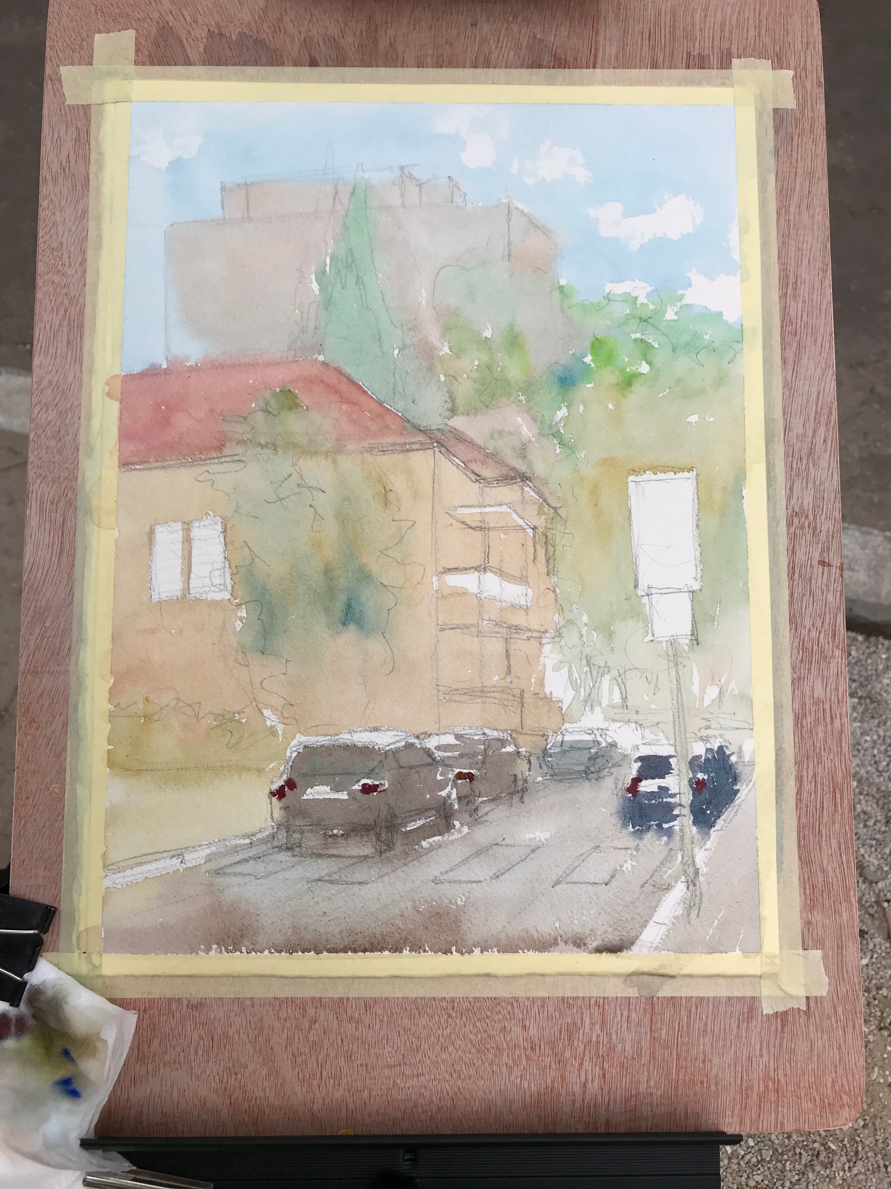
This is a paint I really love, and for multiple reasons. The first is that it’s relatively neutral.

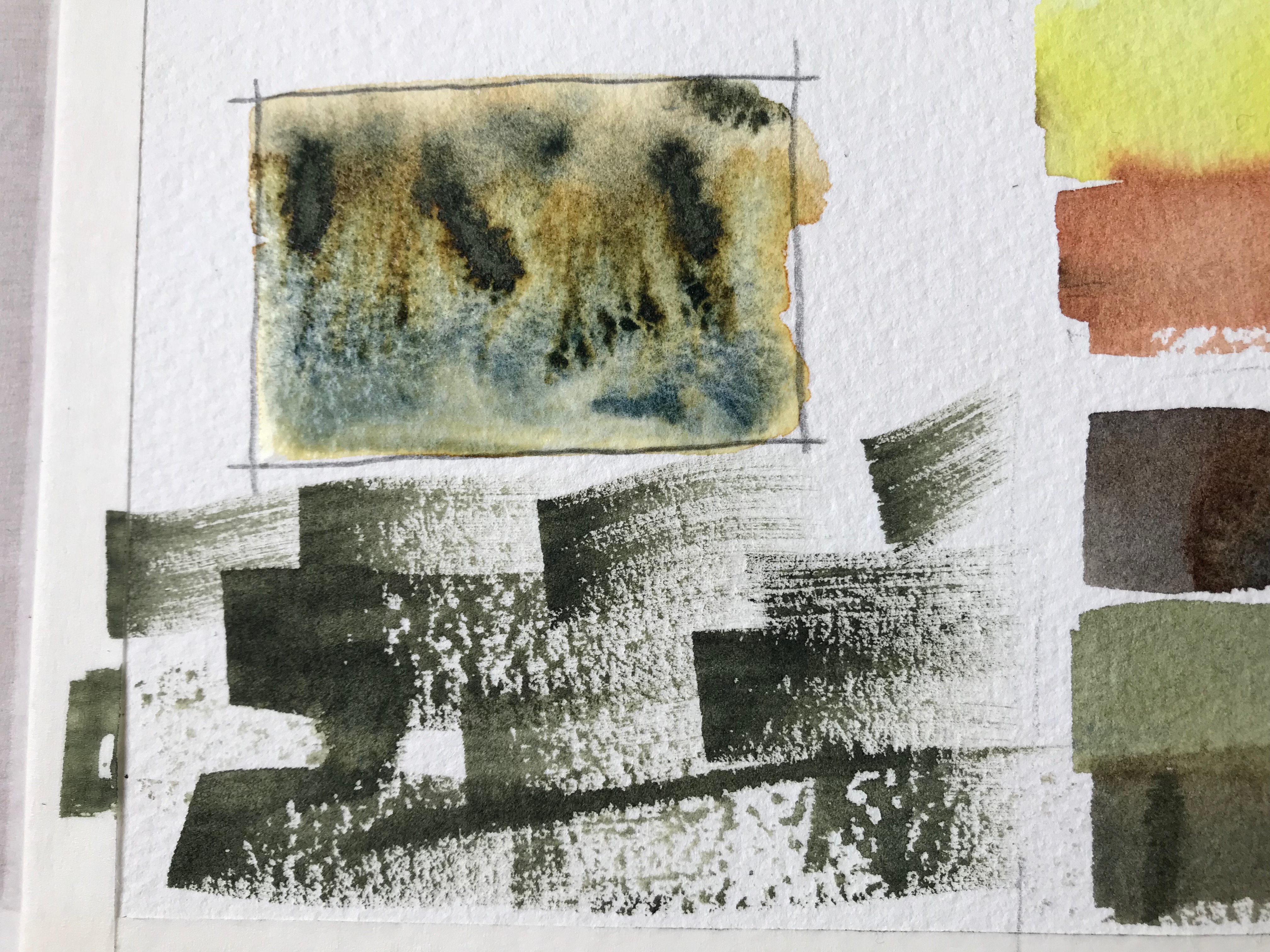
I compared it to Pyrrol Scarlet (left) and Quinacridone Rose (right), and you can see how it’s in the middle. Not too warm, not too cool.

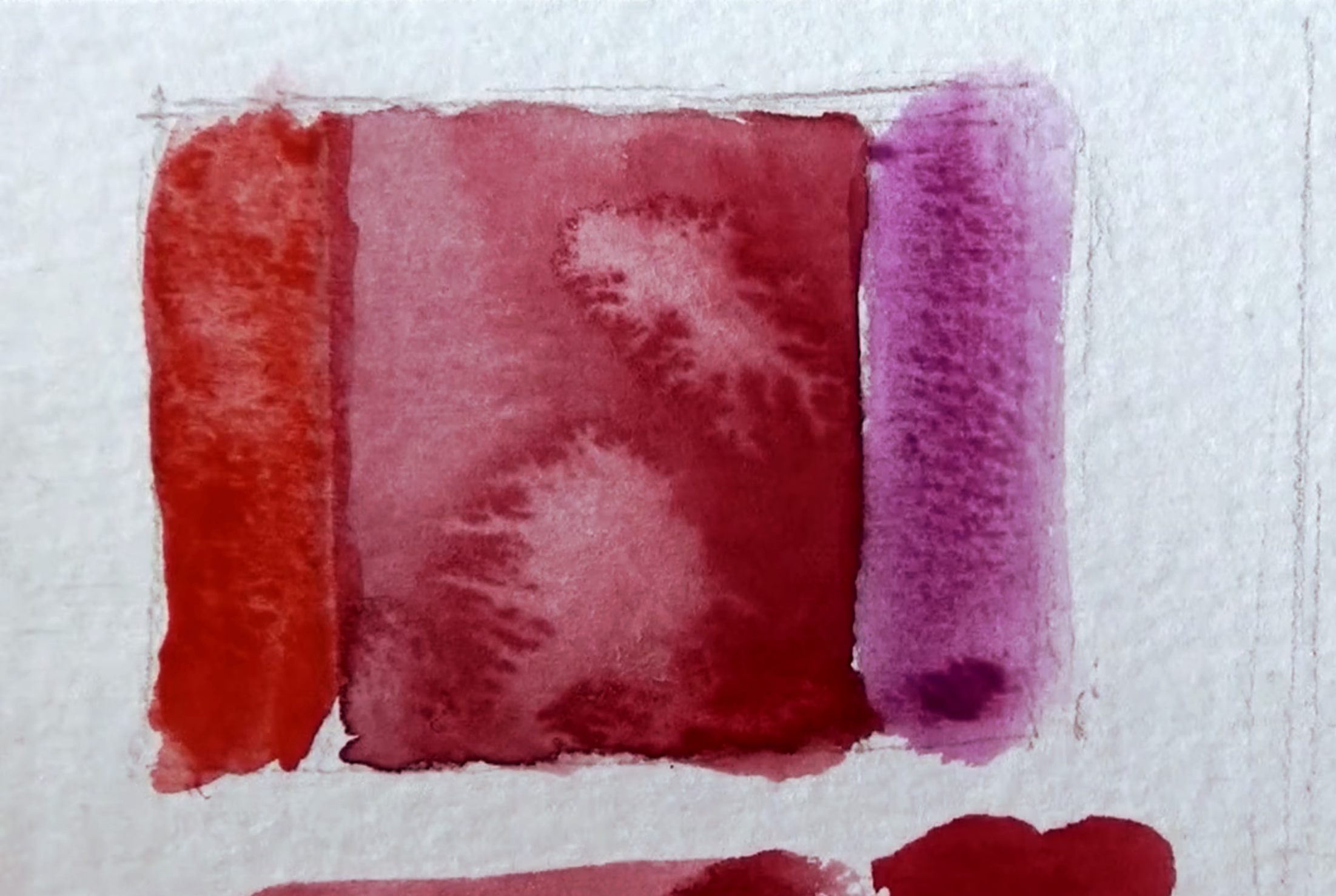
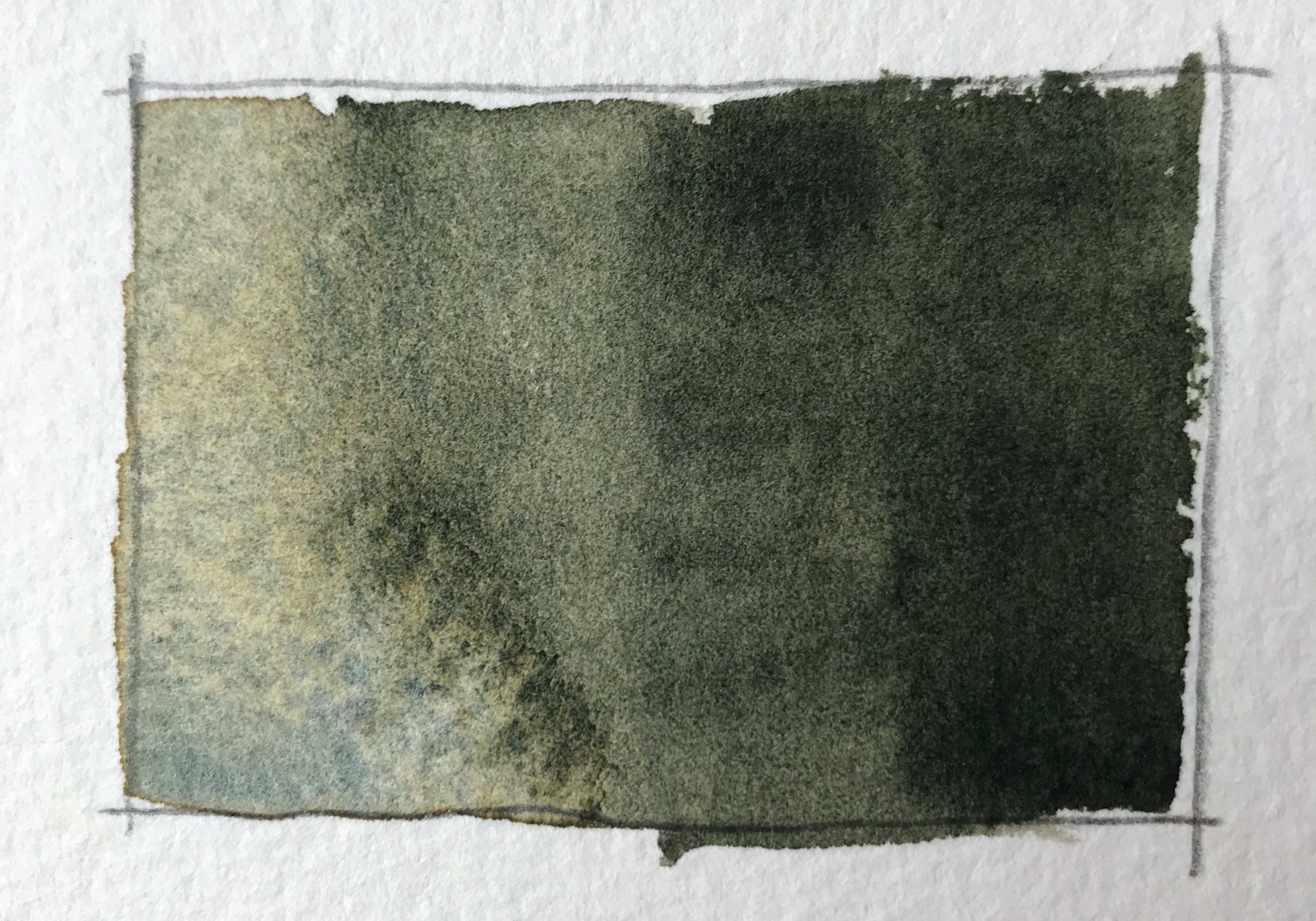
It’s also a semi-transparent paint, has excellent lightfastness and pretty easier to lift, if necessary.

Perylene Red by Daniel Smith – Info

Pigment: PR178

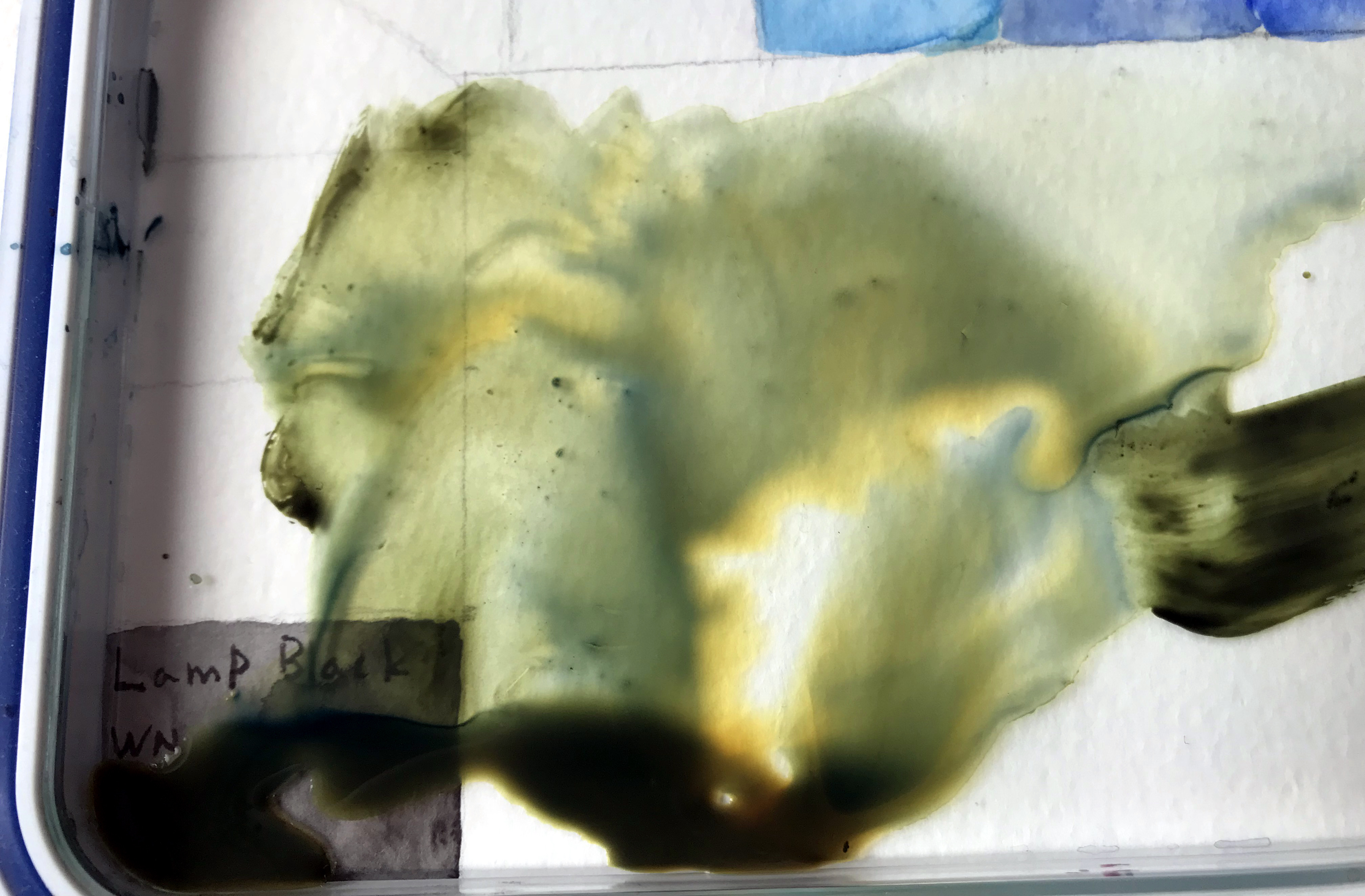
This pigment is said to go through a significant shift when drying. It’s supposed to lighten slightly, and loose about 20% of its saturation (according to HandPrint.com). I didn’t notice such a significant difference.

It’s also highly active in wet-in-wet, and creates large blossoms.

Excellent Lightfastness
Semi-Transparent
Medium-Staining
Non-Granulating
Series 3 – goes on Amazon for ~13$-14$.

Link to purchase (affiliate, you pay the same price, I get a commission):
Tube: http://amzn.to/2GrbC9Q
Set: http://amzn.to/2rJ4eTZ

Conclusion

Perylene Red is great if you are looking for a good primary red that’s relatively neutral. I love the way it handles and behaves, and enjoy using it.

I’d also like to add that getting the Primary Set is highly economical, and results in a relatively cheap “per tube” price. It contains three useful paints (this one, alongside Hansa Yellow and French Ultramarine). All come in 15ml.

Here’s my review of the Daniel Smith Primary Set:

And the link to purchase it: http://amzn.to/2rJ4eTZ

I hope you enjoyed this review of Perylene Red, and I’ll talk to you again really soon!

– Liron

The Products I’m Working On | Liron Yanconsky’s Podcast – Episode 18

Hi there! Liron here. In this episode I want to talk to you about the products I’ve been working on during the month of February 2018.

Courses

I’m working on 3 new course I intend on publishing on the Udemy platform. This is where I currently make my courses available (together with my website).

I’m close to finishing 2 out of the three:

  • Portrait painting in watercolor
  • Landscapes in watercolor

Because I’m working on so many things simultaneously, this has been quite the challenge. I really have to work hard to be able to devote large chuncks of works to these products.

They involve recording, and then A LOT of editing work.

Book – How to Sketch People

I’m working on a book on how to sketch people in pen and pencil. This book is meant to be a “twin” product to my video course on sketching people.

This is a topic I’m trying to tackle from a rather unique angle, in my opinion. I try to provide students with a loose and fun method, that still preserves the accuracy and realism of the sketch.

I think this is an incredibly challenging topic that deters many from tackling. With this book, just like with the course, I wanted to turn it into a fun, light-hearted experience.

Increasing My Income

As an artist that is trying to build a business around their art, I have to be proactive. I always have to take care of my own income and earnings.

I have no boss, or salary. This is a huge challenge, but also a great freedom.

My goal with producing so many products is mainly helping as many people as possible, as well as MAKING MORE MONEY (:

I think this is also a uniqe value I bring to the table when it comes to helping other artists. I’m very business-oriented, and hope to inspire other artists to proudly create and charge money for their creation.

I want to use this opportunity to thank you. Yes – you! My listener, viewer, reader and follower.

Without you, all of this would have been impossible.

Artist Corner

In this episode I talked about no other than Paul Cézanne.

He doesn’t require too much introduction (;

Cezanne was a French post-impressionist painter, who is widely-known and highly-regarded.

Both Henry Matisse and Pablo Picasso have remarked that Paul Cezanne “is the father of us all”.

You can read more about him in his Wikipedia page.

Conclusion

And this is it for today’s episode. I hope you enjoyed it!

Here’s where to find me:

Here you can support me on Patreon

Check out my YouTube Channel – Liron Yanconsky

Or ask me questions on Instagram – @LironYanIL or Snapchat – @LironYan3.


Use Pure Colors in Your Watercolor Painting

Hi there!

Today I want to present to you a painting process I did a while ago.

It’s not my best painting. However, it’s an experiment I did with preserving the purity of colors and letting them mix on the palette.

You can watch the entire process below, and scroll down for the written version (:

Use Pure Colors in Your Watercolor Painting

So here’s the scene I wanted to paint.

And here’s the drawing stage.

Notice it’s quite the busy scene. There are many cars, people and buildings. This was very challenging to break down.

I think this is actually one part where I “failed” with the painting process. With that being said, I still did a decent job simplifying it.

The funny part is that, I think, the drawing itself is inaccurate, especially in regards to its perspective.

In any case – off we go with the first wash.

First Wash

This is exactly where I wanted to keep the purity the most. I found out it’s important to get it right in this particular step.

The reason stems from the transparency of watercolor. If you start of with over-mixed, muted colors, the next wash may still show them through. And so, glazing yellow over muted blue won’t do much good (;

Next, we have an additional wash.

Second Wash And Beyond

I’ll admit, this isn’t the best of my work. But I was able to improve the purity.

In this stage it’s important to still use vibrant colors. This is true especially for the areas you want to keep colorful.

After that, I continue adding more layers.

And this is the final result!

I went for a rather complex scene, and challenged myself to try something new. This is why I’m very pleased with the result.

Putting Pure Colors in The Correct Context

It’s important to remember that this is one particular approach out of many. It doesn’t mean you have to ALWAYS ALWAYS keep your colors pure, or avoid grays.

This is a tool to be used at the right moments. You can use it, perhaps, to direct the viewer’s eye in some way. You could use it to create a focal point or area.

And this is it for today. I hope you enjoyed this one! (:

Let me know what you think in a comment below, or under the video.

Also, if you enjoy my content – consider supporting me on Patreon. This REALLY helps (:

And I’ll talk to you soon.

– Liron

Undersea Green – Daniel Smith Watercolor | The Paint Show 23

Hi there, today I want to share with you my review of Undersea Green by Daniel Smith.

You can see the full episode of The Paint Show here:

And if you want a written version, read on (;

Undersea Green – Daniel Smith Watercolor

I originally got this paint together with Daniel Smith’s Secondary set. In fact, this review will wrap up the series of The Paint Show episodes regarding this set.

I really loved this one from the beginning, and it’s special characteristics impressed me (you’ll soon see what I refer too).

With time I started using it extensively for foliage, leaves and trees. I used it (together with Carbazole Violet) as the background of this painting.

I especially love to mix it with blues and yellows (and even reds!) to create a variety of greens.

Paint Info

Undersea Green is made of three different pigments:

  1. Ultramarine Blue (PB29)
  2. Quinacridone Gold (they say PO48, but that’s the pigment for Quinacridone Burnt Orange, which is a little strange. Quin. Gold should be PO49).
  3. Nickel Azo Yellow (PY150)

This makes it rather simple to mix, if you want to create if for yourself (assuming you can do so without Quin. Gold, which sounds possible).

Some more stats:

  • Series 1 – so cheaper than Quin. Burnt Orange.
  • Semi-transparent
  • Granulating (with a beautiful effect too! The blues and yellows separate)
  • Medium-high staining.

This color is highly pigmented and is easy to achieve dark values with.

Here’s what the pigments look like when they separate into blues and oranges / yellows:

In the video I demo what this paint looks wet on dry, wet-in-wet, and using dry brush strokes.

Here are some examples.

Conclusion

I think this is a very useful color, and I definitely prefer it over more “artificial” looking greens such as Sap Green (which used to be a favourite of mine).

I like my colors to have many uses for me and be versatile, so this is a great one in my opinion.

If you want to get it, here are affiliate links (I get a small commission and you pay the same price):

Undersea Green Tube: http://amzn.to/2EZSwWM

Daniel Smith Secondary set: http://amzn.to/2FzE20T

If you are interested in the other two colors in the set (Quin. Burnt Orange and Carbazole Violet), I highly recommend getting the set. It ends up being much more cost-effective (:

And this is it for today. I hope you enjoyed this one, and we’ll talk soon!

– Liron

Creating Art Outdoors VS Indoors | Liron Yanconsky’s Podcast – Episode 13

Episode Summary

In this episode of my podcast I’m talking about creating indoors VS outdoors. I elaborate on how these are different, and what the benefits are of doing both.

I focus mainly on the implications for visual artists – painters, sketchers, sculptors and so on.

Working outdoors is messier, more dynamic, full of changes, distractions and so on. However, it’s much more immersive, and sucks you into the scene.

Working indoors is cleaner, more well-organised. But it does take you out of the environment to some extent, and “weaken” some of your senses and perception.

I believe you can get the most benefit by practicing to alternate between the two. This means working outdoors, and then indoors.

I also aspire to do both. That way my skills in one are will flow to the other.

Artist Corner

In this episode I mention James Gurney. He is an amazing artist and creator, most well know for creating the Dinotopia book series.

But the reason I personally love him is his tutorials on YouTube, where he paints mostly with gouache paint. This actually got me really interested in gouache myself, and I’ll probably give it a try in the future!

Be sure to check out his YouTube channel here: James Gurney

And you can also find me here (:

Support me on Patreon

YouTube – Liron Yanconsky

Instagram – @LironYanIL

Snapchat – @LironYan3