Podcast: Play in new window | Download
In today’s episode we’ll deeply discuss the concept of CONTRAST, and how you can use it in multiple ways to create MUCH better art and avoid beginners’ mistakes.
What is Contrast?
When I say “contrast” the first thing that may come to mind is probably VALUES, with contrast being the DIFFERENCE in them.
This means light and dark.
A high contrast will mean there’s a strong difference in values, placing both darks and lights next to one another, in order to create interest.
However, in today’s context I want us to look at contrast as the general idea of “difference”.
So actually – there can be contrast in MULTIPLE DIMENSIONS.
We can have contrast in temperatures (very warm and very cool colors). We can have contrast in size (larger vs smaller elements in the painting, that play a major role in its composition). And awe can also have contrast in edges, values (obviously) and many other dimensions.
Common Beginners’ Issue – Lack of Contrast
A very common issue I see among beginners is the lack of contrast in ALL dimensions.
This means the temperature is the same throughout the painting, the values aren’t clear and distinct enough, all the edges are hard and so on.
This leads, in my opinion, to a very boring impression that leaves a lot to be desired.
Alvaro Castagnet Examples
A great artist for observing some of these concepts is Alvaro Castagnet.
If you look at his work you’ll be able to catch contrast in just about every aspect.
Here’s an interesting example, and also one of my favorite paintings of his!
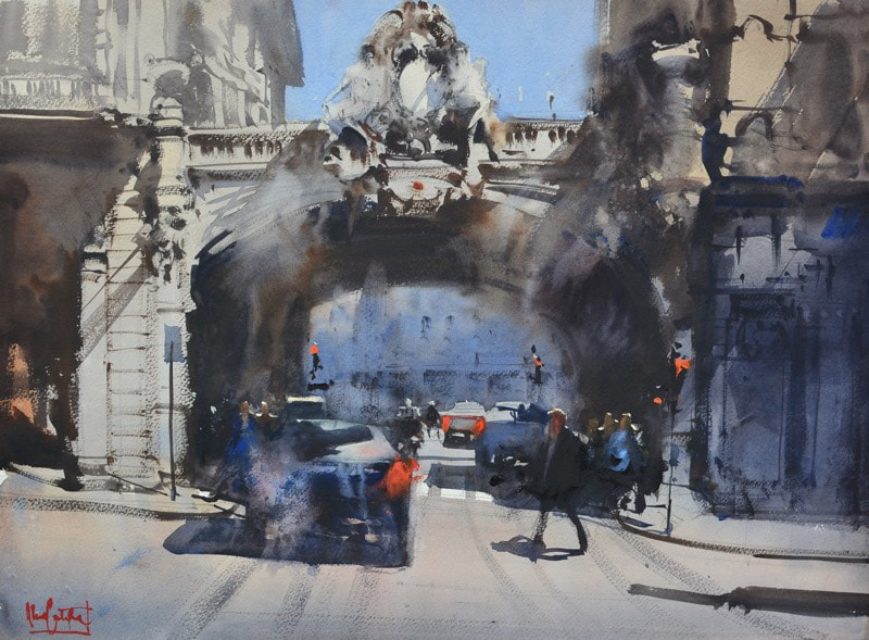
Notice just how much of a contrast (variety) of edges there is here.
He deliberately breaks off rigid and repetitive lines to create a more balanced sense of structure and flow. This is most obvious around the bridge and car in foreground.
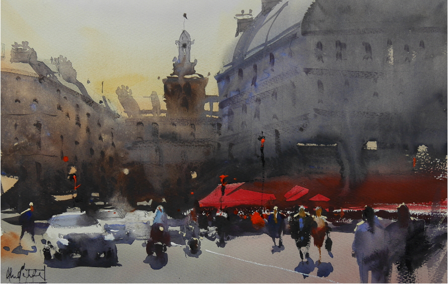
Here’s another great one with contrasting temperatures – warm yellows and reds vs cool grays.
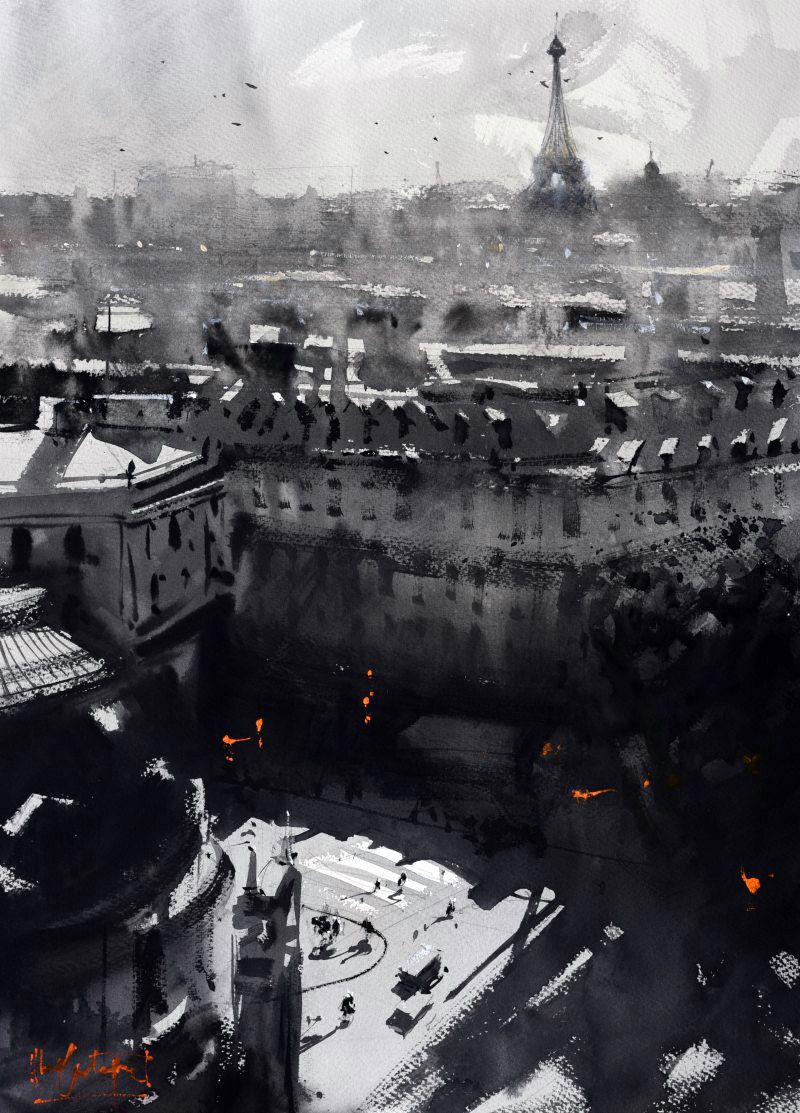
And lastly – notice how even when he eliminates colors almost completely – he makes sure to push the contrast of VALUES. The value contrast in this painting is way more dramatic than in the previous ones – and that is for a reason.
Contrast Technique & Studies
In order to be able to utilize contrast in a good way, there’s a certain awareness, understanding and technique gap that needs to be closed.
You need to understand why this is important, how it works and also how to achieve it technically (to control edges, for example, you have to learn how to control the complex medium of watercolor in multiple ways).
I just wanted to mention this as encouragement. Nothing is “wrong” with your results – you simply need to learn these ideas and the relevant techniques – and with time it will all connect to beautiful artworks.
General Updates
First and foremost – if you enjoy this podcast I would HIGHLY appreciate if you leave a rating on your favorite podcast platform, and perhaps even a review. It means the world to me and really helps in reaching more people.
And – here are the general updates I shared today:
- I’m in contact with a major art-selling platform and we’ll hopefully do collaborative sponsorship soon 😊
- My video on how to know what colors to use is doing really well! – Check it out here!
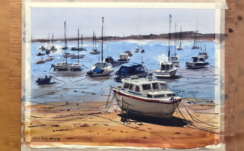
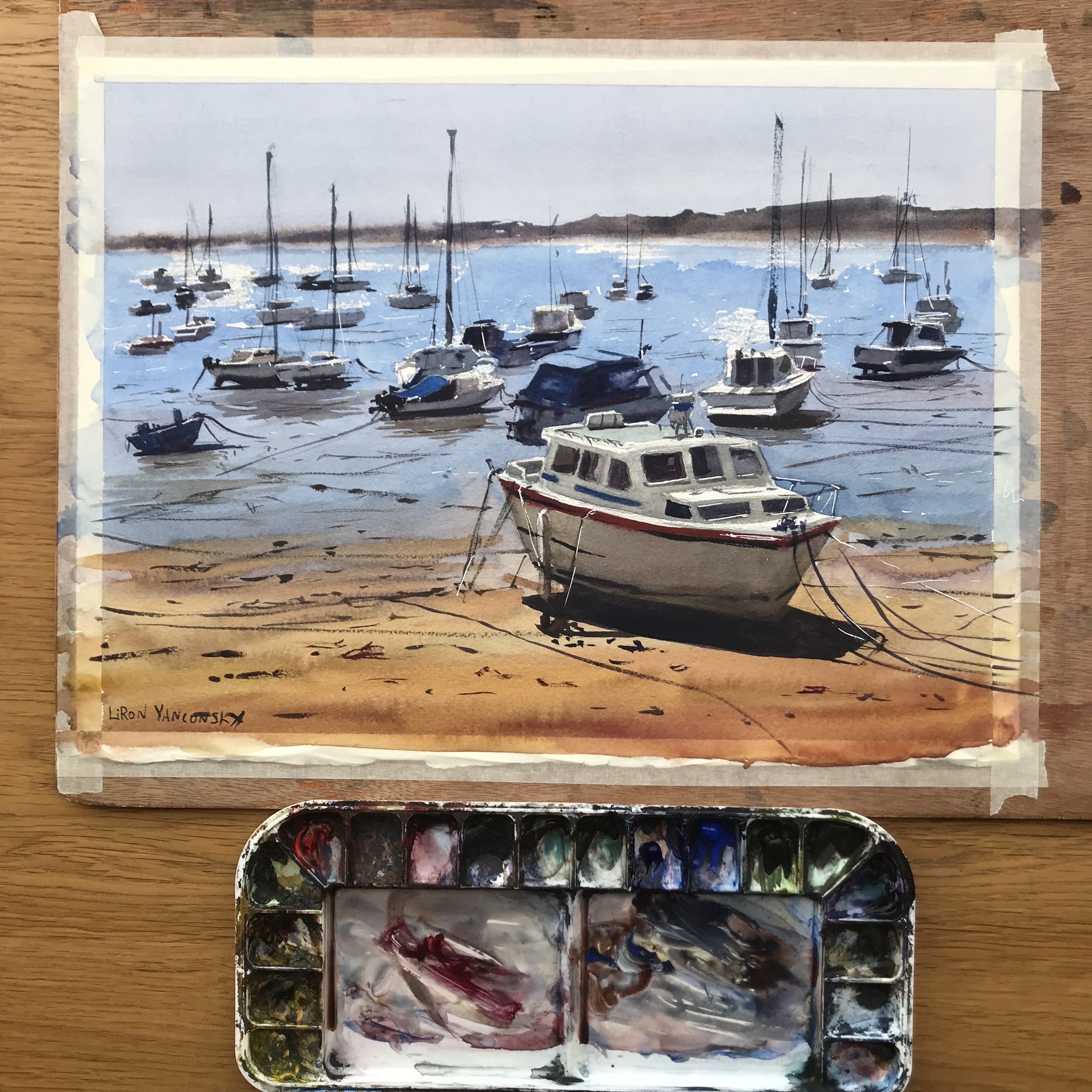
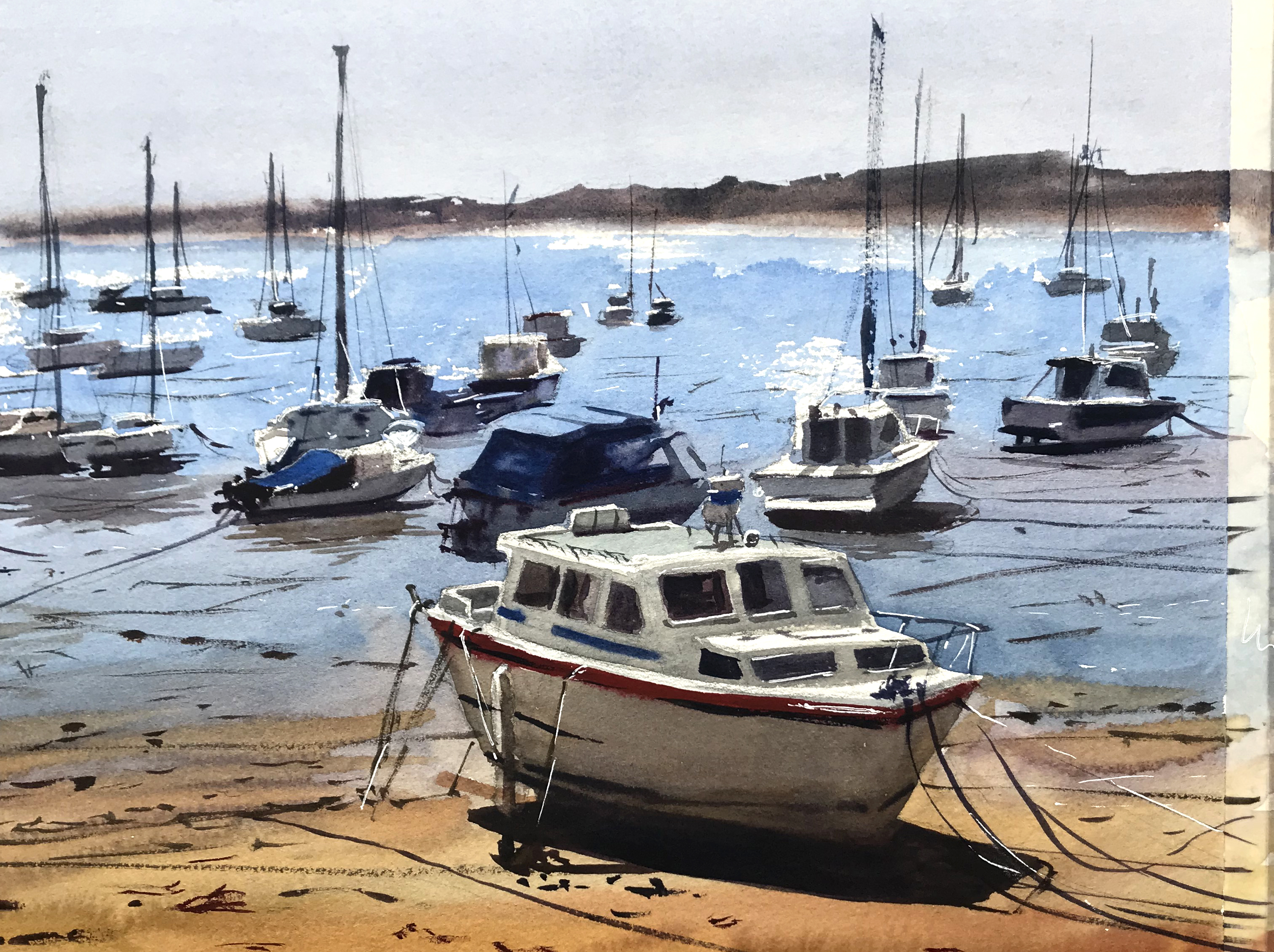
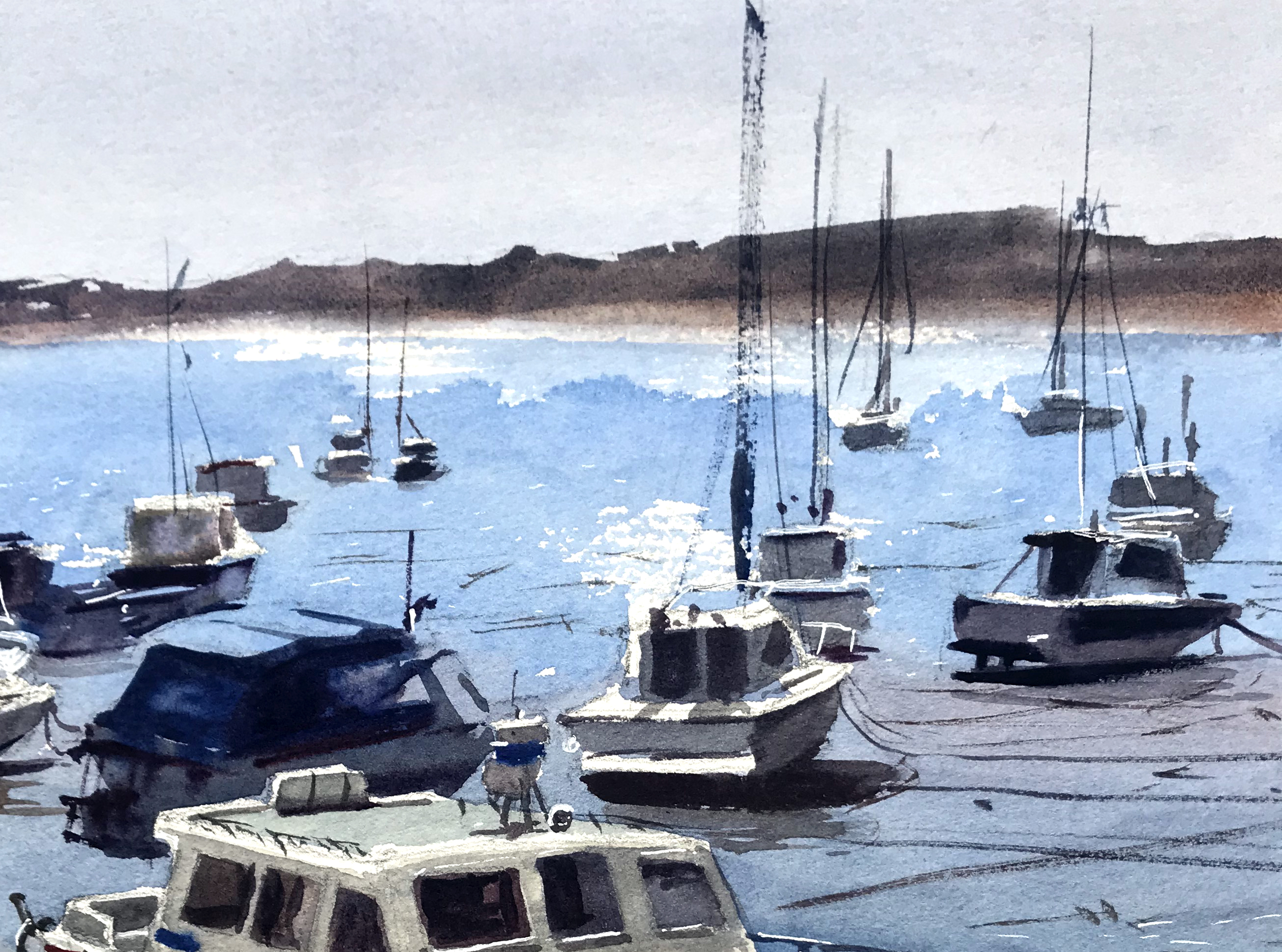
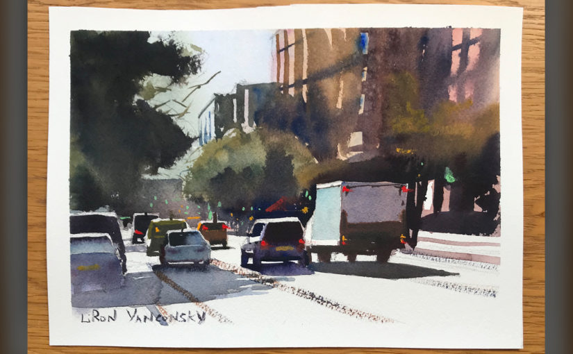
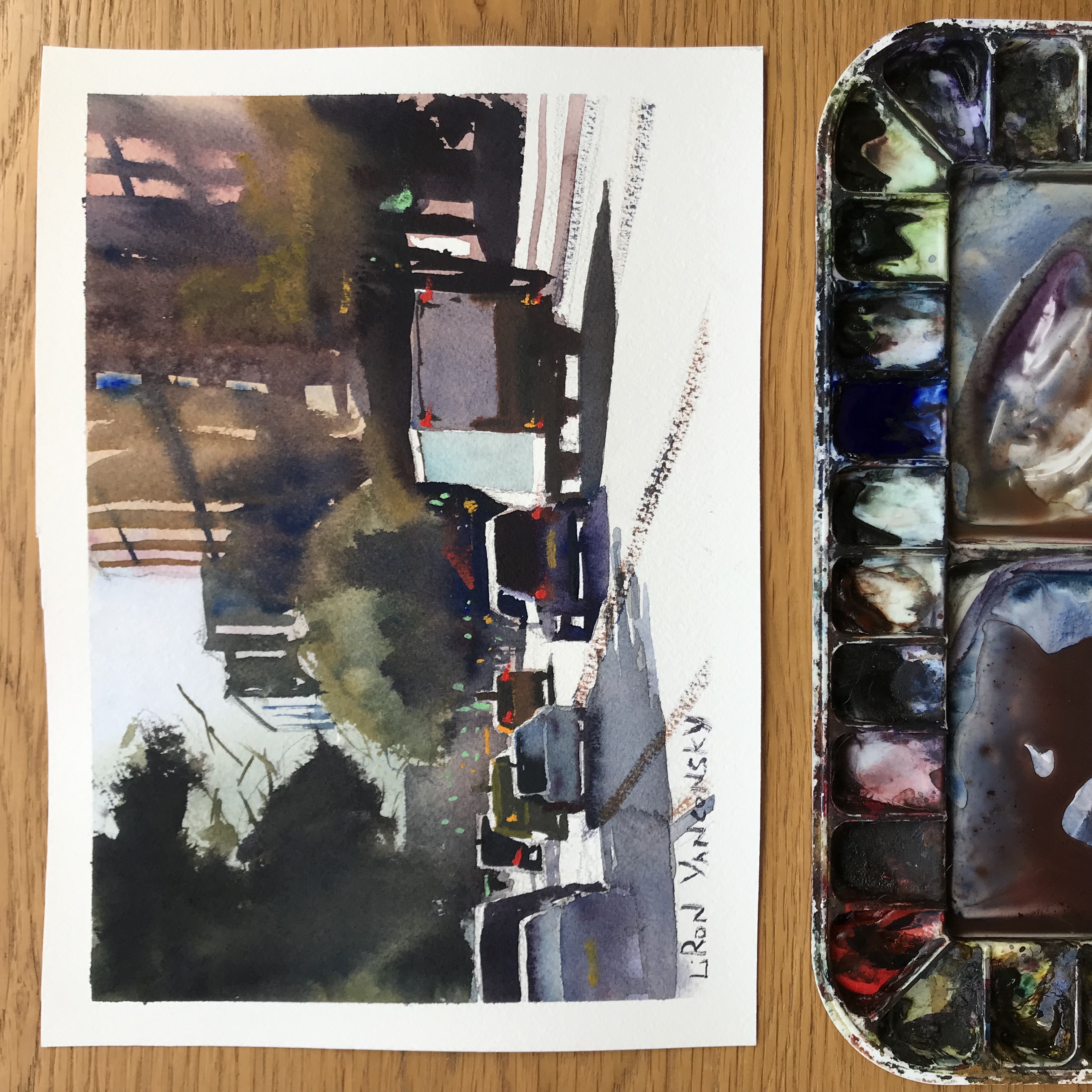
- I’m making nice progress with the upcoming (100% FREE!) How to Simplify in Watercolor course! Here’s one of the paintings I’ll demonstrate there.
And that wraps it up for today!
Thank you so much for tuning in 😊🙏🏼
I’ll talk to you again real soon.
Here’s where to reach out to me:
Instagram – @LironYanIL
TikTok – @Liron.Yan
YouTube – Liron Yanconsky Art
LinkedIn – Liron Yanconsky
Pinterest – Liron Yanconsky
Twitter – @LironYan
— Liron