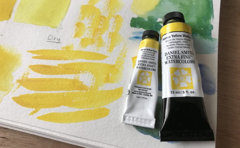
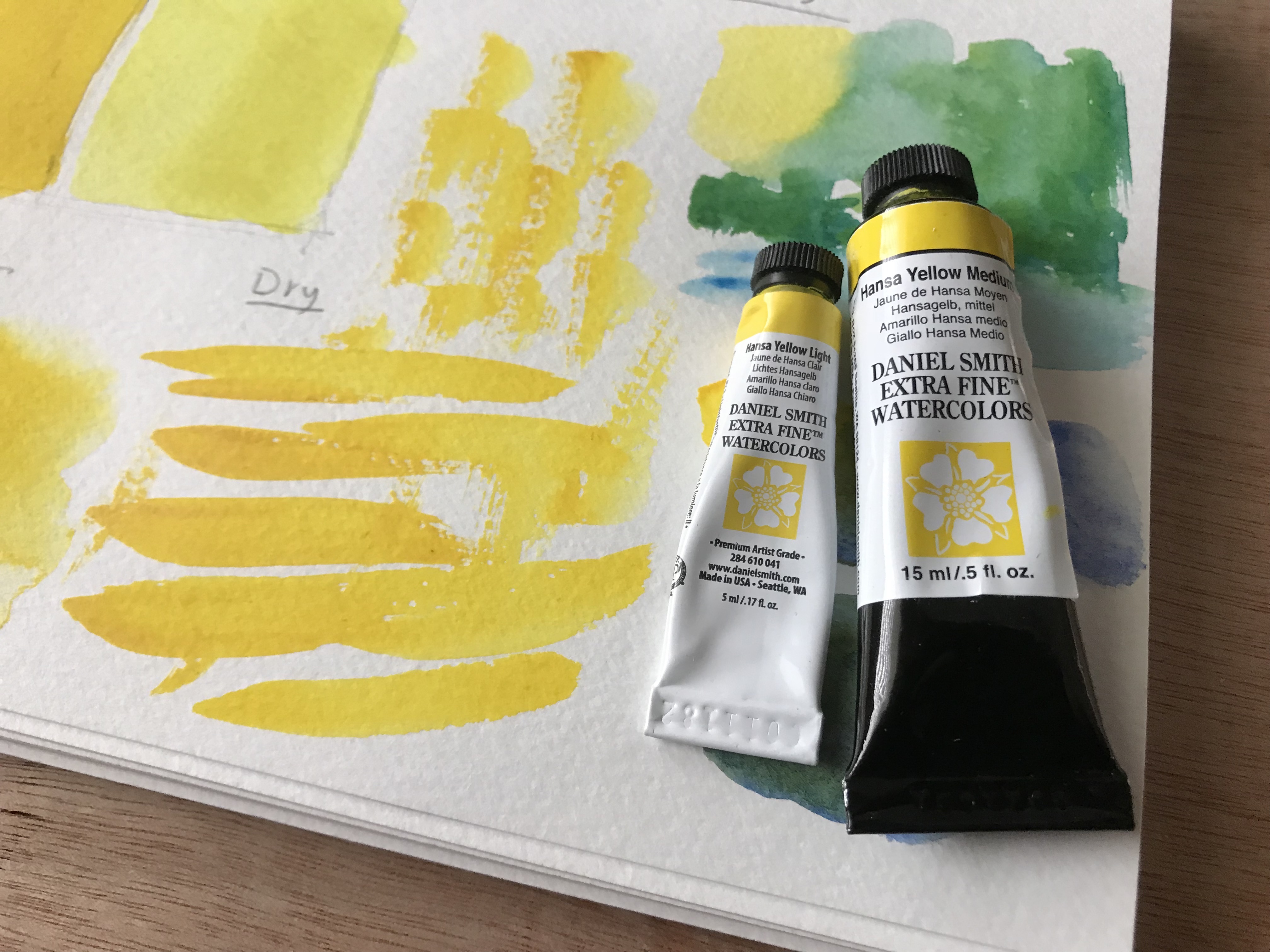
I have to say a word about the set. It’s really useful, and very cost-effective. Each of the paints are useful on their own. I would highly recommend getting it.
Conclusion
If you love Daniel Smith paints, I’d look into this one. It’s a good, neutral yellow to have.
Despite me not liking the set AS A SET, I would recommend getting it. That is because the individual paints are great in their own right.
I hope you enjoyed this one, and I’ll talk to you again real soon!
Hi there! Today I want to talk to you about making your photo reference easier to paint.
Painting as an art form poses innumerable challenges. as we improve, these challenges never really go away. We, however, get better at dealing with them and solving them.
Your Photo Reference Matters
As a beginner, you want to have everything work in your favor. A large part of that is painting from a good reference.
Anything can be painted, but the reality is that not everything is ideal as reference.
In today’s video I want to show you several ways of turning your photos into something that’s easier to paint.
Watch the complete video here, and scroll on for a written version (:
Make Every Photo EASIER TO PAINT
Finding Good Reference
I have several sources for great reference photos, that I also present in the video. Here they are:
These are all great. Generally speaking – Pixabay and WetCanvas photos can be used for anything (commercial or non-commercial).
Access to WetCanvas Reference Photo Library does require registration, which is free.
With Flickr you need to be a little careful, and filter according to the license. You can also always contact the owner of the photo and ask for their permission.
Choosing Good Photos
I’d like to say a few words about choosing good reference photos, and specifically for the purpose of painting and watercolor painting.
Clear and Focused
A good reference photo should be clear and well focused. You should be able to see all of the details.
Large Shapes
Also, it’s best if there are a few larger shapes that are very visible. What I mean by that is that the image isn’t a collection of tiny bits and pieces that don’t really connect to a cohesive subject.
This is why still-life arrangements, as well as portraits can be GREAT subjects. They are very clear and contain major shapes.
A cityscape, on the other hand (and this can very from one photo to another), has the potential of being a little “messier”.
Strong Contrasts
This is especially important if you are a beginner to watercolor painting. Photos that have sharper contrasts are simply easier to paint.
If you’ll try and paint a perfectly lit portrait, that barely has any shadows in it, and is full of gradual light changes – you may loose your mind =P
(check out the full video to see what I’m talking about).
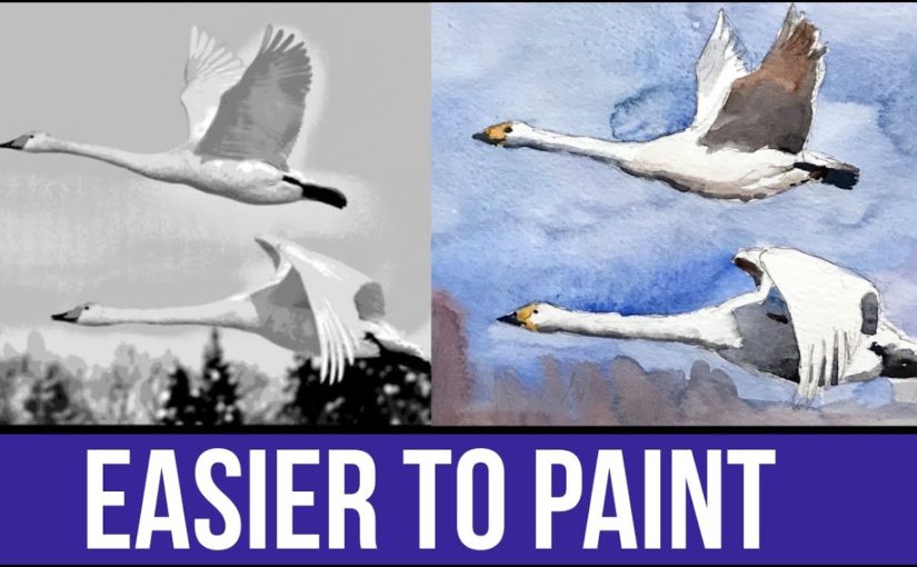
Improving Brightness, Contrast and Levels
This first step is always important. Watch to full video to see how I play with the histogram, but here’s what the effect looks like.
(left – before, right – after)
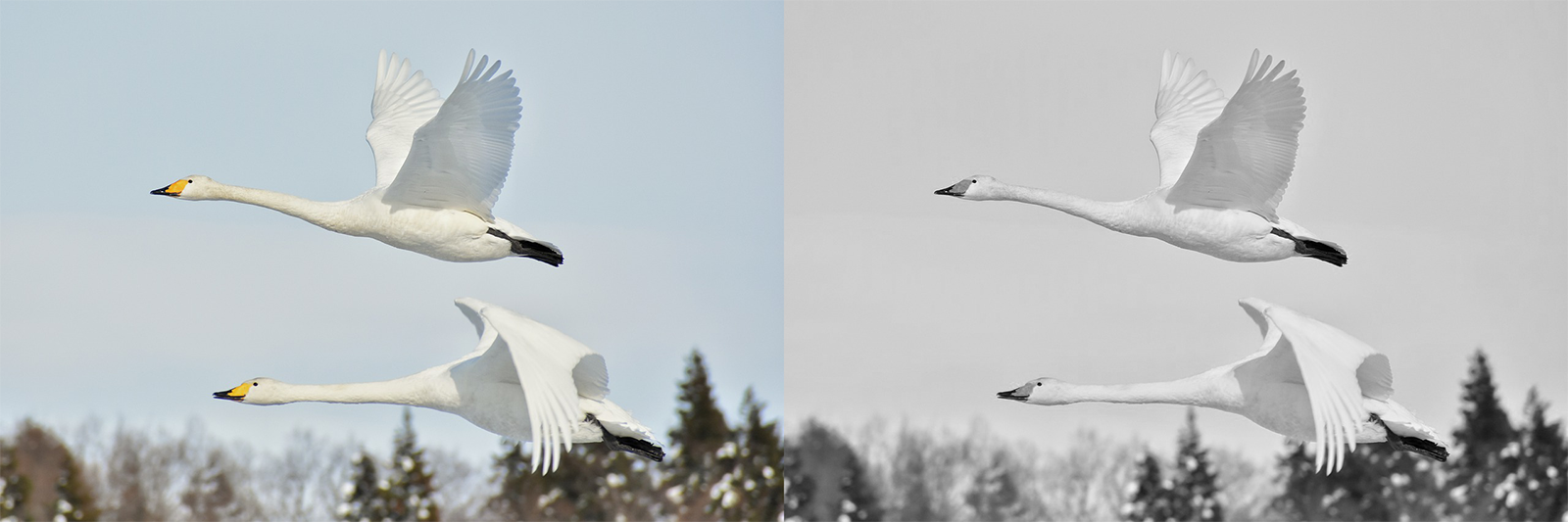
Editing Your Photo Reference – Black and White
The first advice I’d give you is to turn your reference from color mode to black and white.
This can be done easily with the simplest of photo editing softwares. And it will give you a much better look at the values (how dark or light everything is).
Here’s a comparison.
(left – before, right – after)
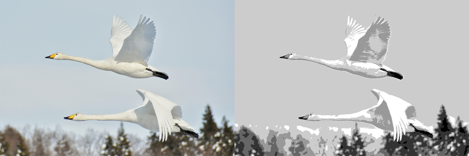
Editing Your Photo Reference – Posterize
Posterize is a handy function that’s available in most advanced photo editing softwares such as Photoshop and (god forbid) Gimp.
It allows you to control the NUMBER of levels (=values). So you can choose 2 values – which will give you an image with two values only. Or you can increase it to 6, 12 or whichever number you’d like.
Here’s another comparison showing this effect.
(left – before, right – after)
I find this one to be particularly useful in simplifying a photo, and making it much easier for us to paint it.
You can just SEE very easily where it gets darker, lighter and so on.
Conclusion
You can paint based on anything. But some references are better than others.
When working from real-life observation, we don’t really have control over what we see. But, when working from a photo reference, we can change things around to our advantage.
I hope this helps you in better understanding how to do that.
I’ve used these methods for creating many of my works. Be sure to follow me on Instagram to see the results. I used this especially for my portraits, such as this one of Santa Clause (;
And this is it, I will talk to you again real soon!
Hi there! Today I want to quickly let you know about my favorite watercolor paper(s).
This really is a personal matter, so don’t worry if our opinions are different. That’s what opinions are for (;
Here’s the full video. For a written version, read on.
In Watercolor, Paper’s IMPORTANT
I want to preface this by saying that paper really matters when it comes to watercolor painting. It has to be of good quality.
I find that I can work well with simple brushes and ok paints. But the paper is crucial for success.
Cold-Press VS Hot-Press
These are the two main watercolor paper types.
Hot-press paper has a soft surface. Paint tends to sit a little more on its surface, and may take a little longer to dry.
Cold-press paper has tooth, aka texture. It tends to be a little thirstier in my experience. It tends to absorb paint faster.
I am an absolute fan of cold-press.
I love the texture and tooth. It’s very forgiving, and holds paint very well. It can be used to create different effects and “dictate” the focus in a painting, by using dry brush techniques.
An Argument FOR Hot-Pressed Paper
There is something to be said of the merits of hot-press watercolor paper. This type of paper allows for smoother transitions and edges. It’s considered more suited for portrait painting, and for works that require finesse and accuracy (which makes sense).
I also find that it’s sometimes easier to blend and soften edges in hot-press paper, though you have to know what you are doing. You usually need to dry the brush a little more (as the paper is smoother and a little more moisture in the brush can cause paint to spread more easily).
I think that the minimum is 300gsm (grams per square meter). Under that you are risking with dealing with major buckling, especially in larger sizes.
I actually love to use 600gsm paper, but it’s not a necessity. That’s me being spoiled haha.
Favorite Watercolor Paper Brands
I have two brands whom papers I love.
Arches and Saunders-Waterford.
These two actually feel REALLY THE SAME. I think I read once those are different lines of the same brand, thus the similarity. Though I don’t remember clearly.
These can take anything, multiple layers, lifting, scratching, whatever!
The paper I most commonly use in the last six months or so is Saunders-Waterford.
Sketchbooks
When in sketchbooks, it’s sometimes a challenge to find one with good paper.
My favorite would be an Arches paper organized as a sketchbook (haven’t seen Saunders-Waterford in that format.
However, there is a different type of sketchbook I like, and that is Canson Montval (and it’s not even cotton paper).
You can watch my review of it here:
Conclusion
I hope this gives you a clearer picture of the types of watercolor paper I love using. this
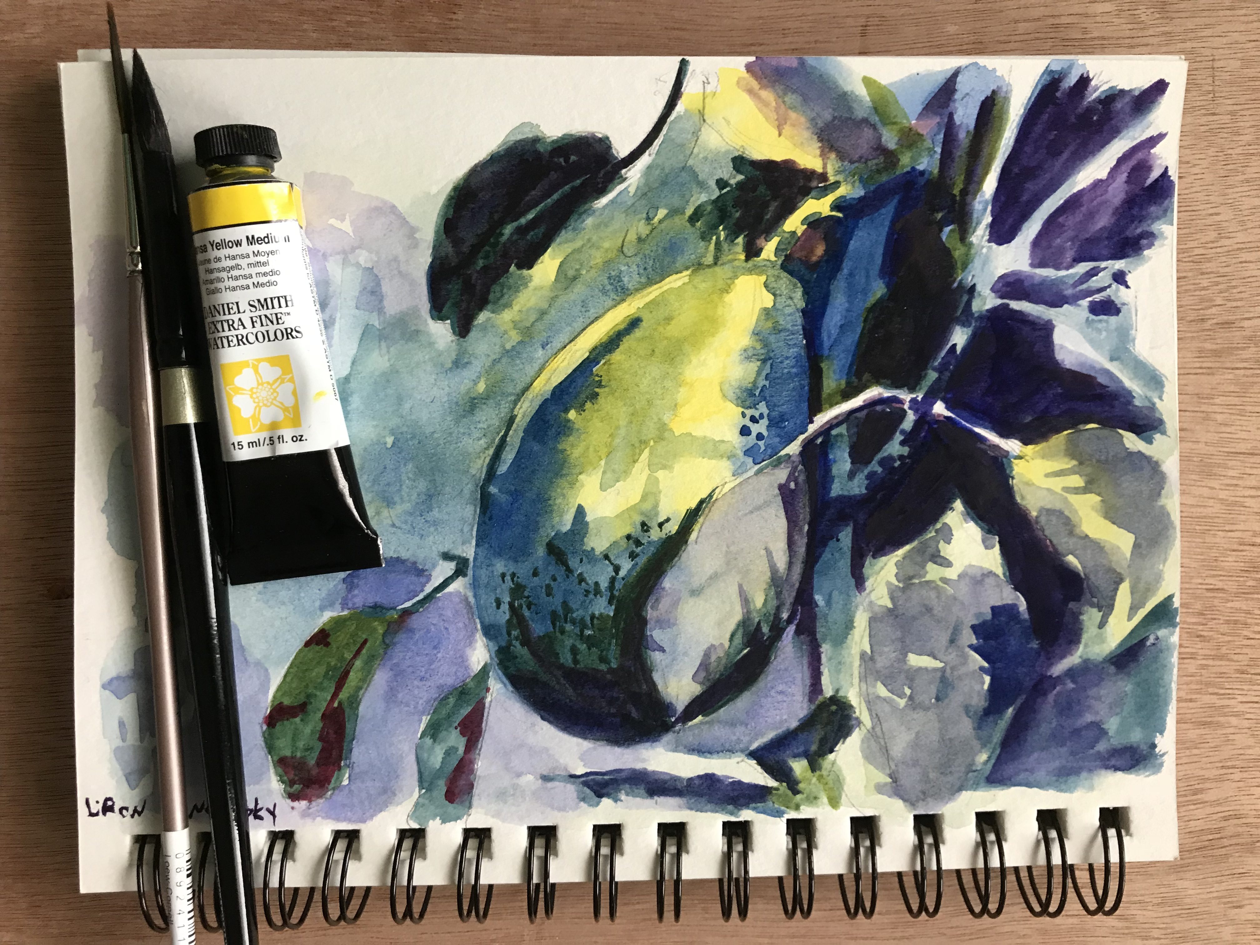
Hi there! Today I want to share with you a review I did for Perylene Red paint, as part of The Paint Show.
This paint is by the Daniel Smith brand, and I got it as part of their Primary Set.
Here’s the full video review, scroll down to read more.
Why I LOVE Perylene Red
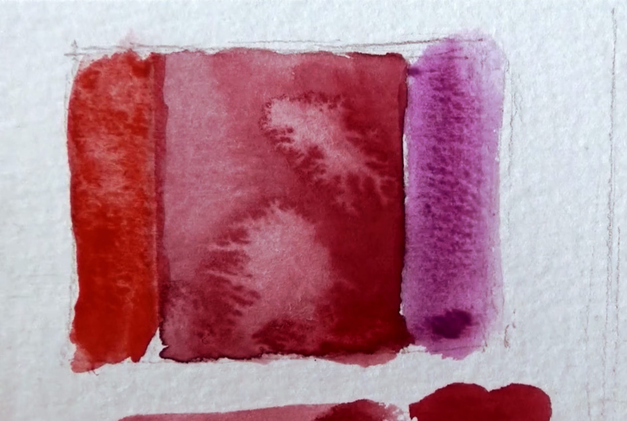
This is a paint I really love, and for multiple reasons. The first is that it’s relatively neutral.
I compared it to Pyrrol Scarlet (left) and Quinacridone Rose (right), and you can see how it’s in the middle. Not too warm, not too cool.
It’s also a semi-transparent paint, has excellent lightfastness and pretty easier to lift, if necessary.
Perylene Red by Daniel Smith – Info
Pigment: PR178
This pigment is said to go through a significant shift when drying. It’s supposed to lighten slightly, and loose about 20% of its saturation (according to HandPrint.com). I didn’t notice such a significant difference.
It’s also highly active in wet-in-wet, and creates large blossoms.
Excellent Lightfastness
Semi-Transparent
Medium-Staining
Non-Granulating
Series 3 – goes on Amazon for ~13$-14$.
Perylene Red is great if you are looking for a good primary red that’s relatively neutral. I love the way it handles and behaves, and enjoy using it.
I’d also like to add that getting the Primary Set is highly economical, and results in a relatively cheap “per tube” price. It contains three useful paints (this one, alongside Hansa Yellow and French Ultramarine). All come in 15ml.