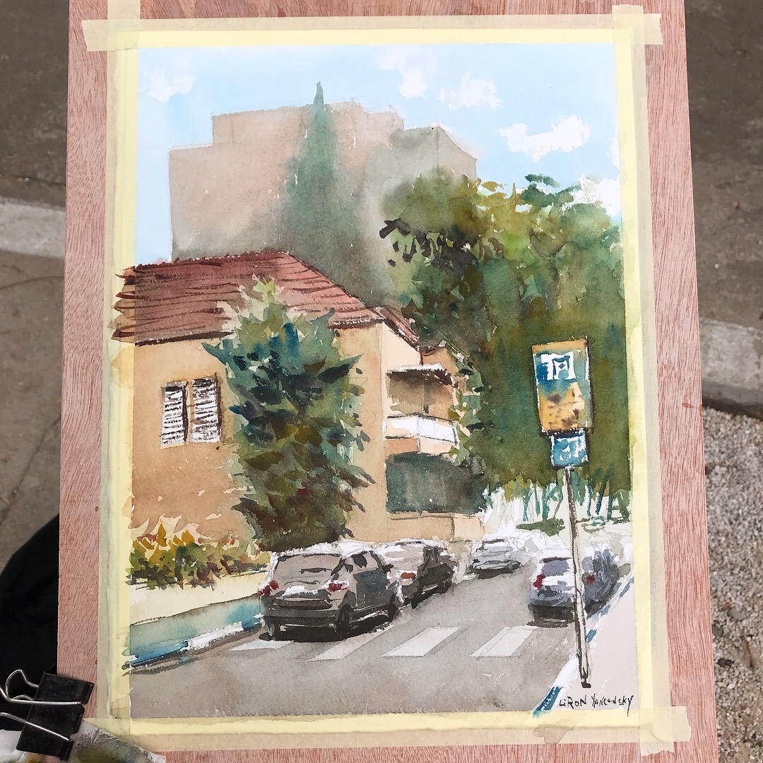
Hansa Yellow Medium – Daniel Smith Watercolors | The Paint Show 26

Hi there! Today I want to review Hansa Yellow Medium, by Daniel Smith Watercolors.

You can view the full video review here, and scroll down to read more.

Hansa Yellow Medium

My story with this paint is so funny.

I originally got it with Daniel Smith’s Primary Set.

But I wasn’t too keen on the actual combination of paints in that set (together with French Ultramarine and Perylene Red – Which I reviewed here).

So I kind of stopped using it. For the longest time this tube took a nap in my drawer.

But then I decided to take it out and give it a try. And I re-fell in love with it instantly!

I guess I just needed more experience to see how useful it was.

Hansa Yellow Medium – Paint Info

Here’s some additional info about this tube.

Pigment: PY97 (Arylide Yellow FGL)
Series 2
Lightfastness: I (excellent)
Semi-transparent
Low-staining
Non-granulating

I find it to be quite useful. It mixes well with many different blues and reds.

My favorite yellows lean to orange, but if I had to go with a more neutral yellow, this would be my choice.

Results of Using Hansa Yellow Medium

Here are some quick paintings and sketches I did using this paint.
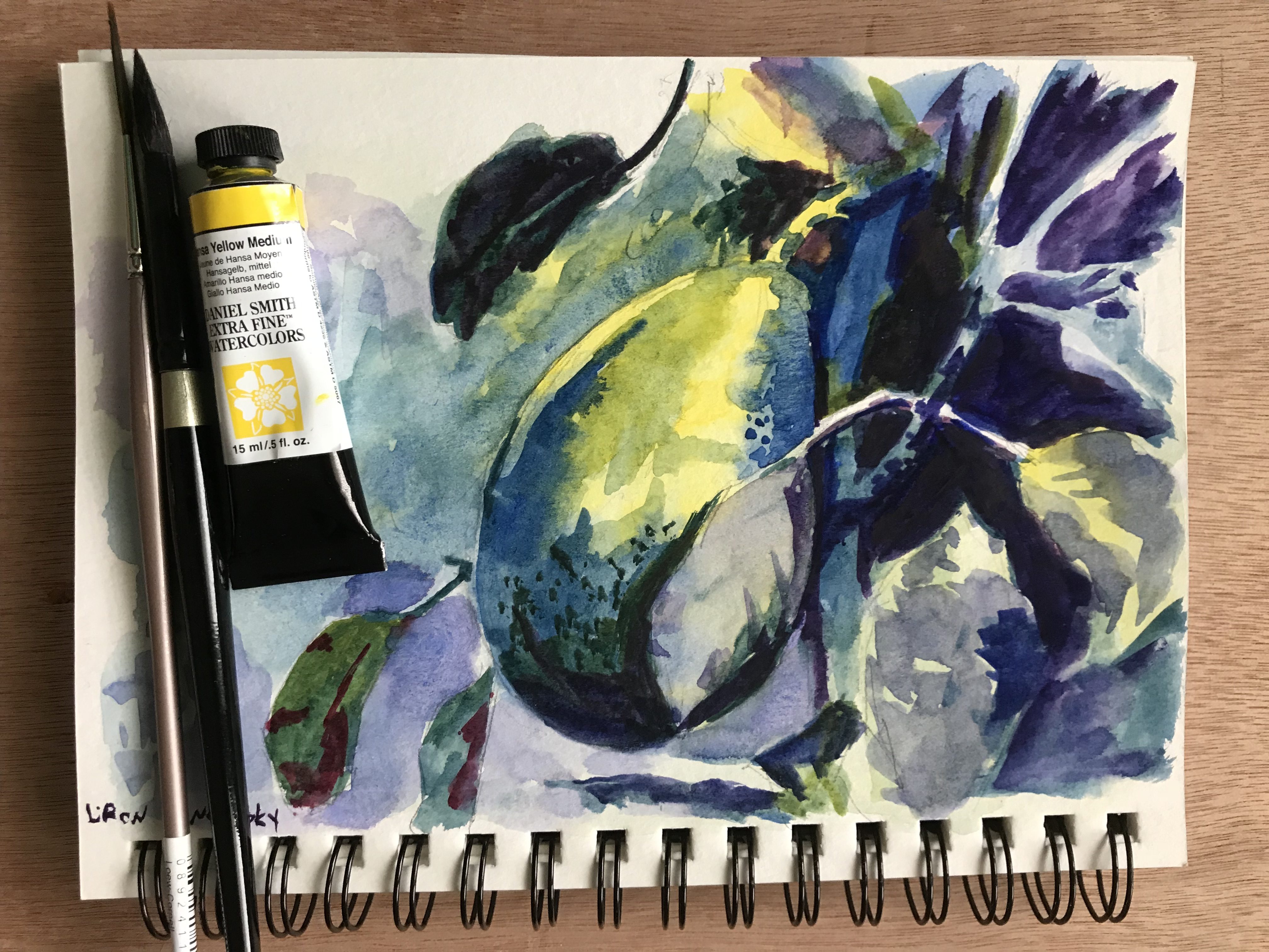
Quick avocado sketch with Hansa Yellow Medium

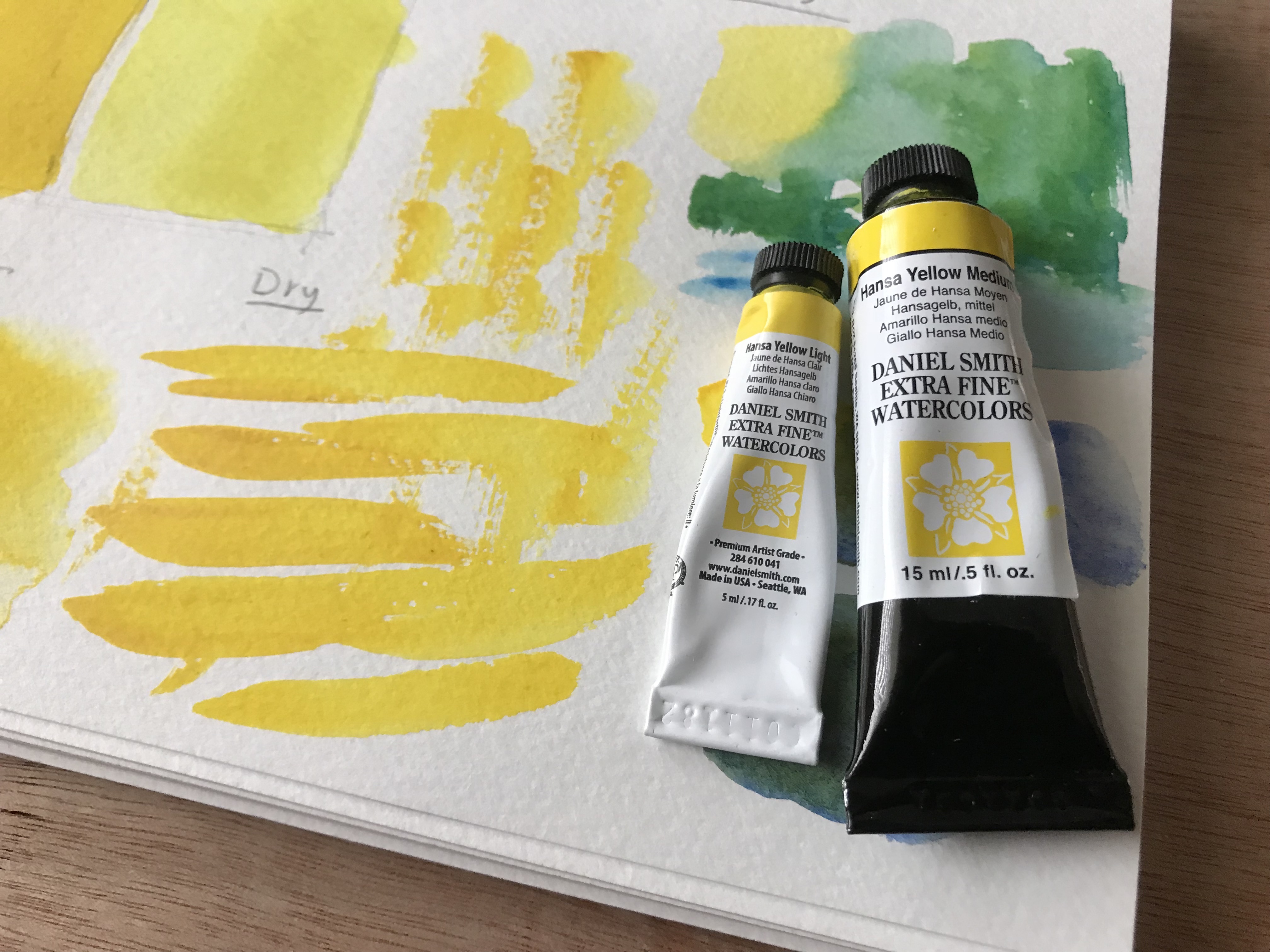
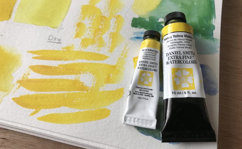
Hansa Yellow Medium and Hansa Yellow Light Tubes

Where to Purchase It

You can purchase a single tube here: http://amzn.to/2H4L0Md
Or the entire set here (very cost-efficient): http://amzn.to/2sjEv4C

I have to say a word about the set. It’s really useful, and very cost-effective. Each of the paints are useful on their own. I would highly recommend getting it.

Conclusion

If you love Daniel Smith paints, I’d look into this one. It’s a good, neutral yellow to have.

Despite me not liking the set AS A SET, I would recommend getting it. That is because the individual paints are great in their own right.

I hope you enjoyed this one, and I’ll talk to you again real soon!

– Liron

SAA Watercolor Paints | Review, Demo & First Impressions

Hi there! Today I want to talk to you about the SAA watercolor Paints.

I reviewed them extensively in this YouTube video:

If you want to read more, scroll below.

SAA Watercolor Paints

I was sent these by one of my followers, Chris. He recommended I give them a try and I absolutely loved them!

I’m writing this quite a while after publishing the video. With this larger perspective I can say these are really high quality.

These paints behave the way I want them to. I find I have great control with them, but they still do what they want.

They are strongly pigmented, easy to activate and are very fun to use. They also have great lightfastness.

The Paints I Got

I got three paints:

1. Indian Yellow
2. Alizarin Crimson Permanent
3. French Ultramarine

Individually they work great. I would, in terms of combos, maybe replace the French Ultramarine with a cooler Phthalo Blue, but that’s just my personal preference.

Detailed Paint info

1. Indian Yellow
A beautiful warm yellow.

Pigment: PY3 (Hansa Yellow)
Semi-transparent
Lightfastness: A (best)

2. Alizarin Crimson Permanent
A strong Alizarin Crimson.

Very well-pigmented and saturated.
Pigments: PR177 (Anthraquinone Red) and PV23 (Dioxazine Violet)
Transparent
Lightfastness: A (best)

3. French Ultramarine
A beautiful warm blue.

Pigment: PB29 (Ultramarine Blue)
Semi-transparent
Lightfastness: A (best)

The Results

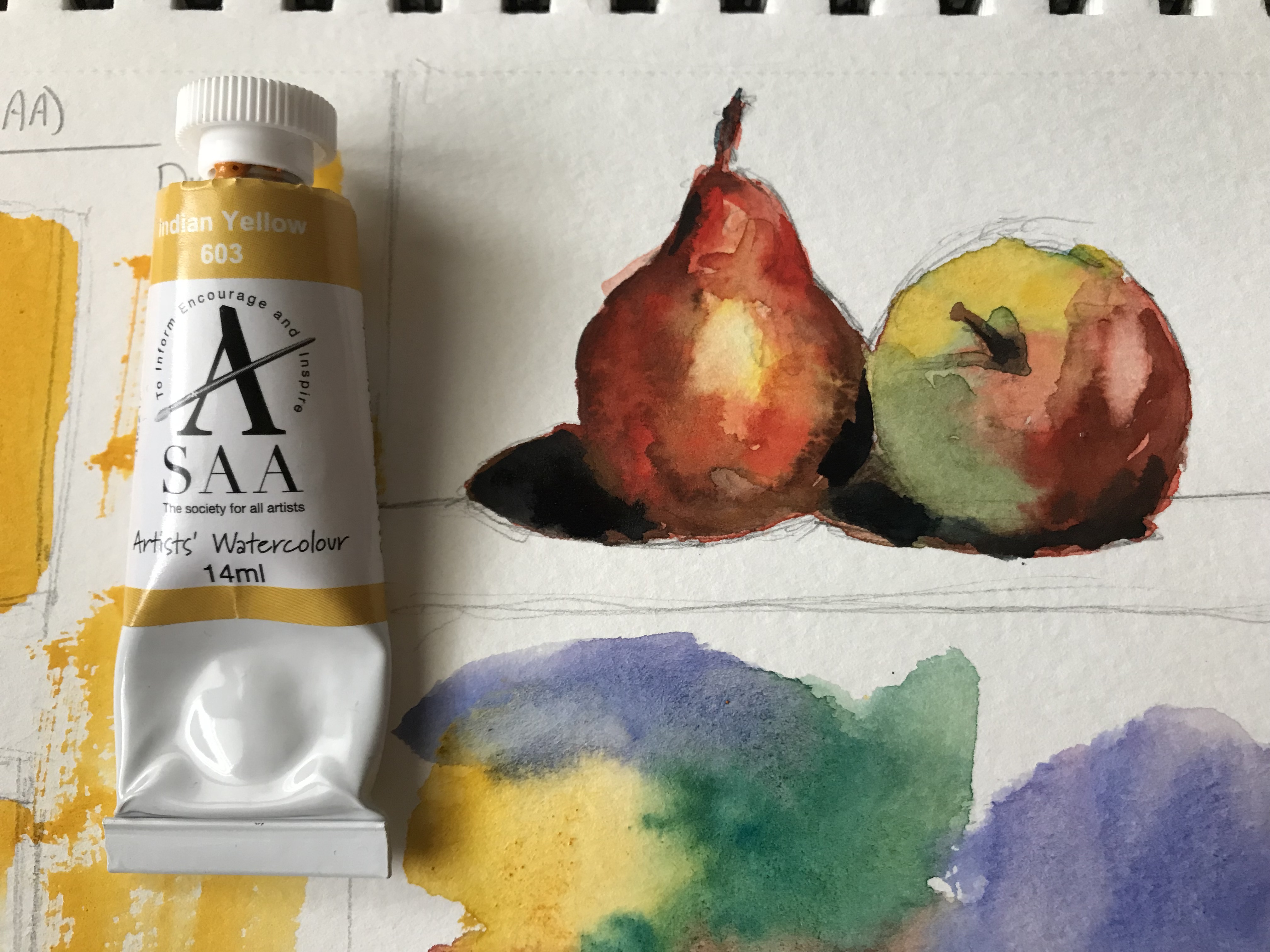
Here are some still-life results I got with these. I really love them!

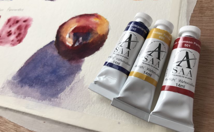
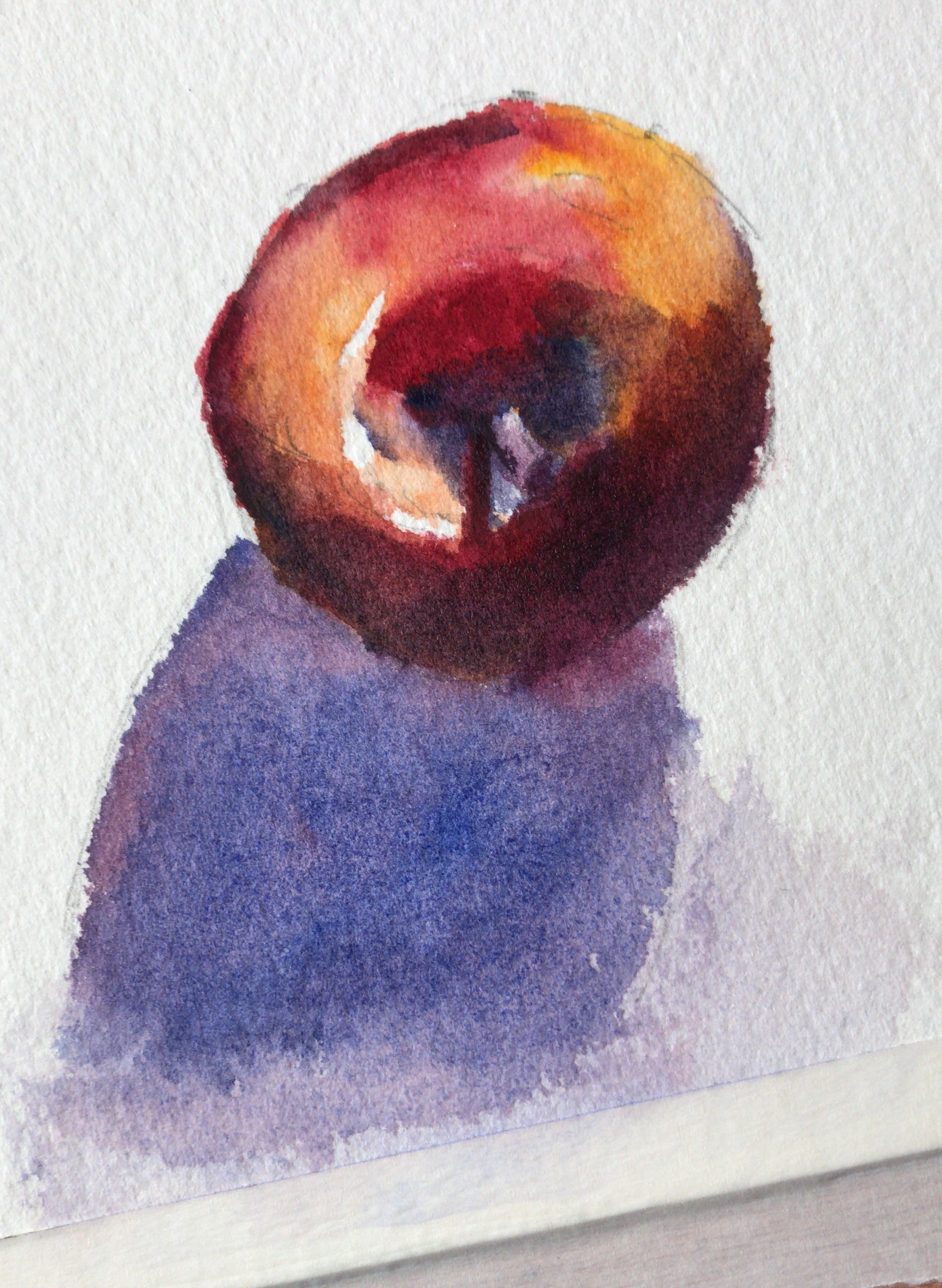
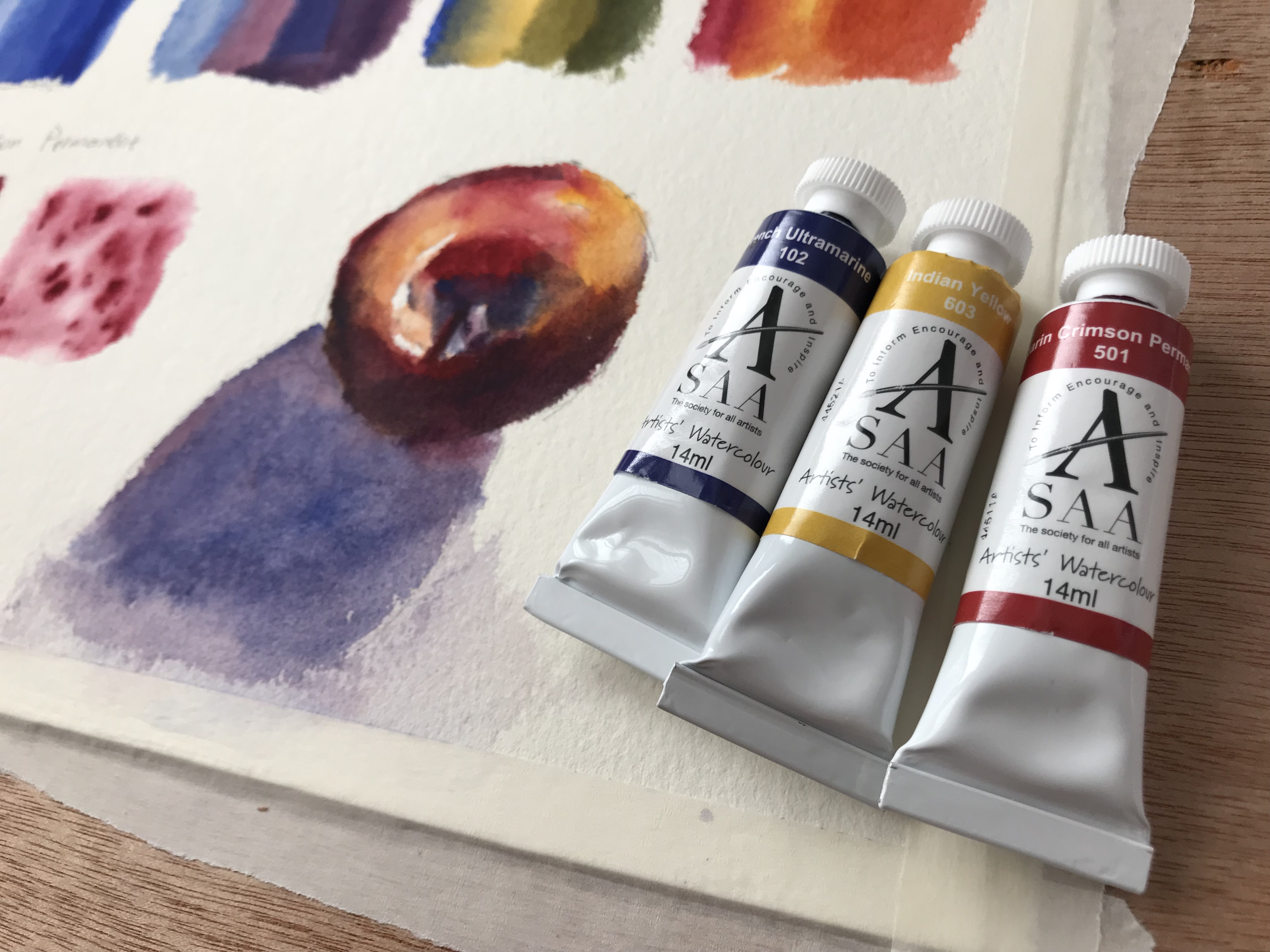
An apple still-life painting with SAA paints The three SAA watercolor paint tubes, next to the still-life painting A still-life of a pear and apple, done with Indian Yellow

Where to Purchase SAA Paints

These are very unique. SAA stands for The Society for All Artists. It is a UK based brand, that has a strong community around it.

They offer several plans that make their tools and paints significantly cheaper. They also don’t have series for their paints. All paints are priced equally.

If you reside in the UK I’d highly recommend giving them a try (although it’s worth mentioning they have an international plan as well).

You can learn more here: https://www.saa.co.uk/info/join-the-saa/

Conclusion

I’m really into these paints. I hope to share more artworks I did with these in the future.

I hope you enjoyed this review, and I’ll talk to you again real soon!

– Liron
Cobalt Blue – ShinHan PWC Watercolor | The Paint Show 25

Hi there!

Today I want to share with you a review of Cobalt Blue by ShinHan PWC watercolor!

PWC is ShinHan’s artist grade watercolor (they also have the Professional line for students and Shami for kids).

You can read more about ShinHan paints and the other paints I bought on the post I published a while back: ShinHan PWC (Primary Set I Selected)

Here’s the complete review on YouTube. Read on for the written version (:

Cobalt Blue by ShinHan PWC

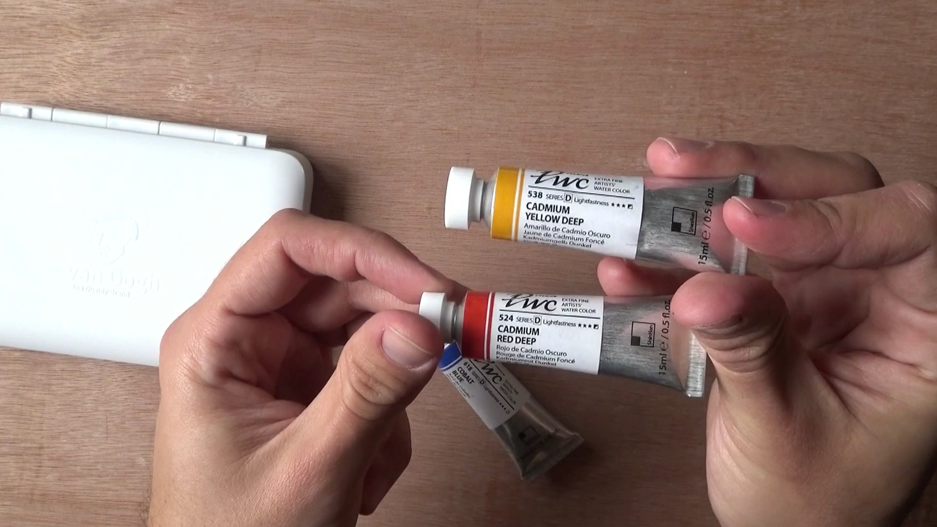
I purchased this alongside their Cadmium Red Deep and Cadmium Yellow Deep.

I really love this paint and have used it EXTENSIVELY, in many of the works I shared with you here and on Instagram for the past several months.

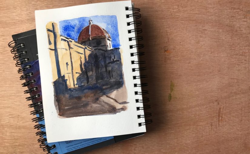
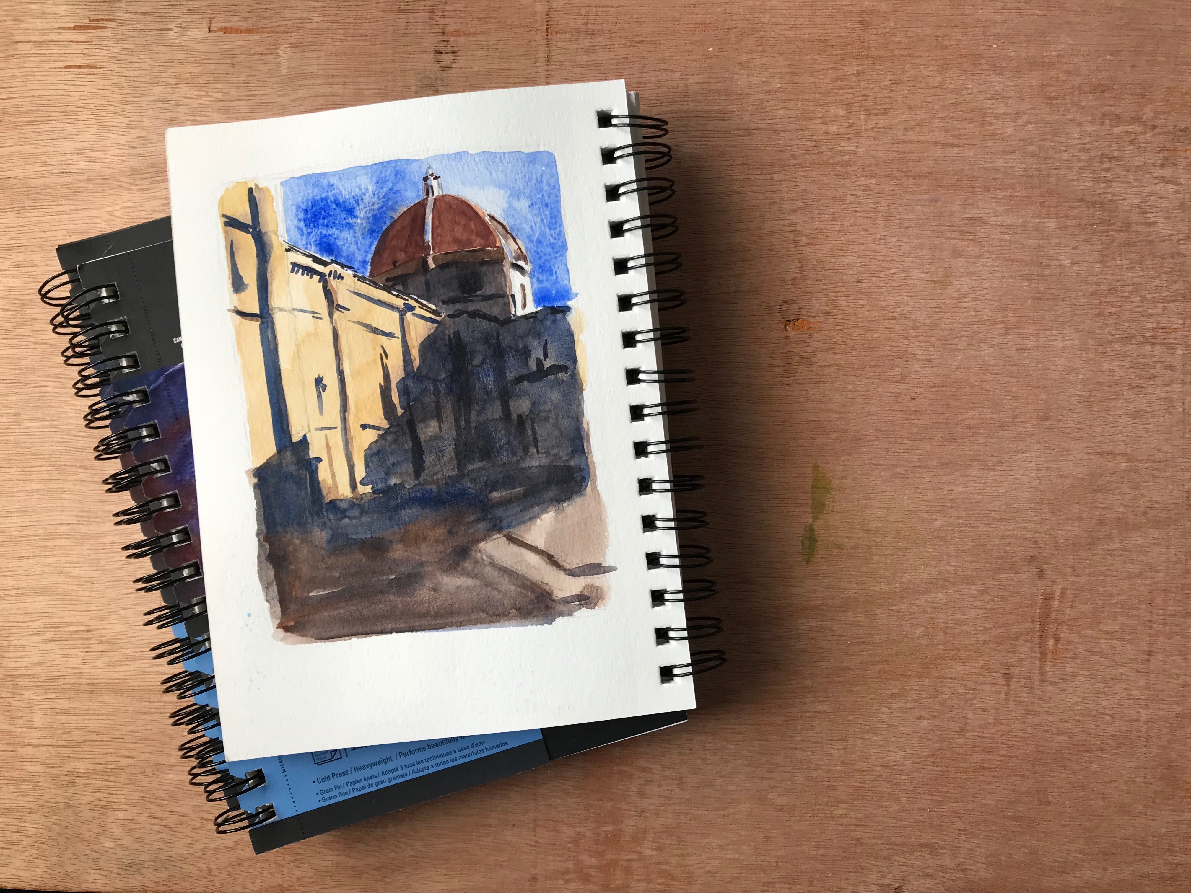
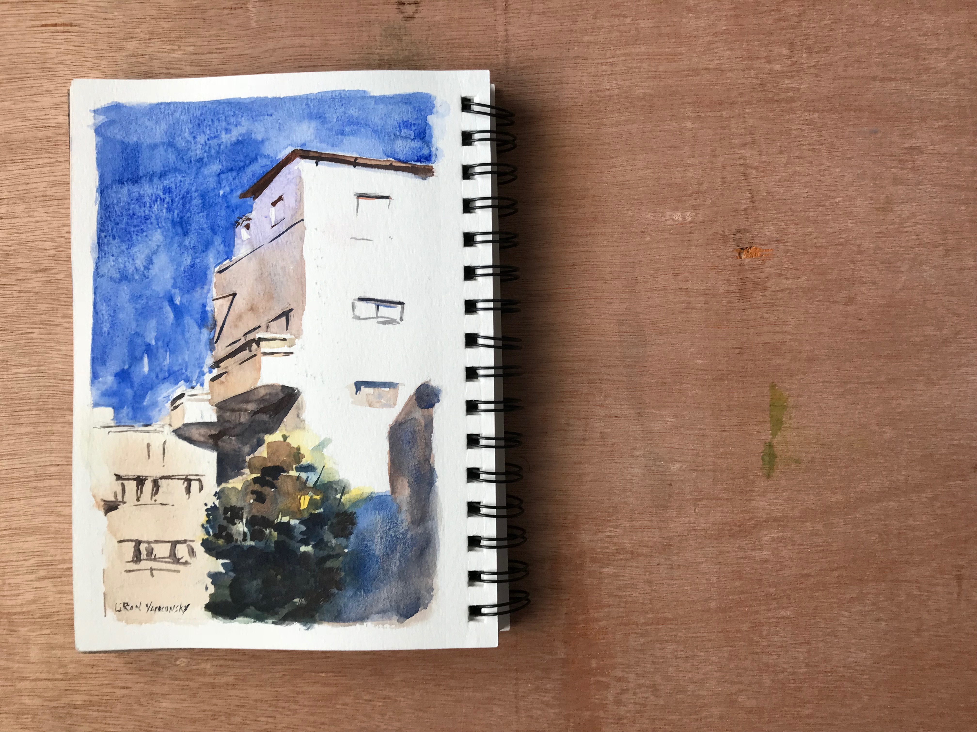
Here are some of my works showcasing it.

Painted the Duomo in Florence using Cobalt Blue by ShinHan PWC

Painted a building in Tel Aviv using Cobalt Blue by ShinHan PWC

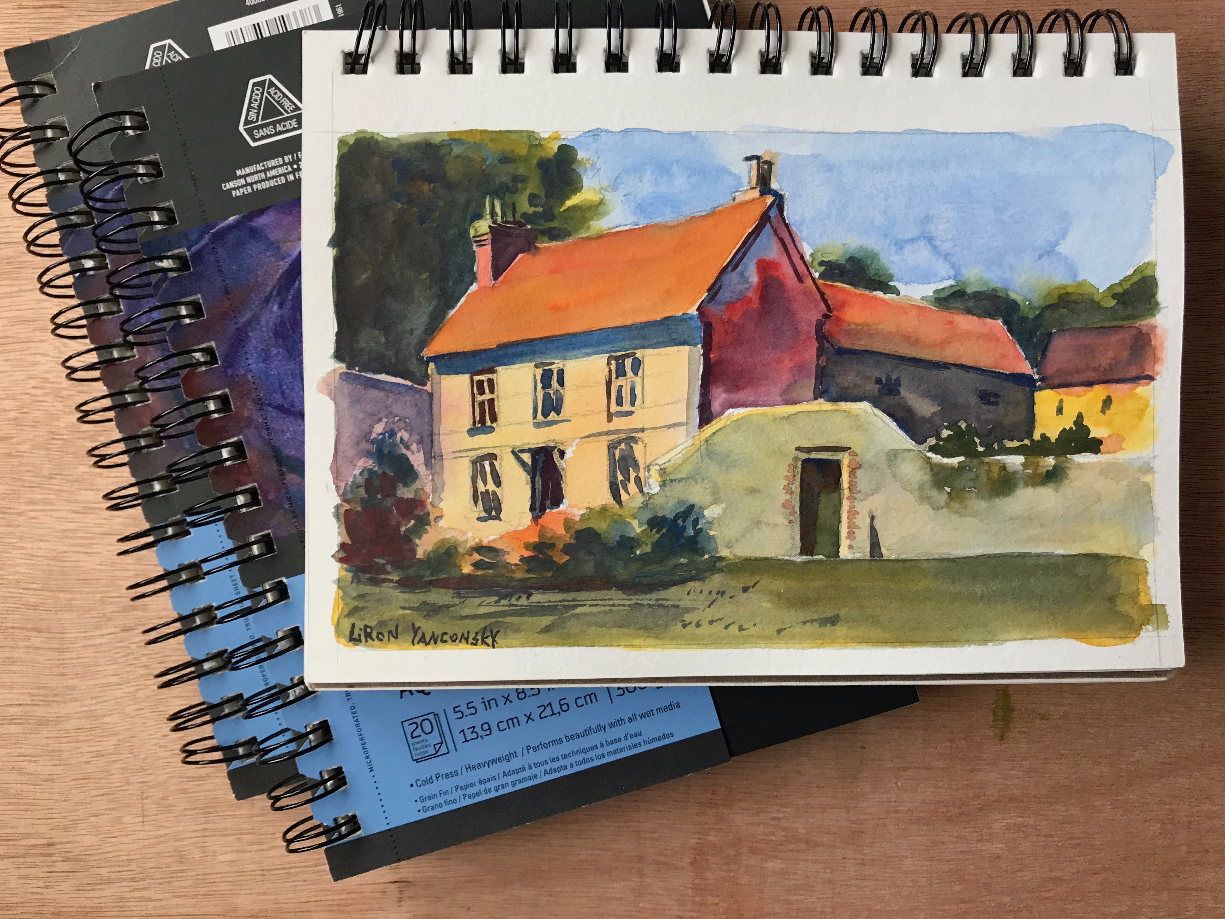
Painted countryside house using Cobalt Blue by ShinHan PWC

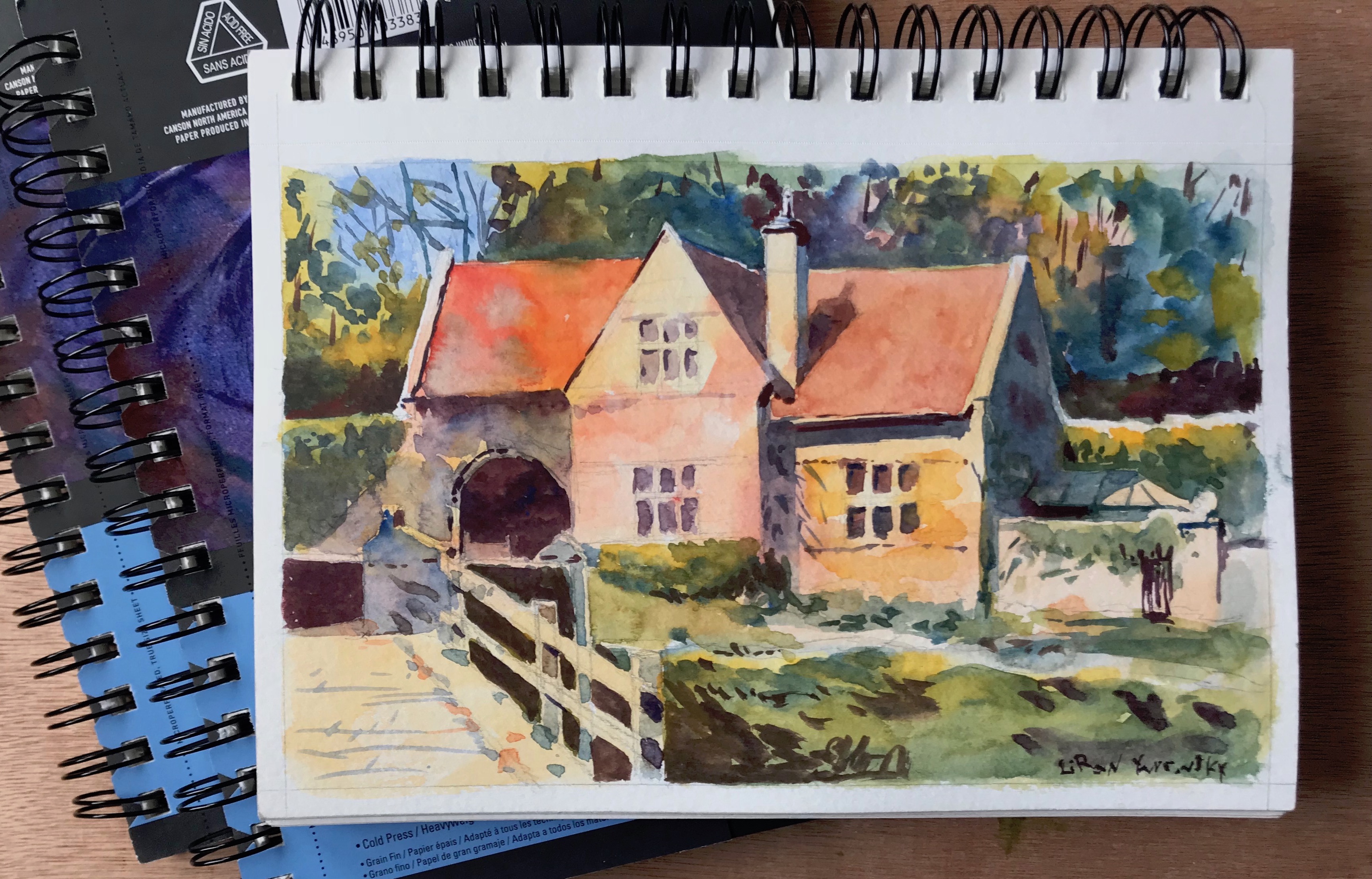
Painted another countryside house using Cobalt Blue by ShinHan PWC

Cobalt Blue – Paint Info

Pigment: PB28 (cobalt blue).
Semi-transparent
Lightfastness 3/3
Series D (almost the most expensive on the A-E scale)

My Only Complaint With Cobalt Blue

My only complaint with this paint is that it doesn’t achieve dark enough values. It’s not as light as some ceruleans I saw, but it’s still not as dark as many of the Phthalo Blues and French Ultramarines.

I think this could work to your advantage if you are painting in a softer style. For me however – I love strong contrasts at times. I love to use a wide range of values.

Another issue caused by this is that it’s hard for the blue to be dominant when mixed with the red and yellows I purchased (partially my fault, as they are more opaque).

I do love the way it looks

With that being said, I produced many beautiful paintings with it, and love the way it looks.

I’d recommend getting it as a part of a gentle trio, alongside lemon yellows and rose-like colors.

Where to get it

These sell on Amazon as sets. I’m not usually a big fan of watercolor sets, but for the price point – these may be worth it.

Here are affiliate links (I get a small commission, you pay the same price):

24 set: http://amzn.to/2DA5WrB
32 set: http://amzn.to/2zR13YR

Conclusion

I really love ShinHan’s PWC paints so far, and plan on getting many more in the future. This is a great color to have too.

I hope you enjoyed this video, and I’ll talk to you again really soon!

– Liron


ShinHan PWC (Primary Set I Selected) – Demo, Review & First Impressions

Hi there! Today I want to share with you an initial review I did for three paints by ShiHan PWC.

I initially came across these at a local art store, and got a free sample pack. I was surprised to find how much I loved and enjoyed using them.

Here’s the full video review. Below it you’ll find an update from when I originally purchased these (after playing around with them a little more).

ShinHan PWC and Other Lines of Paints

ShinHan is a Korean art supplies manufacturer. It produces three lines of watercolor paints.

  • PWC – These are their ARTIST GRADE paints. Their best watercolors.
  • Professional – These are their STUDENT GRADE paints. Confusing name, I know (;
  • SHAMI – These are watercolors aimed for kids (perhaps similar to the sets you’ll find in the art section of an office supplies store)

Just to clarify – I haven’t tried the other lines so I can’t give a first-hand review. In this review I’ll only talk about the PWC line.

ShinHan PWC Paints I Got

So I decided to kind of build my own primary set. I got three paints:

  1. Cobalt blue
  2. Cadmium Red Deep
  3. Cadmium Yellow Deep

Here’s the first (EVER) painting I did with these.

Needless to say, I was very pleased with this result, especially for a first try. I immediately fell in love with these paints.

Individual Tubes Info

Cobalt Blue – A blue somewhat resembling French Ultramarine. Pigment – PB28 (Cobalt Blue). It’s semi-transparent and has excellent lightfastness.

Cadmium Red Deep – A semi-opaque, strong warm red. Pigment – PR108 (Cadmium Sulfoselenide). Excellent Lightfastness

Cadmium Yellow Deep – A nother semi-opaque paint. Strong warm yellow. Pigment – PY35 (Cadmium Yellow).

As chance has it, all of these are Series D (which is relatively expensive, the scale starts at A).

Issues With This Particular Primary Combo

Here are some issues I experience with this specific combinations. These do not necessarily reflect poorly on the paints (but perhaps reflect poorly on my selection haha).

The blue isn’t dark enough. Their Cobalt Blue is easily overpowered by the red. Its range of values simply isn’t wide enough.

This creates problems when trying to achieve a cooler gray, or simply a dark blue.

The red and yellow are a little too opaque for my taste. This makes them even more dominant in the mixture. It’s a bit hard to explain, but it’s like they don’t mix too well.

Again, this has more to do with color selection. I do plan on getting a few more, and this time focusing on transparency and a large range of values.

Here’s another painting I did using these. I love this one too.

Where to Purchase ShinHan PWC Paints

From what I saw, ShinHan does not sell the individual PWC tubes on Amazon. I got lucky, as I can easily get them locally.

However, they do sell sets. I usually don’t recommend sets, especially for beginners, and especially very large ones. But the price for these may actually be worth it. The price per tube is much cheaper that way.

Here are links to purchase two sets (affiliate links, you pay the same price – I get a small commission):

Get the 24 set here
Get the 32 set here

Conclusion

I would highly recommend giving these a try. They seem to be priced cheaper, but as far as I can tell they are beautiful, vibrant and lightfast. Many are single pigments too.

I would suggest doing a more proper research than what I did, and making sure you get a good combo.

I hope you enjoyed this one, and I’ll talk to you soon!

– Liron


Use Pure Colors in Your Watercolor Painting

Hi there!

Today I want to present to you a painting process I did a while ago.

It’s not my best painting. However, it’s an experiment I did with preserving the purity of colors and letting them mix on the palette.

You can watch the entire process below, and scroll down for the written version (:

Use Pure Colors in Your Watercolor Painting

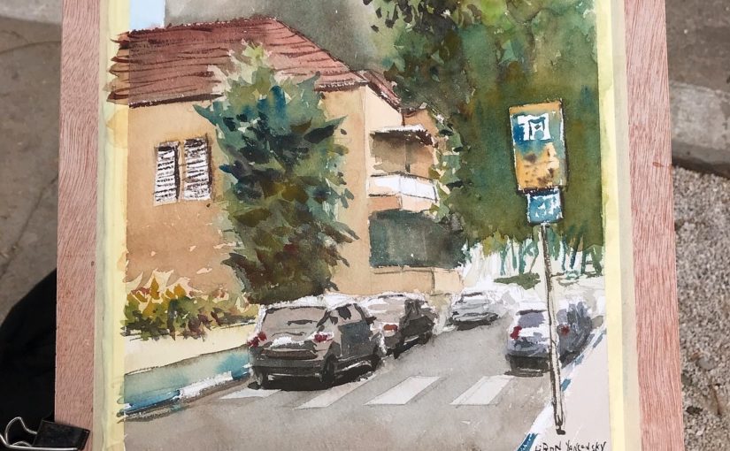
So here’s the scene I wanted to paint.

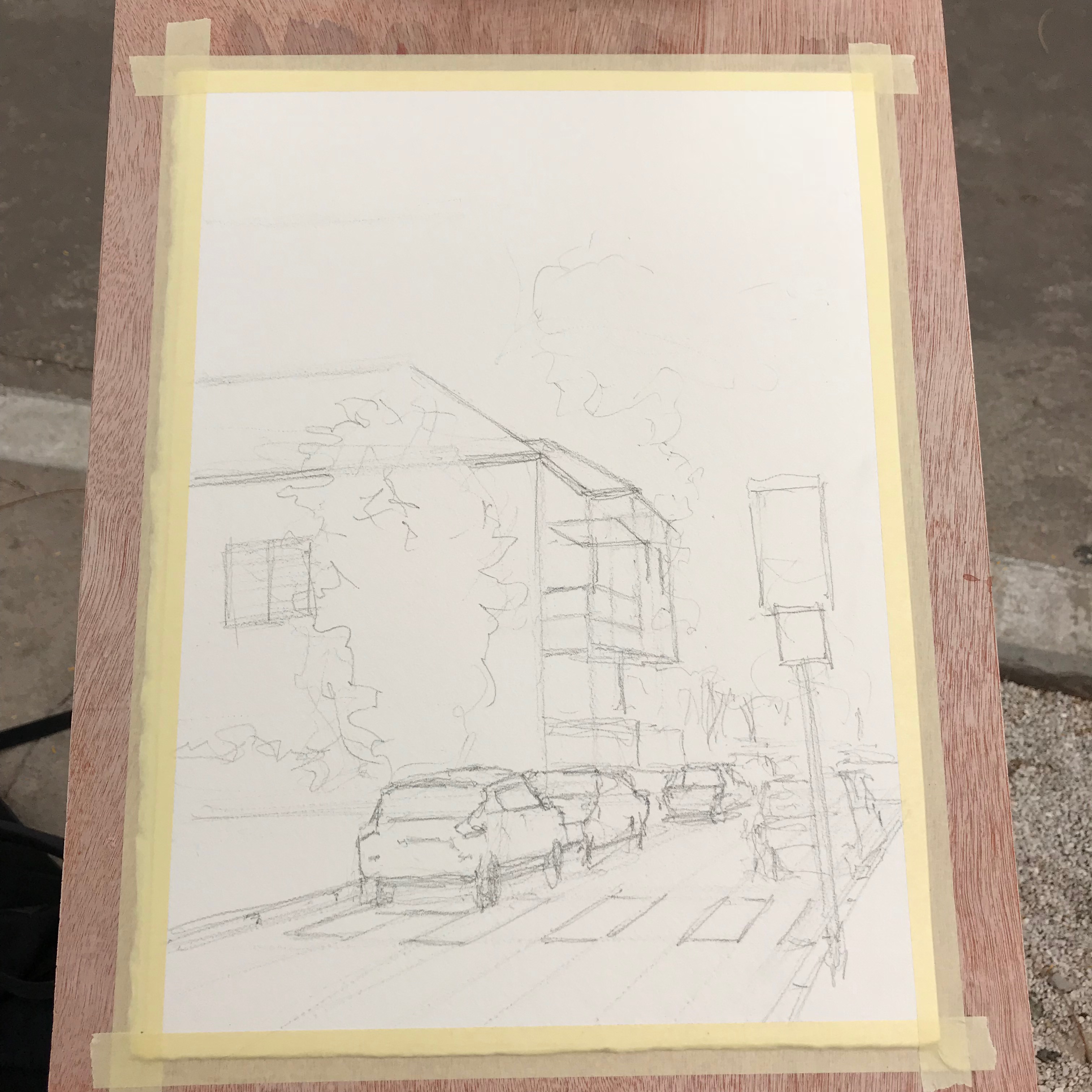
And here’s the drawing stage.

Notice it’s quite the busy scene. There are many cars, people and buildings. This was very challenging to break down.

I think this is actually one part where I “failed” with the painting process. With that being said, I still did a decent job simplifying it.

The funny part is that, I think, the drawing itself is inaccurate, especially in regards to its perspective.

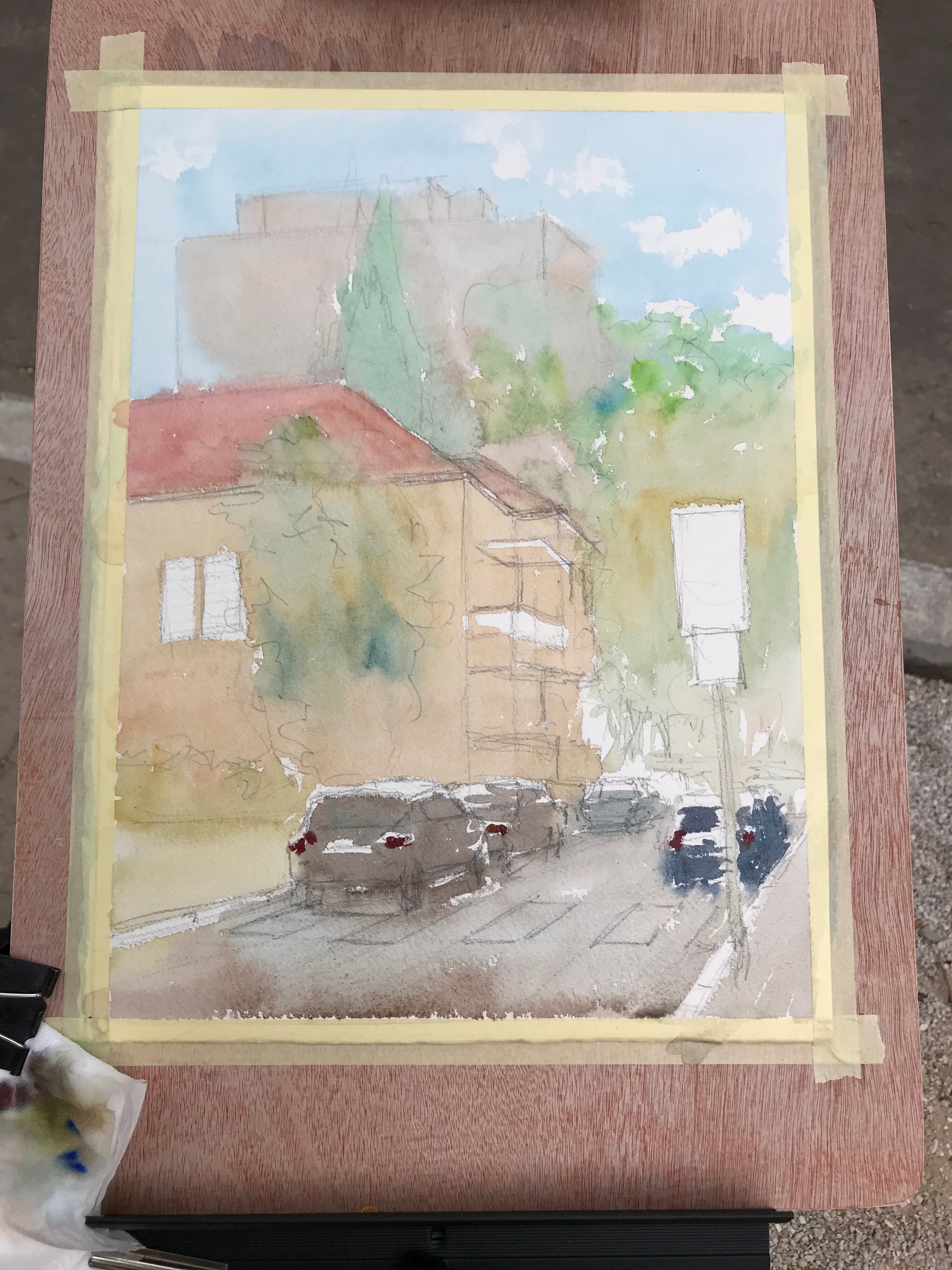
In any case – off we go with the first wash.

First Wash

This is exactly where I wanted to keep the purity the most. I found out it’s important to get it right in this particular step.

The reason stems from the transparency of watercolor. If you start of with over-mixed, muted colors, the next wash may still show them through. And so, glazing yellow over muted blue won’t do much good (;

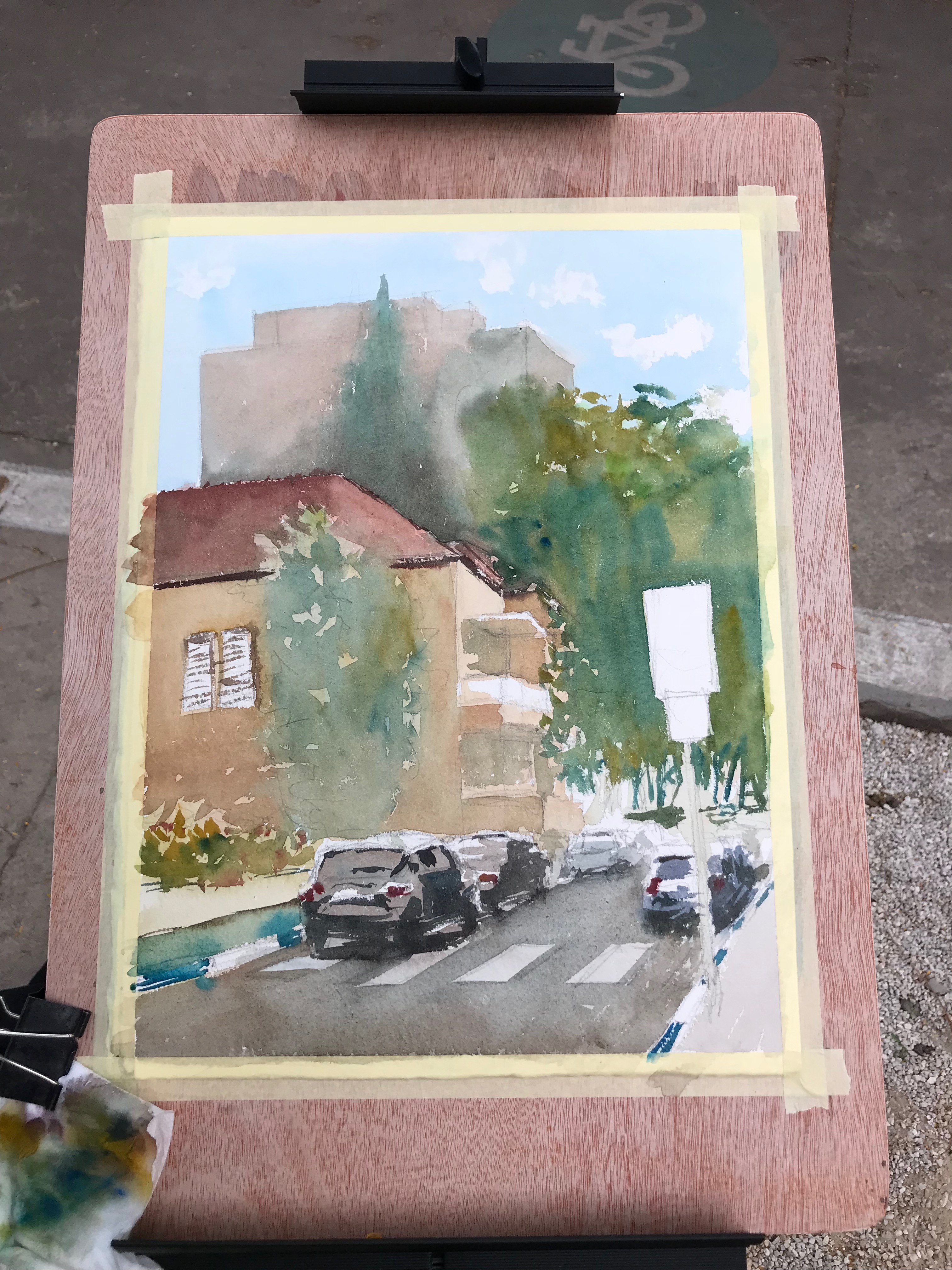
Next, we have an additional wash.

Second Wash And Beyond

I’ll admit, this isn’t the best of my work. But I was able to improve the purity.

In this stage it’s important to still use vibrant colors. This is true especially for the areas you want to keep colorful.

After that, I continue adding more layers.

And this is the final result!

I went for a rather complex scene, and challenged myself to try something new. This is why I’m very pleased with the result.

Putting Pure Colors in The Correct Context

It’s important to remember that this is one particular approach out of many. It doesn’t mean you have to ALWAYS ALWAYS keep your colors pure, or avoid grays.

This is a tool to be used at the right moments. You can use it, perhaps, to direct the viewer’s eye in some way. You could use it to create a focal point or area.

And this is it for today. I hope you enjoyed this one! (:

Let me know what you think in a comment below, or under the video.

Also, if you enjoy my content – consider supporting me on Patreon. This REALLY helps (:

And I’ll talk to you soon.

– Liron