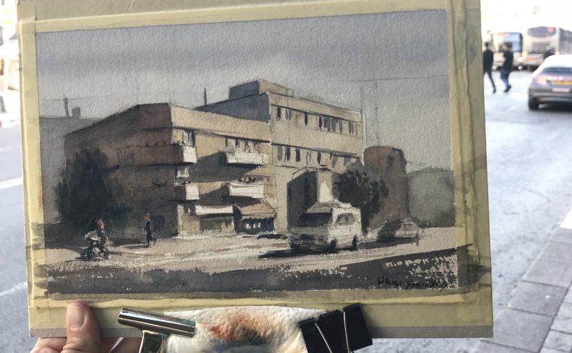
Hi, Liron here! Today we’ll briefly talk about how to improve the composition of our paintings and artwork.
I decided to translate my videos to blog posts as well. And I decided to do so on a regular basis, as much as I possibly can!
So in this one, I want to talk to you about this video, on improving your paintings’ composition.
In the video I talk about how I approached doing this, and the things I focused on.
So let’s get started!
Improving My Composition
For the last 2 months or so I’ve been really focused on improving my composition.
I find watercolor to be such a fascinating and challenging learning curve. I basically keep learning the same principles, only at different levels.
In any case, I’ve been really focused on composition and believe I made some progress.
Where I Used to Be
So here’s an example of a typical painting I would make. Aside from the multiple mistakes and inaccurate representation – what really bugged me was the composition.
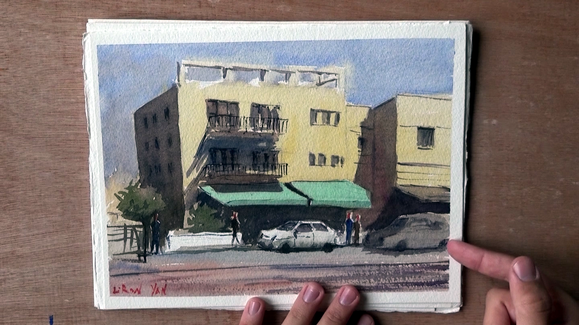
The building’s just stuck in there, dead in the middle. Sure, there’s that car, but even that doesn’t read as well.
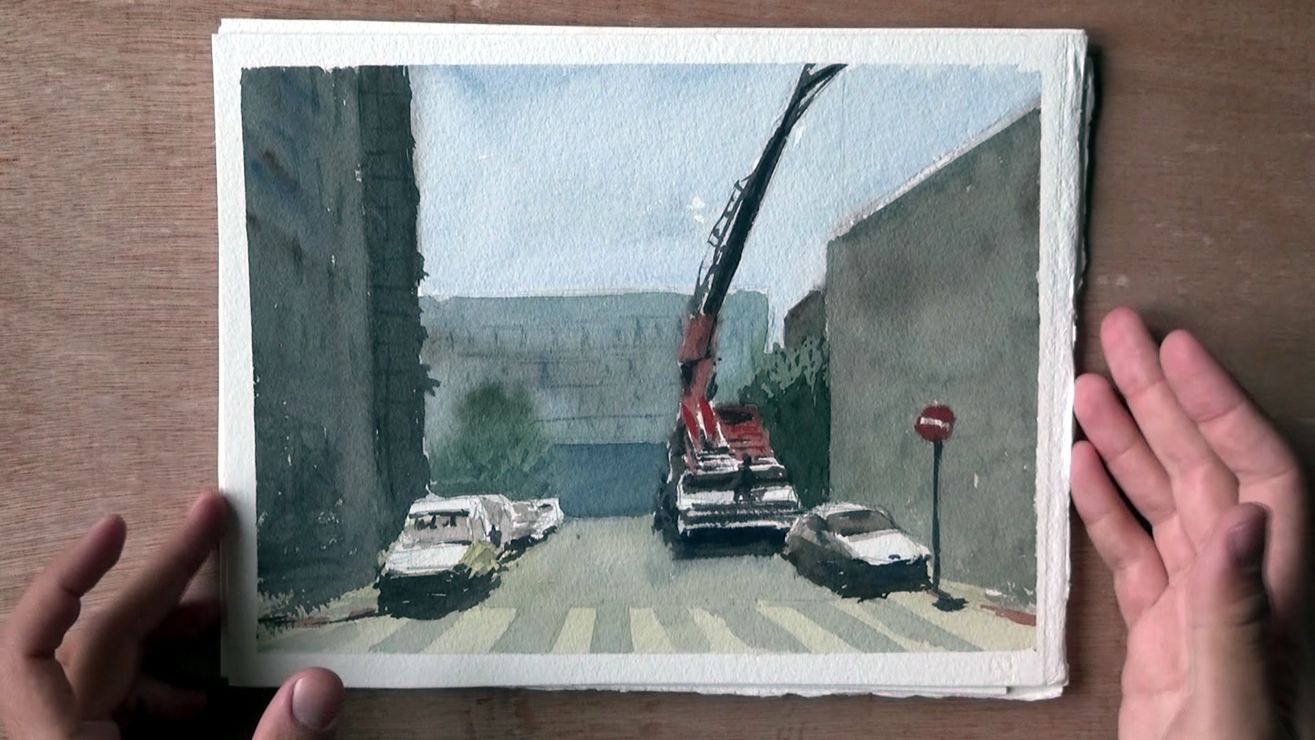
Here are several other examples. Some may even look good in terms of the technique, but the composition, to me, is obviously not thought through enough.
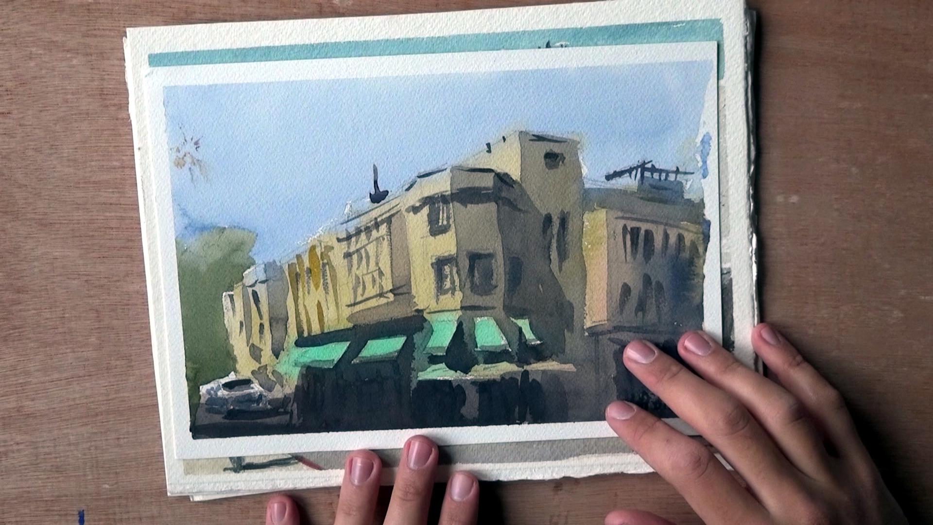
Now, here’s an interesting example from when I got lucky and accidentally got a nice composition going.
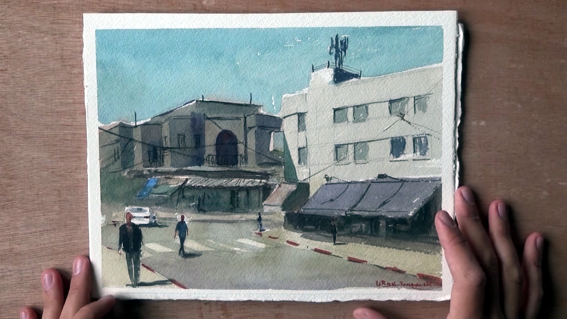
Lot’s of things to improve, and the style doesn’t feel like it’s “mine”, but at least there’s some movement and interest.
Where I am Now
So here’s the first painting in which I REALLY devoted my thoughts and work process to composition.
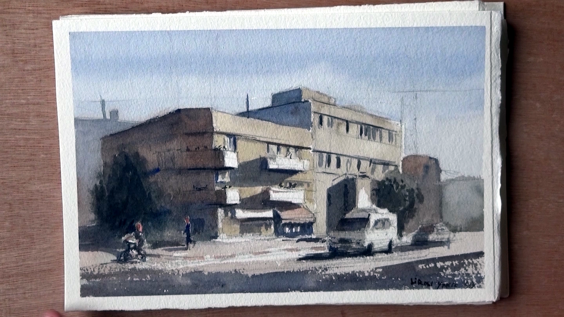
With this one I took some time to carefully plan where everything is going to be placed.
The main change I’ve gone through is avoiding the centers, and putting more emphasis on uneven space divisions that create more interest.
I show more of how I do this in the video. If you want to see it make sure you watch it HERE, or by scrolling to the top of this post.
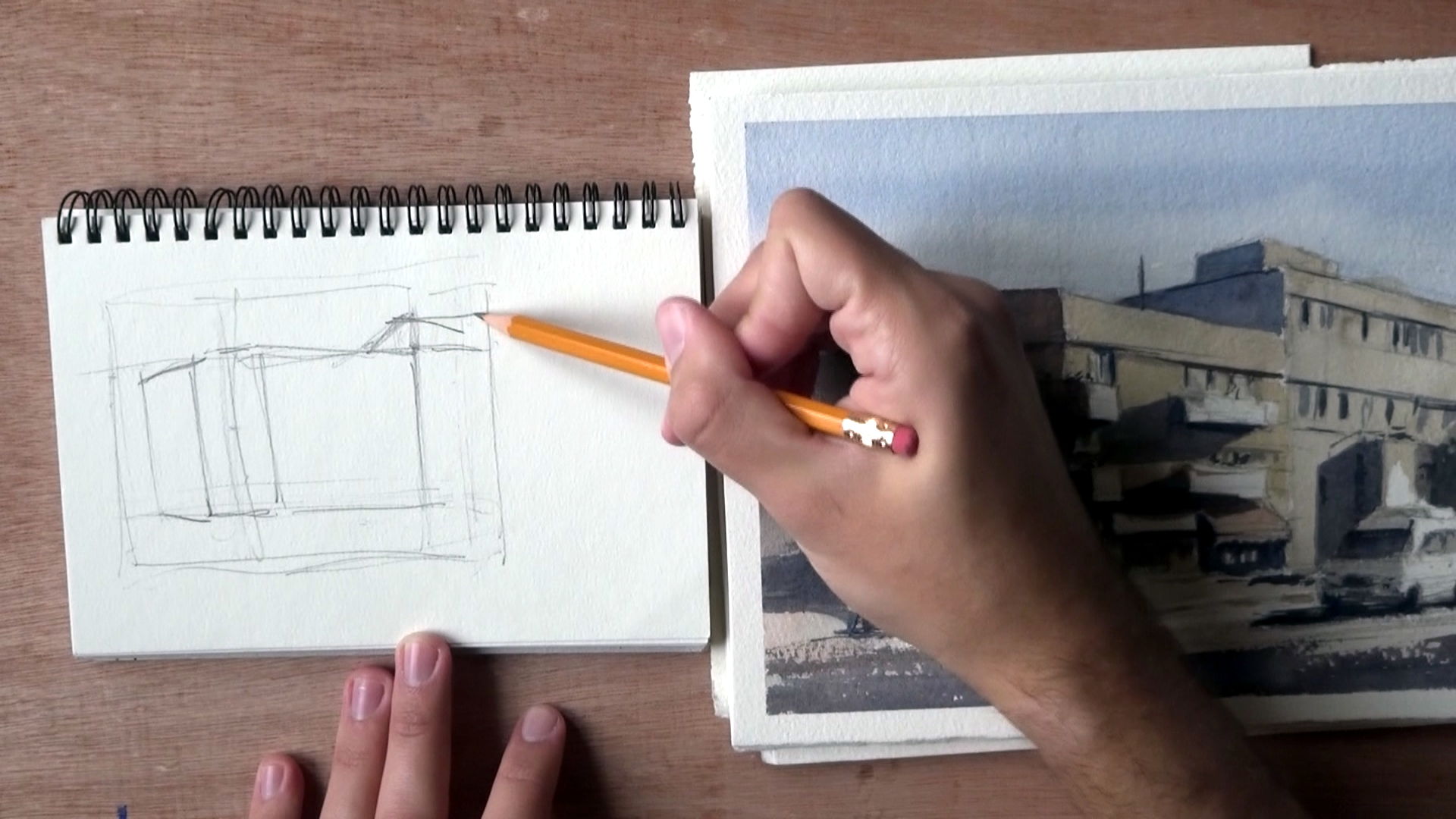
Here’s another good example.
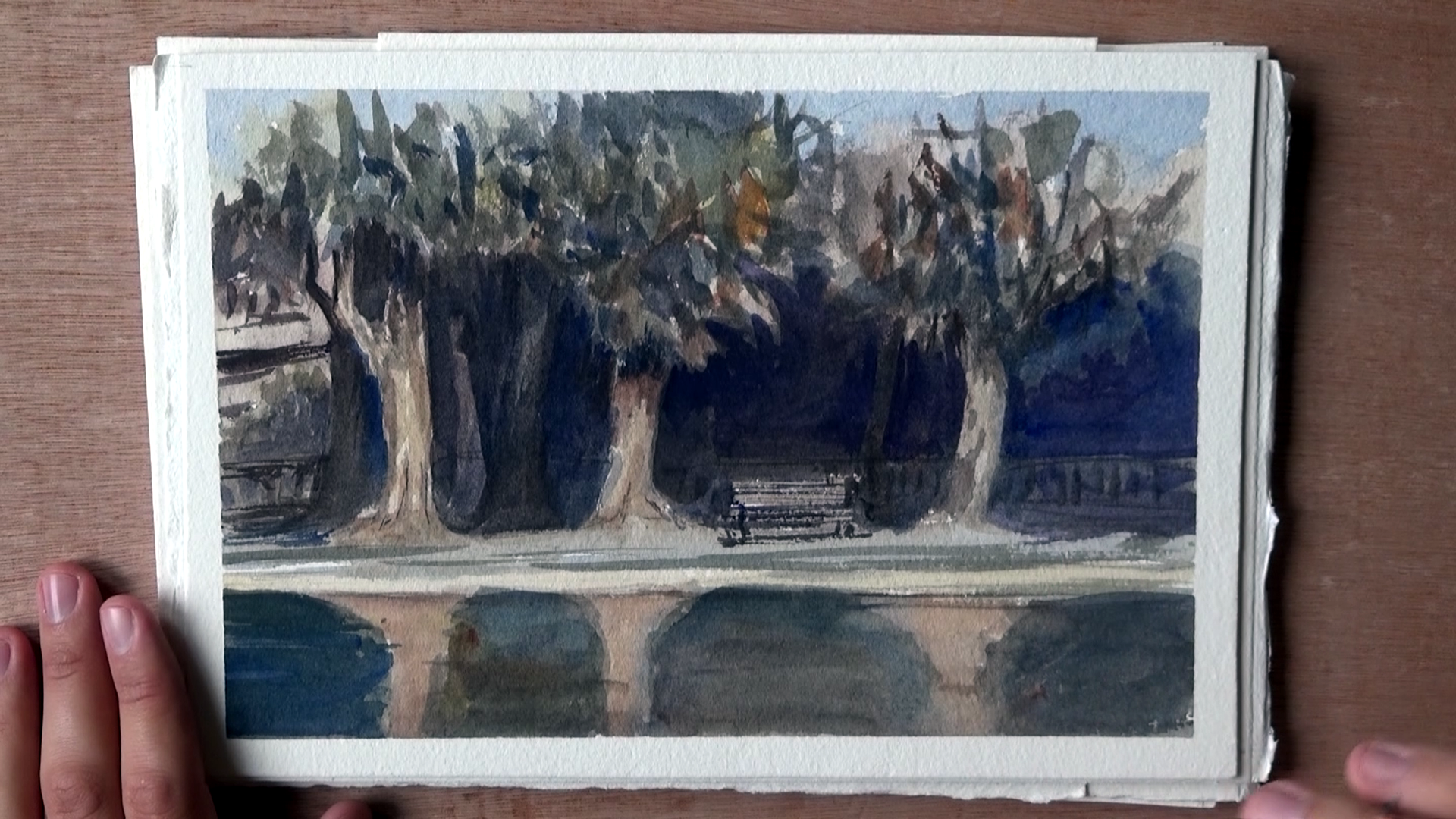
Notice how the distances between the trees are varied. This is true for the trees in the background as well, and pretty much for most elements in this painting.
Here’s another example, simpler this time. What I love about this one is how simple yet effective it is, in my opinion.
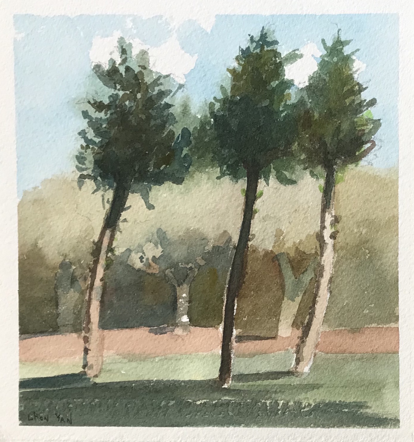
And a final, more detailed one.
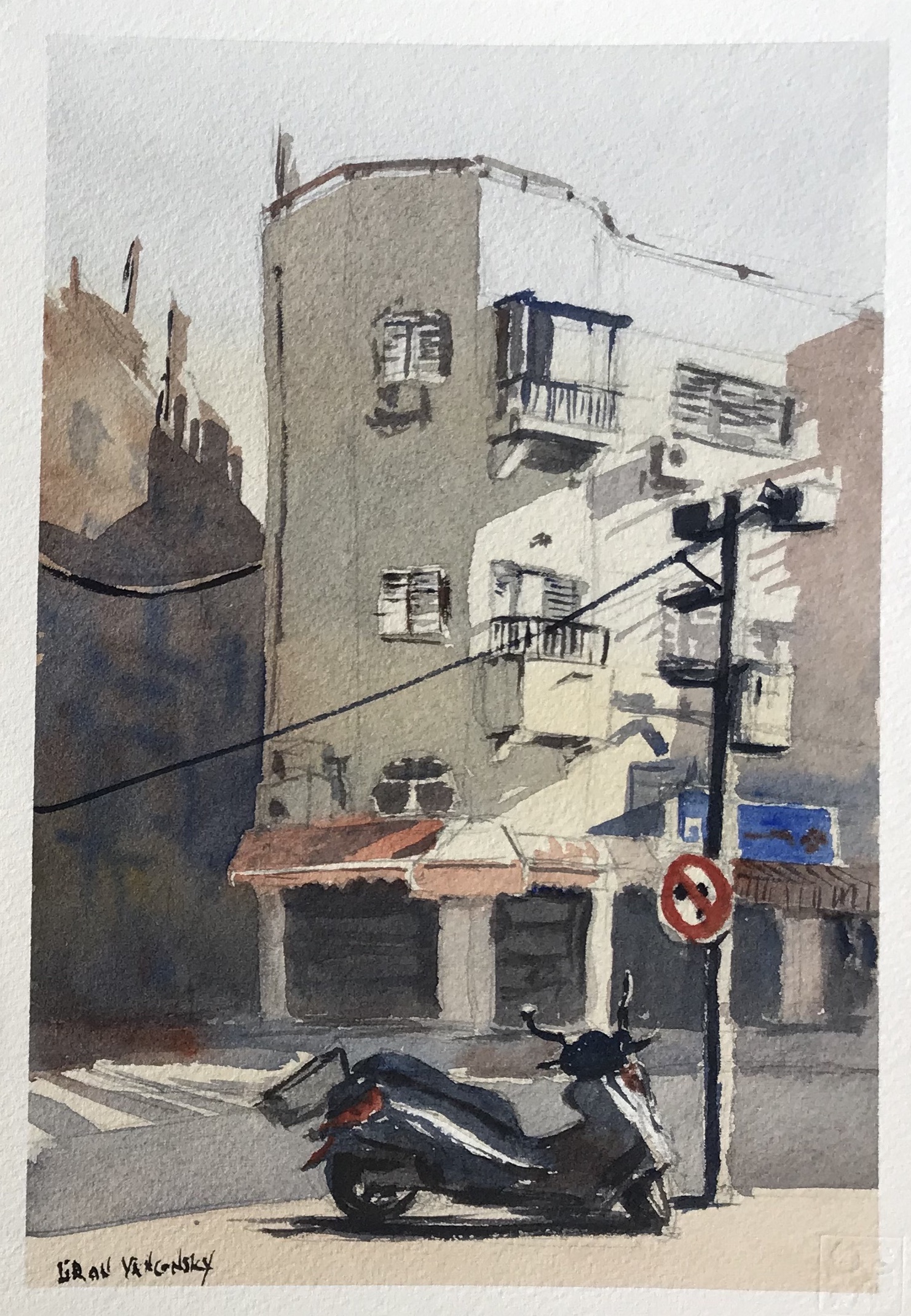
Notice how it is quite even when you examine it horizontally. I tried creating interest here around the vertical axis.
Conclusion
And this is it!
I hope this encourages you to devote more time to composition and more careful preparation for your paintings.
I know this was (and still is) one of my weaknesses, and I sometimes have to forcibly slow down my work process.
Again, you can check out the full vid with my explanations HERE.
Let me know if this helped in any way!
– Liron

