Let Your Watercolors Mix On Paper | Greens

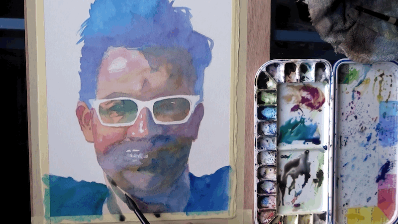
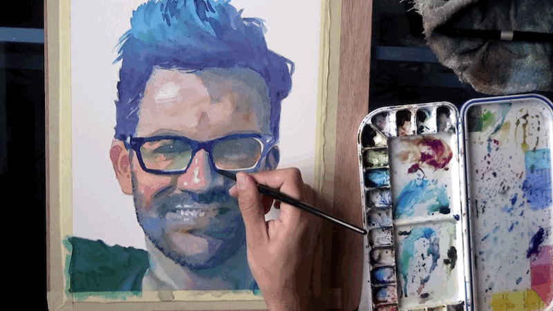
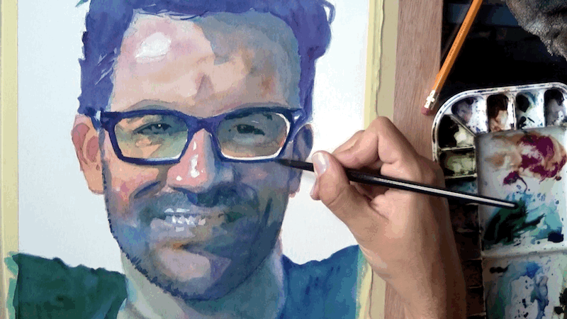
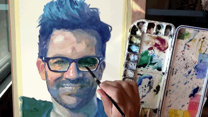
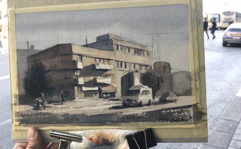
In this quick tutorial I’ll talk about letting your watercolors mix on paper. I believe this can be used as a tip for improving your paintings and making them more interesting.

This is based on a YouTube video I published yesterday.
If you want to view the whole thing, check it out here:

Real Life VS Photos

When looking at a view in real life, there’s a tremendous variety of colors and details.
If you look at a field or forest, you’ll see many types of greens, but also yellows, reds and purples (for flowers for examples).
You’ll also see different types of browns and even blues.

A photo FLATTENS it all.

All the variety of yellows, reds and blues turns into one even green.
This is boring.

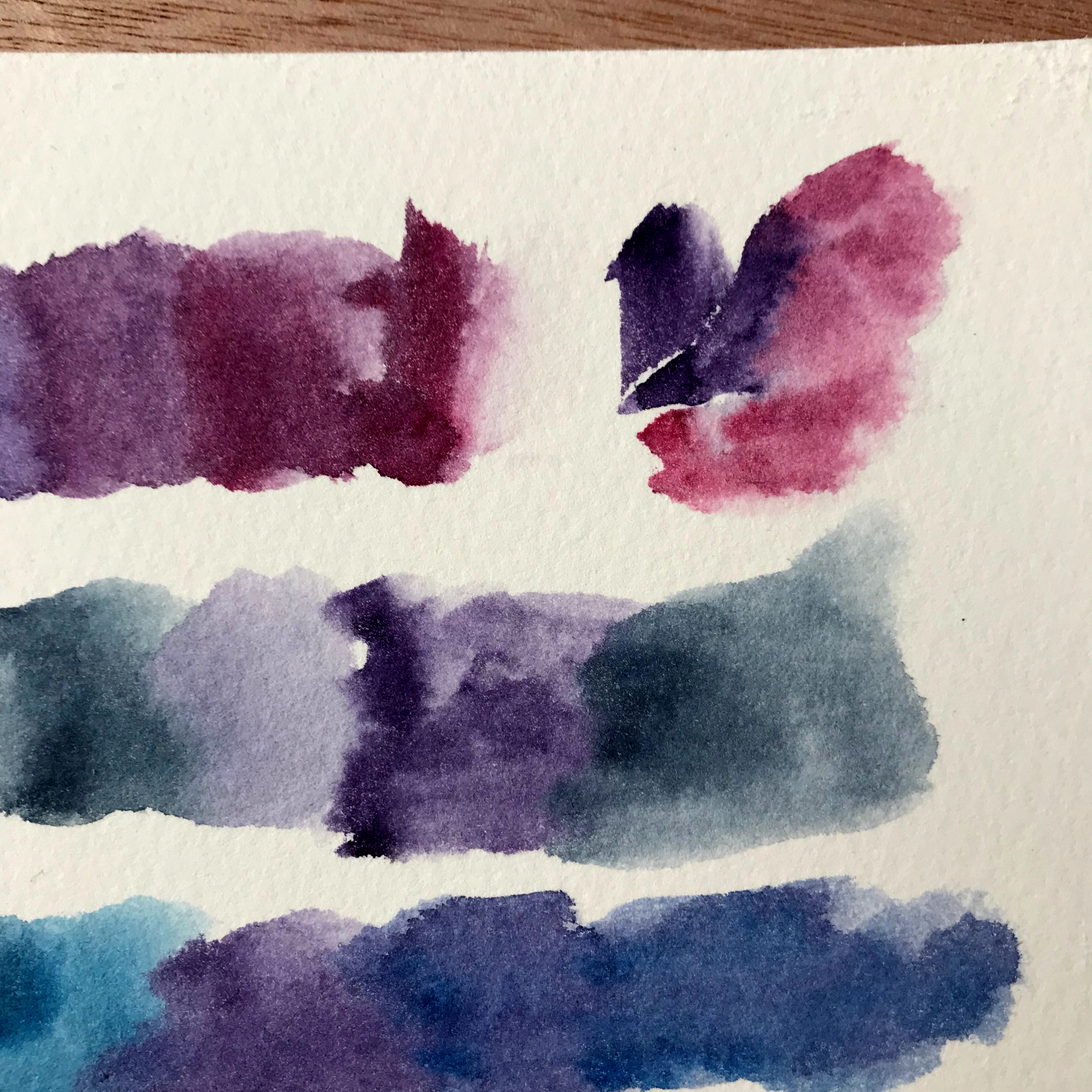
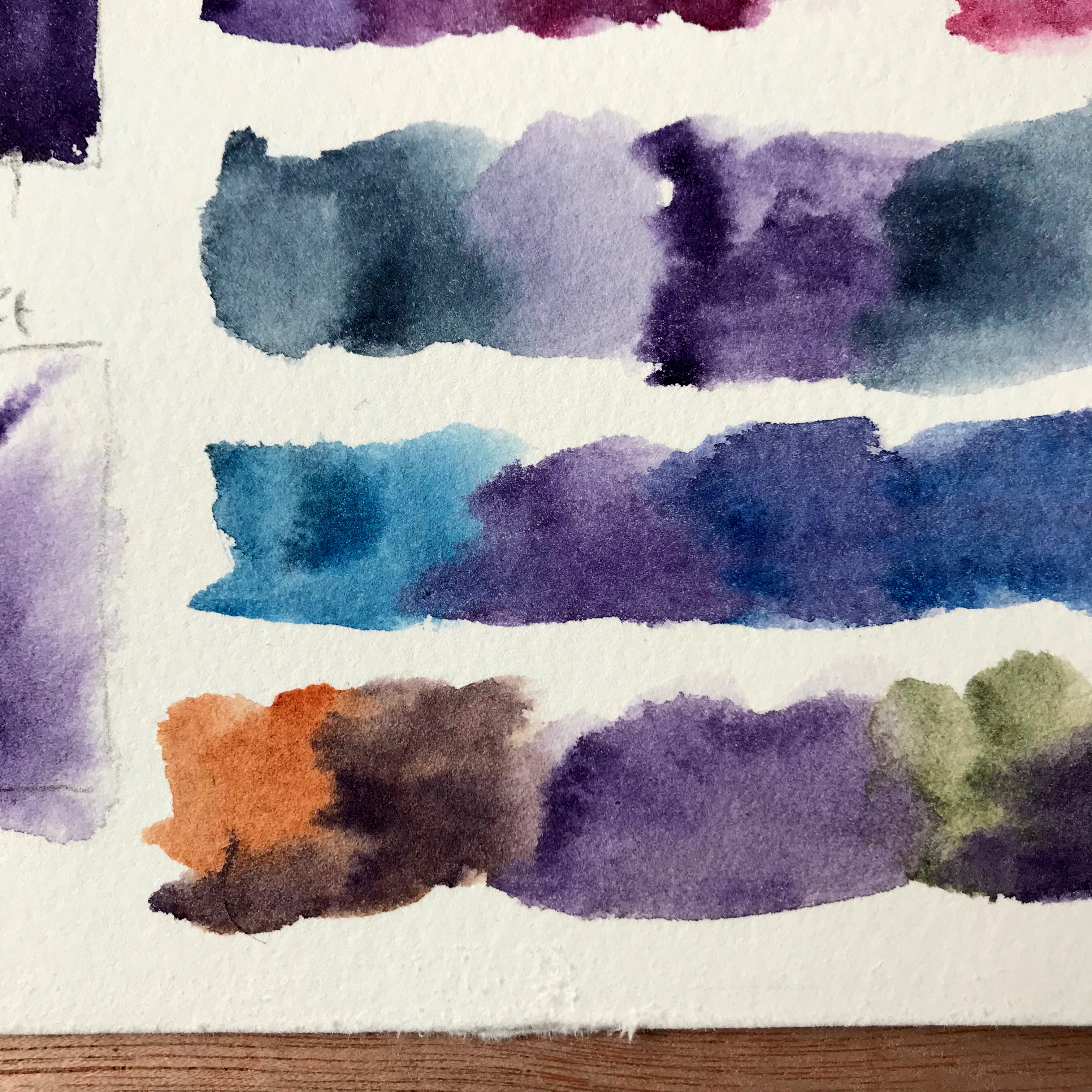
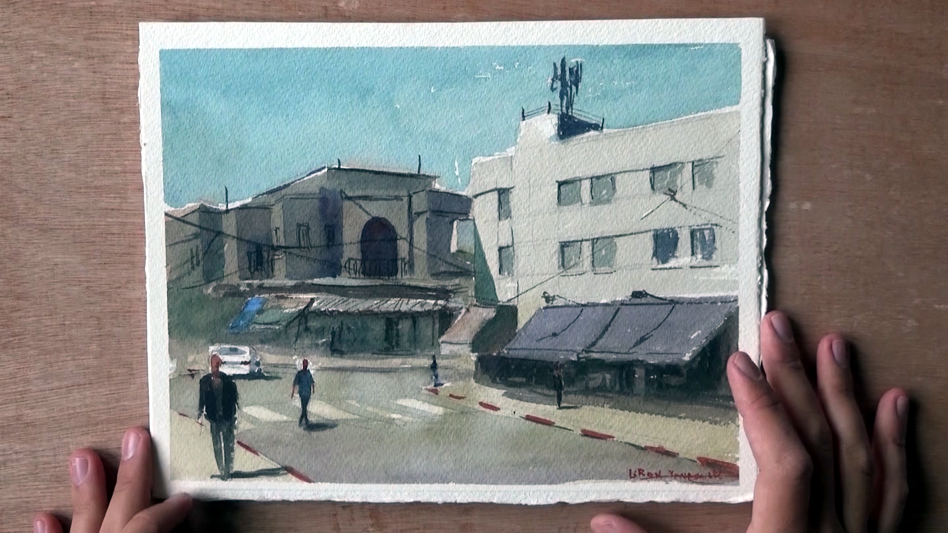
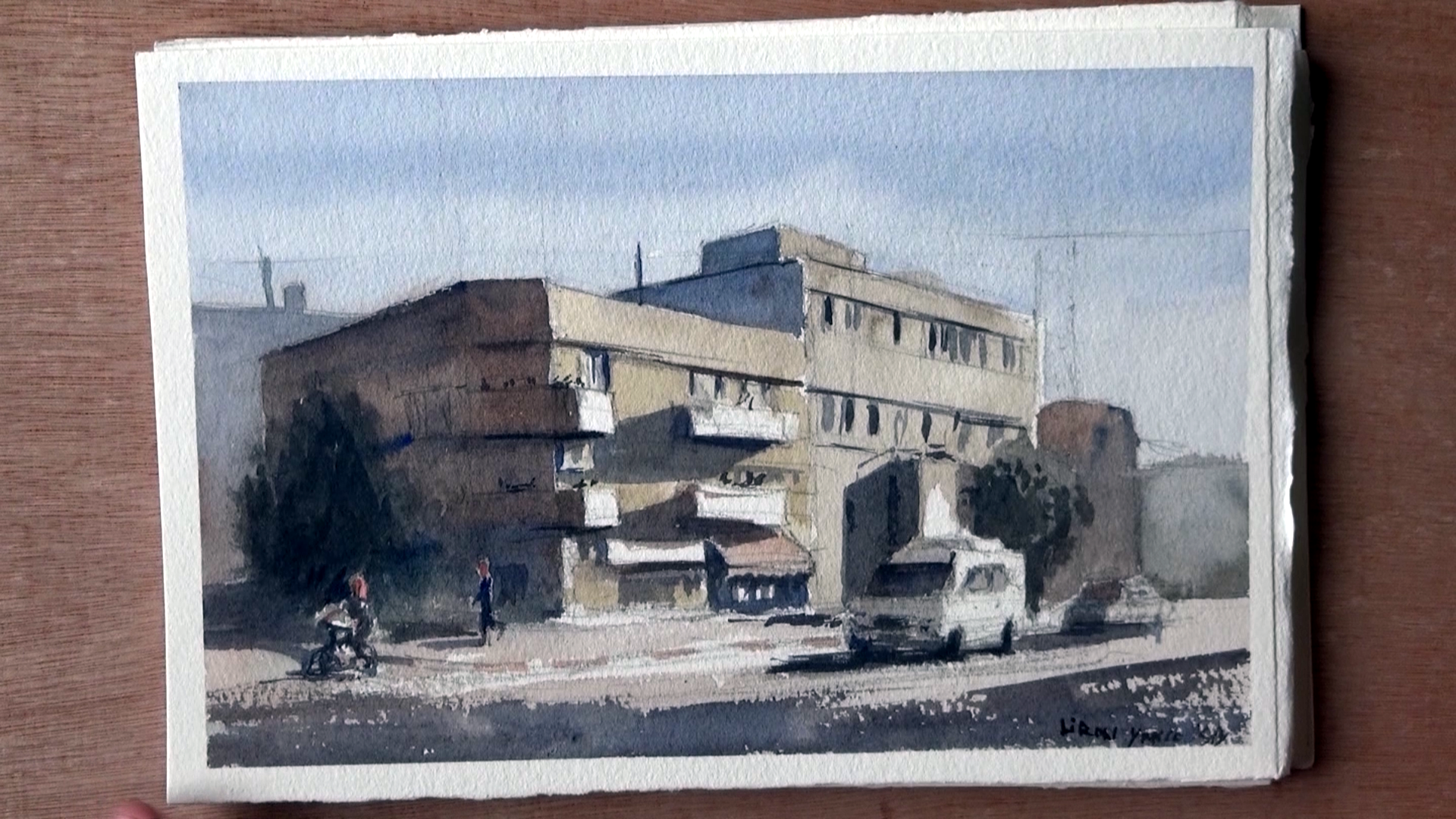
In order to mimic real life, and provide a complete impression, I highly recommend using pure colors in your paintings.

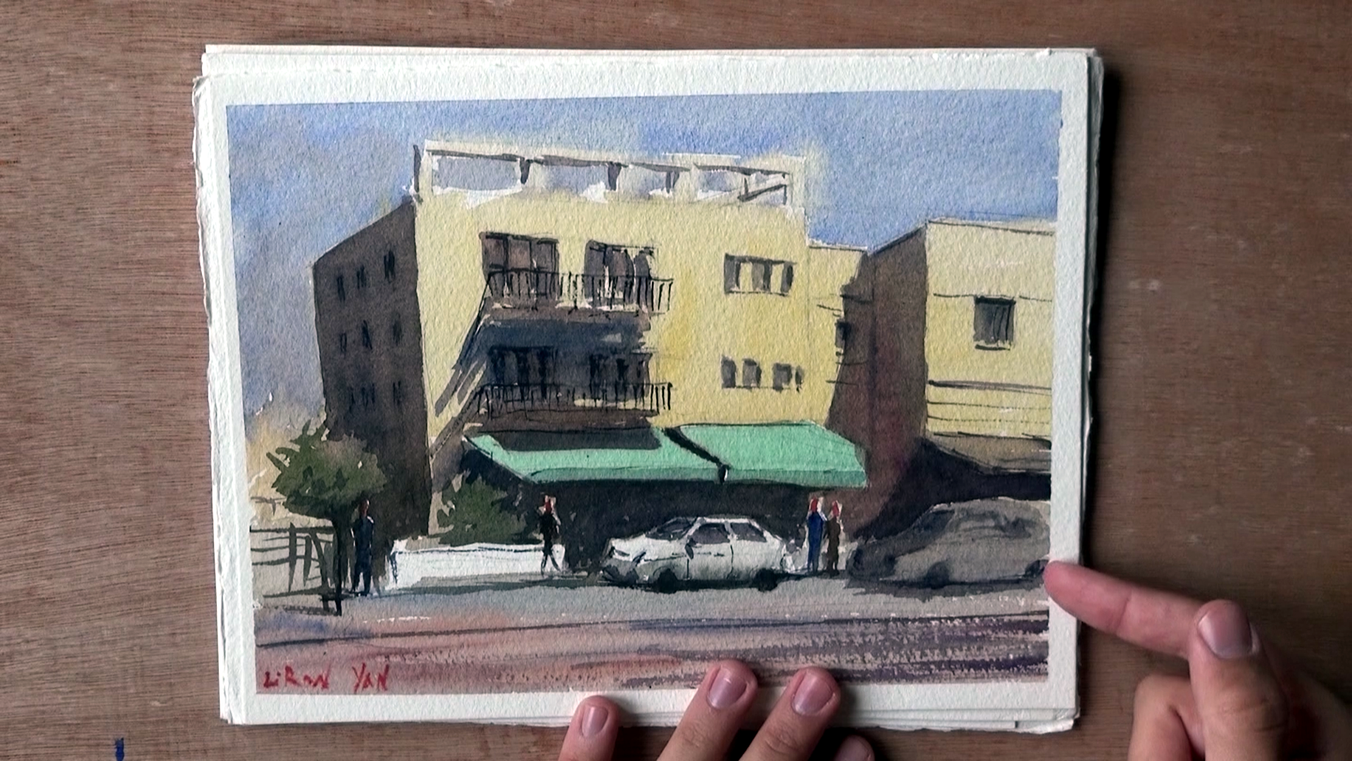
Painting in Patches of Colors

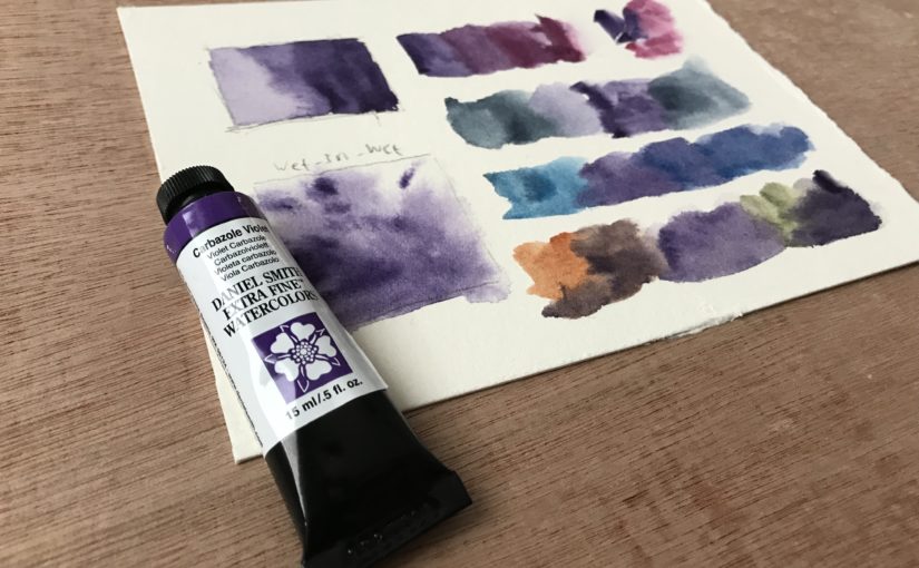
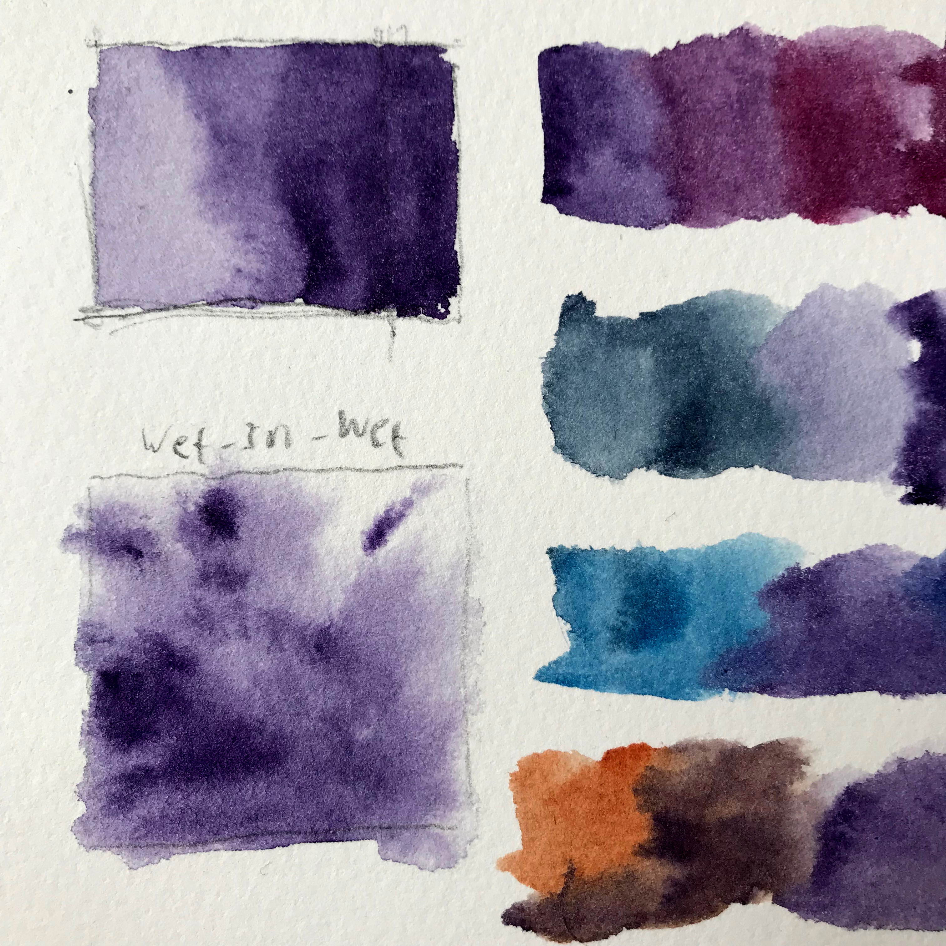
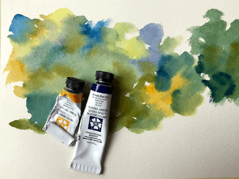
Here is a quick demo of me applying this and creating greens by using different blues and yellows.

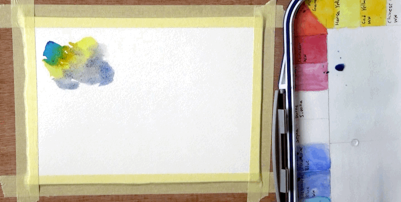
I just put a few patches of different colors, one next to another.
This allows them to mix a little on paper.

They don’t have to mix too much. Our brain complete the image and sees “green”.

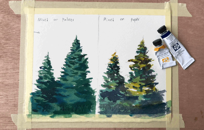
The specific colors I used are Phthalo Blue, French Ultramarine, Hansa Yellow medium and New gamboge (all Daniel Smith).

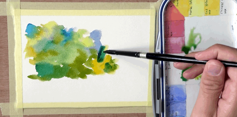
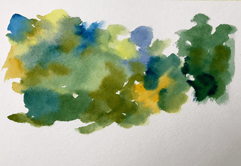
Consider how much more interesting this looks, when compared to a flat green wash.

What I used to do in the past, was to mix the paint on the palette, and then vary the ration of yellow-blue.

I now realise this isn’t sufficient.
You sometimes have to show the pure colors to get that rich and varied effect.

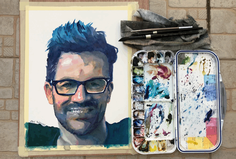
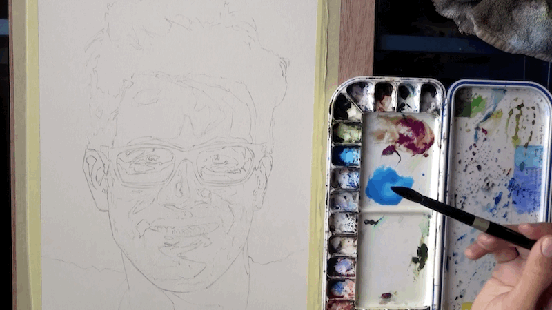
Here’s what the final result looks like.
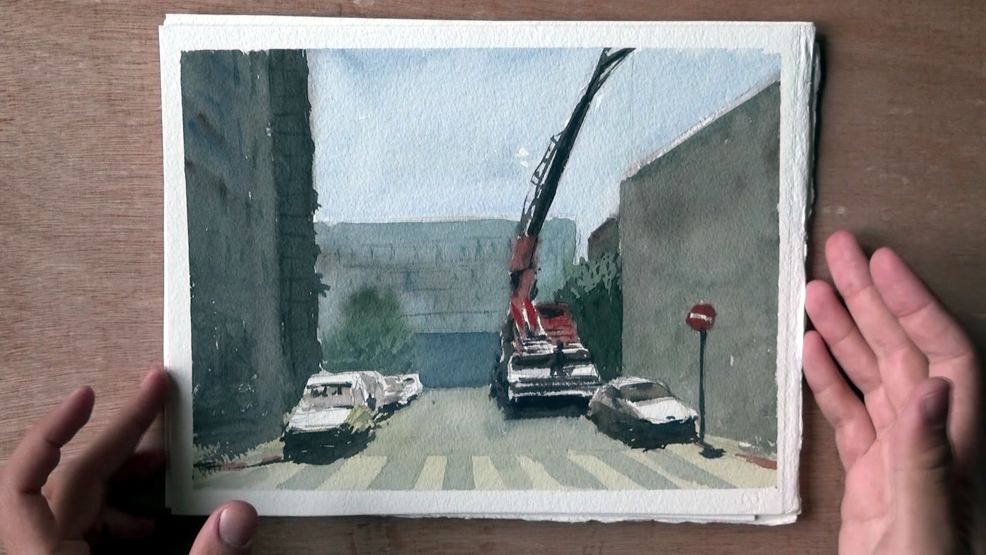
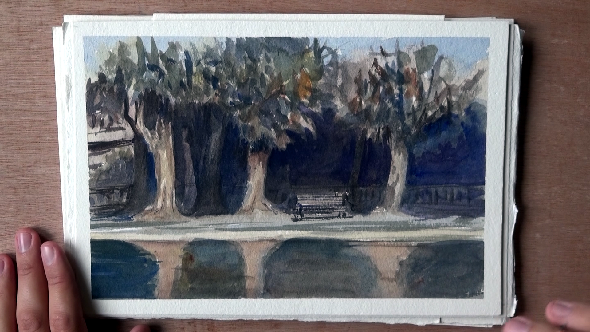
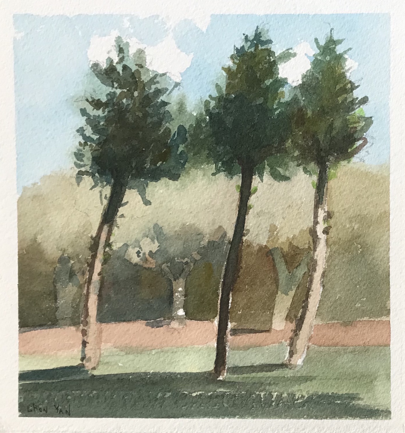
Trees Demo

Let’s look at another example. This time I sketched two trees.

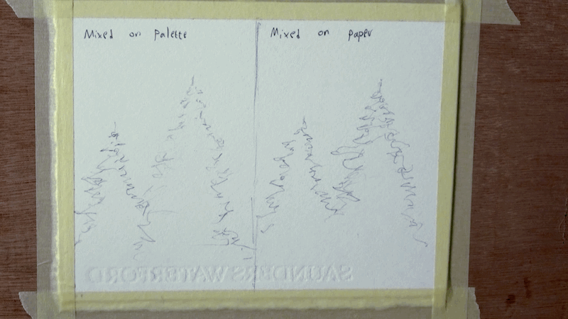
I want to show you 2 things:

  1. The difference it makes to use purer colors
  2. Bonus – how shading with a third, complementary color is better than “tonal” shading (shading using a darker version of the same color).

So here’s the difference in results.
On the right hand side I worked in patches of pure colors.
On the left I worked with the same green.

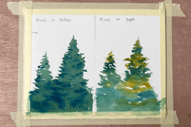
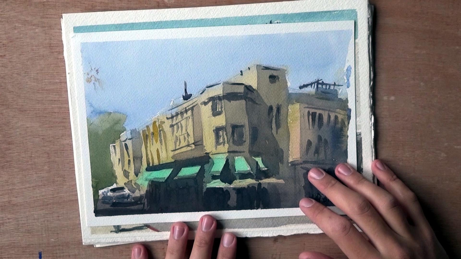
I want to mention how I somewhat messed up a part of this demo.
I actually didn’t follow my own advice, and didn’t use pure enough blues on the right.
It’s more like I used yellows and greens =P

My bad!

Next up, I added a second wash for the shadows.
Let me show you the difference.

On the right I used a mix containing Quinacridone Rose.
On the left I used the same blue for shadows (Phthalo Blue).

Unfortunately, because of the mistake I did of NOT going pure enough, some of the effect was not achieved to the extent I was hoping for.

But hopefully you can still see the difference that it made.

Conclusion

And this is it.
I really hope you enjoyed this quick tutorial.

If you want to see the full video, you can check it out here:
Let It Mix On Paper

And this is it! I will see you again in another tutorial (:

– Liron

Carbazole Violet – Daniel Smith Watercolor | The Paint Show 21

In this episode of The Paint Show we’ll be looking at Carbazole Violet by Daniel Smith, which is an old favorite of mine!

Here’s the video on YouTube:

If you are interested in the written version, keep on reading (:

Carbazole Violet – Daniel Smith Watercolor | The Paint Show 21

I originally got this in the Daniel Smith Secondary set, which I highly recommend.

You can get the set here (affiliate link): Daniel Smith Secondary Set
Or the specific tube here (also affiliate link): Carbazole Violet 15ml Tube

Here’s what Daniel Smith say about this paint:

This slightly granular blue-violet is an intense, vibrant color with medium staining properties. A brushstroke of concentrated Carbazole Violet onto dry paper moves the pigment from black-violet to clear purple, and can invent an iris petal with each stroke. Add Indigo to Carbazole Violet, along with Quinacridone Rose or Anthraquinoid Red. Blot, squeegee and incise damp passages to created veins, variegated passages and highlights.

I did several paintings with the entire set, as well as this specific paint, and the thing I like the most about it is the insane range of values.

Here are some examples

It can go from really light to almost black. This is a really unique feature, and I don’t know of many paints that can do that.

And so, if you are interested in monochromatic paintings, or even doing a value matching exercise, this is a great tube to have.

Paint Info

Pigment: PV23 (Dioxazine Violet)
Excellent lightfastness, semi-transparent, non-granulating, medium staining.

Demo

Here is the swatch of paint going from light to dark (top), as well as the wet-in-wet swatch (bottom).

Notice the insane variety of values. This one gets REALLY dark. Also, notice the interesting patterns created in the wet-in-wet part (to get a better look at those, watch the original video HERE – this is a direct link to the wet-in-wet time stamp).

Based on Daniel Smith’s recommendation, I mixed this one with several paints. So from top to bottom, we got mixes with (1) Quinacridone Rose (2) Indigo (3) Phthalo Blue.

And here at the very bottom you can see what this looks like with the rest of the secondary set (Quinacridone Burnt Orange and Undersea Green).

And this is it!

I hope you enjoyed this review. I will try to share here on my website all of the new episodes of The Paint Show.

And I’ll talk to you soon.

– Liron

Tutorial | Watercolor Portrait Painting in 3 Colors – Tai Lopez

Hi there! Today I want to share with you a written version of my video of painting a portrait of Tai Lopez.

To check out the full video tutorial on YouTube, click here:
Portrait Painting in 3 Colors | Tai Lopez

I did this portrait using a limited palette of three colors only:

  1. Phthalo Blue
  2. Quinacridone Rose
  3. New Gamboge

Final result

As mentioned, you can check out the full video tutorial on YouTube:
Portrait Painting in 3 Colors | Tai Lopez

If you want this in written format, go on ahead 🙂

Portrait Painting in 3 Colors | Tai Lopez

First wash

So I start off with a very detail drawing showing all of the changes in values.
I desaturated and posterised the reference image to make it easier to see the value shifts.

I make sure to mix a very large quantity of paint for the hair, as it takes up a lot of space and I sometimes run out of paint easily

The next step is starting the wash.

Now, I got lucky and his glasses are super dark.
This allows me to use them as a “checkpoint” or a break for the wash.
It makes life easier, because I can have better control of the different sections.

You don’t have to do it this way.
You can simply pull the wash over everything (avoiding the highlights of course).

However I chose to do so in the spur of the moment.
Next up I continue to pull the wash down.

At this stage I’m done with the initial wash.
Notice how I strongly contrasted his shirt with the skin tone.
This was important for me, for creating an interesting color harmony / composition.

Second wash

At this stage I’m concerned with two things:
1. Edges – getting a variety of rough and soft / blended edges.
(you can notice that especially on the forehead).
2. Preserving the “second tier” of highlights.

Here I’m pulling the wash down to the very bottom.

Third wash

And now I’m moving on to the 3rd wash.
The reason I’m going through so many, is that I wasn’t able to get the impression I wanted right away.

Sometimes I’m able to nail most of the value variation in the first and second washes, but this time was more challenging for some reason.

Now you can see how and why I used the glasses as a pausing point for the first wash.
They are so much darker then the rest of the face, that the break in the wash won’t be visible.

The disadvantage to this is that I have to go over them several times, as they are painted over the white paper (and it’s hard getting such darkness with one layer).

Fourth & fifth washes

Here I finally added the eyes – which also have quite a dark value.

And now I’m adding the mid values (I didn’t go dark enough in the first 3 washes, as mentioned earlier).

Final result

And finally I’m just going over some dark areas, and we are done!

I hope this was helpful!
If you are interested in the full video tutorial, be sure to check it out here:
Portrait Painting in 3 Colors | Tai Lopez

Let me know if this is helpful.
I tried really generalising the stages so it won’t turn into a 30+ stages tutorial haha.

All the best!
– Liron

Improving the Composition of Your Paintings

Hi, Liron here! Today we’ll briefly talk about how to improve the composition of our paintings and artwork.

I decided to translate my videos to blog posts as well. And I decided to do so on a regular basis, as much as I possibly can!

So in this one, I want to talk to you about this video, on improving your paintings’ composition.

In the video I talk about how I approached doing this, and the things I focused on.

So let’s get started!

Improving My Composition

For the last 2 months or so I’ve been really focused on improving my composition.

I find watercolor to be such a fascinating and challenging learning curve. I basically keep learning the same principles, only at different levels.

In any case, I’ve been really focused on composition and believe I made some progress.

Where I Used to Be

So here’s an example of a typical painting I would make. Aside from the multiple mistakes and inaccurate representation – what really bugged me was the composition.

The building’s just stuck in there, dead in the middle. Sure, there’s that car, but even that doesn’t read as well.

Here are several other examples. Some may even look good in terms of the technique, but the composition, to me, is obviously not thought through enough.

Now, here’s an interesting example from when I got lucky and accidentally got a nice composition going.

Lot’s of things to improve, and the style doesn’t feel like it’s “mine”, but at least there’s some movement and interest.

Where I am Now

So here’s the first painting in which I REALLY devoted my thoughts and work process to composition.

With this one I took some time to carefully plan where everything is going to be placed.

The main change I’ve gone through is avoiding the centers, and putting more emphasis on uneven space divisions that create more interest.

I show more of how I do this in the video. If you want to see it make sure you watch it HERE, or by scrolling to the top of this post.

Here’s another good example.

Notice how the distances between the trees are varied. This is true for the trees in the background as well, and pretty much for most elements in this painting.

Here’s another example, simpler this time. What I love about this one is how simple yet effective it is, in my opinion.

And a final, more detailed one.

Notice how it is quite even when you examine it horizontally. I tried creating interest here around the vertical axis.

Conclusion

And this is it!

I hope this encourages you to devote more time to composition and more careful preparation for your paintings.

I know this was (and still is) one of my weaknesses, and I sometimes have to forcibly slow down my work process.

Again, you can check out the full vid with my explanations HERE.

Let me know if this helped in any way!

– Liron

What I LOVE about Watercolor Painting | Liron Yanconsky’s Podcast – Episode 7

In this episode I talk about what I learned to absolutely love about watercolor painting.

I mainly love how the medium flows and mixes easily. I love the transparency, the speed in which you can finish a painting, and the work process of light to dark.

I also talk about how these insights can help you choose the right medium for you, based on the different characteristics of oils, acrylics and watercolor.

Today’s artist: Marek Yanai

Marek has some beautiful artwork that I recommend you check out HERE.

You can also check out his videos on YouTube. I really enjoyed this particular one.

Find me on…

YouTube – Liron Yanconsky

Instagram – @LironYanIL

Snapchat – @LironYan3