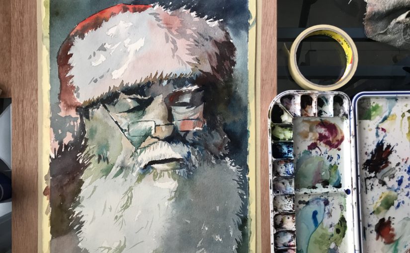
Tutorial | Watercolor Portrait Painting in 3 Colors – Tai Lopez

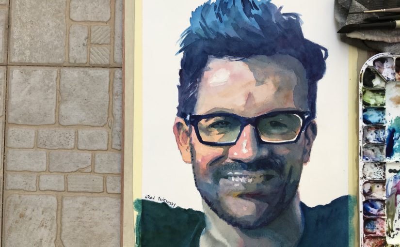
Hi there! Today I want to share with you a written version of my video of painting a portrait of Tai Lopez.

To check out the full video tutorial on YouTube, click here:
Portrait Painting in 3 Colors | Tai Lopez

I did this portrait using a limited palette of three colors only:

  1. Phthalo Blue
  2. Quinacridone Rose
  3. New Gamboge

Final result

As mentioned, you can check out the full video tutorial on YouTube:
Portrait Painting in 3 Colors | Tai Lopez

If you want this in written format, go on ahead 🙂

Portrait Painting in 3 Colors | Tai Lopez

First wash

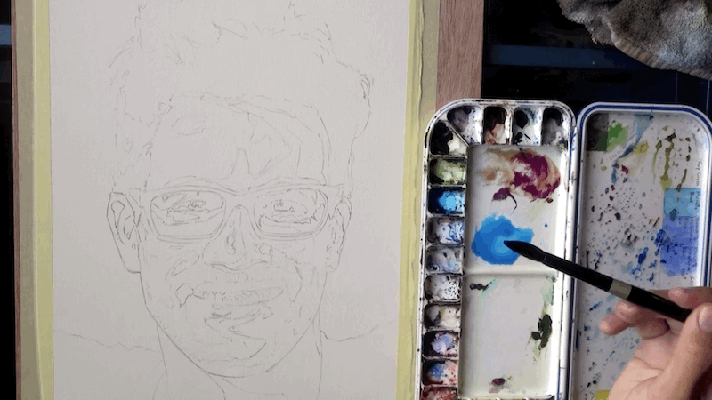
So I start off with a very detail drawing showing all of the changes in values.
I desaturated and posterised the reference image to make it easier to see the value shifts.
I make sure to mix a very large quantity of paint for the hair, as it takes up a lot of space and I sometimes run out of paint easily

The next step is starting the wash.
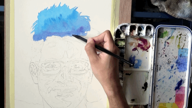
Now, I got lucky and his glasses are super dark.
This allows me to use them as a “checkpoint” or a break for the wash.
It makes life easier, because I can have better control of the different sections.
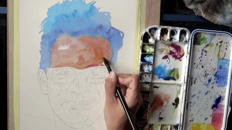
You don’t have to do it this way.
You can simply pull the wash over everything (avoiding the highlights of course).

However I chose to do so in the spur of the moment.
Next up I continue to pull the wash down.
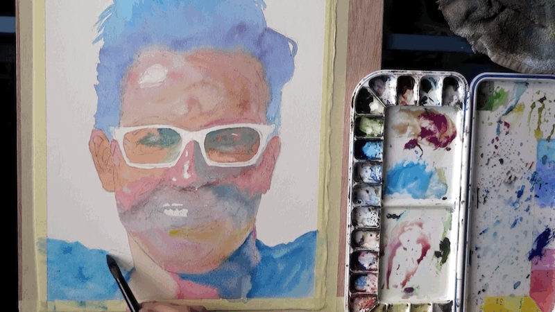
At this stage I’m done with the initial wash.
Notice how I strongly contrasted his shirt with the skin tone.
This was important for me, for creating an interesting color harmony / composition.

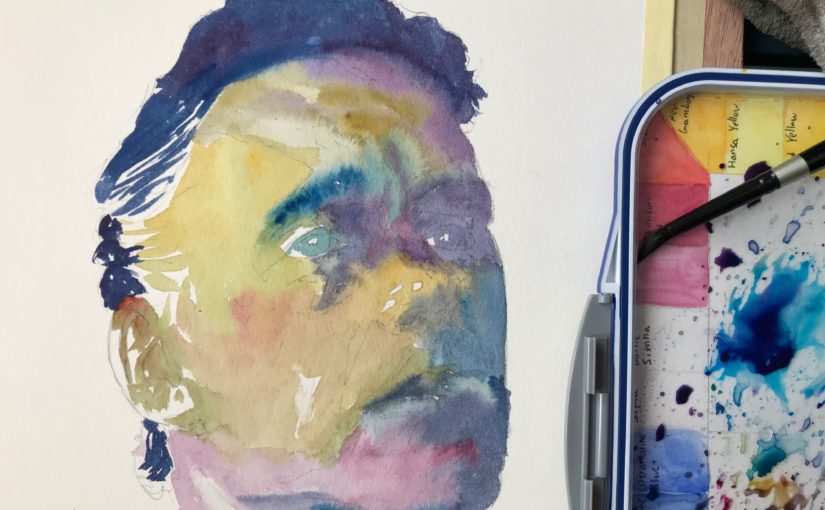
Second wash
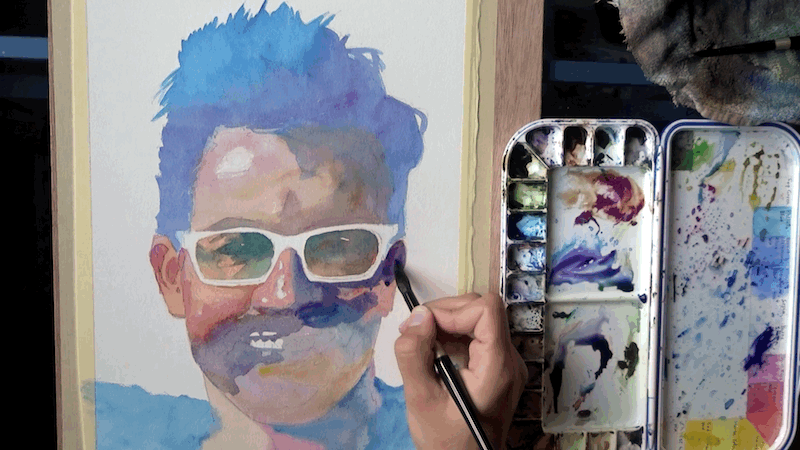
At this stage I’m concerned with two things:
1. Edges – getting a variety of rough and soft / blended edges.
(you can notice that especially on the forehead).
2. Preserving the “second tier” of highlights.

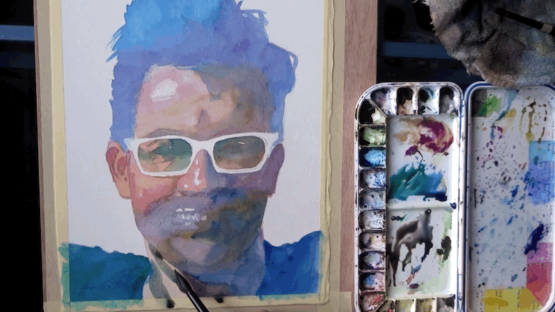
Here I’m pulling the wash down to the very bottom.
Third wash

And now I’m moving on to the 3rd wash.
The reason I’m going through so many, is that I wasn’t able to get the impression I wanted right away.

Sometimes I’m able to nail most of the value variation in the first and second washes, but this time was more challenging for some reason.
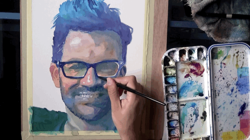
Now you can see how and why I used the glasses as a pausing point for the first wash.
They are so much darker then the rest of the face, that the break in the wash won’t be visible.

The disadvantage to this is that I have to go over them several times, as they are painted over the white paper (and it’s hard getting such darkness with one layer).

Fourth & fifth washes

Here I finally added the eyes – which also have quite a dark value.
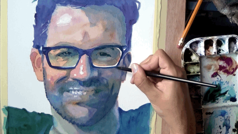
And now I’m adding the mid values (I didn’t go dark enough in the first 3 washes, as mentioned earlier).
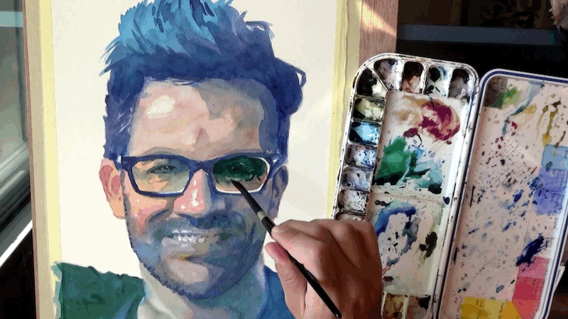
Final result

And finally I’m just going over some dark areas, and we are done!
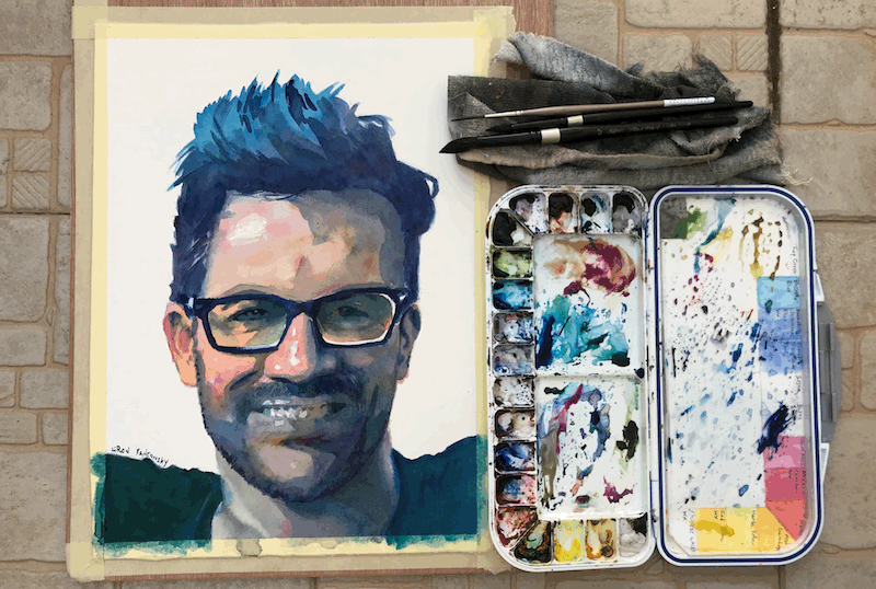
I hope this was helpful!
If you are interested in the full video tutorial, be sure to check it out here:
Portrait Painting in 3 Colors | Tai Lopez

Let me know if this is helpful.
I tried really generalising the stages so it won’t turn into a 30+ stages tutorial haha.

All the best!
– Liron

Improving the Composition of Your Paintings

Hi, Liron here! Today we’ll briefly talk about how to improve the composition of our paintings and artwork.

I decided to translate my videos to blog posts as well. And I decided to do so on a regular basis, as much as I possibly can!

So in this one, I want to talk to you about this video, on improving your paintings’ composition.

In the video I talk about how I approached doing this, and the things I focused on.

So let’s get started!

Improving My Composition

For the last 2 months or so I’ve been really focused on improving my composition.

I find watercolor to be such a fascinating and challenging learning curve. I basically keep learning the same principles, only at different levels.

In any case, I’ve been really focused on composition and believe I made some progress.

Where I Used to Be

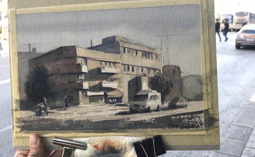
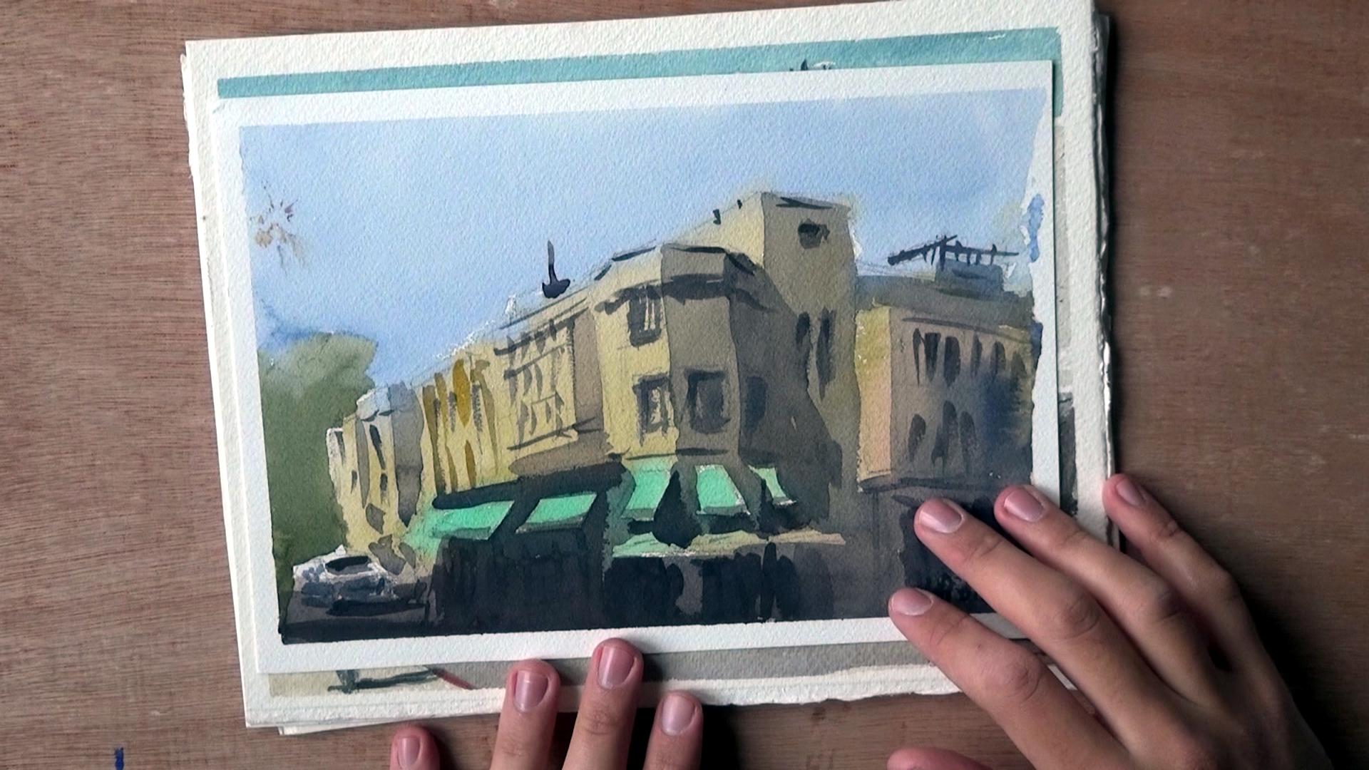
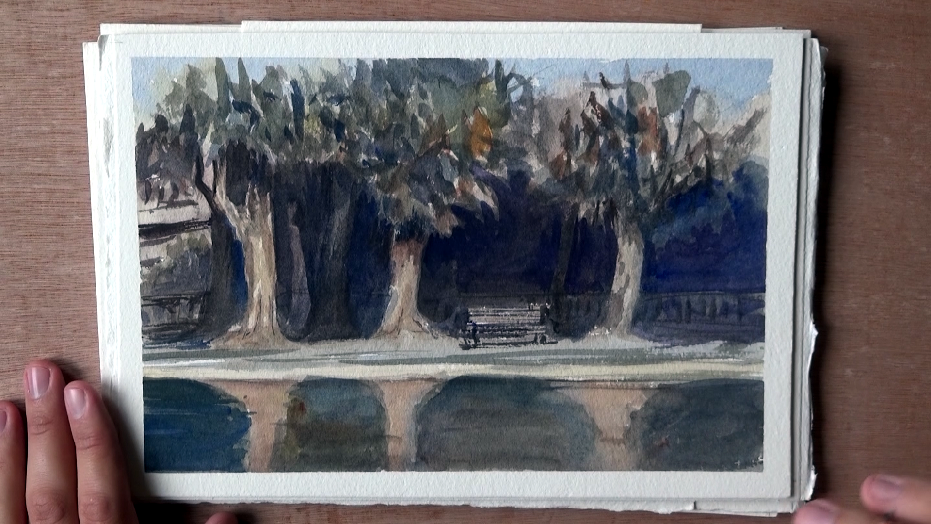
So here’s an example of a typical painting I would make. Aside from the multiple mistakes and inaccurate representation – what really bugged me was the composition.

The building’s just stuck in there, dead in the middle. Sure, there’s that car, but even that doesn’t read as well.

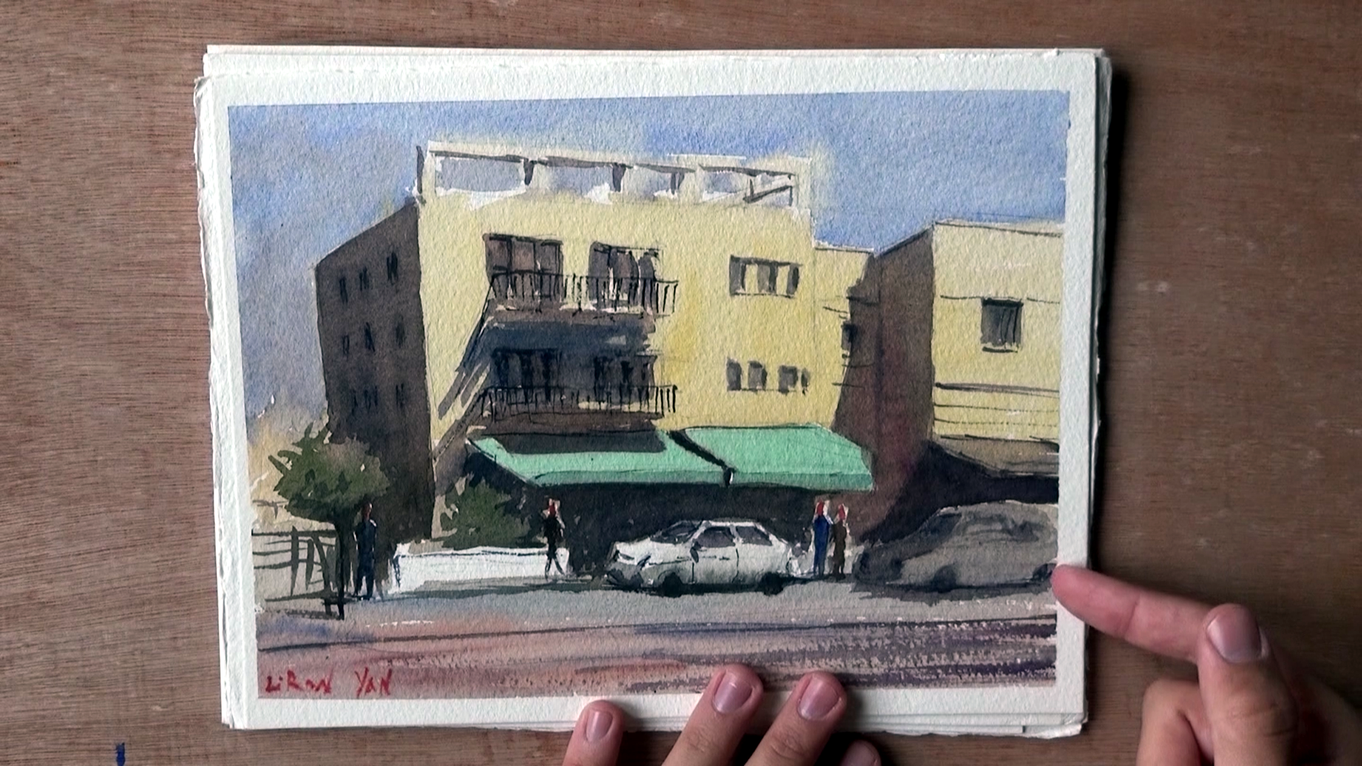
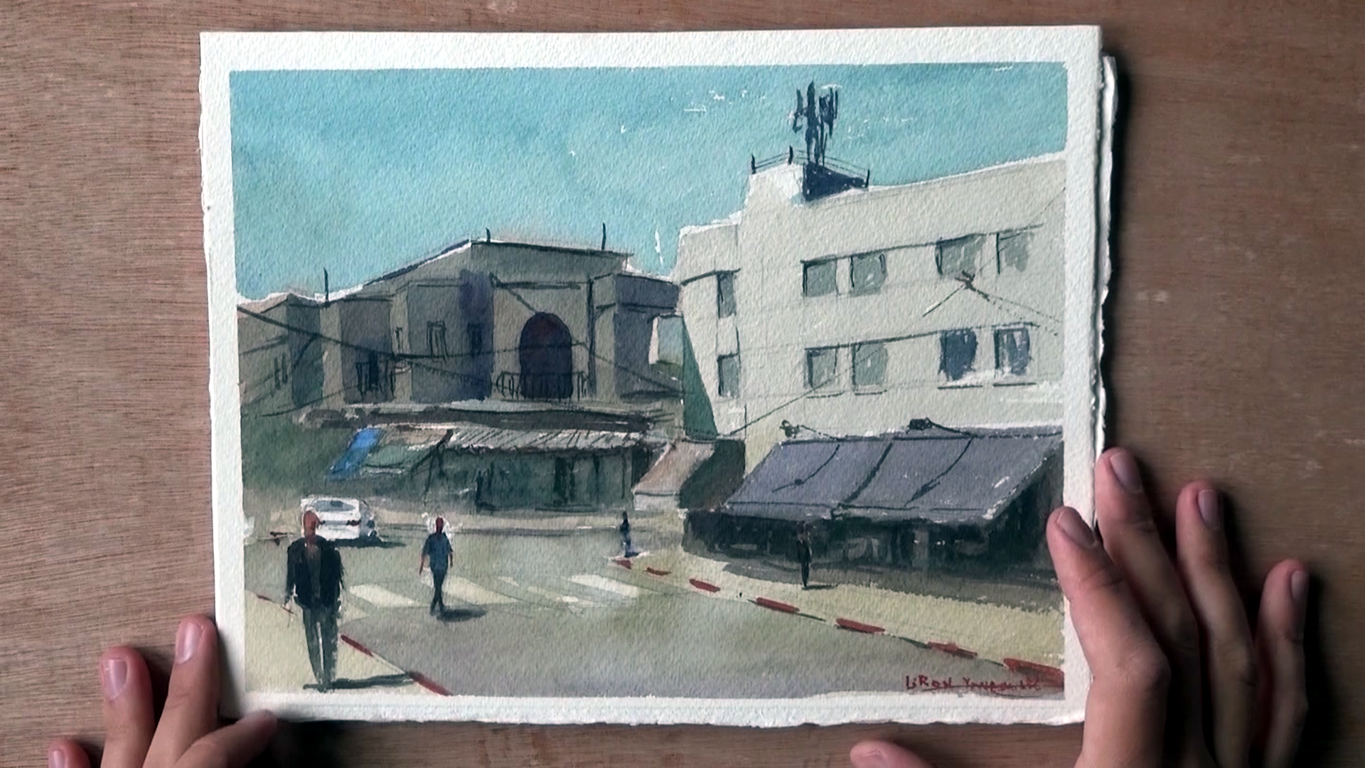
Here are several other examples. Some may even look good in terms of the technique, but the composition, to me, is obviously not thought through enough.

Now, here’s an interesting example from when I got lucky and accidentally got a nice composition going.

Lot’s of things to improve, and the style doesn’t feel like it’s “mine”, but at least there’s some movement and interest.

Where I am Now

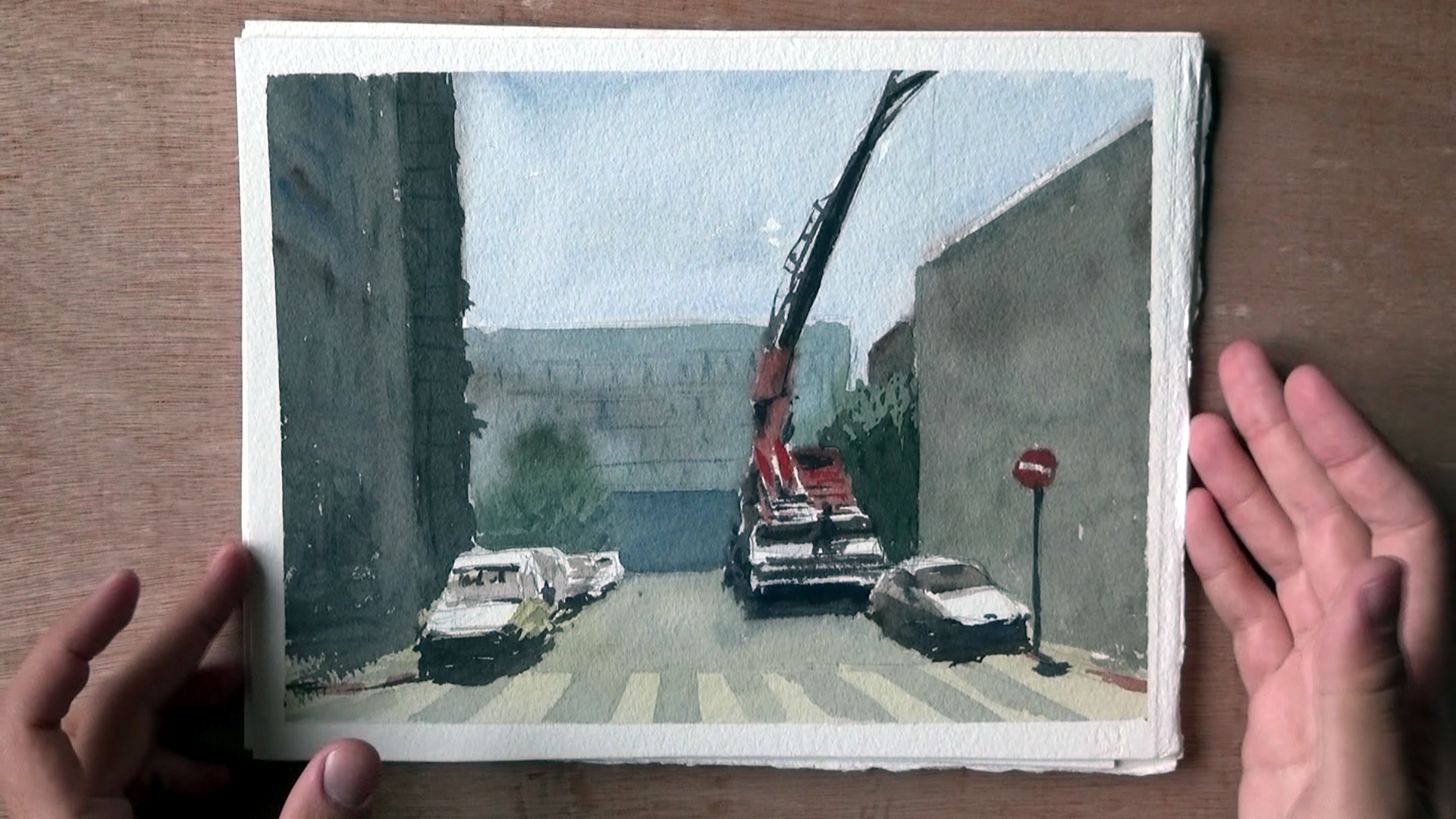
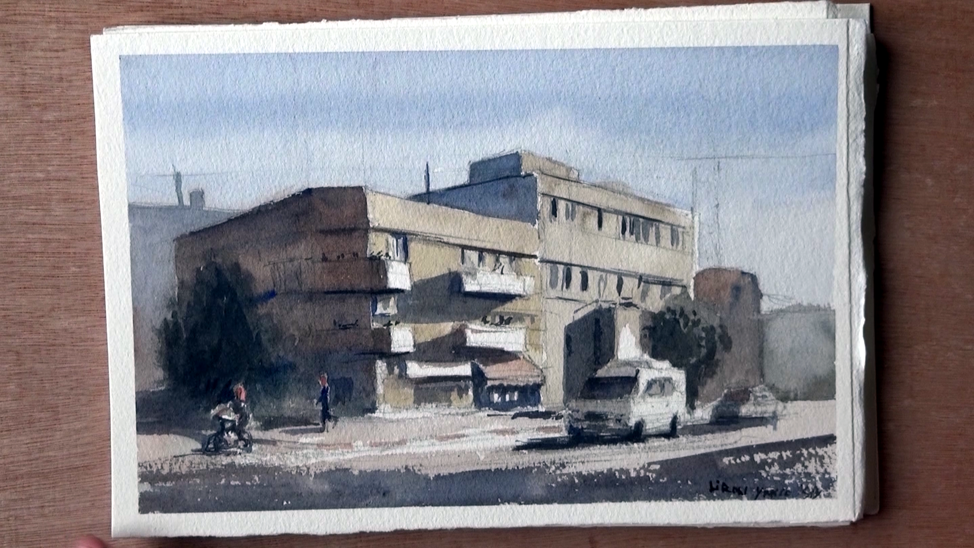
So here’s the first painting in which I REALLY devoted my thoughts and work process to composition.

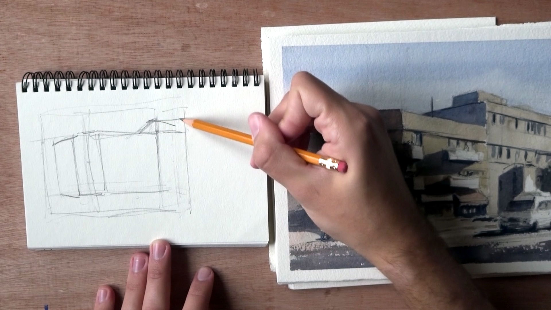
With this one I took some time to carefully plan where everything is going to be placed.

The main change I’ve gone through is avoiding the centers, and putting more emphasis on uneven space divisions that create more interest.

I show more of how I do this in the video. If you want to see it make sure you watch it HERE, or by scrolling to the top of this post.

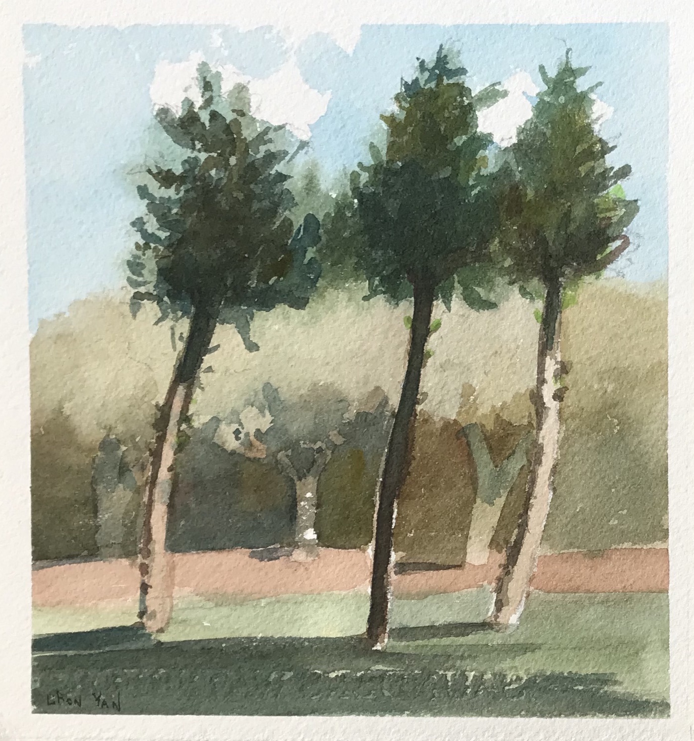
Here’s another good example.

Notice how the distances between the trees are varied. This is true for the trees in the background as well, and pretty much for most elements in this painting.

Here’s another example, simpler this time. What I love about this one is how simple yet effective it is, in my opinion.

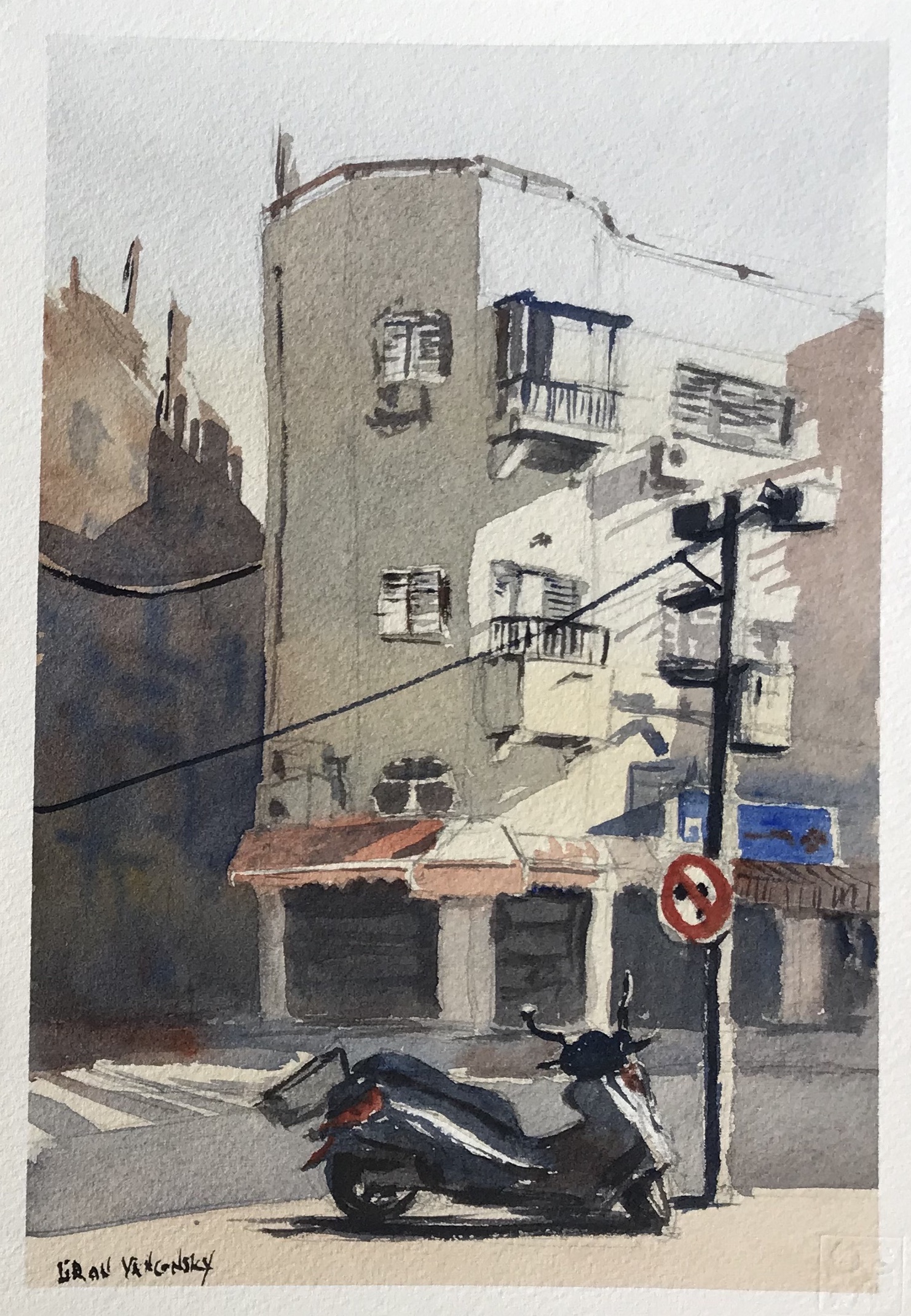
And a final, more detailed one.

Notice how it is quite even when you examine it horizontally. I tried creating interest here around the vertical axis.

Conclusion

And this is it!

I hope this encourages you to devote more time to composition and more careful preparation for your paintings.

I know this was (and still is) one of my weaknesses, and I sometimes have to forcibly slow down my work process.

Again, you can check out the full vid with my explanations HERE.

Let me know if this helped in any way!

– Liron

Goal Setting and my 2018 Goals | Liron Yanconsky’s Podcast – Episode 10

Art, creativity and the art business. In this episode I’ll talk about goal setting and my main goals for 2018.

Some of my main goals for 2018 are related to my income level, my YouTube channel, getting my own studio and health & fitness.

I hope you enjoy this one!

Artist Corner

Keiko Tanabe – a Japanese WC artist. She mainly does fantastic plein air work. She works in a loose style that really resembles Alvaro Castagnet’s style. This is no surprise, as she studied under him!

Find me on…

YouTube – Liron Yanconsky

Instagram – @LironYanIL

Snapchat – @LironYan3

How to Develop Your Own Artistic Style | Liron Yanconsky’s Podcast – Episode 9

In this episode I want to share my (hopefully) unique perspective on a widely discussed topic – how to develop your own artistic style.

My focus will be visual arts, but this can definitely be applied to many other artistic endeavors.

As I preface this episode, I am talking from the perspective of someone who is going through the process of finding their own style right now.

When it comes to pen and ink I’m pretty much there, but when it comes to watercolor painting I still have a long way to go.

The two concepts I present in this episode are:

  1. Focusing on the basics. These are mini-skills that are detached from a certain style. These are the building blocks. Each medium has their own basic skills.
  2. Inspiration and Isolation. A cycle I go through often that allows me to soak up inspiration and knowledge from other artists while maintaining and honing my own uniqueness.

I hope you enjoy this episode!

Artist corner

Today I talked about Wassily Kandinsky – an amazing painter that became a very influential figure in the abstract painting world.

what I love about his work is that he clearly is able to create both realistically (or perhaps “literally”) and abstractly.

Check out ‘Odessa Port’ which he did in 1898, and compare that with ‘Houses in Munich’ from 1908. It’s amazing.

And this is it for today’s episode. I hope you enjoyed this one, and I’ll talk to you again really soon!

– Liron

Find me on…

YouTube – Liron Yanconsky

Instagram – @LironYanIL

Snapchat – @LironYan3

Preparation and Patience | Liron Yanconsky’s Podcast – Episode 8

In this episode I want to share with you some insights I recently had regarding preparation and patience, and how they significantly improved my artwork!

A few months ago I started more carefully planning my paintings, before starting to work on them.

But the serious improvement I started feeling in the last 2 months or so, came when I started devoting more time to studying composition and planning it in each painting. I immediately noticed the difference it made.

I hope you enjoy this episode!

Today’s artist: Anna Mayorova

Instagram: @Mayooroova | https://www.instagram.com/mayooroova/

YouTube: Anna Mayorova

Find me on…

YouTube – Liron Yanconsky

Instagram – @LironYanIL

Snapchat – @LironYan3