Business Monday – How to Build a Successful Art Business | Liron Yanconsky’s Podcast – Episode 27

Hi there! In today’s episode I want to present to you my new show – Business Monday. The show will deal with how to build a successful art business.

Business Monday – My New Show

Next week I’m going to start a new show on my YouTube channel.

Business Monday will be a show dedicated to the art business. I will talk to you from my own PERSONAL EXPERIENCE. I want to share my insights regarding how to build a successful art business.

Why I’m Starting This Show

My current content attracts a lot of older audiences, which is great! Sometimes, later in life – people find more time to create art and paint.

However, I’d also like to help younger audiences. I’m talking about young artists that are HUNGRY for success.

I feel like this is something I can share my knowledge about.

How I Got the Idea

I wanted to talk about topics related to art and business for a LONG time now. In fact, I’ve been doing that to some extent for a while now.

I would occasionally talk about topics such as business, marketing and so on. But it was always at the “fringes” of my content. It was something I always did “along” the way.

a few days ago I was talking to a friend about this. Suddenly he told me: “Why not just make a show dedicated to that?”

I immediately felt how on-point he was.

Content Pillars – Building an Art Business

I have many content pillars in my YouTube channel (and on other places such as Instagram). I talk about watercolor, sketching, The Paint Show, and I also have my new series – Painting Masters.

Having these as content pillars, or “headlines”, helped me significantly with brainstorming a multitude of ideas for videos, posts and so on.

But up until this point, I haven’t had an organized content pillar for BUSINESS. And now I do (:

My Intentions with Business Monday

Sharing ONLY What I Know

My only intent with this show is the share my insights. I will not pretend to know everything. I want to talk about the things I am experienced at.

I’ve been working on my art business and personal brand for the past 4 years, and only now feel like I start to reap some of the rewards.

And so, I also feel like I have a lot to teach.

Detailed, Specific Talk

Another thing I intend to do is to go DEEP. I want to show you the exact things I’m talking about. I want to show you my actual sales funnel, my Facebook ads, my autoresponder. Everything!

There’s plenty of general information out there. Frankly, it helps almost nobody. It’s been commoditized.

I want to give you what I did, specifically. That’s the best type of information, in my experience.

Conclusion

So now that you know about this new show, make sure you subscribe to my YouTube channel, if you still haven’t.

The first episode will be up on Monday, the 7th of May.

As always, feel free to comment and let me know if there are any topics you want me to cover in the show, podcast, or anywhere else!

And now, let’s wrap up with the Artist Corner.

Artist Corner

In this episode I wanted to talk to you about Alexander Votsmush.

Alexander is a watercolor painter. He creates surrealistic works that are simply astounding. He seems to have complete mastery of watercolor, and even realism. I believe he distorts reality as a style choice. I wouldn’t be surprised if he can draw realistically, or even hyper-realistically.

By the way, I read that Votsmush is a nickname, a play on the letters of his original last name – Shumtov.

Check out his Instagram here: @Votsmush

Check out these websites for an awesome view of his works:

LivingDesign – Alexander Votsmush
LinesAndColors – Alexander Votsmush

Here’s where you can find me (:

You can support me on Patreon

Check out my YouTube Channel – Liron Yanconsky

Or ask me questions on Instagram – @LironYanIL or Snapchat – @LironYan3

And this is it. I hope you enjoyed this episode!

– Liron

How to Make Every Photo Reference Easier to Paint | Photo Editing Tips for Watercolor Painting

Hi there! Today I want to talk to you about making your photo reference easier to paint.

Painting as an art form poses innumerable challenges. as we improve, these challenges never really go away. We, however, get better at dealing with them and solving them.

Your Photo Reference Matters

As a beginner, you want to have everything work in your favor. A large part of that is painting from a good reference.

Anything can be painted, but the reality is that not everything is ideal as reference.

In today’s video I want to show you several ways of turning your photos into something that’s easier to paint.

Watch the complete video here, and scroll on for a written version (:

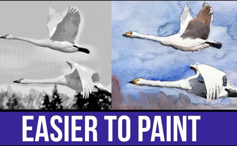
Make Every Photo EASIER TO PAINT

Finding Good Reference

I have several sources for great reference photos, that I also present in the video. Here they are:

These are all great. Generally speaking – Pixabay and WetCanvas photos can be used for anything (commercial or non-commercial).

Access to WetCanvas Reference Photo Library does require registration, which is free.

With Flickr you need to be a little careful, and filter according to the license. You can also always contact the owner of the photo and ask for their permission.

Choosing Good Photos

I’d like to say a few words about choosing good reference photos, and specifically for the purpose of painting and watercolor painting.

Clear and Focused

A good reference photo should be clear and well focused. You should be able to see all of the details.

Large Shapes

Also, it’s best if there are a few larger shapes that are very visible. What I mean by that is that the image isn’t a collection of tiny bits and pieces that don’t really connect to a cohesive subject.

This is why still-life arrangements, as well as portraits can be GREAT subjects. They are very clear and contain major shapes.

A cityscape, on the other hand (and this can very from one photo to another), has the potential of being a little “messier”.

Strong Contrasts

This is especially important if you are a beginner to watercolor painting. Photos that have sharper contrasts are simply easier to paint.

If you’ll try and paint a perfectly lit portrait, that barely has any shadows in it, and is full of gradual light changes – you may loose your mind =P

(check out the full video to see what I’m talking about).

Improving Brightness, Contrast and Levels

This first step is always important. Watch to full video to see how I play with the histogram, but here’s what the effect looks like.

(left – before, right – after)

Editing the photo reference levels

Editing Your Photo Reference – Black and White

The first advice I’d give you is to turn your reference from color mode to black and white.

This can be done easily with the simplest of photo editing softwares. And it will give you a much better look at the values (how dark or light everything is).

Here’s a comparison.

Desaturating the photo reference

(left – before, right – after)

Editing Your Photo Reference – Posterize

Posterize is a handy function that’s available in most advanced photo editing softwares such as Photoshop and (god forbid) Gimp.

It allows you to control the NUMBER of levels (=values). So you can choose 2 values – which will give you an image with two values only. Or you can increase it to 6, 12 or whichever number you’d like.

Here’s another comparison showing this effect.

Using the Posterize effect on the photo reference

(left – before, right – after)

I find this one to be particularly useful in simplifying a photo, and making it much easier for us to paint it.

You can just SEE very easily where it gets darker, lighter and so on.

Conclusion

You can paint based on anything. But some references are better than others.

When working from real-life observation, we don’t really have control over what we see. But, when working from a photo reference, we can change things around to our advantage.

I hope this helps you in better understanding how to do that.

I’ve used these methods for creating many of my works. Be sure to follow me on Instagram to see the results. I used this especially for my portraits, such as this one of Santa Clause (;

And this is it, I will talk to you again real soon!

– Liron

Cobalt Blue – ShinHan PWC Watercolor | The Paint Show 25

Hi there!

Today I want to share with you a review of Cobalt Blue by ShinHan PWC watercolor!

PWC is ShinHan’s artist grade watercolor (they also have the Professional line for students and Shami for kids).

You can read more about ShinHan paints and the other paints I bought on the post I published a while back: ShinHan PWC (Primary Set I Selected)

Here’s the complete review on YouTube. Read on for the written version (:

Cobalt Blue by ShinHan PWC

I purchased this alongside their Cadmium Red Deep and Cadmium Yellow Deep.

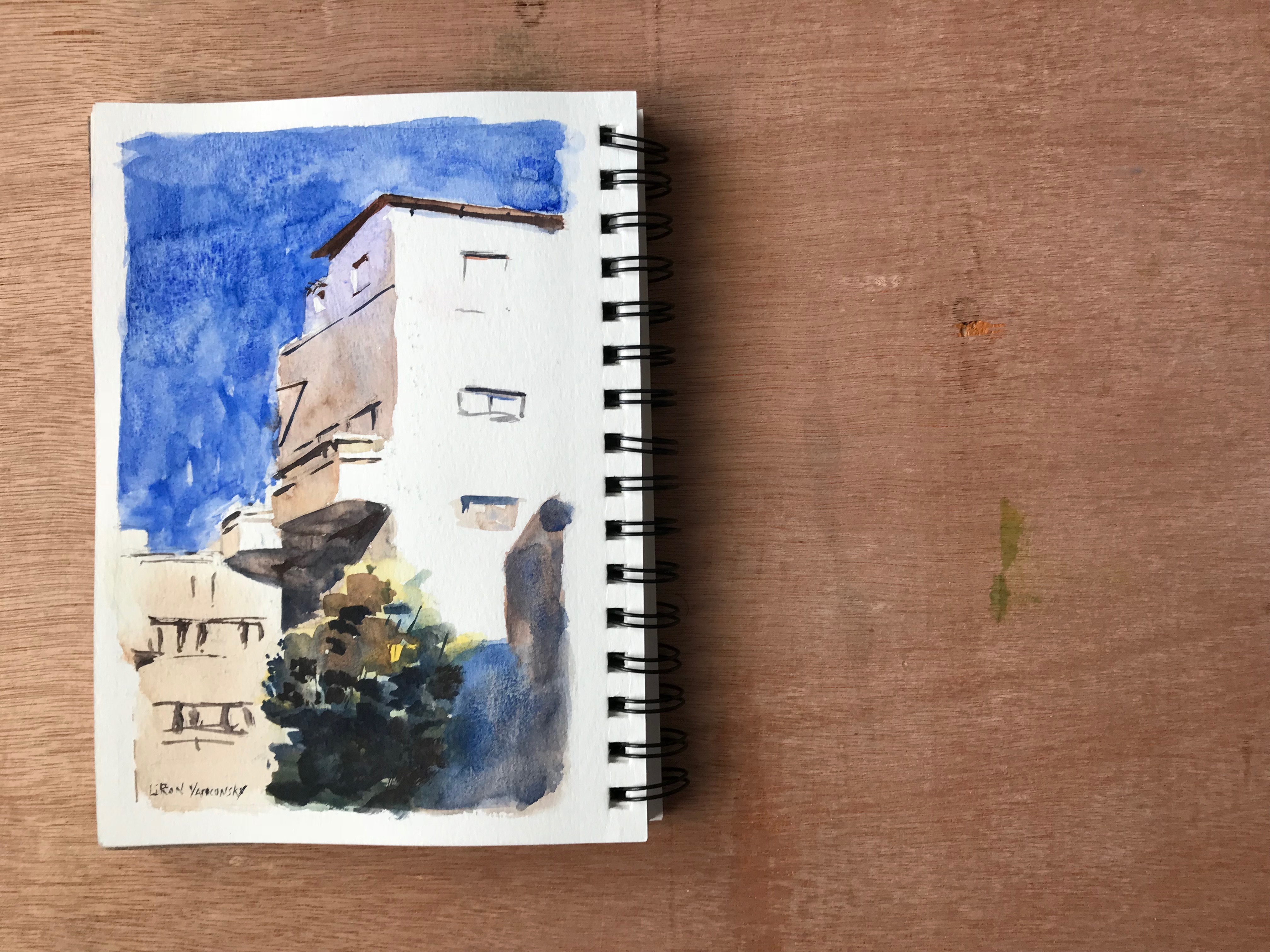
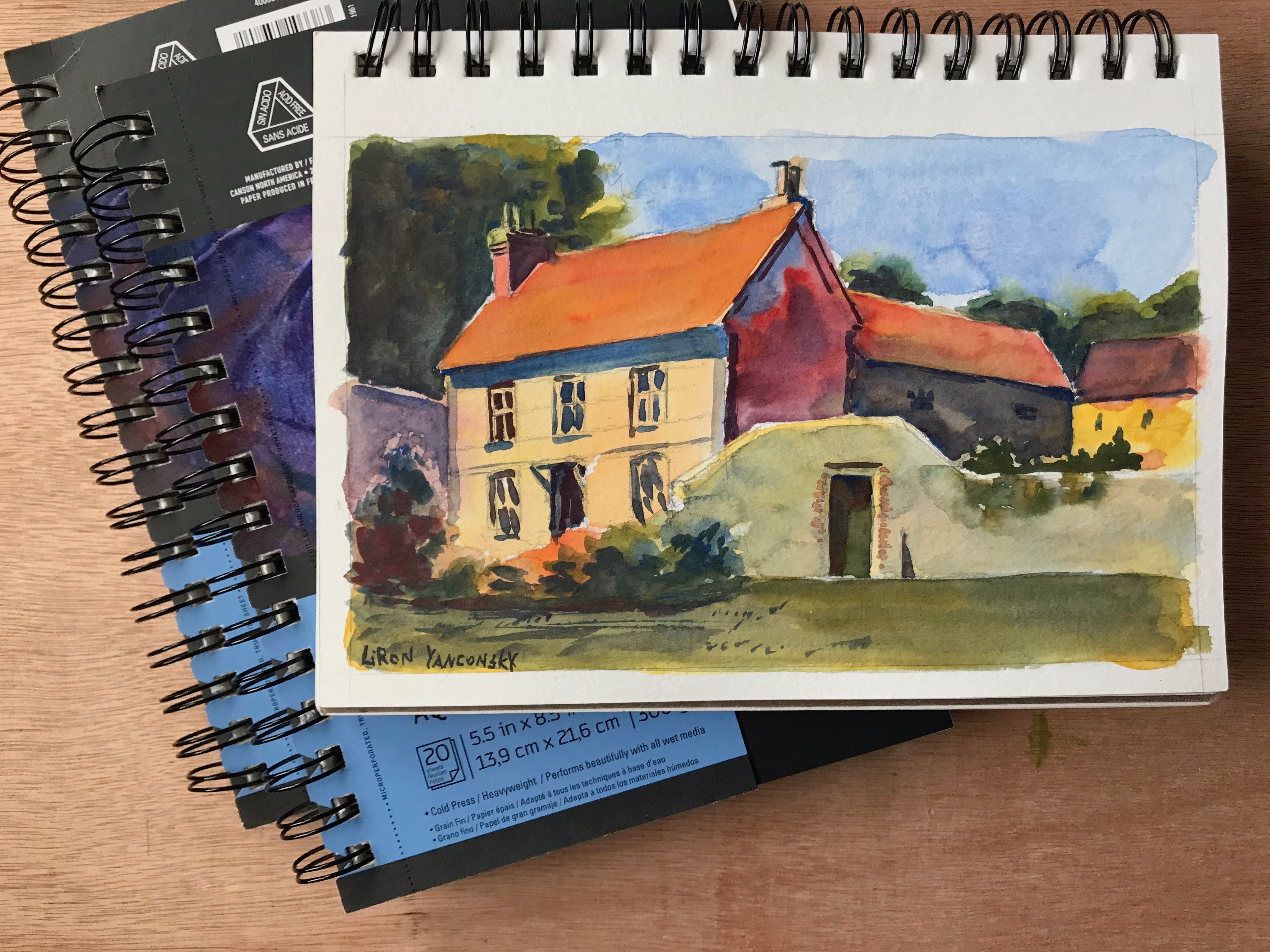
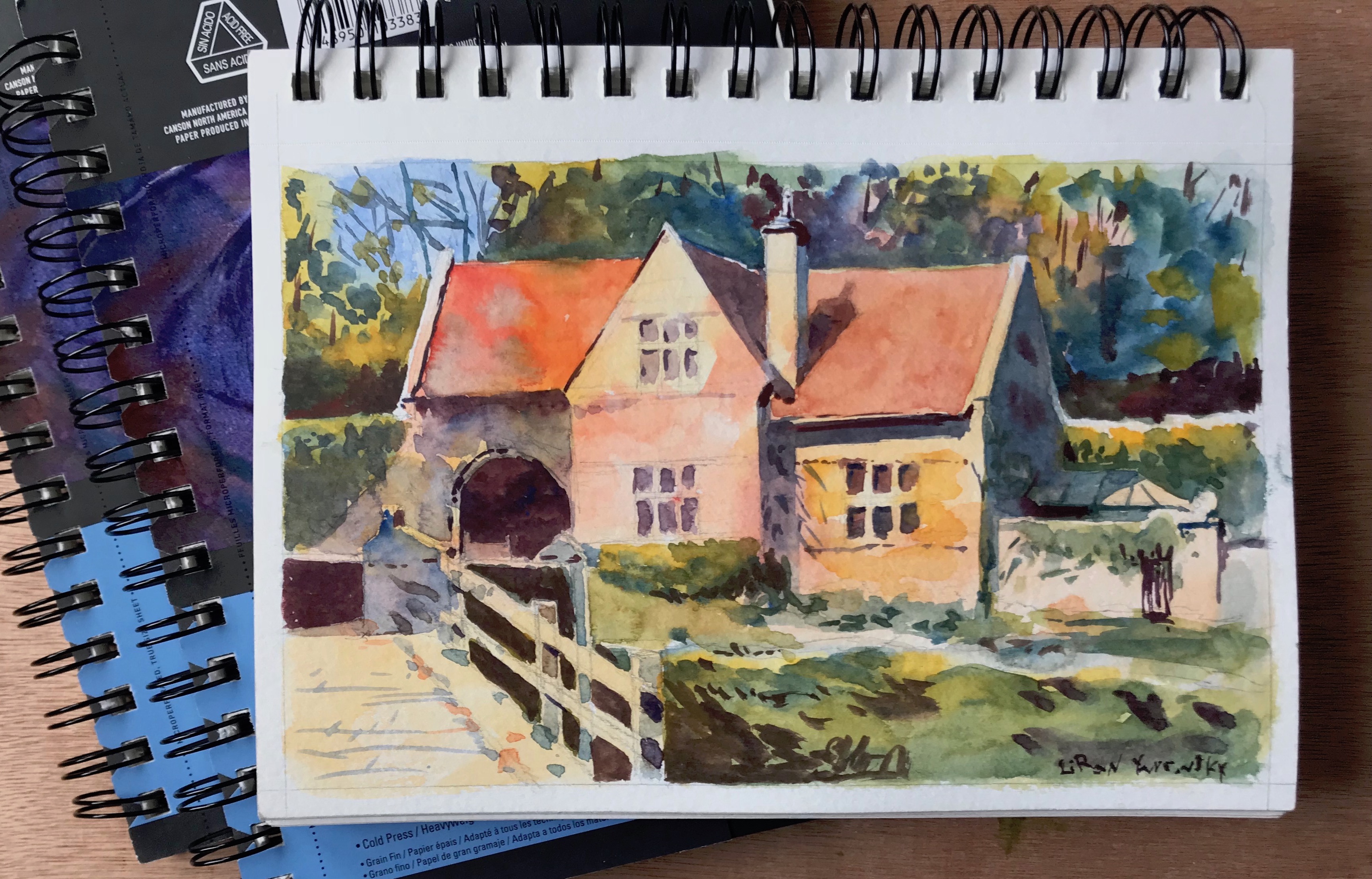
I really love this paint and have used it EXTENSIVELY, in many of the works I shared with you here and on Instagram for the past several months.

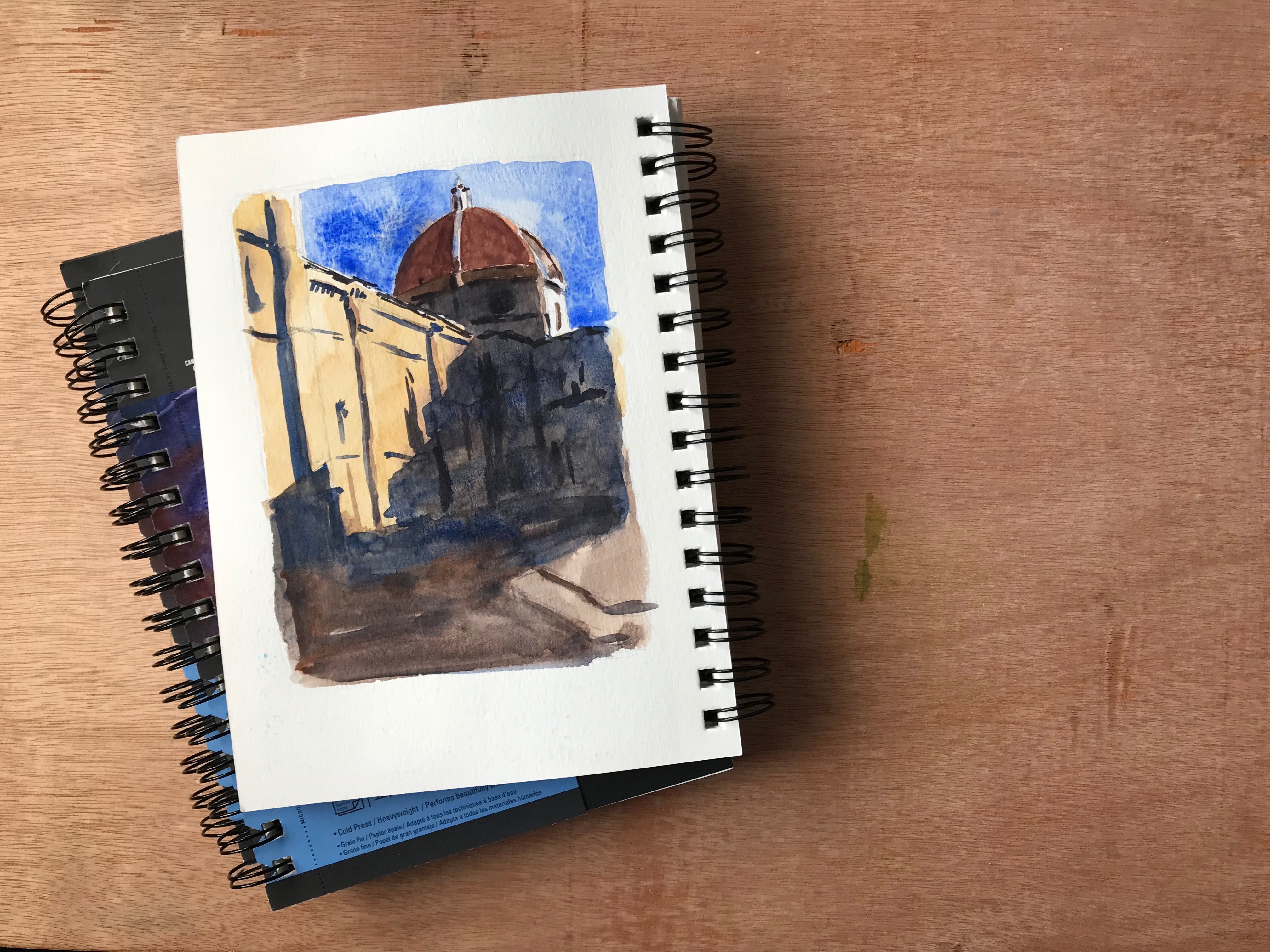
Here are some of my works showcasing it.

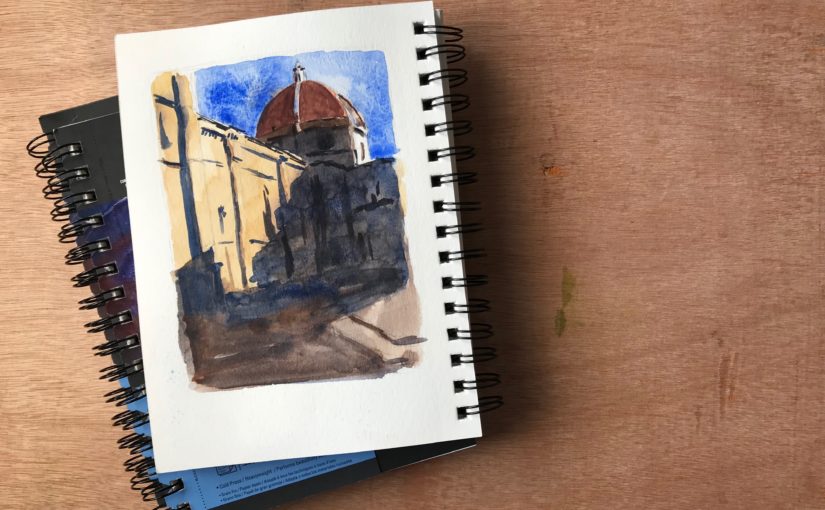
Painted the Duomo in Florence using Cobalt Blue by ShinHan PWC

Painted a building in Tel Aviv using Cobalt Blue by ShinHan PWC

Painted countryside house using Cobalt Blue by ShinHan PWC

Painted another countryside house using Cobalt Blue by ShinHan PWC

Cobalt Blue – Paint Info

Pigment: PB28 (cobalt blue).
Semi-transparent
Lightfastness 3/3
Series D (almost the most expensive on the A-E scale)

My Only Complaint With Cobalt Blue

My only complaint with this paint is that it doesn’t achieve dark enough values. It’s not as light as some ceruleans I saw, but it’s still not as dark as many of the Phthalo Blues and French Ultramarines.

I think this could work to your advantage if you are painting in a softer style. For me however – I love strong contrasts at times. I love to use a wide range of values.

Another issue caused by this is that it’s hard for the blue to be dominant when mixed with the red and yellows I purchased (partially my fault, as they are more opaque).

I do love the way it looks

With that being said, I produced many beautiful paintings with it, and love the way it looks.

I’d recommend getting it as a part of a gentle trio, alongside lemon yellows and rose-like colors.

Where to get it

These sell on Amazon as sets. I’m not usually a big fan of watercolor sets, but for the price point – these may be worth it.

Here are affiliate links (I get a small commission, you pay the same price):

24 set: http://amzn.to/2DA5WrB
32 set: http://amzn.to/2zR13YR

Conclusion

I really love ShinHan’s PWC paints so far, and plan on getting many more in the future. This is a great color to have too.

I hope you enjoyed this video, and I’ll talk to you again really soon!

– Liron


Cold-Press VS Hot-Press Watercolor Paper – MY PREFERENCE

Hi there! Today I want to quickly let you know about my favorite watercolor paper(s).

This really is a personal matter, so don’t worry if our opinions are different. That’s what opinions are for (;

Here’s the full video. For a written version, read on.

In Watercolor, Paper’s IMPORTANT

I want to preface this by saying that paper really matters when it comes to watercolor painting. It has to be of good quality.

I find that I can work well with simple brushes and ok paints. But the paper is crucial for success.

Cold-Press VS Hot-Press

These are the two main watercolor paper types.

Hot-press paper has a soft surface. Paint tends to sit a little more on its surface, and may take a little longer to dry.

Cold-press paper has tooth, aka texture. It tends to be a little thirstier in my experience. It tends to absorb paint faster.

I am an absolute fan of cold-press.

I love the texture and tooth. It’s very forgiving, and holds paint very well. It can be used to create different effects and “dictate” the focus in a painting, by using dry brush techniques.

An Argument FOR Hot-Pressed Paper

There is something to be said of the merits of hot-press watercolor paper. This type of paper allows for smoother transitions and edges. It’s considered more suited for portrait painting, and for works that require finesse and accuracy (which makes sense).

I also find that it’s sometimes easier to blend and soften edges in hot-press paper, though you have to know what you are doing. You usually need to dry the brush a little more (as the paper is smoother and a little more moisture in the brush can cause paint to spread more easily).

Check out this video I did on blending and edge softening: Watercolor Blending and Edge Control

Weight of Your Watercolor Paper

Watercolor paper comes in different weights.

I think that the minimum is 300gsm (grams per square meter). Under that you are risking with dealing with major buckling, especially in larger sizes.

I actually love to use 600gsm paper, but it’s not a necessity. That’s me being spoiled haha.

Favorite Watercolor Paper Brands

I have two brands whom papers I love.

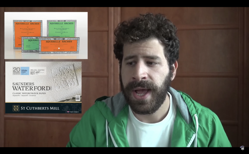
Arches and Saunders-Waterford.

These two actually feel REALLY THE SAME. I think I read once those are different lines of the same brand, thus the similarity. Though I don’t remember clearly.

These can take anything, multiple layers, lifting, scratching, whatever!

The paper I most commonly use in the last six months or so is Saunders-Waterford.

Sketchbooks

When in sketchbooks, it’s sometimes a challenge to find one with good paper.

My favorite would be an Arches paper organized as a sketchbook (haven’t seen Saunders-Waterford in that format.

However, there is a different type of sketchbook I like, and that is Canson Montval (and it’s not even cotton paper).

You can watch my review of it here:

Conclusion

I hope this gives you a clearer picture of the types of watercolor paper I love using. this


Publishing as Much Content as Possible | Liron Yanconsky’s Podcast – Episode 26

Hi there! In this episode we’ll talk about publishing A LOT of content and making the most out of opportunities.

Focusing on Publishing a Lot of Content

My current focus in my work is to publish as much content as possible.

I post three videos a week on YouTube. I post on instagram, Snapchat and Facebook every day. And I have this podcast (and the new one on anchor! Anchor.fm/Liron)

Reasons for Publishing so Much Content

There are many reasons for me doing the work I do.

I would say the main thing is that there’s less competition now. Not a lot of people (and artists in particular) actually try to show a lot of their lives, work processes and so on.

This is a rare chance to do so. It’s easier to get peoples’ attention on different media outlets.

This connects to another reason – regret.

Regret

I only regret things I didn’t do.

Looking back at my YouTube channel, my first video is from 2014!!! I always have this thought with me: if only I would have done back then, what I do for the past year and a half.

I’m sure if that would have been the case, then I would have at least quarter-half a million followers by now. Same for Instagram. If only I’d have started years earlier.

This really goes to show you the importance of doing things to the fullest. At the moment I have nothing I regret from the past 1.5-2 years. I did (and am doing) everything I can to my best knowledge.

Avicii

I talked about this in several places. Avicii the musician died at the age of 28, which is my age. This again makes me realize how important it is to have a life of no regrets. At least as much as possible.

IWS Competition

On a completely different note, in this podcast episode I’m also talking about submitting my work for a IWS Israel competition.

I’ll keep you updated on that. Wish me good luck! If you want to see some ideas for paintings that I had, consider supporting me on Patreon (: I’ll be sharing more info there, as things develop.

My Patreon page

Artist Corner

In this episode we talked about no other than John Singer Sargent! He was an incredibly impressive American artist.

He worked mainly in oils, but also produced some watercolor paintings. His style is my favorite in oil painting, and he is highly regarded for his portraits.

He had a way of simplifying everything he painted. If you look from far, it almost looks realistic. But when you get up close you see all the roughness of the brush strokes, and what a “mess” he makes.

It’s my favorite!

You can read more about him on Wikipedia: John Singer Sargent

Or check out his works on Google Images. Here’s one of my favorites of his:

Here’s where you can find me (:

You can support me on Patreon

Check out my YouTube Channel – Liron Yanconsky

Or ask me questions on Instagram – @LironYanIL or Snapchat – @LironYan3