In this quick tutorial I’ll talk about letting your watercolors mix on paper. I believe this can be used as a tip for improving your paintings and making them more interesting.
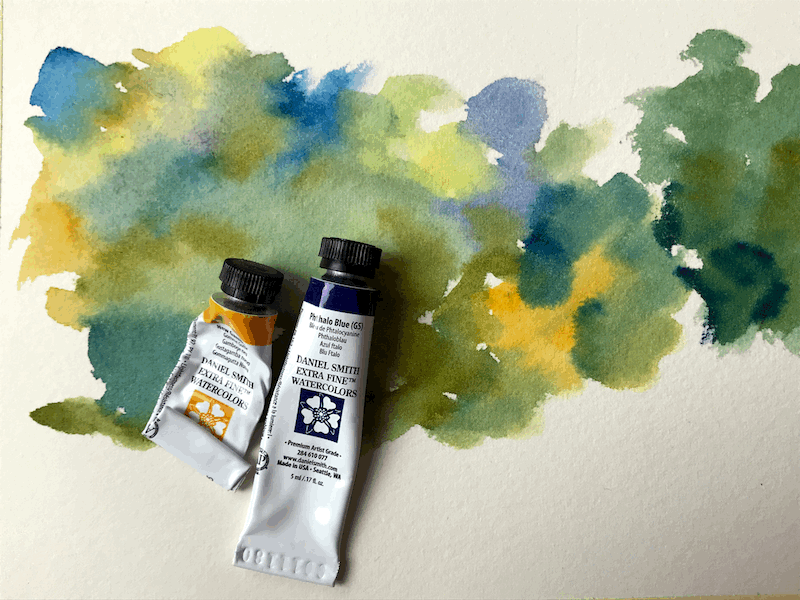
This is based on a YouTube video I published yesterday.
If you want to view the whole thing, check it out here:
Real Life VS Photos
When looking at a view in real life, there’s a tremendous variety of colors and details.
If you look at a field or forest, you’ll see many types of greens, but also yellows, reds and purples (for flowers for examples).
You’ll also see different types of browns and even blues.
A photo FLATTENS it all.
All the variety of yellows, reds and blues turns into one even green.
This is boring.
In order to mimic real life, and provide a complete impression, I highly recommend using pure colors in your paintings.
Painting in Patches of Colors
Here is a quick demo of me applying this and creating greens by using different blues and yellows.
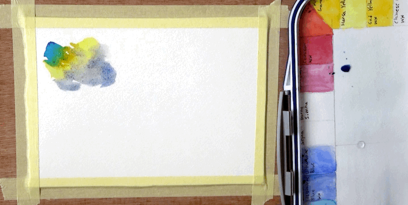
I just put a few patches of different colors, one next to another.
This allows them to mix a little on paper.
They don’t have to mix too much. Our brain complete the image and sees “green”.
The specific colors I used are Phthalo Blue, French Ultramarine, Hansa Yellow medium and New gamboge (all Daniel Smith).
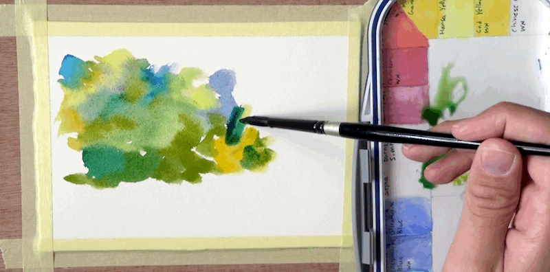
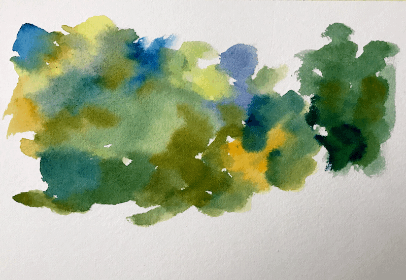
Consider how much more interesting this looks, when compared to a flat green wash.
What I used to do in the past, was to mix the paint on the palette, and then vary the ration of yellow-blue.
I now realise this isn’t sufficient.
You sometimes have to show the pure colors to get that rich and varied effect.
Here’s what the final result looks like.
Trees Demo
Let’s look at another example. This time I sketched two trees.
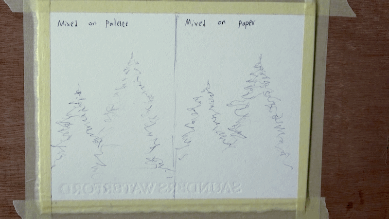
I want to show you 2 things:
- The difference it makes to use purer colors
- Bonus – how shading with a third, complementary color is better than “tonal” shading (shading using a darker version of the same color).
So here’s the difference in results.
On the right hand side I worked in patches of pure colors.
On the left I worked with the same green.
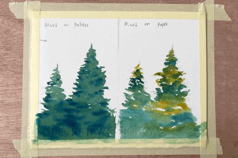
I want to mention how I somewhat messed up a part of this demo.
I actually didn’t follow my own advice, and didn’t use pure enough blues on the right.
It’s more like I used yellows and greens =P
My bad!
Next up, I added a second wash for the shadows.
Let me show you the difference.
On the right I used a mix containing Quinacridone Rose.
On the left I used the same blue for shadows (Phthalo Blue).
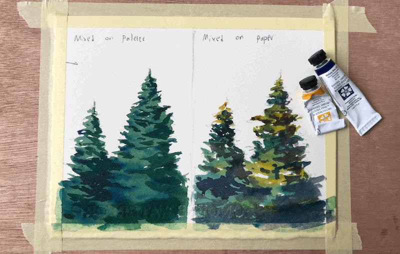
Unfortunately, because of the mistake I did of NOT going pure enough, some of the effect was not achieved to the extent I was hoping for.
But hopefully you can still see the difference that it made.
Conclusion
And this is it.
I really hope you enjoyed this quick tutorial.
If you want to see the full video, you can check it out here:
Let It Mix On Paper
And this is it! I will see you again in another tutorial (:
– Liron
