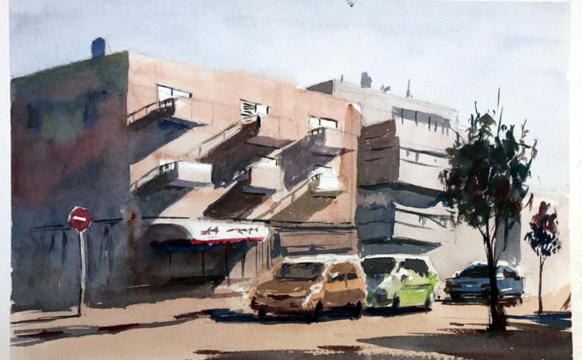
Creating With Complete Immersion | Liron Yanconsky’s Podcast – Episode 17

In this episode we’ll talk about immersion, and being immersed while you are creating. We will see how this can actually help you make better art!

I got this idea while working out…

So a few weeks ago I was working out, and I noticed I wasn’t really into it.

I noticed my thoughts go somewhere else, and I’m not really focused on the exercise I was doing.

And then I suddenly though – why?

I mean, this is so stupid! I already scheduled the workout session, and I’m already working out.

So why am I so unfocused?

Painting and art making is the same

From there, it was an inevitable connection.

I immediately realized this was also (occasionally) happening to me with painting.

I would sometimes feel unfocused. Like i just want to get it done. Kind of like washing the dishes or brushing your teeth.

And the difference in results shows.

Working while in that headspace leads (at least for me) to mediocre art.

Why do we loose immersion?

I think this can happen for multiple reasons.

For me, this mainly happened as I was detached from the overarching goal. I wasn’t seeing how what I’m doing RIGHT NOW, helps me attain my goals.

This is lack of clarity, and from my experience it isn’t ideal.

So I worked on building up my clarity, writing and figuring out the exact connection between what I’m doing and the end result.

And lo and behold, it worked!

(how I built my clarity is a topic for a future podcast, but brainstorming, writing, asking the right questions and visualizing were a major part of it)

As soon as my clarity increased, I was able to understand why a single rep of a single set of a weight lifting exercise – produces strong ripples into my future.

I was also able to understand how with every brush stroke I improve a certain technique.

Artist Corner

In this episode we talked about Eudes Correia, a Portuguese watercolor artist and instructor.

His work consists of people and figures for the most part. He has an incredible sense of light, shadow and movement.

You can check out his website here: Eudes Correia

And his Instagram account @Eudes_Watercolor

Conclusion

And this is it for today’s episode. I hope you enjoyed it!

Here’s where to find me:

Support me on Patreon

Check out my YouTube Channel – Liron Yanconsky

Or ask me questions on Instagram – @LironYanIL or Snapchat – @LironYan3.

Use Pure Colors in Your Watercolor Painting

Hi there!

Today I want to present to you a painting process I did a while ago.

It’s not my best painting. However, it’s an experiment I did with preserving the purity of colors and letting them mix on the palette.

You can watch the entire process below, and scroll down for the written version (:

Use Pure Colors in Your Watercolor Painting

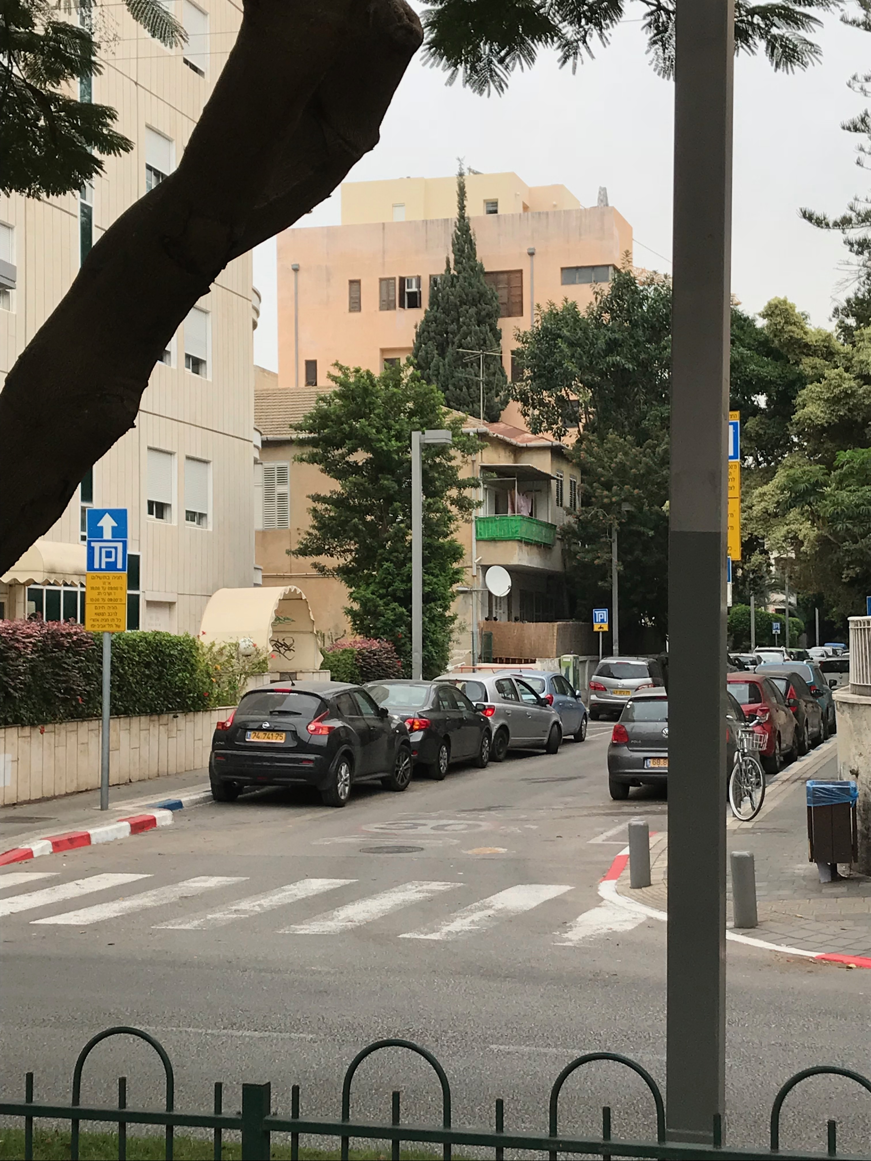
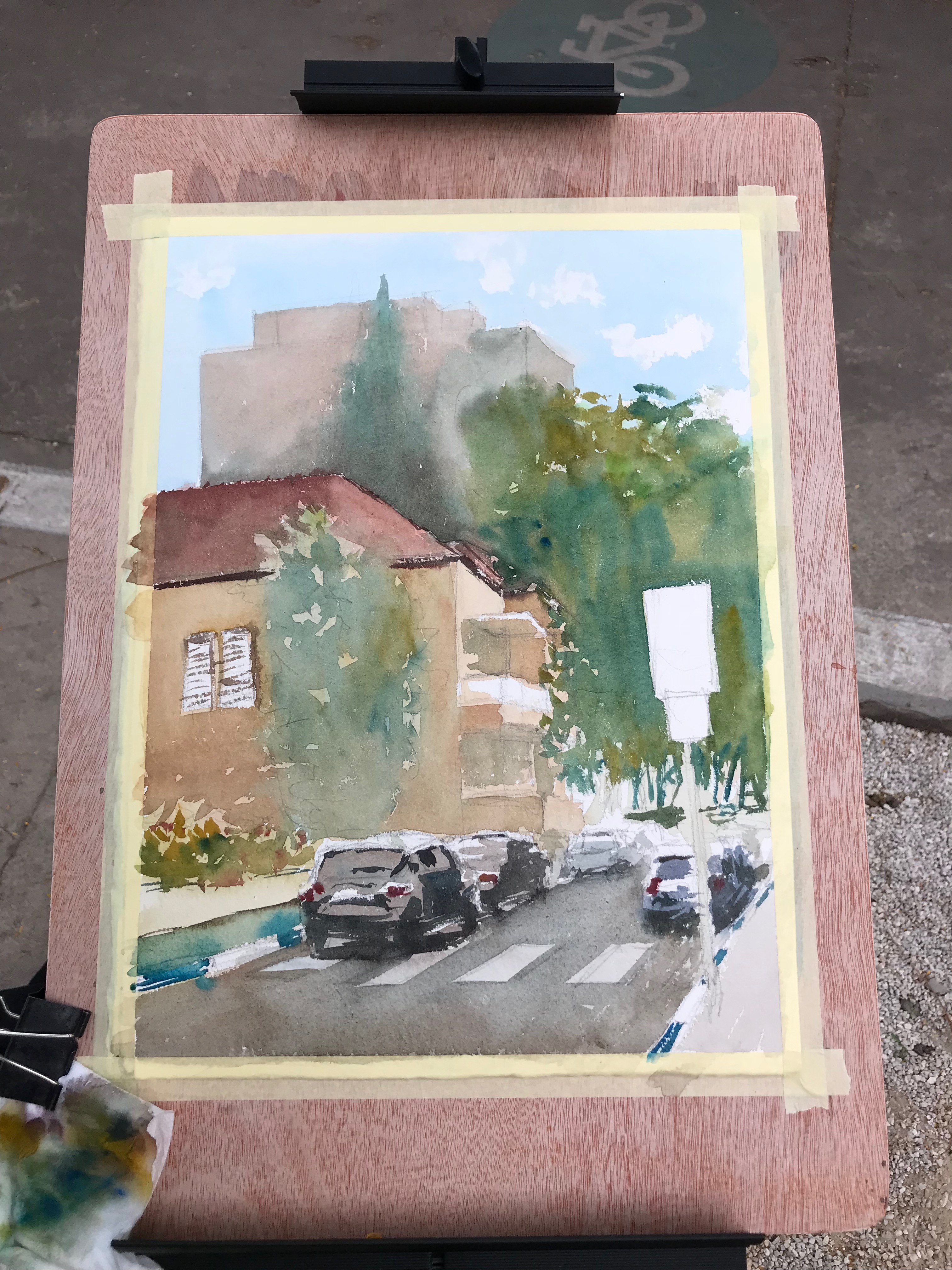
So here’s the scene I wanted to paint.

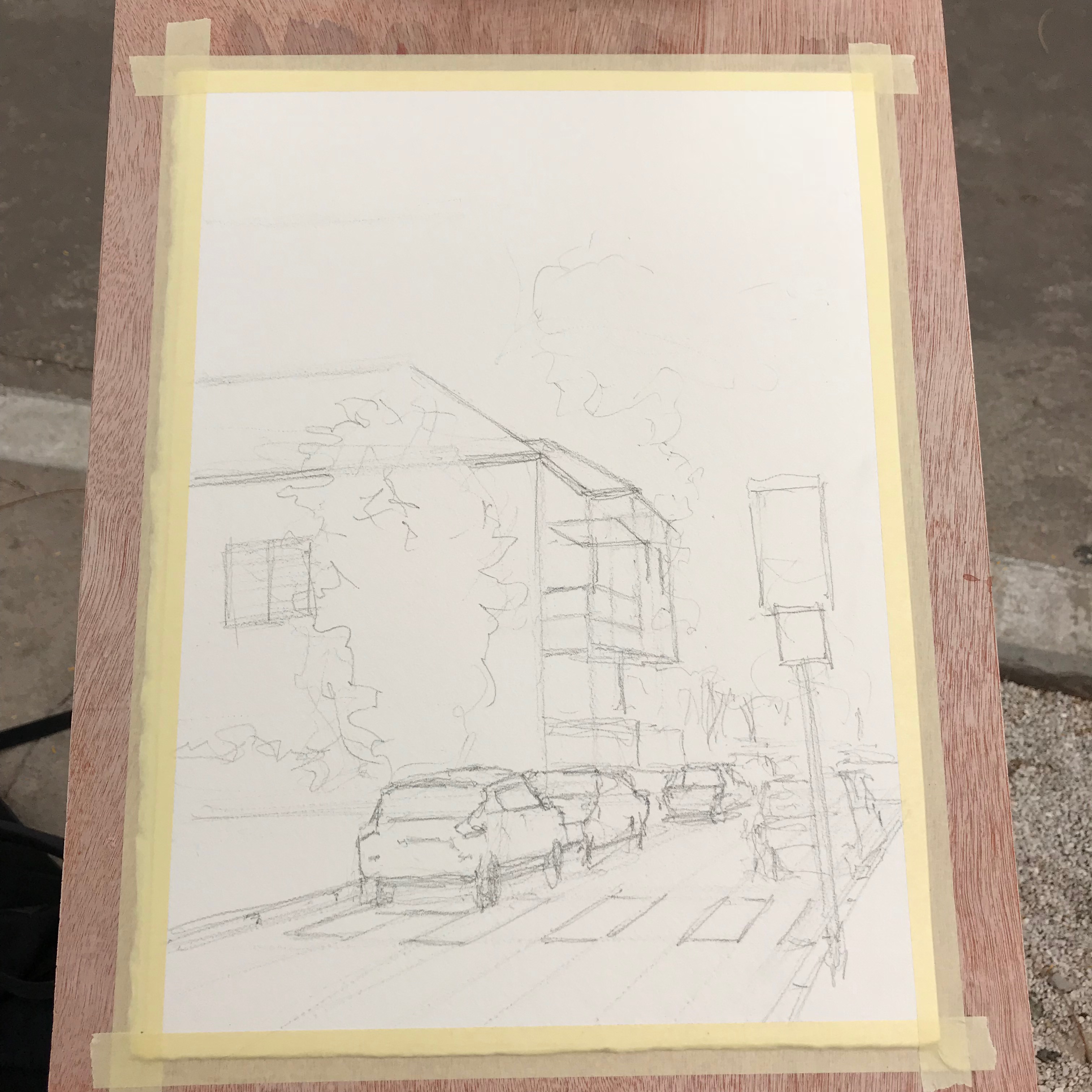
And here’s the drawing stage.

Notice it’s quite the busy scene. There are many cars, people and buildings. This was very challenging to break down.

I think this is actually one part where I “failed” with the painting process. With that being said, I still did a decent job simplifying it.

The funny part is that, I think, the drawing itself is inaccurate, especially in regards to its perspective.

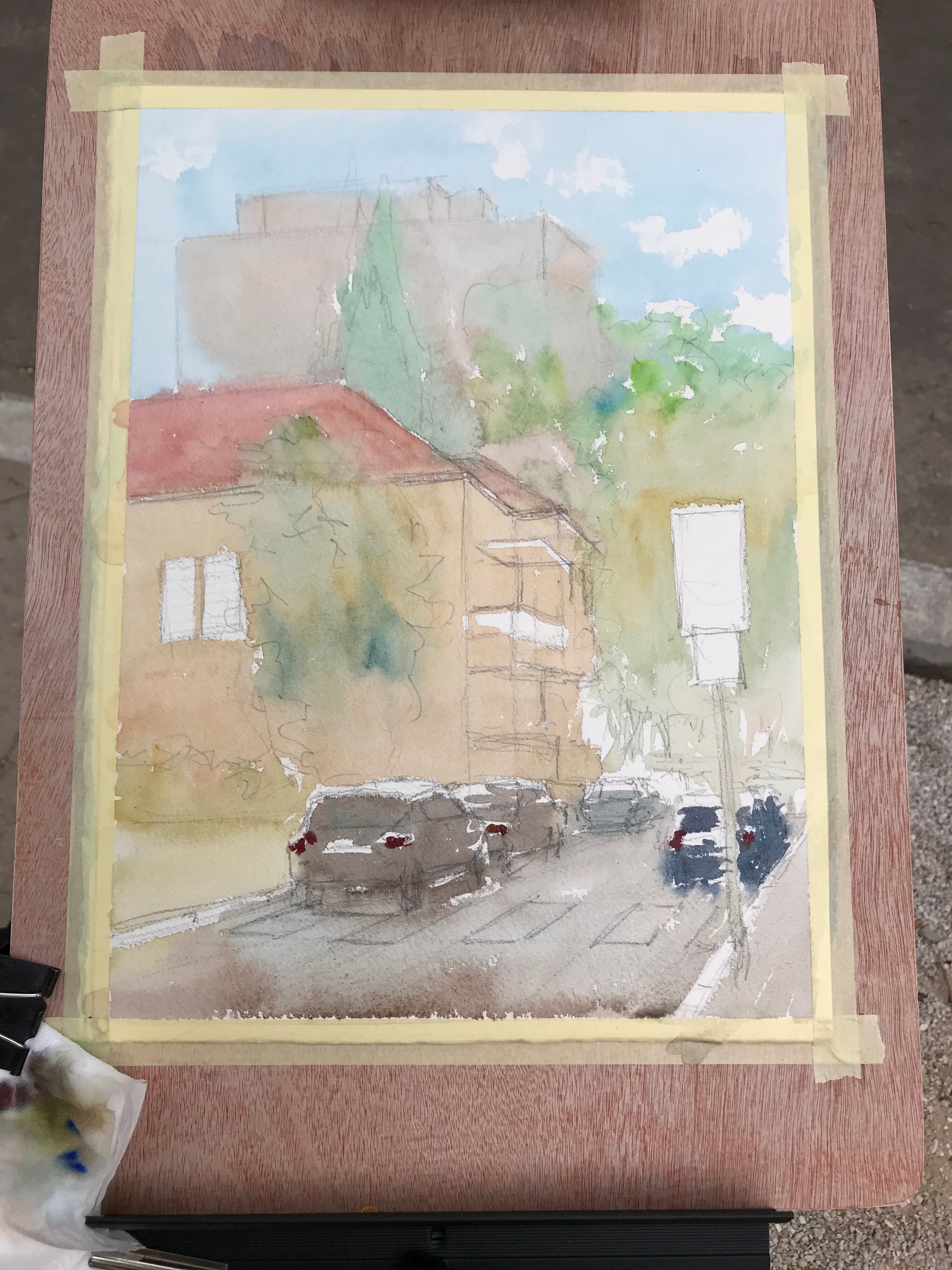
In any case – off we go with the first wash.

First Wash

This is exactly where I wanted to keep the purity the most. I found out it’s important to get it right in this particular step.

The reason stems from the transparency of watercolor. If you start of with over-mixed, muted colors, the next wash may still show them through. And so, glazing yellow over muted blue won’t do much good (;

Next, we have an additional wash.

Second Wash And Beyond

I’ll admit, this isn’t the best of my work. But I was able to improve the purity.

In this stage it’s important to still use vibrant colors. This is true especially for the areas you want to keep colorful.

After that, I continue adding more layers.

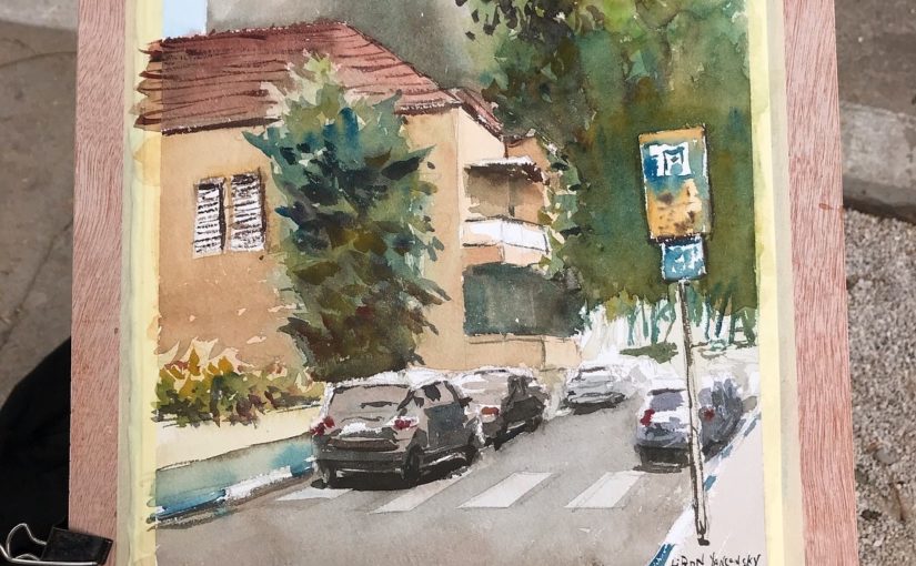
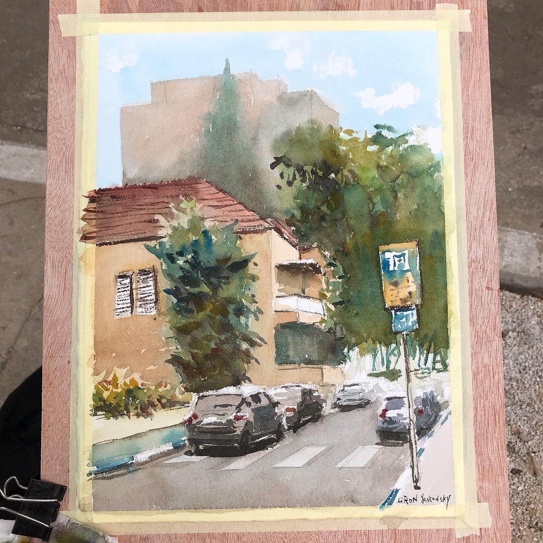
And this is the final result!

I went for a rather complex scene, and challenged myself to try something new. This is why I’m very pleased with the result.

Putting Pure Colors in The Correct Context

It’s important to remember that this is one particular approach out of many. It doesn’t mean you have to ALWAYS ALWAYS keep your colors pure, or avoid grays.

This is a tool to be used at the right moments. You can use it, perhaps, to direct the viewer’s eye in some way. You could use it to create a focal point or area.

And this is it for today. I hope you enjoyed this one! (:

Let me know what you think in a comment below, or under the video.

Also, if you enjoy my content – consider supporting me on Patreon. This REALLY helps (:

And I’ll talk to you soon.

– Liron

Artistic Project Management | Liron Yanconsky’s Podcast – Episode 16

In this episode we’ll talk about artistic project management, and how to efficiently manage your time as an artist!

My “History” of Productivity

In this episode I explain how I got started with my art business.

In the beginning I didn’t have a clear vision of what I want to do and achieve. Ands so, I was working on specific projects.

The first projects I worked on were my early books. I had a one track mind back then, and would often work on that project for 12+ hours a day.

Later on I started developing a clearer vision of my mission, and the type of work I want to do in this world. This inevitably created a multitude of tasks, goals, projects and products I had to tackle.

Merging Similar Tasks

One of the most efficient “tricks” I found was to merge similar tasks together.

I discovered this by accident. While I was working on writing and illustrating one of my books, I realized it takes some time to “warm-up” to the task at hand.

So I discovered it would take me around 15 minutes to really get in the groove of writing. I also found out that the more I stick with it, the faster I become and the more coherent my ideas become as well.

This led to an important understanding. When you are already immersed in a task – BETTER KEEP AT IT for as long as possible.

This also needs to be put in the context of your entire work day as well. How much time CAN YOU afford to spend on this particular task? How important is it? How urgent?

My Productivity So Far in 2018

I also briefly discuss wrapping-up 2017 and my productivity up to the point of recording the episode – for 2018.

2017 was great for me. It was a year of clarity. A year of defining my mission and sticking to it.

I can honestly say I have no regrets for 2017. This is a huge source of motivation for me in general – having no regrets.

Artist Corner

In this episode we talked about Piet Mondrian. He was a very well known Dutch painter and theoretician.

He is most famous for his works revolving squares in different colors and compositions.

He is regarded as one of the greatest artists of the 20th century.

What I love about artists like him is that they HAVE THE ABILITY to paint realistically, if they choose to. But they deliberately choose their impressionistic, figurative or abstract style.

They don’t go for abstract due to lack of ability (not to say artist who do abstract have no abilities, but it seems like the skill set of painting realistically requires SO MANY additional skills).

They go for abstract because they are genuinely exploring different territories, and expressing complex ideas and thoughts using their art.

Here’s a great place to start reading more about Piet Mondrian.

Conclusion

And this is it for today’s episode. I hope you enjoyed it!

Here’s where to find me:

Support me on Patreon

Check out my YouTube Channel – Liron Yanconsky

Or ask me questions on Instagram – @LironYanIL or Snapchat – @LironYan3.
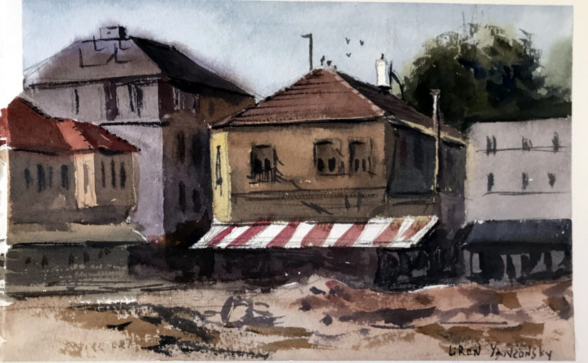
Undersea Green – Daniel Smith Watercolor | The Paint Show 23

Hi there, today I want to share with you my review of Undersea Green by Daniel Smith.

You can see the full episode of The Paint Show here:

And if you want a written version, read on (;

Undersea Green – Daniel Smith Watercolor

I originally got this paint together with Daniel Smith’s Secondary set. In fact, this review will wrap up the series of The Paint Show episodes regarding this set.

I really loved this one from the beginning, and it’s special characteristics impressed me (you’ll soon see what I refer too).

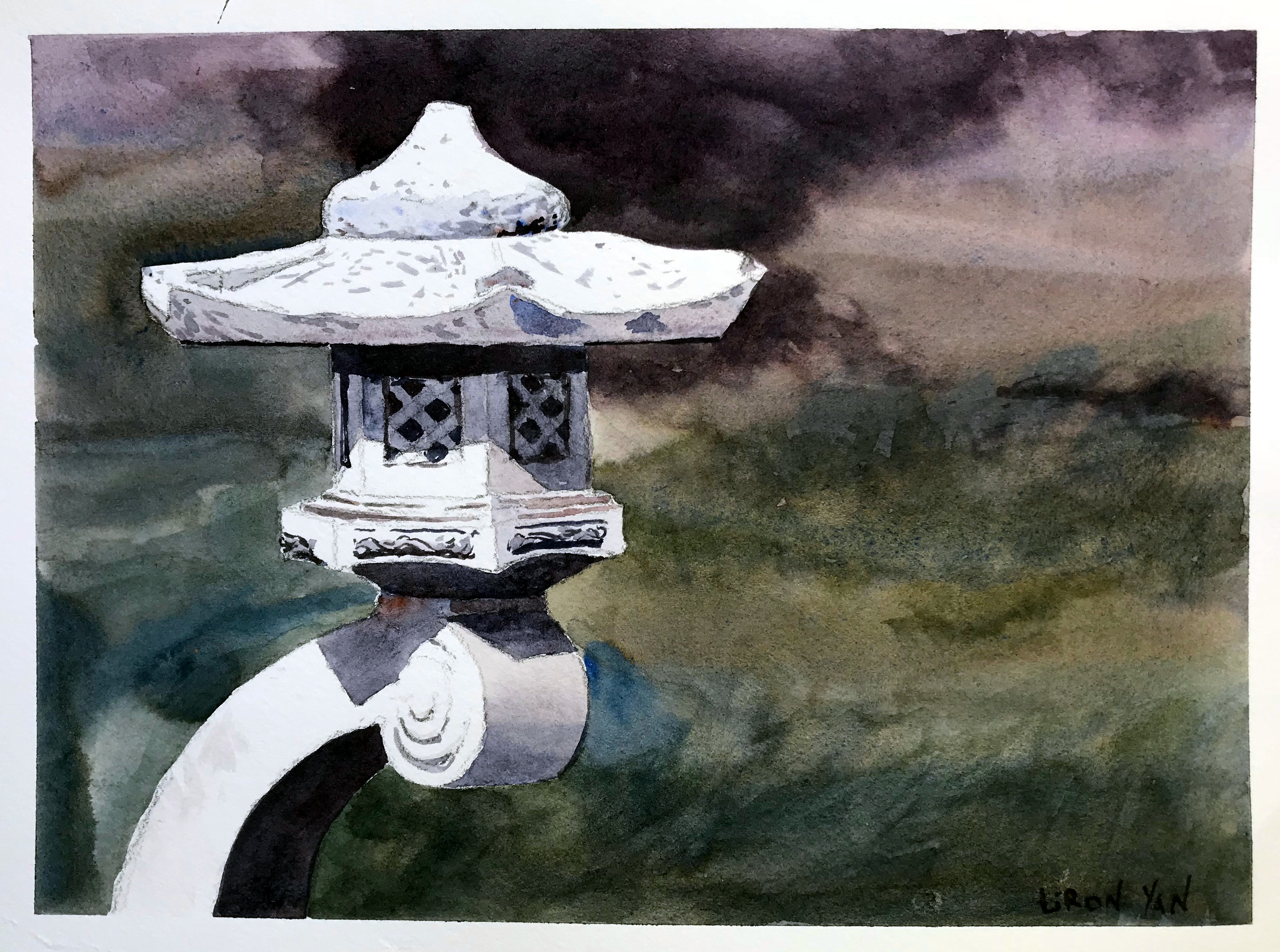
With time I started using it extensively for foliage, leaves and trees. I used it (together with Carbazole Violet) as the background of this painting.

I especially love to mix it with blues and yellows (and even reds!) to create a variety of greens.

Paint Info

Undersea Green is made of three different pigments:

  1. Ultramarine Blue (PB29)
  2. Quinacridone Gold (they say PO48, but that’s the pigment for Quinacridone Burnt Orange, which is a little strange. Quin. Gold should be PO49).
  3. Nickel Azo Yellow (PY150)

This makes it rather simple to mix, if you want to create if for yourself (assuming you can do so without Quin. Gold, which sounds possible).

Some more stats:

  • Series 1 – so cheaper than Quin. Burnt Orange.
  • Semi-transparent
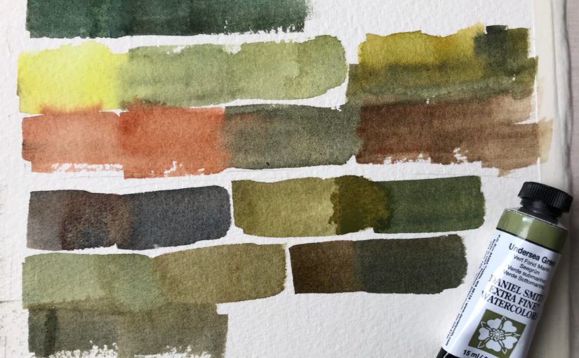
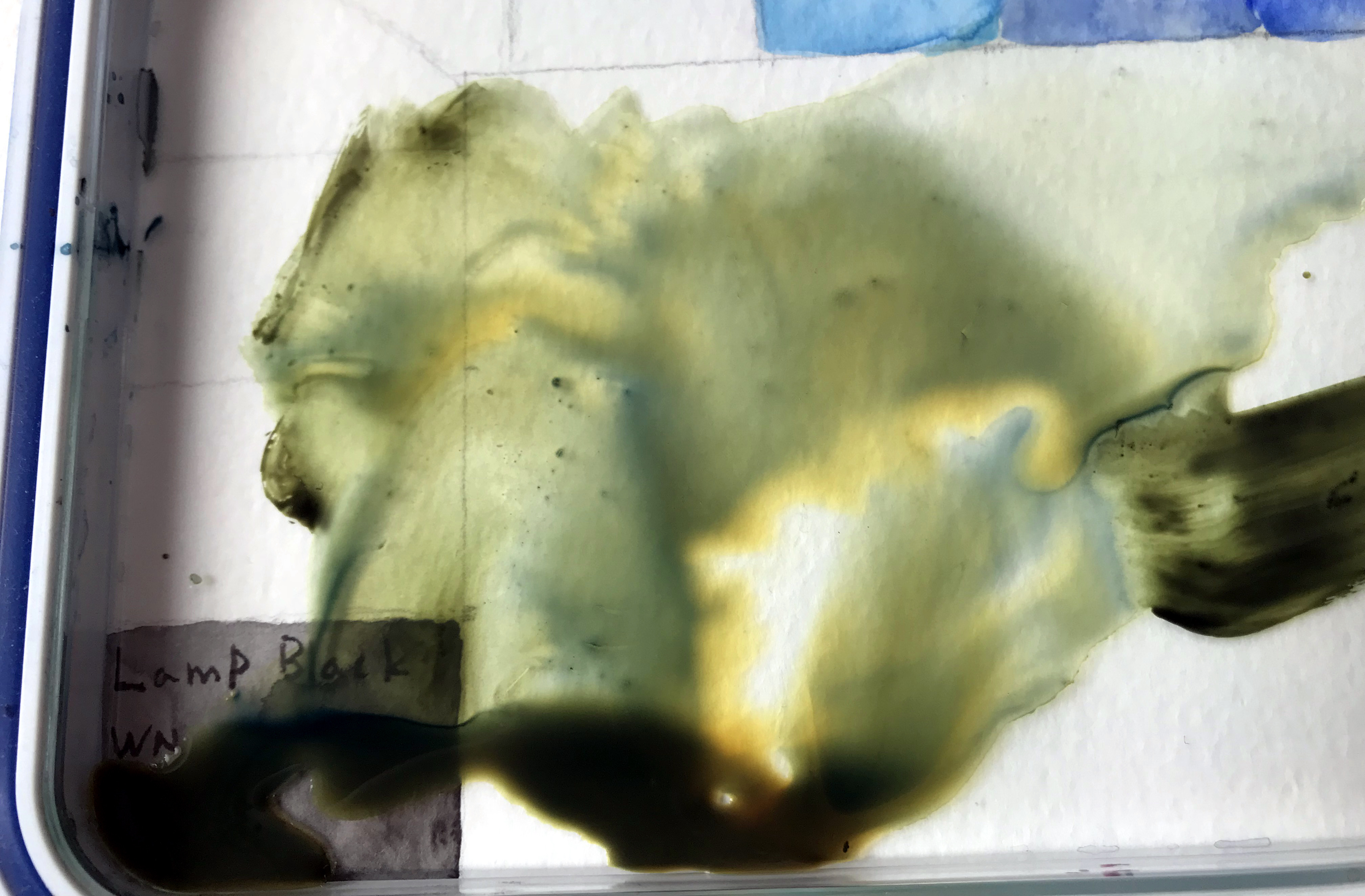
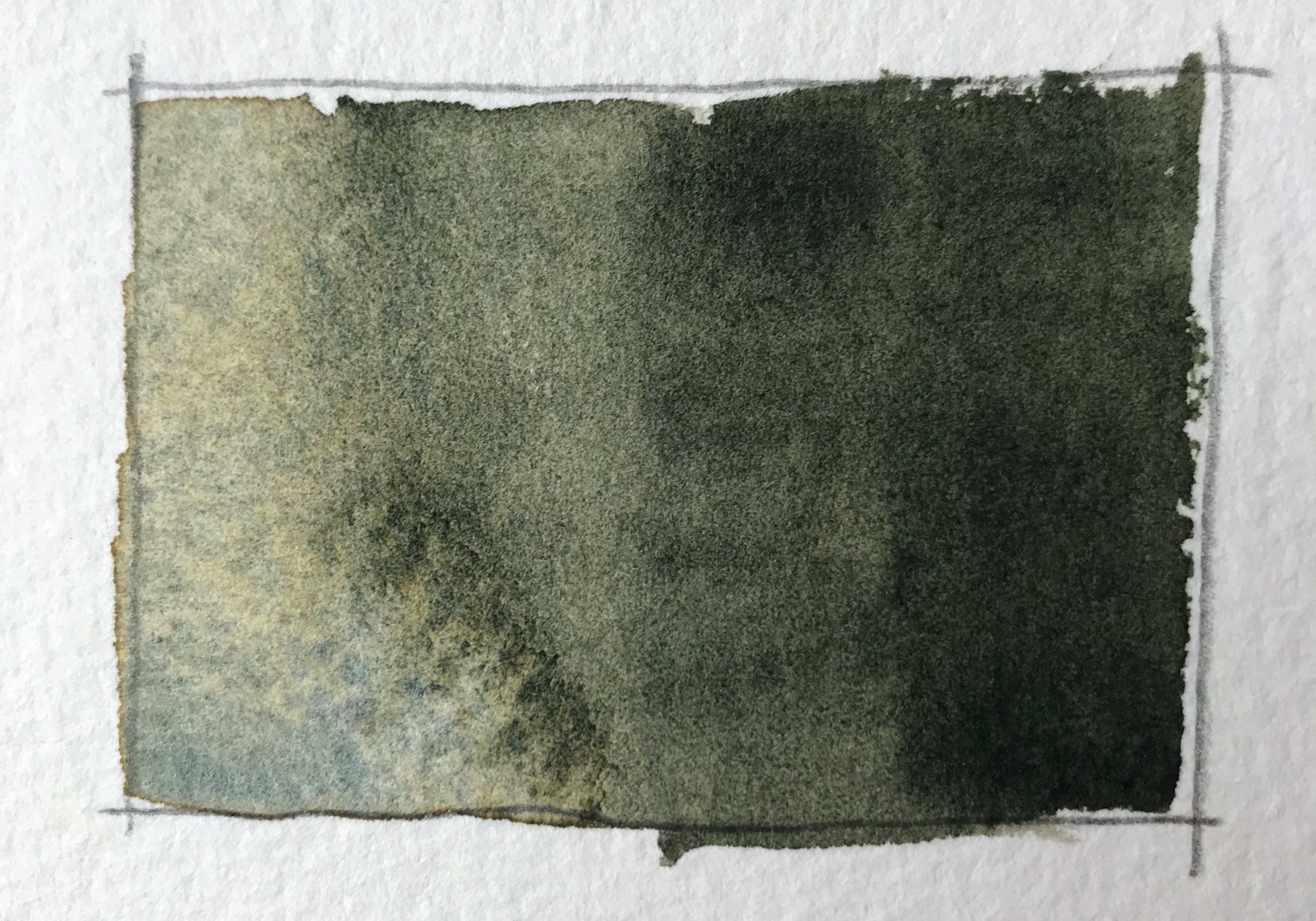
  • Granulating (with a beautiful effect too! The blues and yellows separate)
  • Medium-high staining.

This color is highly pigmented and is easy to achieve dark values with.

Here’s what the pigments look like when they separate into blues and oranges / yellows:

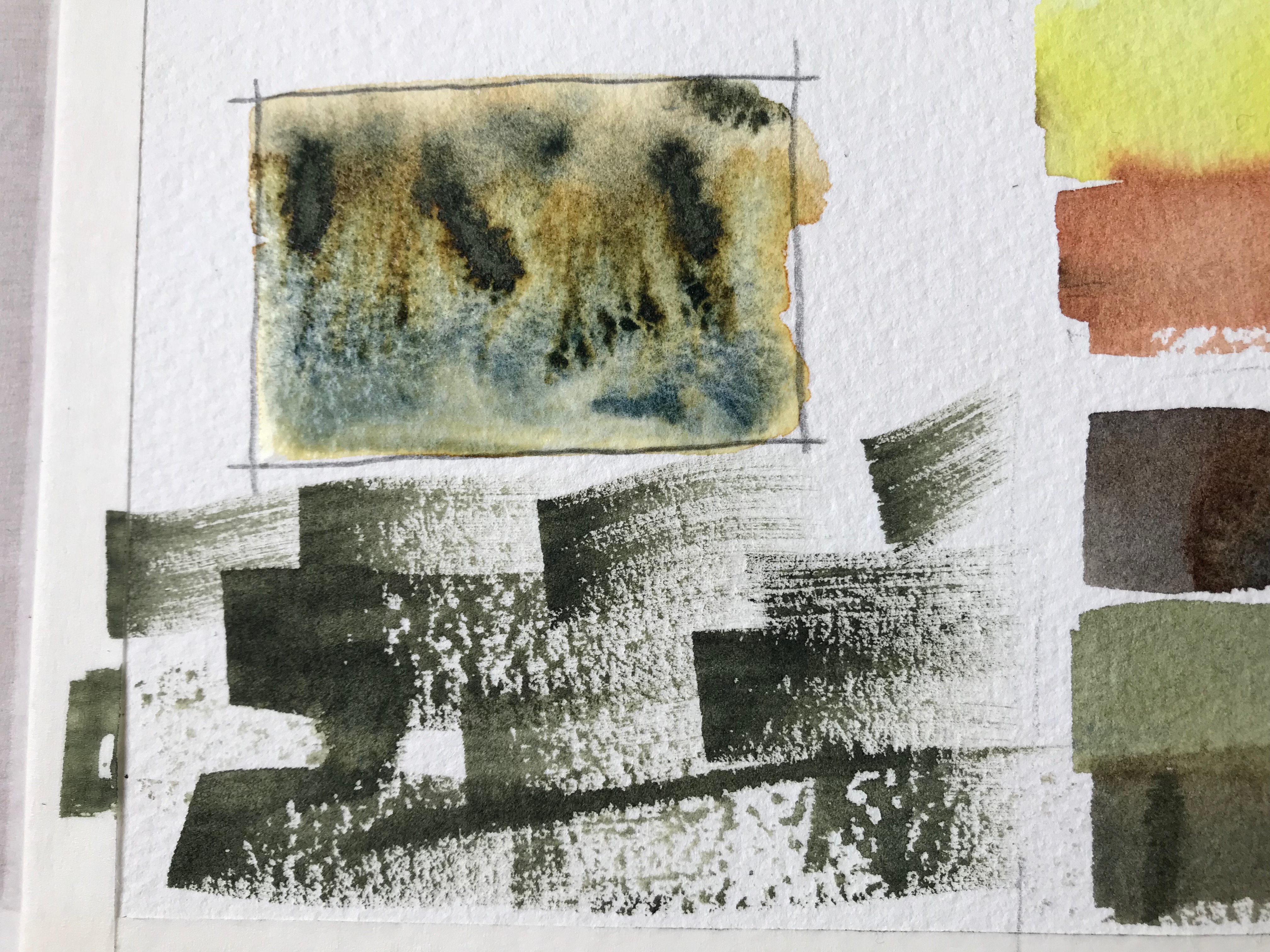
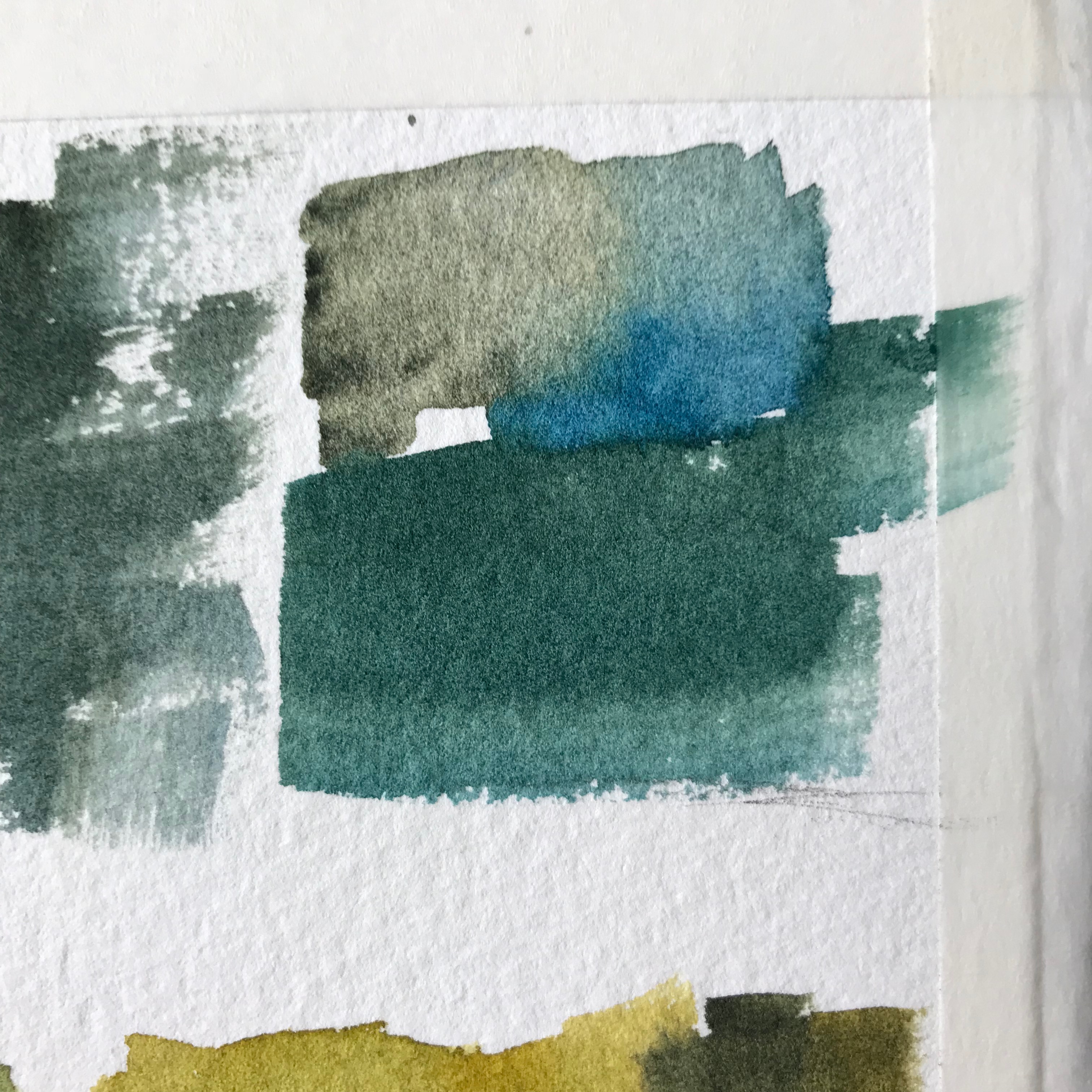
In the video I demo what this paint looks wet on dry, wet-in-wet, and using dry brush strokes.

Here are some examples.

Conclusion

I think this is a very useful color, and I definitely prefer it over more “artificial” looking greens such as Sap Green (which used to be a favourite of mine).

I like my colors to have many uses for me and be versatile, so this is a great one in my opinion.

If you want to get it, here are affiliate links (I get a small commission and you pay the same price):

Undersea Green Tube: http://amzn.to/2EZSwWM

Daniel Smith Secondary set: http://amzn.to/2FzE20T

If you are interested in the other two colors in the set (Quin. Burnt Orange and Carbazole Violet), I highly recommend getting the set. It ends up being much more cost-effective (:

And this is it for today. I hope you enjoyed this one, and we’ll talk soon!

– Liron

Don’t Worry About Inconsistent Artistic Results | Liron Yanconsky’s Podcast – Episode 15

Episode Summary

In this episode I want to share with you an epiphany I’ve had following a conversation with a friend of mine.

I bumped into her as I was painting, and we talked for a while. I shared how I recently feel like my results are inconsistent.

Here response really surprised me. She simply said that OF COURSE it’s going to be inconsistent. It’s art!

This really got me thinking.

I finally came to realize after a while – OF COURSE she’s right. Art and creativity are BY DEFINITION inconsistent.

That’s their magic! If they were consistent, they’d also be boring!

Artist Corner

In this episode we talked about the artist Lora Zombie. She’s an extremely talented Russian painter.

She often expresses different ideas and messages through here work. Her style has this unique POP to it (she refers to it as grunge art), and her favorite color seems to be blue.

She does exhibitions and galleries all around the world, and also makes and sells clothing items featuring her art.

Be sure to check out her work on her website (http://lorazombie.com/), or on Instagram HERE, or @LoraZombie.

Conclusion

And this is it for today’s episode. I hope you enjoyed it!

Here’s where to find me:

Support me on Patreon

Check out my YouTube Channel – Liron Yanconsky

Or ask me questions on Instagram – @LironYanIL or Snapchat – @LironYan3.