I have to say a word about the set. It’s really useful, and very cost-effective. Each of the paints are useful on their own. I would highly recommend getting it.
Conclusion
If you love Daniel Smith paints, I’d look into this one. It’s a good, neutral yellow to have.
Despite me not liking the set AS A SET, I would recommend getting it. That is because the individual paints are great in their own right.
I hope you enjoyed this one, and I’ll talk to you again real soon!
Hi there! Today I want to talk to you about the SAA watercolor Paints.
I reviewed them extensively in this YouTube video:
If you want to read more, scroll below.
SAA Watercolor Paints
I was sent these by one of my followers, Chris. He recommended I give them a try and I absolutely loved them!
I’m writing this quite a while after publishing the video. With this larger perspective I can say these are really high quality.
These paints behave the way I want them to. I find I have great control with them, but they still do what they want.
They are strongly pigmented, easy to activate and are very fun to use. They also have great lightfastness.
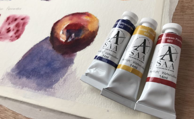
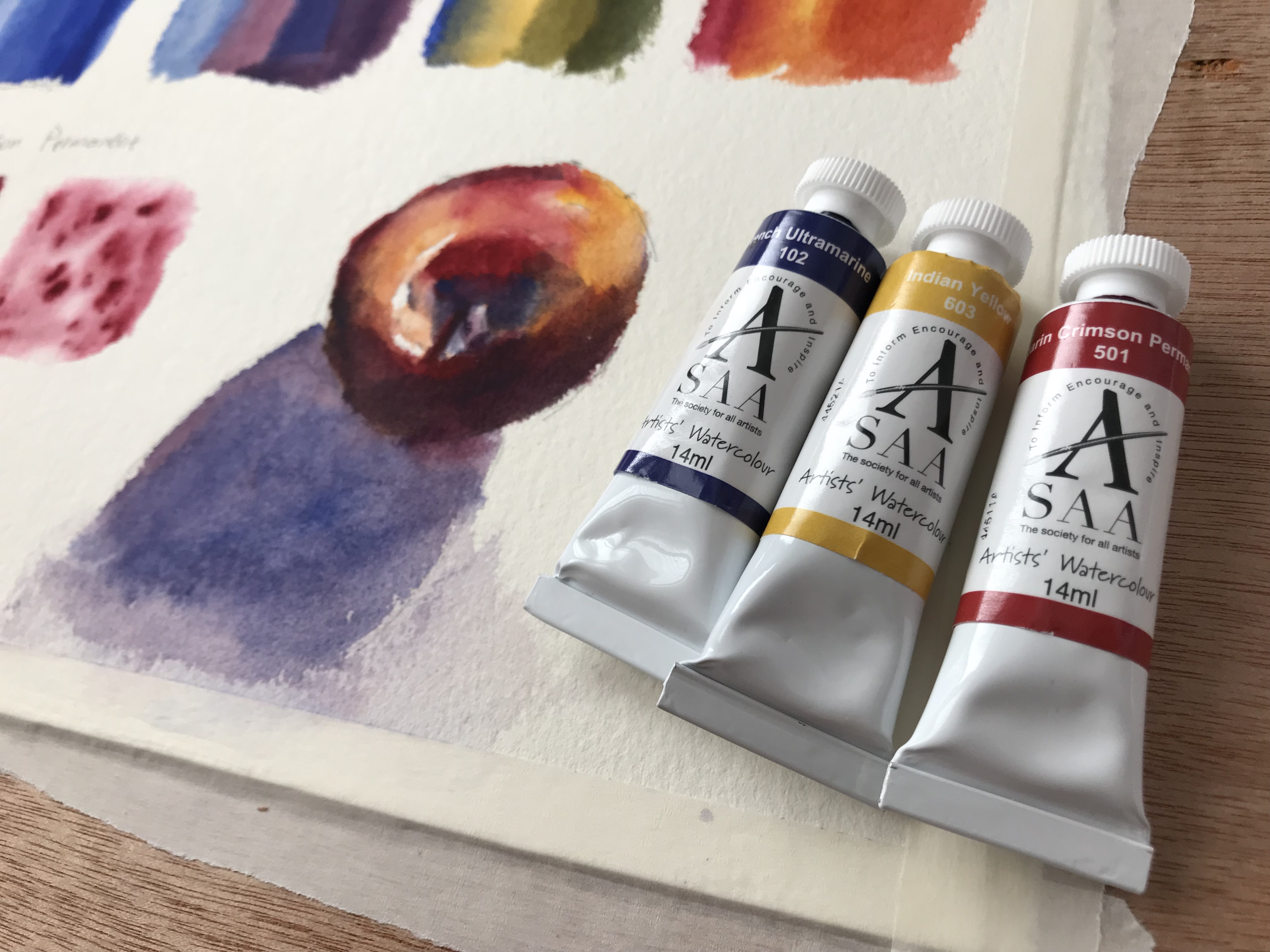
The Paints I Got
I got three paints:
1. Indian Yellow
2. Alizarin Crimson Permanent
3. French Ultramarine
Individually they work great. I would, in terms of combos, maybe replace the French Ultramarine with a cooler Phthalo Blue, but that’s just my personal preference.
Detailed Paint info
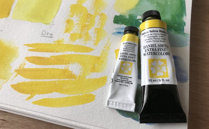
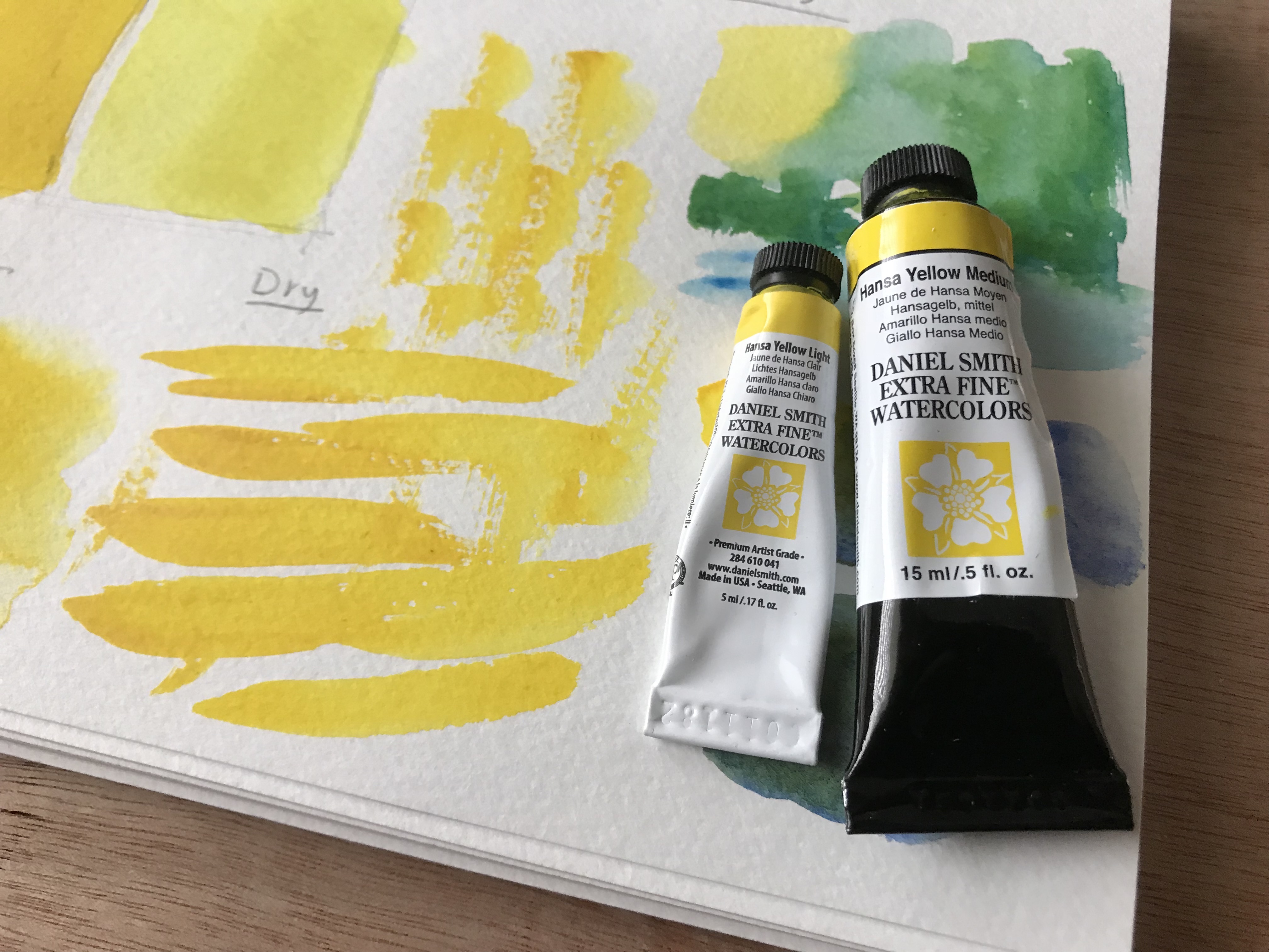
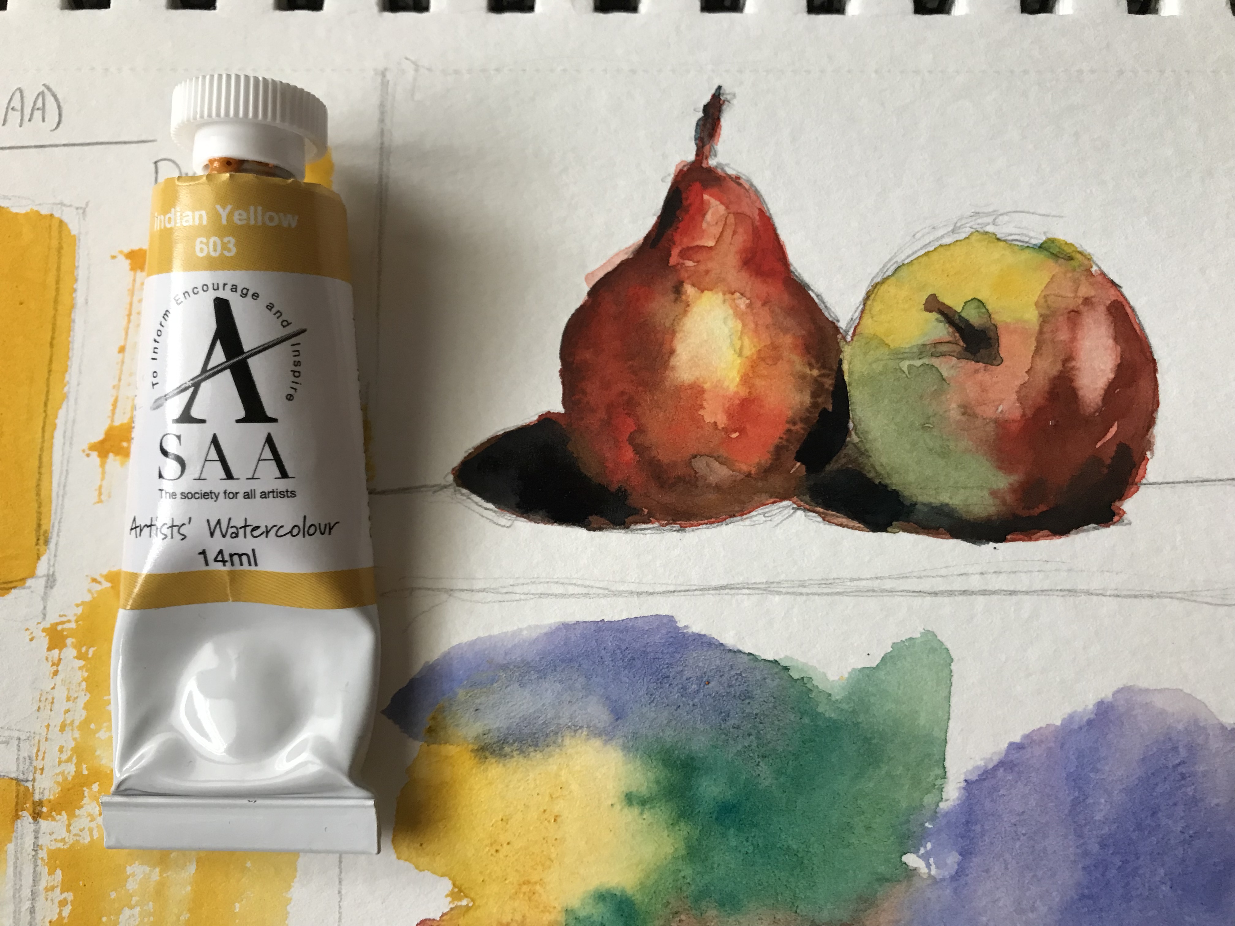
1. Indian Yellow
A beautiful warm yellow.
Pigment: PY3 (Hansa Yellow)
Semi-transparent
Lightfastness: A (best)
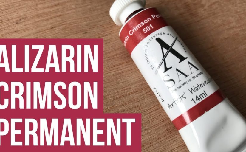
2. Alizarin Crimson Permanent
A strong Alizarin Crimson.
Very well-pigmented and saturated.
Pigments: PR177 (Anthraquinone Red) and PV23 (Dioxazine Violet)
Transparent
Lightfastness: A (best)
3. French Ultramarine
A beautiful warm blue.
Pigment: PB29 (Ultramarine Blue)
Semi-transparent
Lightfastness: A (best)
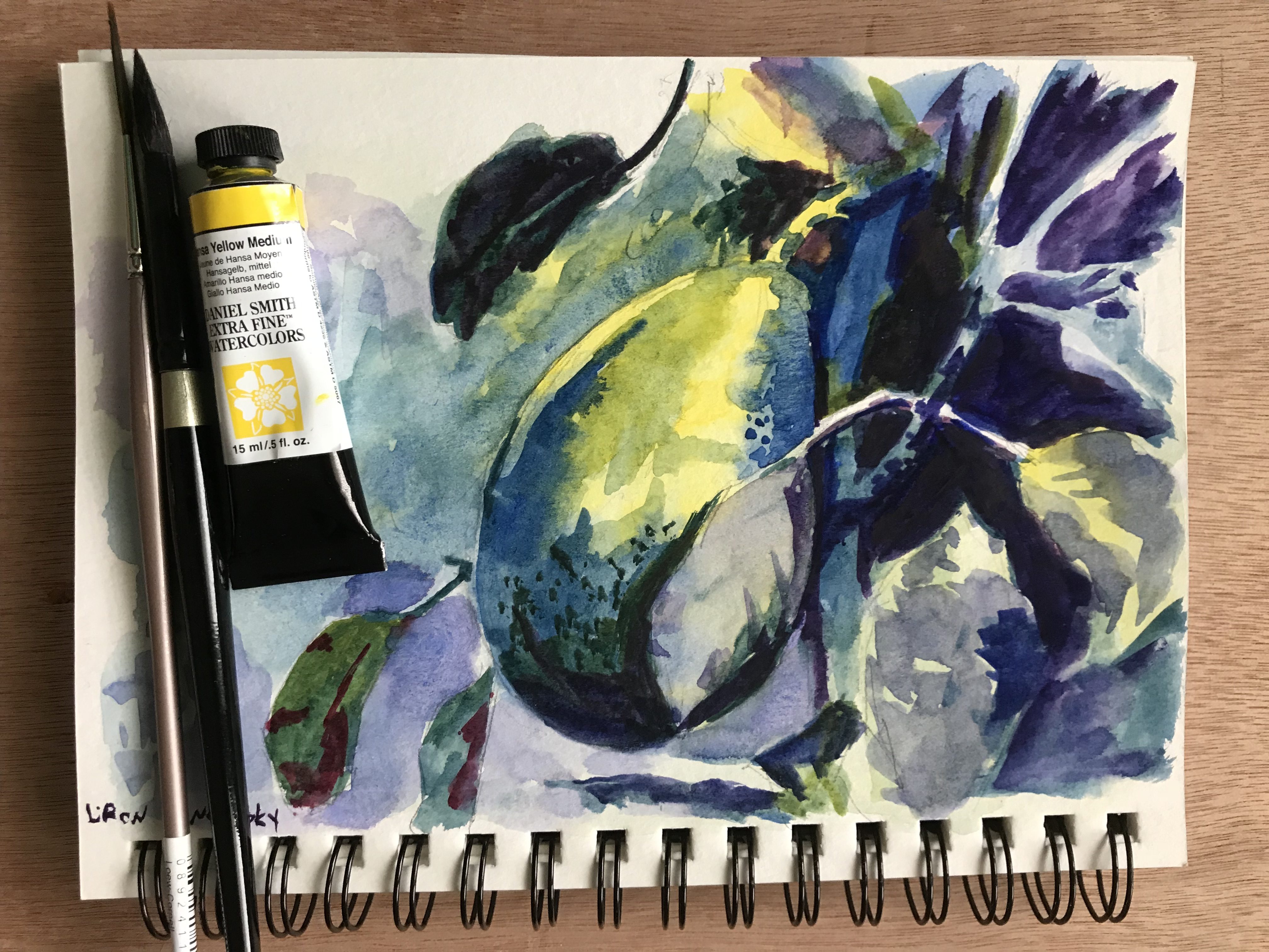
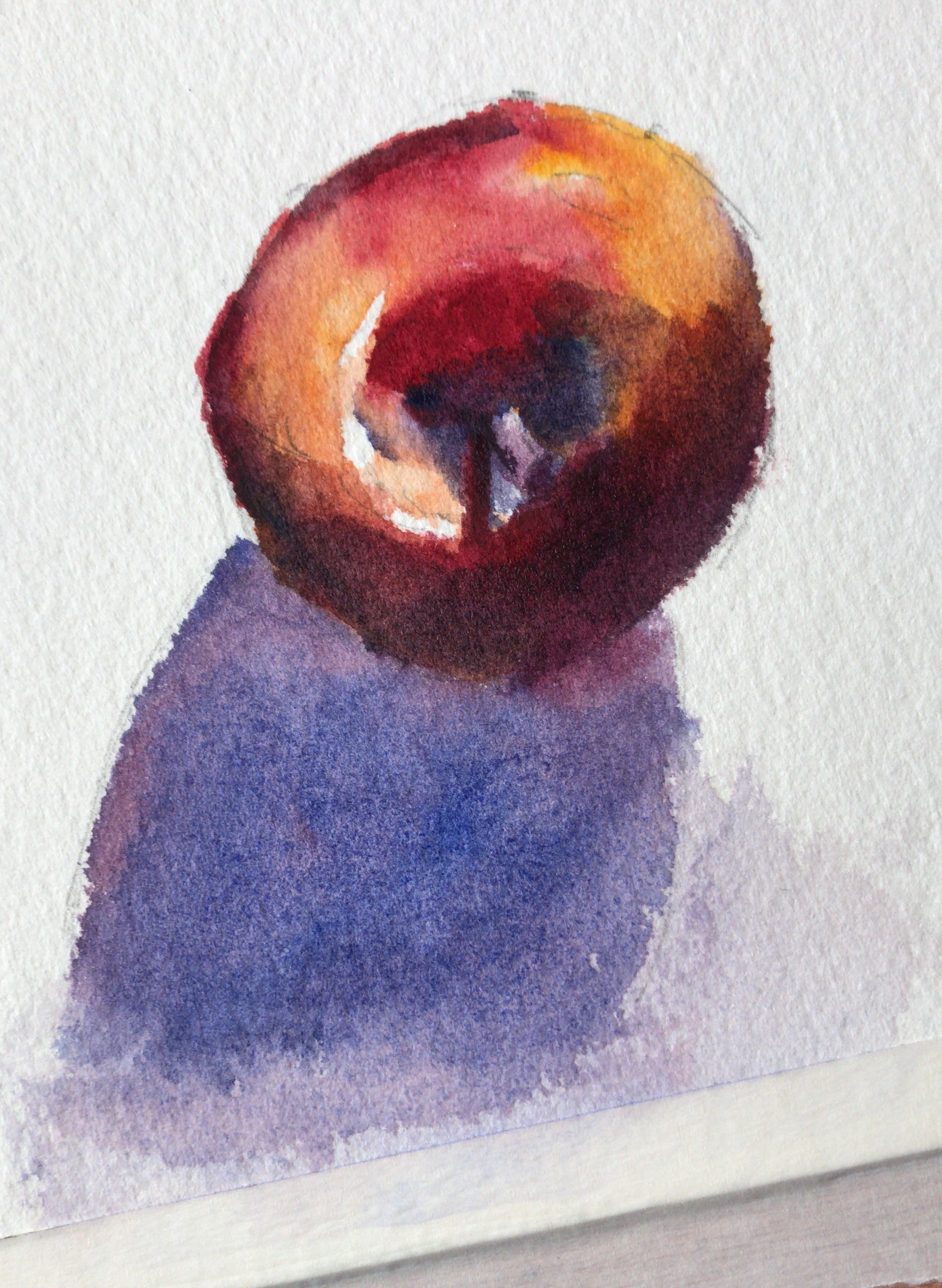
The Results
Here are some still-life results I got with these. I really love them!
Where to Purchase SAA Paints
These are very unique. SAA stands for The Society for All Artists. It is a UK based brand, that has a strong community around it.
They offer several plans that make their tools and paints significantly cheaper. They also don’t have series for their paints. All paints are priced equally.
If you reside in the UK I’d highly recommend giving them a try (although it’s worth mentioning they have an international plan as well).
Here’s the complete review on YouTube. Read on for the written version (:
Cobalt Blue by ShinHan PWC
I purchased this alongside their Cadmium Red Deep and Cadmium Yellow Deep.
I really love this paint and have used it EXTENSIVELY, in many of the works I shared with you here and on Instagram for the past several months.
Here are some of my works showcasing it.
Cobalt Blue – Paint Info
Pigment: PB28 (cobalt blue).
Semi-transparent
Lightfastness 3/3
Series D (almost the most expensive on the A-E scale)
My Only Complaint With Cobalt Blue
My only complaint with this paint is that it doesn’t achieve dark enough values. It’s not as light as some ceruleans I saw, but it’s still not as dark as many of the Phthalo Blues and French Ultramarines.
I think this could work to your advantage if you are painting in a softer style. For me however – I love strong contrasts at times. I love to use a wide range of values.
Another issue caused by this is that it’s hard for the blue to be dominant when mixed with the red and yellows I purchased (partially my fault, as they are more opaque).
I do love the way it looks
With that being said, I produced many beautiful paintings with it, and love the way it looks.
I’d recommend getting it as a part of a gentle trio, alongside lemon yellows and rose-like colors.
Where to get it
These sell on Amazon as sets. I’m not usually a big fan of watercolor sets, but for the price point – these may be worth it.
Here are affiliate links (I get a small commission, you pay the same price):
Hi there! Today I want to quickly let you know about my favorite watercolor paper(s).
This really is a personal matter, so don’t worry if our opinions are different. That’s what opinions are for (;
Here’s the full video. For a written version, read on.
In Watercolor, Paper’s IMPORTANT
I want to preface this by saying that paper really matters when it comes to watercolor painting. It has to be of good quality.
I find that I can work well with simple brushes and ok paints. But the paper is crucial for success.
Cold-Press VS Hot-Press
These are the two main watercolor paper types.
Hot-press paper has a soft surface. Paint tends to sit a little more on its surface, and may take a little longer to dry.
Cold-press paper has tooth, aka texture. It tends to be a little thirstier in my experience. It tends to absorb paint faster.
I am an absolute fan of cold-press.
I love the texture and tooth. It’s very forgiving, and holds paint very well. It can be used to create different effects and “dictate” the focus in a painting, by using dry brush techniques.
An Argument FOR Hot-Pressed Paper
There is something to be said of the merits of hot-press watercolor paper. This type of paper allows for smoother transitions and edges. It’s considered more suited for portrait painting, and for works that require finesse and accuracy (which makes sense).
I also find that it’s sometimes easier to blend and soften edges in hot-press paper, though you have to know what you are doing. You usually need to dry the brush a little more (as the paper is smoother and a little more moisture in the brush can cause paint to spread more easily).
I think that the minimum is 300gsm (grams per square meter). Under that you are risking with dealing with major buckling, especially in larger sizes.
I actually love to use 600gsm paper, but it’s not a necessity. That’s me being spoiled haha.
Favorite Watercolor Paper Brands
I have two brands whom papers I love.
Arches and Saunders-Waterford.
These two actually feel REALLY THE SAME. I think I read once those are different lines of the same brand, thus the similarity. Though I don’t remember clearly.
These can take anything, multiple layers, lifting, scratching, whatever!
The paper I most commonly use in the last six months or so is Saunders-Waterford.
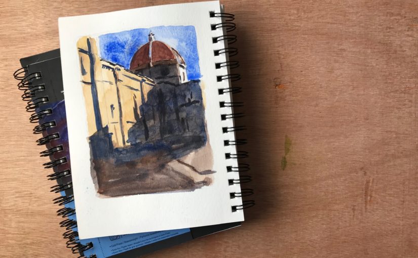
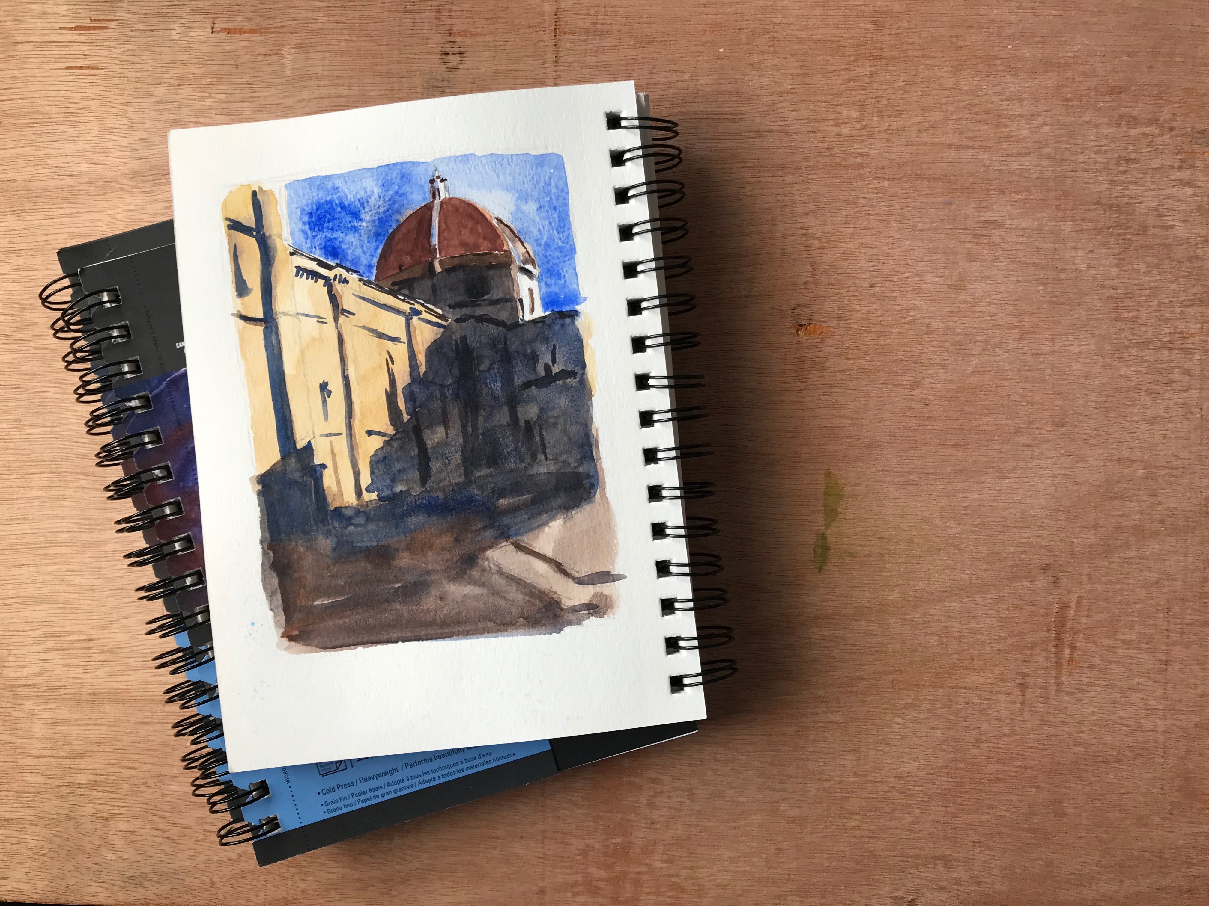
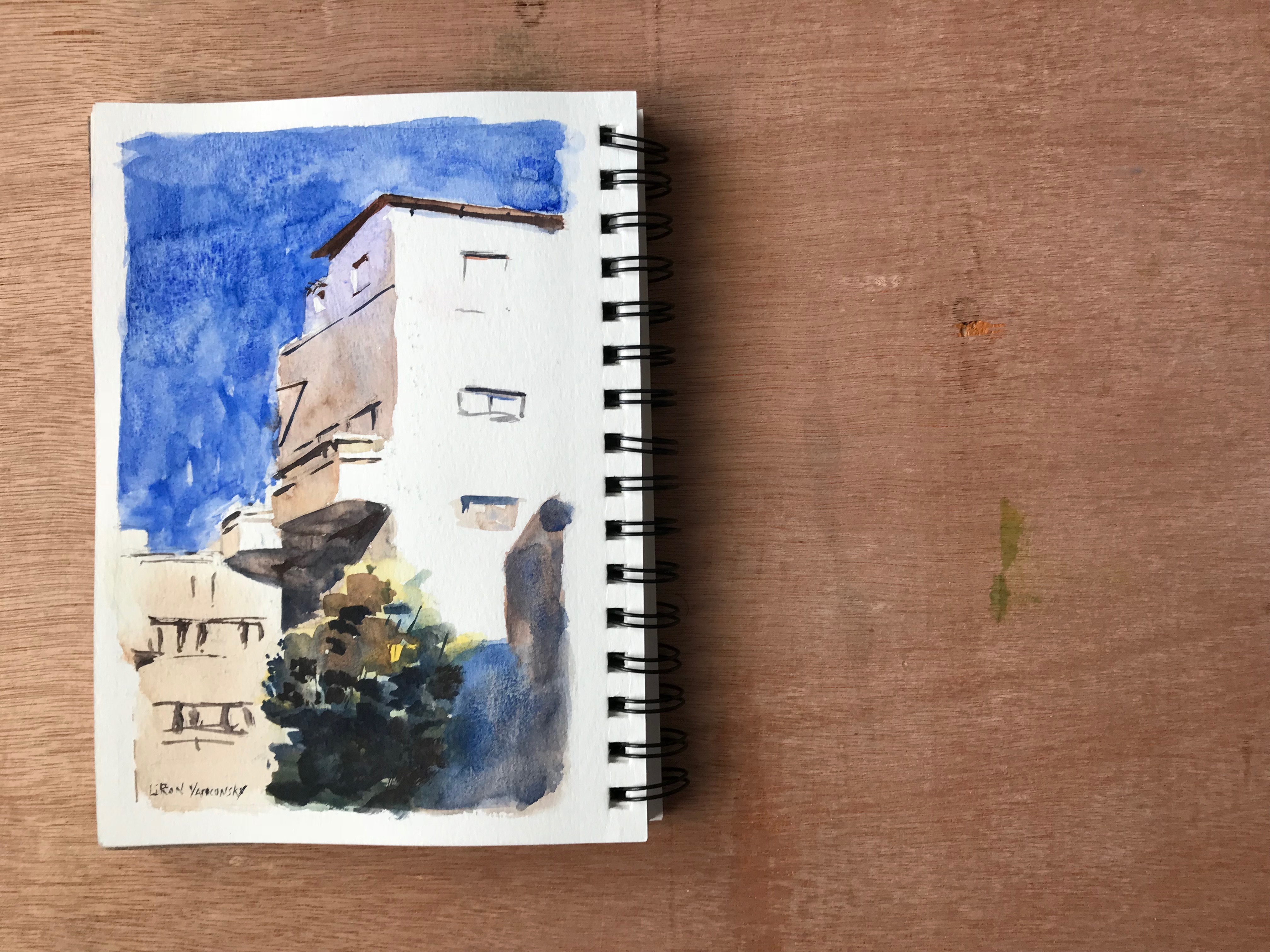
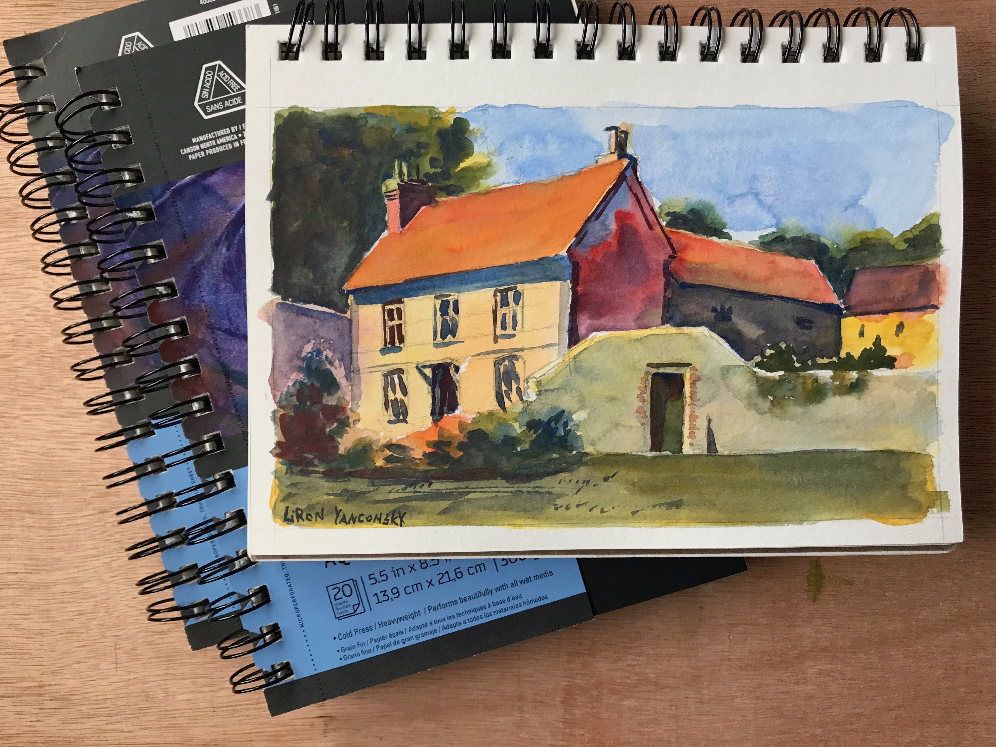
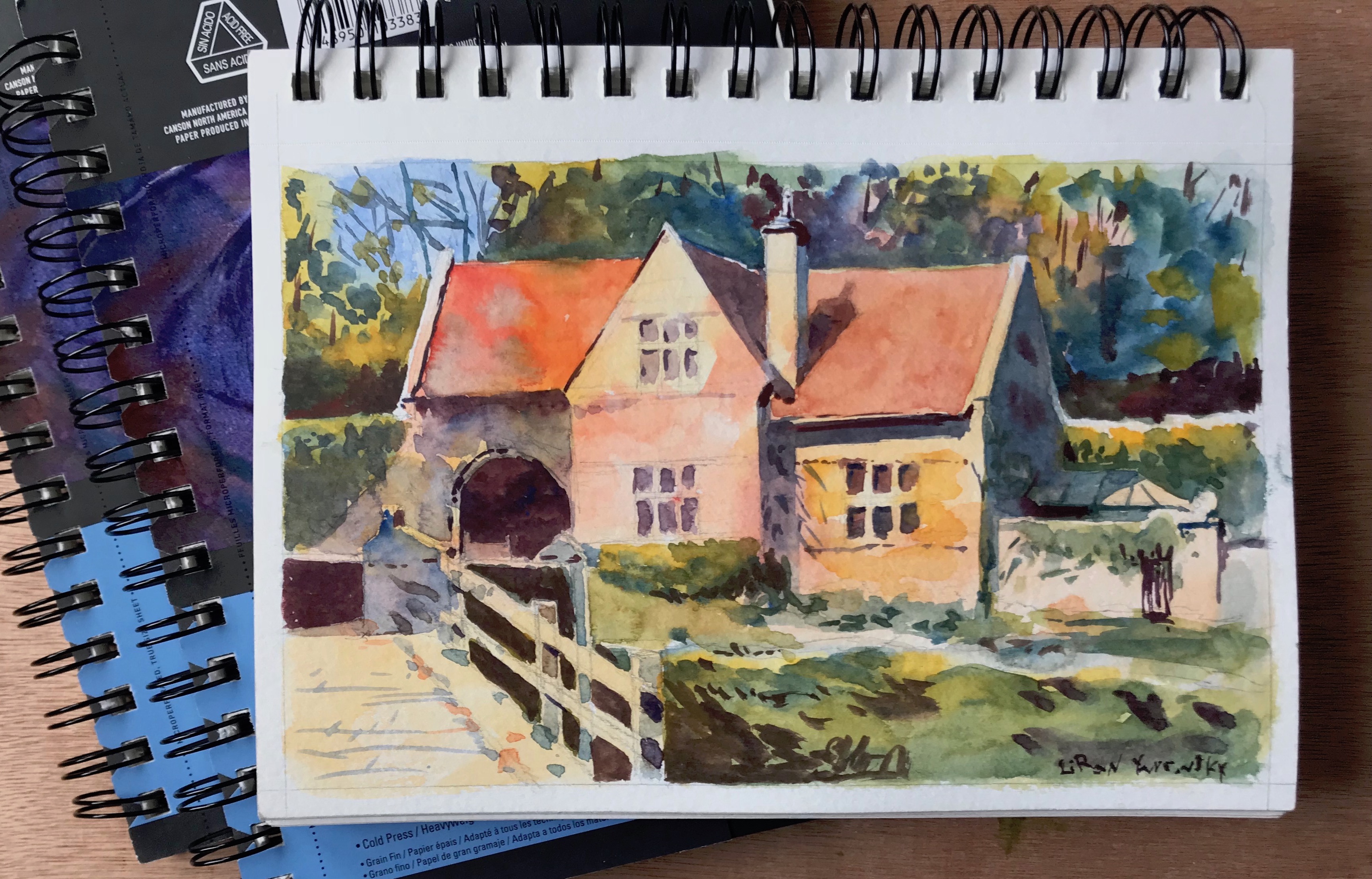
Sketchbooks
When in sketchbooks, it’s sometimes a challenge to find one with good paper.
My favorite would be an Arches paper organized as a sketchbook (haven’t seen Saunders-Waterford in that format.
However, there is a different type of sketchbook I like, and that is Canson Montval (and it’s not even cotton paper).
You can watch my review of it here:
Conclusion
I hope this gives you a clearer picture of the types of watercolor paper I love using. this