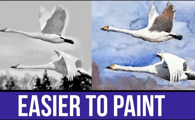
Hi there! Today I want to talk to you about making your photo reference easier to paint.
Painting as an art form poses innumerable challenges. as we improve, these challenges never really go away. We, however, get better at dealing with them and solving them.
Your Photo Reference Matters
As a beginner, you want to have everything work in your favor. A large part of that is painting from a good reference.
Anything can be painted, but the reality is that not everything is ideal as reference.
In today’s video I want to show you several ways of turning your photos into something that’s easier to paint.
Watch the complete video here, and scroll on for a written version (:
Make Every Photo EASIER TO PAINT
Finding Good Reference
I have several sources for great reference photos, that I also present in the video. Here they are:
These are all great. Generally speaking – Pixabay and WetCanvas photos can be used for anything (commercial or non-commercial).
Access to WetCanvas Reference Photo Library does require registration, which is free.
With Flickr you need to be a little careful, and filter according to the license. You can also always contact the owner of the photo and ask for their permission.
Choosing Good Photos
I’d like to say a few words about choosing good reference photos, and specifically for the purpose of painting and watercolor painting.
Clear and Focused
A good reference photo should be clear and well focused. You should be able to see all of the details.
Large Shapes
Also, it’s best if there are a few larger shapes that are very visible. What I mean by that is that the image isn’t a collection of tiny bits and pieces that don’t really connect to a cohesive subject.
This is why still-life arrangements, as well as portraits can be GREAT subjects. They are very clear and contain major shapes.
A cityscape, on the other hand (and this can very from one photo to another), has the potential of being a little “messier”.
Strong Contrasts
This is especially important if you are a beginner to watercolor painting. Photos that have sharper contrasts are simply easier to paint.
If you’ll try and paint a perfectly lit portrait, that barely has any shadows in it, and is full of gradual light changes – you may loose your mind =P
(check out the full video to see what I’m talking about).
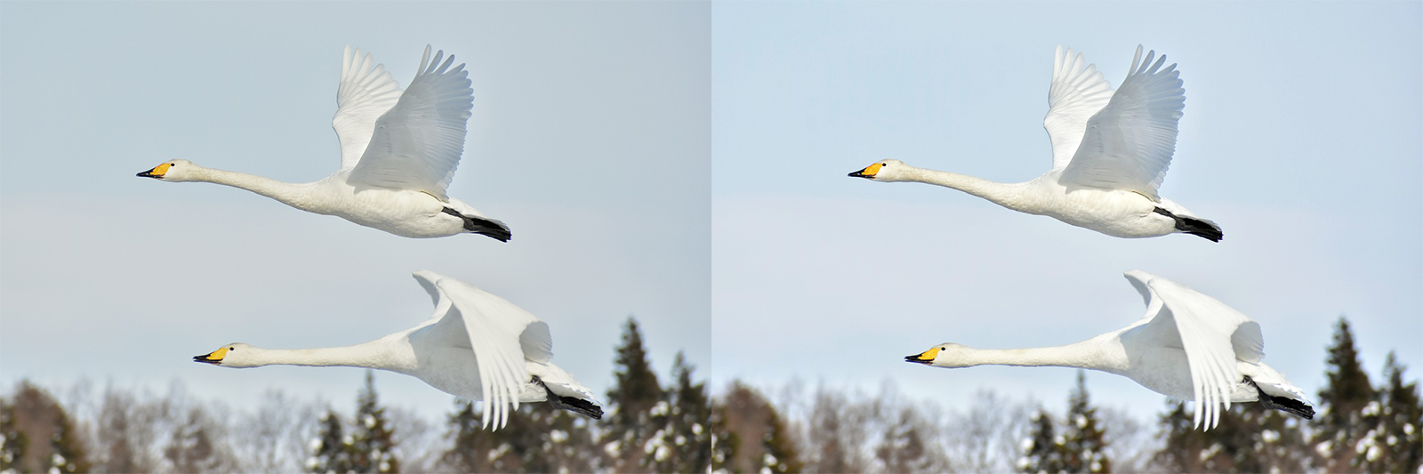
Improving Brightness, Contrast and Levels
This first step is always important. Watch to full video to see how I play with the histogram, but here’s what the effect looks like.
(left – before, right – after)
Editing Your Photo Reference – Black and White
The first advice I’d give you is to turn your reference from color mode to black and white.
This can be done easily with the simplest of photo editing softwares. And it will give you a much better look at the values (how dark or light everything is).
Here’s a comparison.
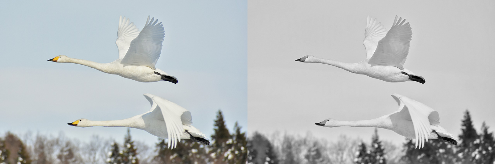
(left – before, right – after)
Editing Your Photo Reference – Posterize
Posterize is a handy function that’s available in most advanced photo editing softwares such as Photoshop and (god forbid) Gimp.
It allows you to control the NUMBER of levels (=values). So you can choose 2 values – which will give you an image with two values only. Or you can increase it to 6, 12 or whichever number you’d like.
Here’s another comparison showing this effect.
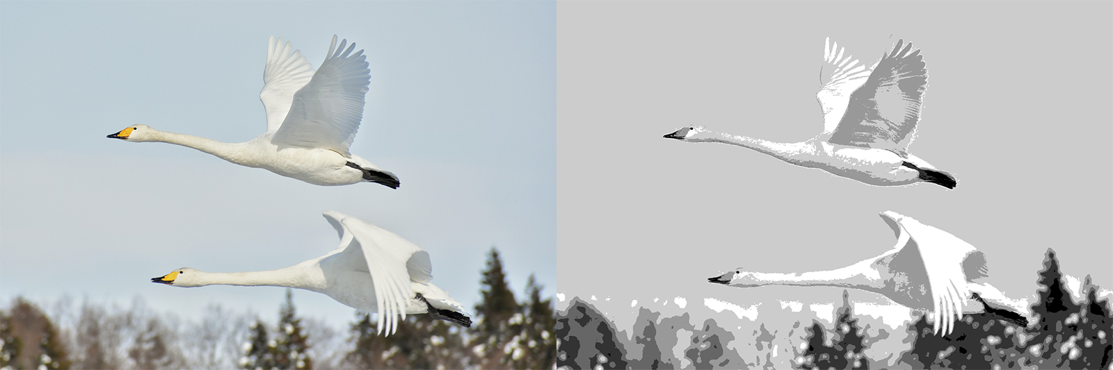
(left – before, right – after)
I find this one to be particularly useful in simplifying a photo, and making it much easier for us to paint it.
You can just SEE very easily where it gets darker, lighter and so on.
Conclusion
You can paint based on anything. But some references are better than others.
When working from real-life observation, we don’t really have control over what we see. But, when working from a photo reference, we can change things around to our advantage.
I hope this helps you in better understanding how to do that.
I’ve used these methods for creating many of my works. Be sure to follow me on Instagram to see the results. I used this especially for my portraits, such as this one of Santa Clause (;
And this is it, I will talk to you again real soon!
– Liron