ShinHan PWC (Primary Set I Selected) – Demo, Review & First Impressions

Hi there! Today I want to share with you an initial review I did for three paints by ShiHan PWC.

I initially came across these at a local art store, and got a free sample pack. I was surprised to find how much I loved and enjoyed using them.

Here’s the full video review. Below it you’ll find an update from when I originally purchased these (after playing around with them a little more).

ShinHan PWC and Other Lines of Paints

ShinHan is a Korean art supplies manufacturer. It produces three lines of watercolor paints.

  • PWC – These are their ARTIST GRADE paints. Their best watercolors.
  • Professional – These are their STUDENT GRADE paints. Confusing name, I know (;
  • SHAMI – These are watercolors aimed for kids (perhaps similar to the sets you’ll find in the art section of an office supplies store)

Just to clarify – I haven’t tried the other lines so I can’t give a first-hand review. In this review I’ll only talk about the PWC line.

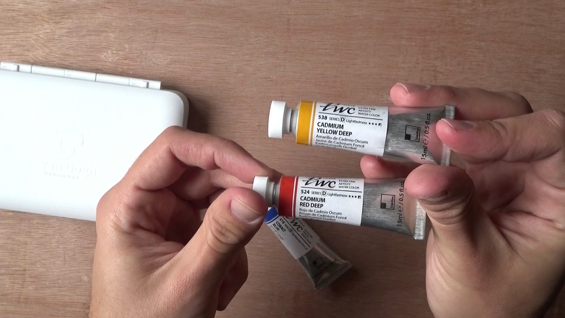
ShinHan PWC Paints I Got

So I decided to kind of build my own primary set. I got three paints:

  1. Cobalt blue
  2. Cadmium Red Deep
  3. Cadmium Yellow Deep

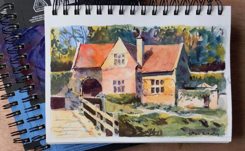
Here’s the first (EVER) painting I did with these.

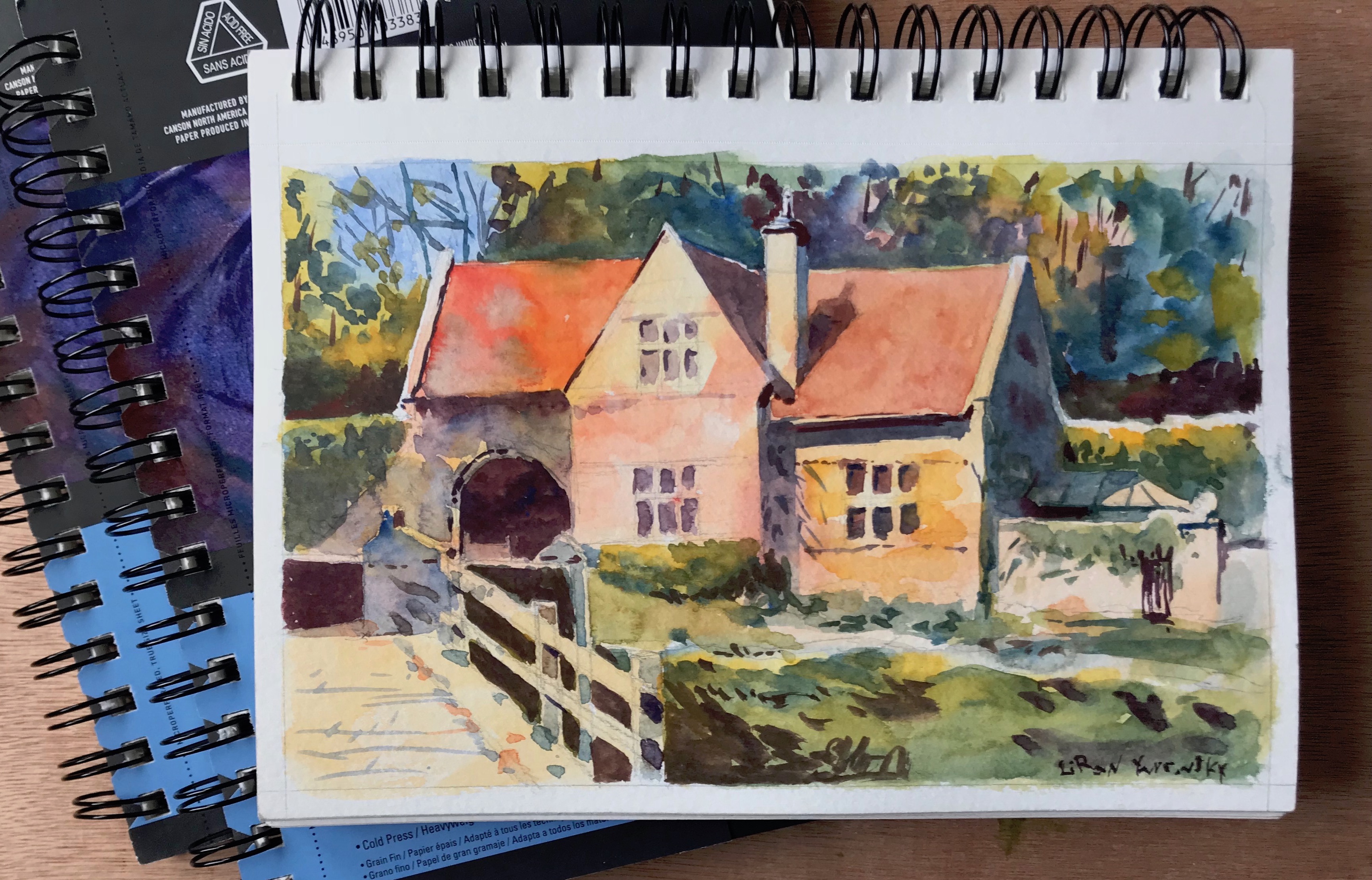
Needless to say, I was very pleased with this result, especially for a first try. I immediately fell in love with these paints.

Individual Tubes Info

Cobalt Blue – A blue somewhat resembling French Ultramarine. Pigment – PB28 (Cobalt Blue). It’s semi-transparent and has excellent lightfastness.

Cadmium Red Deep – A semi-opaque, strong warm red. Pigment – PR108 (Cadmium Sulfoselenide). Excellent Lightfastness

Cadmium Yellow Deep – A nother semi-opaque paint. Strong warm yellow. Pigment – PY35 (Cadmium Yellow).

As chance has it, all of these are Series D (which is relatively expensive, the scale starts at A).

Issues With This Particular Primary Combo

Here are some issues I experience with this specific combinations. These do not necessarily reflect poorly on the paints (but perhaps reflect poorly on my selection haha).

The blue isn’t dark enough. Their Cobalt Blue is easily overpowered by the red. Its range of values simply isn’t wide enough.

This creates problems when trying to achieve a cooler gray, or simply a dark blue.

The red and yellow are a little too opaque for my taste. This makes them even more dominant in the mixture. It’s a bit hard to explain, but it’s like they don’t mix too well.

Again, this has more to do with color selection. I do plan on getting a few more, and this time focusing on transparency and a large range of values.

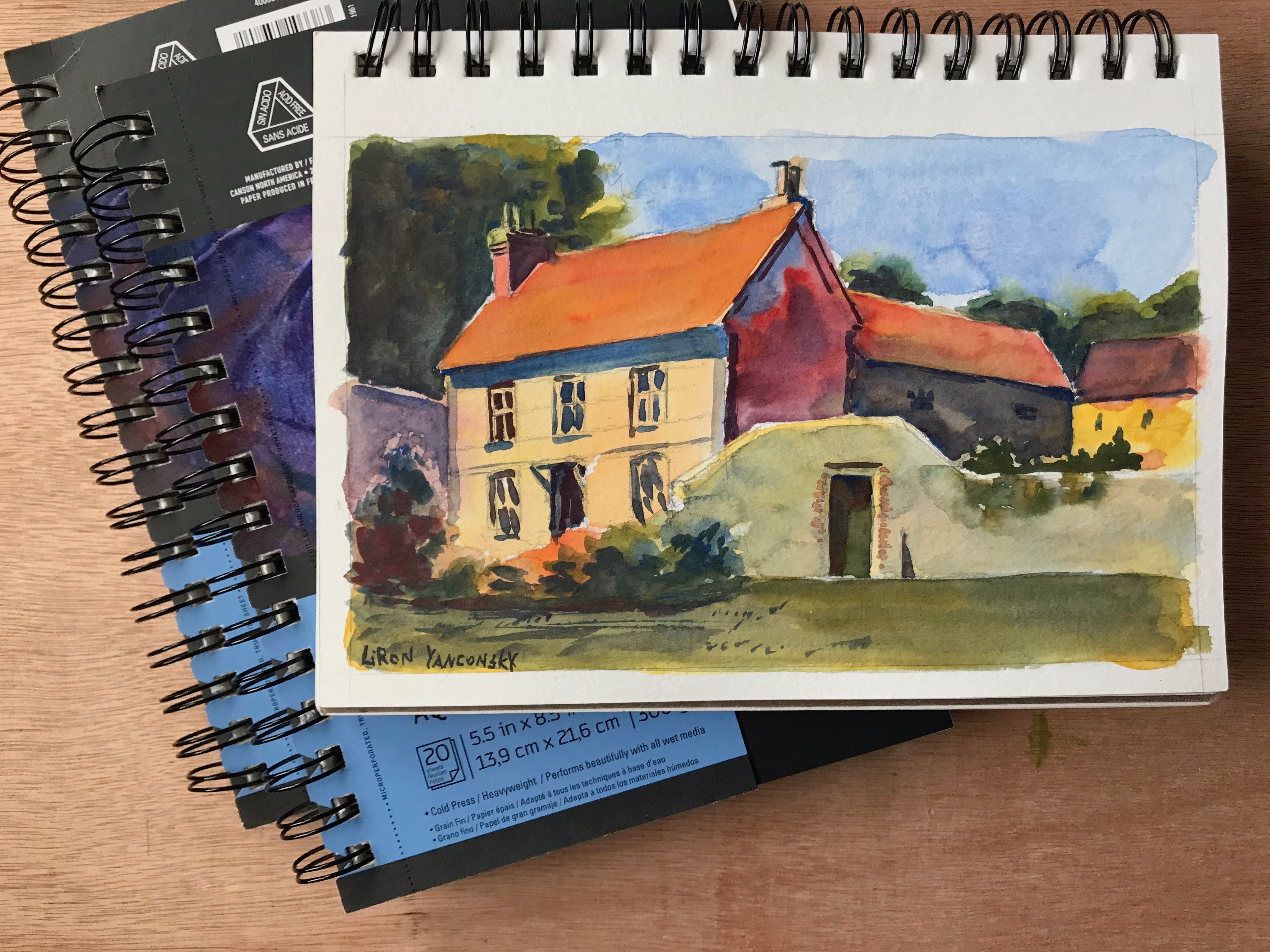
Here’s another painting I did using these. I love this one too.

Where to Purchase ShinHan PWC Paints

From what I saw, ShinHan does not sell the individual PWC tubes on Amazon. I got lucky, as I can easily get them locally.

However, they do sell sets. I usually don’t recommend sets, especially for beginners, and especially very large ones. But the price for these may actually be worth it. The price per tube is much cheaper that way.

Here are links to purchase two sets (affiliate links, you pay the same price – I get a small commission):

Get the 24 set here
Get the 32 set here

Conclusion

I would highly recommend giving these a try. They seem to be priced cheaper, but as far as I can tell they are beautiful, vibrant and lightfast. Many are single pigments too.

I would suggest doing a more proper research than what I did, and making sure you get a good combo.

I hope you enjoyed this one, and I’ll talk to you soon!

– Liron


Undersea Green – Daniel Smith Watercolor | The Paint Show 23

Hi there, today I want to share with you my review of Undersea Green by Daniel Smith.

You can see the full episode of The Paint Show here:

And if you want a written version, read on (;

Undersea Green – Daniel Smith Watercolor

I originally got this paint together with Daniel Smith’s Secondary set. In fact, this review will wrap up the series of The Paint Show episodes regarding this set.

I really loved this one from the beginning, and it’s special characteristics impressed me (you’ll soon see what I refer too).

With time I started using it extensively for foliage, leaves and trees. I used it (together with Carbazole Violet) as the background of this painting.

I especially love to mix it with blues and yellows (and even reds!) to create a variety of greens.

Paint Info

Undersea Green is made of three different pigments:

  1. Ultramarine Blue (PB29)
  2. Quinacridone Gold (they say PO48, but that’s the pigment for Quinacridone Burnt Orange, which is a little strange. Quin. Gold should be PO49).
  3. Nickel Azo Yellow (PY150)

This makes it rather simple to mix, if you want to create if for yourself (assuming you can do so without Quin. Gold, which sounds possible).

Some more stats:

  • Series 1 – so cheaper than Quin. Burnt Orange.
  • Semi-transparent
  • Granulating (with a beautiful effect too! The blues and yellows separate)
  • Medium-high staining.

This color is highly pigmented and is easy to achieve dark values with.

Here’s what the pigments look like when they separate into blues and oranges / yellows:

In the video I demo what this paint looks wet on dry, wet-in-wet, and using dry brush strokes.

Here are some examples.

Conclusion

I think this is a very useful color, and I definitely prefer it over more “artificial” looking greens such as Sap Green (which used to be a favourite of mine).

I like my colors to have many uses for me and be versatile, so this is a great one in my opinion.

If you want to get it, here are affiliate links (I get a small commission and you pay the same price):

Undersea Green Tube: http://amzn.to/2EZSwWM

Daniel Smith Secondary set: http://amzn.to/2FzE20T

If you are interested in the other two colors in the set (Quin. Burnt Orange and Carbazole Violet), I highly recommend getting the set. It ends up being much more cost-effective (:

And this is it for today. I hope you enjoyed this one, and we’ll talk soon!

– Liron

Quinacridone Burnt Orange – Daniel Smith Watercolor | The Paint Show 22

Welcome to episode 22 of The Paint Show, in which I’ll present Quinacridone Burnt Orange, by Daniel Smith!

You can check out the full episode on YouTube, right here:

Me and Quinacridone Burnt Orange

I got this paint originally together with the Daniel Smith Secondary set, alongside Carbazole Violet and Undersea Green.

I really enjoyed this set, and I think it’s REALLY worth it in terms of the price. This is why I originally reviewed the entire set.

Then, I reviewed Carbazole Violet on the previous episode, and next week I hope to review Undersea Green as well!

I slowly got to love each and every one of these paints, and I wholeheartedly recommend getting them.

If you are interested in purchasing Quinacridone Burnt Orange, you can do so here (affiliate link): Quinacridone Burnt Orange – 15ml Tube.

If you want to get the entire set, you can do so here: Daniel Smith Secondary Set

(If you buy using these links you pay the exact same price, and I get a commission).

Paint Information

Here’s some more information about this paint.

  • Pigment: PO48 (Quinacridone Orange)
  • Series 2
  • Excellent Lightfastness
  • Transparent
  • Granulating
  • Low Staining

As this is a series 2 paint, it’s not the cheapest. On Amazon it goes for about 17$ (and the set is 24$, so you can understand why I recommend that…).

I love this paint’s transparency too. I usually use heavier and darker wash from the get (not aiming for multiple glazings), but this one just may make me try some of that.

I also like the relatively gentle granulation texture, and the fact it’s more easily liftable, as it’s low staining.

If I recall correctly PO48 should be staining. I’m not sure what Daniel smith did here, but this one seems to be low staining.

Demo

Here are some things I show in the video review…

A basic swatch and a quick wet-in-wet swatch.

Mixes with French Ultramarine and Sap Green (which Daniel Smith recommends doing).

And lastly, I attempt to recreate the paint. According to information I found online, this can be remixed by combining a yellow similar to PY150 and a red such as Quinacridone Rose (PV19) or Maroon Red (PR179).

I didn’t have a suitable yellow (PY150 is somewhat neutral), and so I used a combination of Lemon Yellow and New Gamboge, and mixed it with Quinacridone Rose.

The result is pretty nice!

Pretty similar, right?

Conclusion

I really enjoyed making this review for you. Let me know what you think by leaving a comment under the video or here on my website.

If you want to watch the full episode on YouTube, you can check it out here: Quinacridone Burnt Orange – The Paint Show – Episode 22

And again, If you wish to buy the tube, you can do so here: Quinacridone Burnt Orange – 15ml Tube.

And if you want to get the entire set, you can do so here: Daniel Smith Secondary Set

I hope you enjoyed this one, and I’ll talk to you again really soon!

– Liron