Inktober Is Here! Pen and Ink Sketching Challenge | Liron Yanconsky’s Podcast – Episode 42

Hi there, Liron here! And today I wanted to talk to you about the Inktober 2018 challenge!

What is Inktober Challenge

Every year during October, many artists and creators take part in Inktober. This is a pen and ink sketching challenge.

The goal is simply, for the entirety of the month of October, you produce a sketch every day.

It doesn’t have to be fancy. It can be simple, small, or whatever you want.

The goal is to produce something every day.

The challenge was started by an artist and illustrator called Jake Parker, as a small initiative. With time it grew in popularity – it’s huge now!

If you search for #Inktober2017 on Instagram, for example, you’ll find over 3 million posts.

Inktober Prompts

Every year, a list of prompts is posted. These are ideas meant to ignite your creativity.

You can look at it either as a crutch (for getting ideas), or as a handicap (“making” you do something around a specific idea).

I like to look at it as an added layer of challenge. It’s another thing to be creative about (:

Additional Benefits to Doing Inktober

I think what Inktober does really well, is force artists to create FOR CREATIONS SAKE. Or even for THEIR OWN sake.

It’s so easy to get caught up in our work. For me that’s creating content around watercolor painting, mainly. Or marketing my products, books, courses etc.

Doing this challenge is a huge opportunity of creating and enjoying it to its fullest.

When art turns into your career, it can take away some of the magic. This is a tremendous opportunity to get some of it back (:

My Plan for Inktober 2018

I’m planning on leveraging the challenge for multiple purposes.

1. As I mentioned – creating for myself and my own enjoyment.

2. Sharing more about myself, by doing art you aren’t used to seeing from me.

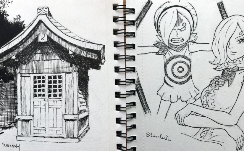
So for example, yesterday I posted a manga style sketch of Reiju, a character from the manga series One Piece. This is the type of work you won’t normally see from me!

3. I’ll try leveraging the challenge to reach more people. The challenge’s hashtags are quite popular, so perhaps my work will get to more people.

Conclusion

I hope you enjoyed this episode. I will probably do a summary podcast at the start of November, concluding my Inktober experience.

Stay tuned!

And now…

Artist Corner

Today we talked about Eiichiro Oda – the mastermind behind the manga One Piece!

This is the first time I talk about a manga artist and creator, and this man is incredible.

He sleeps 3 hours a night (yes yes, highly not recommended by the way), and he created what’s currently THE MOST popular manga and anime series in Japan and worldwide.

I highly recommend you check out his artwork. And if you are into manga and haven’t read One Piece, I would highly recommend taking a look.

It’s wacky and very unique, but it’s one of the best stories I’ve read / watched, and it has a lot of DEPTH.

You can read more about One Piece here: One Piece

And about Eiichiro Oda sensei here: Eiichiro Oda

And again, I really hope you enjoyed this episode, and I want to send you my complete gratitude for watching / listening / reading my stuff

Here’s where you can find me (:

You can support me on Patreon

Check out my YouTube Channel – Liron Yanconsky

Or ask me questions on Instagram – @LironYanIL or Snapchat – @LironYan3

– Liron

How to Draw for a Painting – Still-Life Watercolor Painting Process

Hi there!

A while ago I worked on this painting of a pastry called Rozalach (which is insanely delicious!!).

I also recorded the entire painting process.

As I was watching the footage, I realised it would be great material to talk about DRAWING in the context of painting.

In other words, this is great content to explain how to draw for a painting.

so without further ado, here’s the video (and if you prefer to read – scroll on! 😉)

Drawing for a painting is different

Drawing for a painting is different from drawing when pencil is the final purpose in mind.

It requires to be as detailed as necessary, but not more than that.

With this process, I starting by marking the edges of the pile of Rozalach pastries.

You can see what these look like in the reference pic on the top left corner.

Once I finished indicating the edges, I was able to fill up the space with quick sketches, representing the shapes of the tasty doughy rolls.

This is the hardest part. Once you get those guidelines in, it’s only a matter of filling in the gaps with the finer details.

Here you see me filling in those details. The main things I’m looking for are strong changes in values (meaning darks and lights).

When drawing for a painting, this is extremely important.

Here is the final drawing!

This is a good indication of how a typical drawing that’s ready to paint will look.

Some prefer to be more detailed, while others prefer less details.

I will tell you what – I recommend experimenting with both. Trying different levels of detail has its utility.

More detailed – may allow for more realistic results.

Less detailed – allows you to practice using the brush more, and “drawing” with the paint (rather than just “coloring” the areas between the lines).

And now is my favourite part – The drawing is ready to be painted! At this stage I can already imagine the colors I’ll be using, and the transparency of watercolor (which I love).

Painting

List of colors:

  • New Gamboge
  • Quinacridone Burnt Orange
  • Pyrrol Scarlet
  • French Ultramarine

Here is the very first wash.

My main concern is achieving an even result that’s “flowing” properly, and a variety of interesting colors.

Sometimes I go really wild with my colors (especially with portraits), but this time I decided not too.

I was afraid the colors will make it harder to communicate what I painted (a pastry that not everyone will be instantly familiar with).

And so I decided to go with an interesting range of yellows, oranges, reds and some blues.

Notice how I also made sure to connect the Rozalachs with the background. The purpose is to ensure they don’t appear to be “cut off” from the background. We want them to look like an integral part of the setting.

I find this extremely important at times, especially with painting people as a part of a scene.

After that, I move onto the second wash, where we’ll put in the darker shades.

This immediately breaks the painting down into more discernible shapes that actually have a meaning.

In most paintings, I find this to be the most difficult stage. That’s because you really need to start paying attention to the drawing.

There’s one cool effect I think I was able to get at this stage.

The pastries are covered in sugar powder. To indicate that powder’s texture I made use of the paper’s texture (I’m using a cold-press paper for this one).

Notice the areas just under the Rozalachs in particular. I used dry brush strokes that will preserve the paper’s texture and create a powder-like effect.

And here’s the final result!

There was actually a third layer as well. Make sure to watch the full video to see it.

I’m very pleased with how this painting turned out. I love the color selection, composition, temperature and overall feeling.

I hope you enjoyed this quick lesson, and I’ll talk to you soon!

– Liron