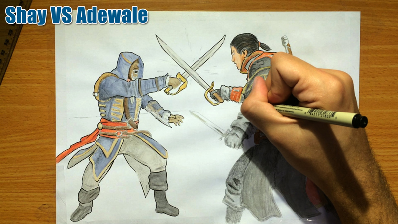
How to Draw for a Painting – Still-Life Watercolor Painting Process

Hi there!

A while ago I worked on this painting of a pastry called Rozalach (which is insanely delicious!!).

I also recorded the entire painting process.

As I was watching the footage, I realised it would be great material to talk about DRAWING in the context of painting.

In other words, this is great content to explain how to draw for a painting.

so without further ado, here’s the video (and if you prefer to read – scroll on! 😉)

Drawing for a painting is different

Drawing for a painting is different from drawing when pencil is the final purpose in mind.

It requires to be as detailed as necessary, but not more than that.

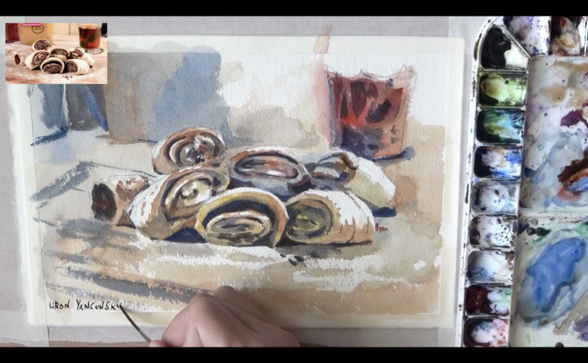
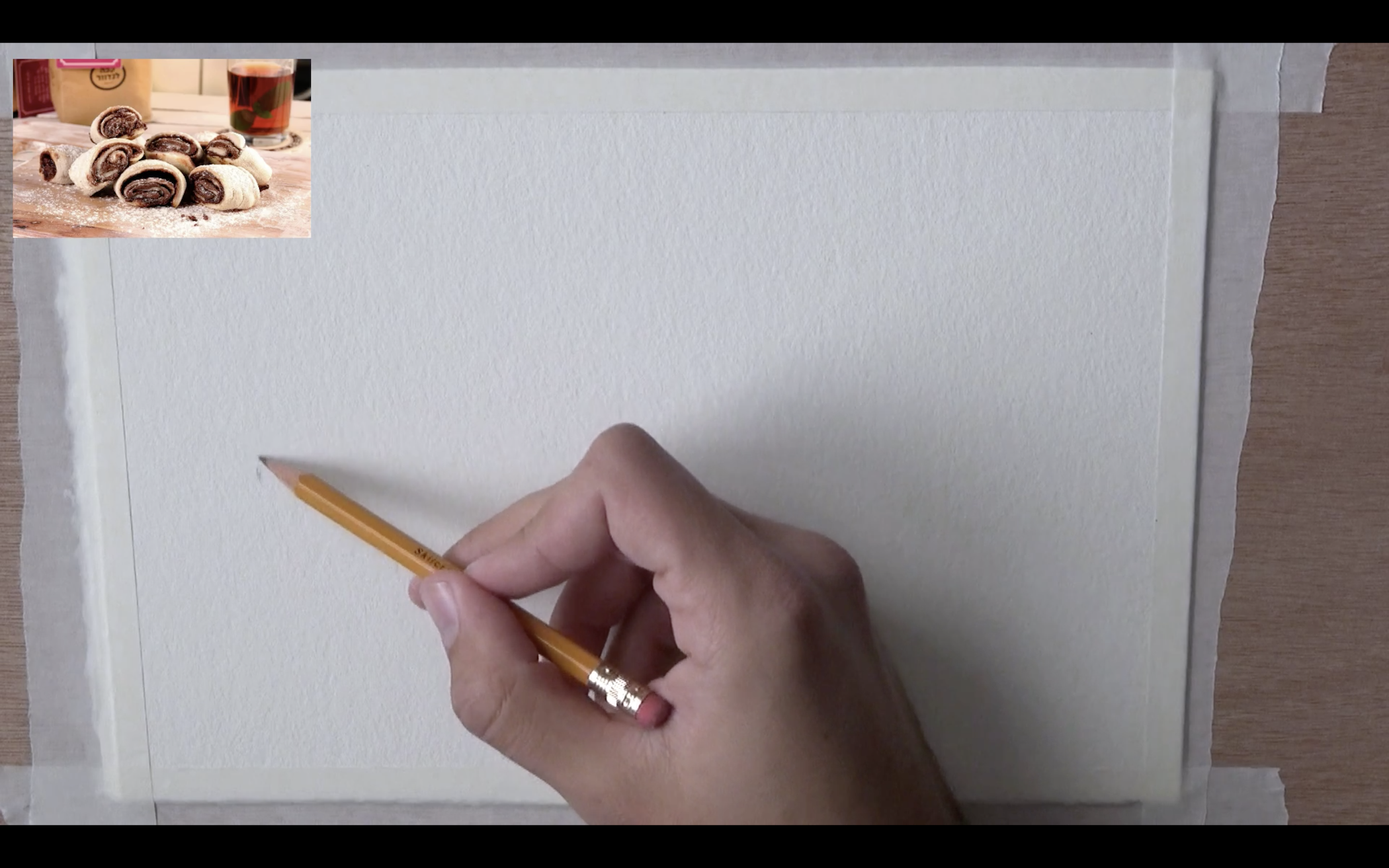
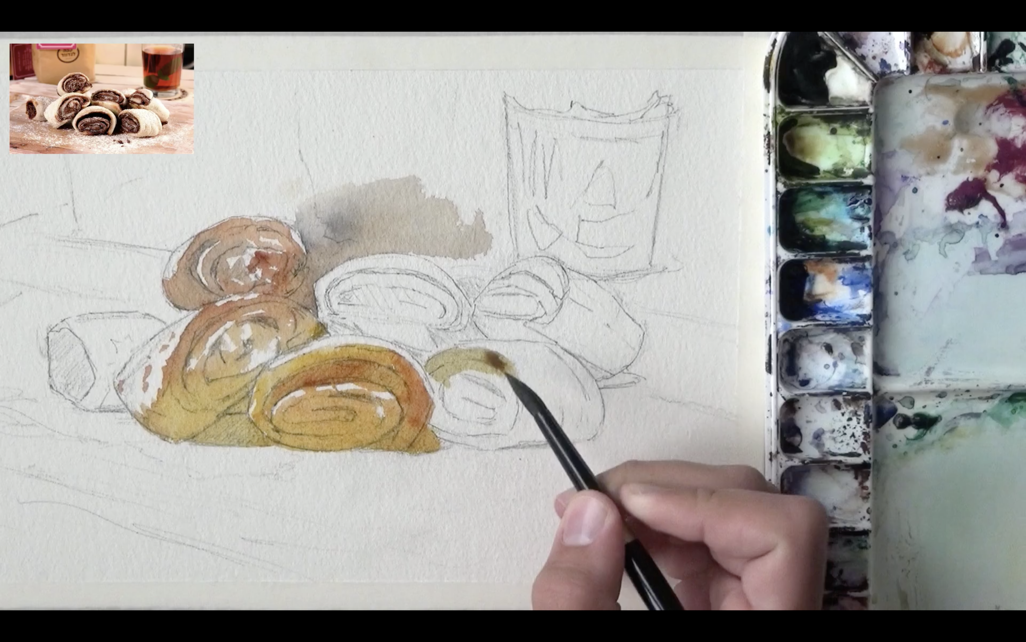
With this process, I starting by marking the edges of the pile of Rozalach pastries.

You can see what these look like in the reference pic on the top left corner.

Once I finished indicating the edges, I was able to fill up the space with quick sketches, representing the shapes of the tasty doughy rolls.

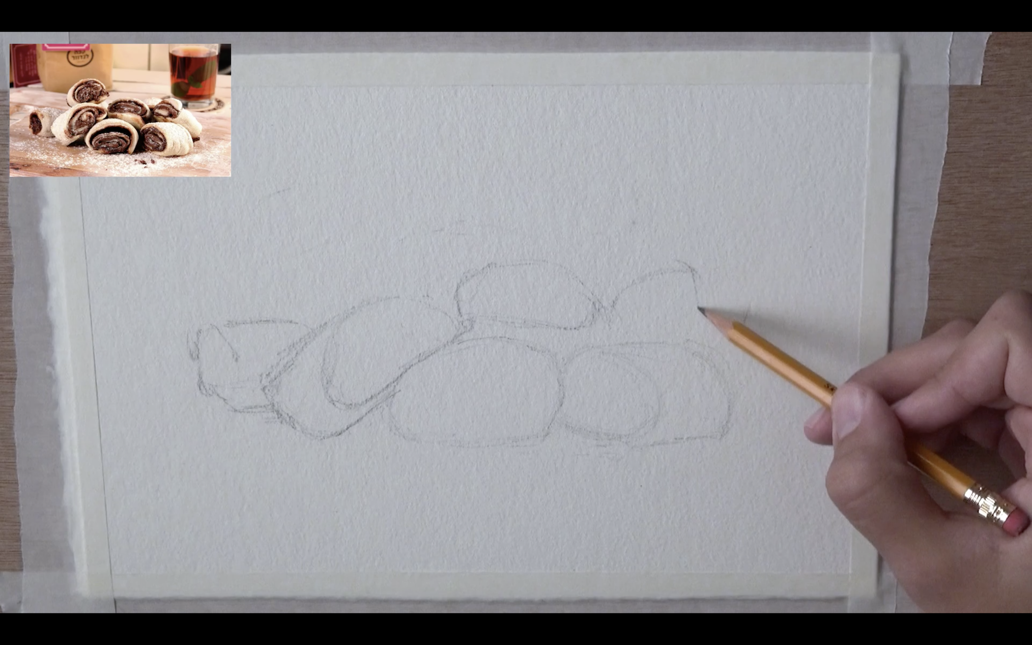
This is the hardest part. Once you get those guidelines in, it’s only a matter of filling in the gaps with the finer details.

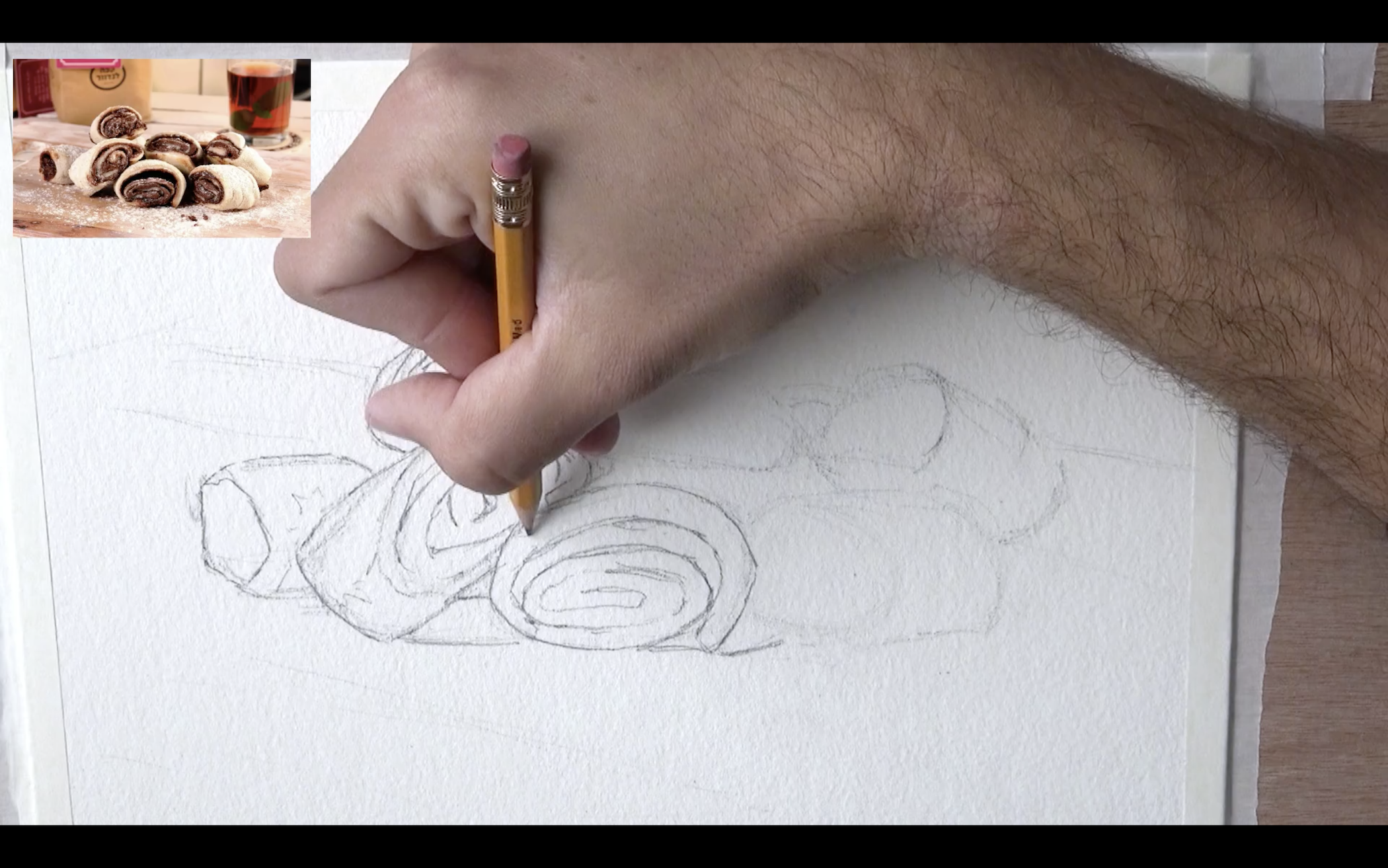
Here you see me filling in those details. The main things I’m looking for are strong changes in values (meaning darks and lights).

When drawing for a painting, this is extremely important.

Here is the final drawing!

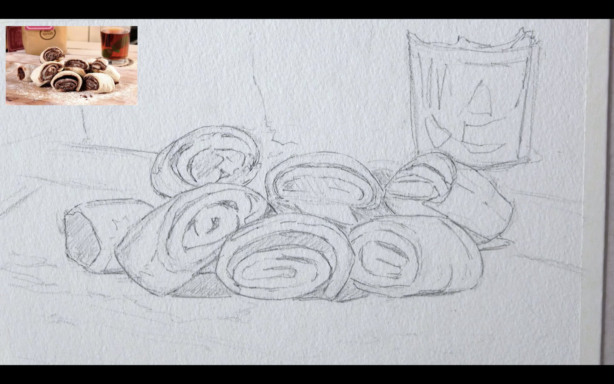
This is a good indication of how a typical drawing that’s ready to paint will look.

Some prefer to be more detailed, while others prefer less details.

I will tell you what – I recommend experimenting with both. Trying different levels of detail has its utility.

More detailed – may allow for more realistic results.

Less detailed – allows you to practice using the brush more, and “drawing” with the paint (rather than just “coloring” the areas between the lines).

And now is my favourite part – The drawing is ready to be painted! At this stage I can already imagine the colors I’ll be using, and the transparency of watercolor (which I love).

Painting

List of colors:

  • New Gamboge
  • Quinacridone Burnt Orange
  • Pyrrol Scarlet
  • French Ultramarine

Here is the very first wash.

My main concern is achieving an even result that’s “flowing” properly, and a variety of interesting colors.

Sometimes I go really wild with my colors (especially with portraits), but this time I decided not too.

I was afraid the colors will make it harder to communicate what I painted (a pastry that not everyone will be instantly familiar with).

And so I decided to go with an interesting range of yellows, oranges, reds and some blues.

Notice how I also made sure to connect the Rozalachs with the background. The purpose is to ensure they don’t appear to be “cut off” from the background. We want them to look like an integral part of the setting.

I find this extremely important at times, especially with painting people as a part of a scene.

After that, I move onto the second wash, where we’ll put in the darker shades.

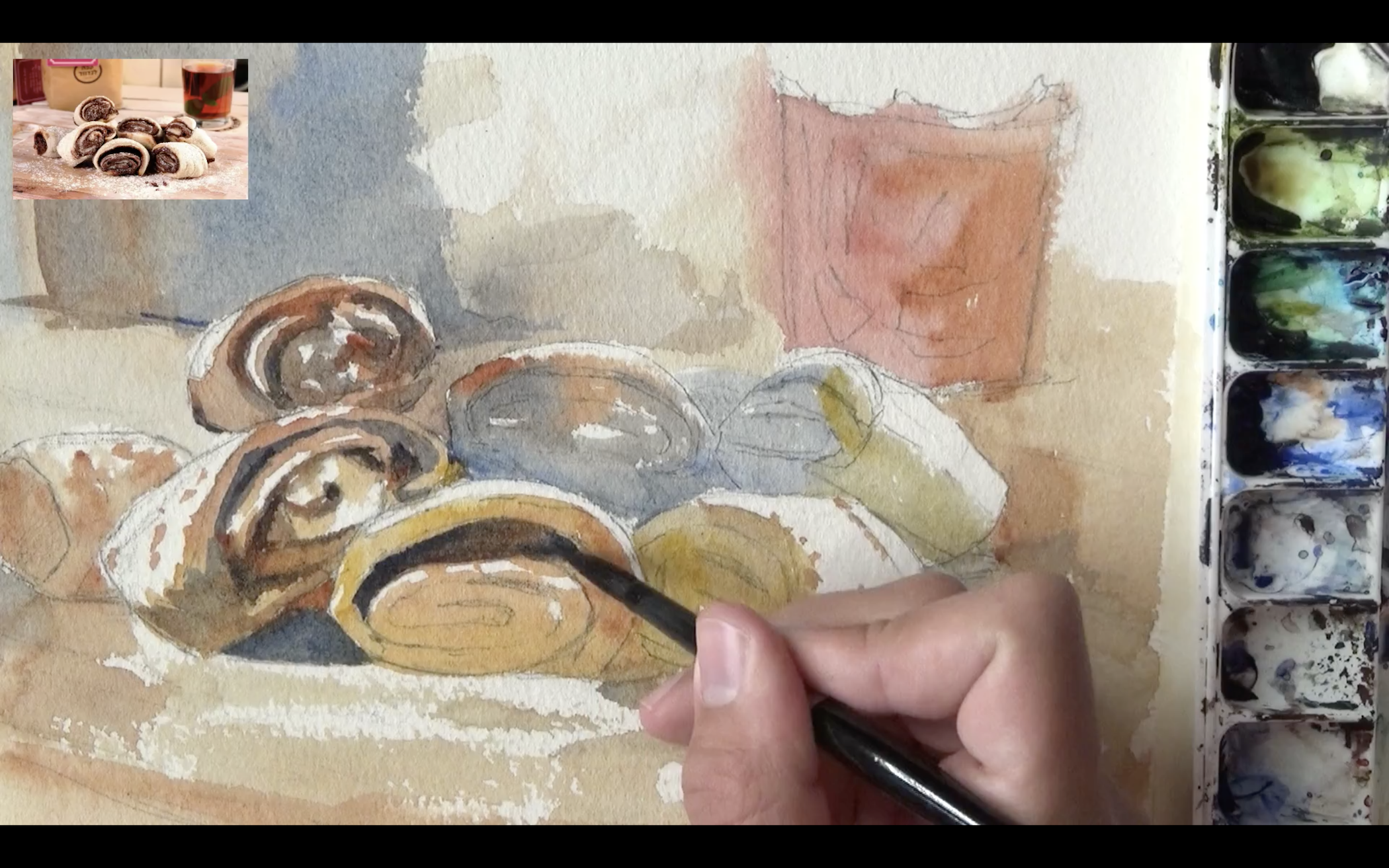
This immediately breaks the painting down into more discernible shapes that actually have a meaning.

In most paintings, I find this to be the most difficult stage. That’s because you really need to start paying attention to the drawing.

There’s one cool effect I think I was able to get at this stage.

The pastries are covered in sugar powder. To indicate that powder’s texture I made use of the paper’s texture (I’m using a cold-press paper for this one).

Notice the areas just under the Rozalachs in particular. I used dry brush strokes that will preserve the paper’s texture and create a powder-like effect.

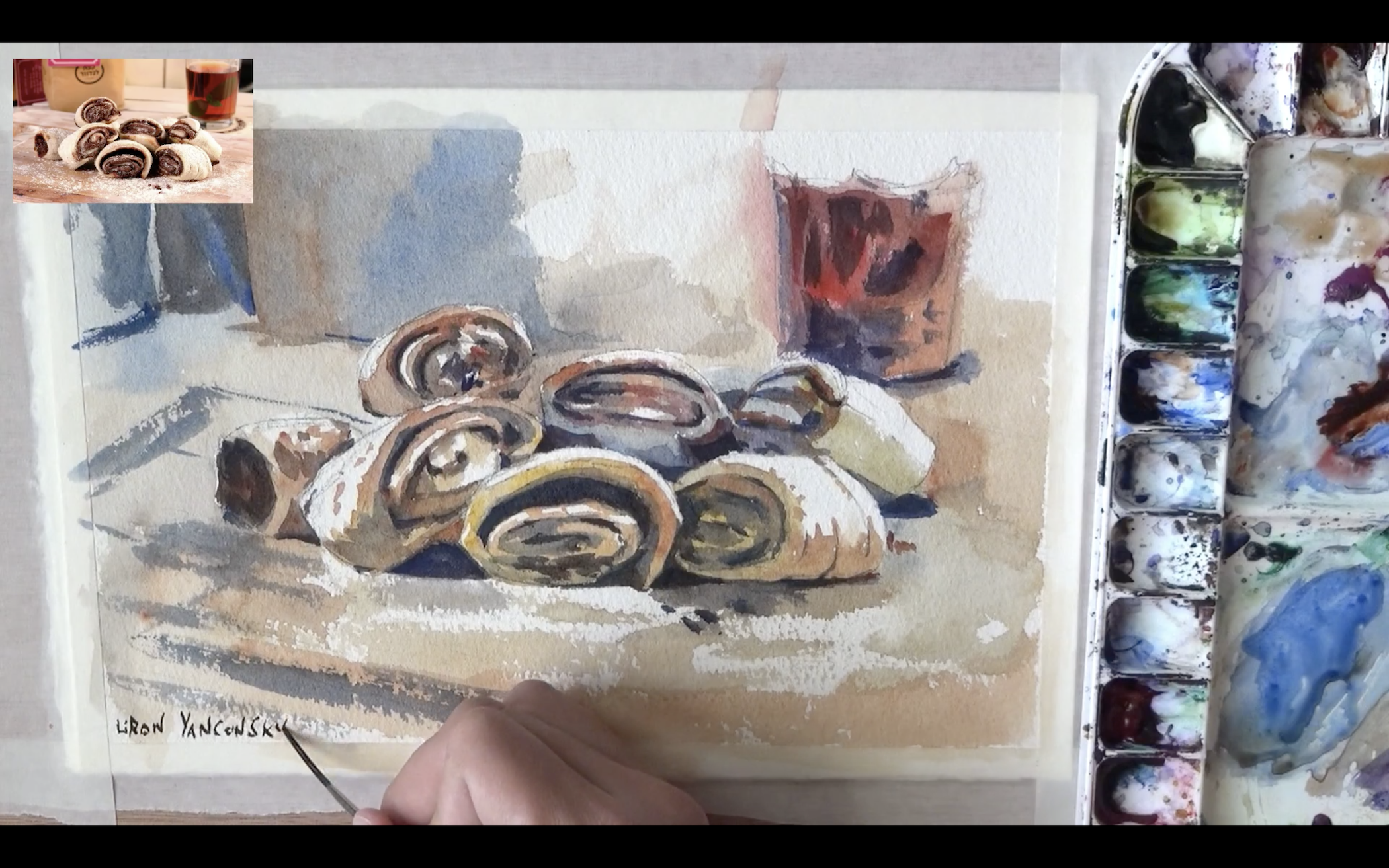
And here’s the final result!

There was actually a third layer as well. Make sure to watch the full video to see it.

I’m very pleased with how this painting turned out. I love the color selection, composition, temperature and overall feeling.

I hope you enjoyed this quick lesson, and I’ll talk to you soon!

– Liron

How to Draw Shay Cormac VS Adewale (AC Rogue)

Hey there!

Today I want to do something special.

In this video I show you how to draw a battle scene between Shay Patrick Cormac and Adewale – two characters from the Assassin’s Creed Rogue video game.

This is less of a drawing lesson, and more of a speed-drawing demonstration of my complete drawing process.

You’ll see everything from drawing, to painting (watercolors AND colored pencils) and inking.

So without further ado, here it is!

A few notes:

1. I like to paint before I ink.

This is something I talked about before.

This type of process allows the colors to really shine, and then also allows you to be minimal with your pen and ink.

2. I mix watercolors with colored pencils.

I like the look I achieve by applying watercolors and then completing the look using colored pencils.

This is a common practice, and is my favorite way to go. The watercolors easily cover large surfaces and give the base tone. Then, the colored pencils add the texture and more accurate shading.

However, you are invited to try a different way, and let me know if it works better for you (=

Anyway, this is it. Let me know if you have any questions!

And if you want to become a king at drawing, inking, painting, sketching and whatnot, be sure to subscribe here. You’ll also receive my book as a gift! (=

3D-Cover-PNG-DS2

I’ll talk to you soon,

– Liron

How to Draw Realistic Braids!

Hey friends!

A lot of people have been asking me how to draw hair, realistic hair and especially braids.

Well, for you girls and boys – in this drawing lesson we are going to learn how to draw realistic braids! (=

I think there is something in the challenge of drawing braids, that attract aspiring artists to it more than other “simple” hair styles.

P.S. notice how I am a little sick! I partied too hard on our independence day here in Israel, and slightly blew my voice =P So you’ll have to forgive me for that.

Okay, first – watch the videos on how to draw realistic braids! (=

Part 1:

Now part 2:

After you watched these, you might want to read on for MY key tips on this topic…

Key tips on how to draw realistic braids

#1 – Contrast!

In realistic drawings, one of the key elements is good use of contrast.

If the dark areas in reality are black, you want to get them as pitch black in your drawing.

If the highlights are perfect white, don’t settle for paper-white. Use a gouache to get a perfect white. If the… you get the point (=

I’m nowhere near master in realism drawing just yet, but these are some of my experiences.

#2 – Be the man with the plan (or the woman with the plan…)

Draw some guidelines that’ll help you later on.

This is especially important when drawing braids, as the hair will be divided in a certain way.

You want to understand the natural direction in which the hair flows, as well as the way it’s divided / sectioned, according to the specific hairstyle being worn.

#3 – Hairs and strands!

Now comes the grueling part of actually drawing the single strands of hair.

Remember – there is a direct correlation between this step, and the final result. If you’ll put in the time and effort on each single strand – it will show!

I personally still have a hard time really taking my time and focusing on the tiny details WHILE FILMING AND TALKING ^_^

This is something I’ll have to get over haha…

And I think that wraps it up. Let me know if you have any questions or comments!

Also, I’m really trying to grow this blog and help as many people as possible. But that’s impossible without your help. So PLEASE share / subscribe on the left, and I’ll be forever grateful.

Oh, and did I mention you’ll get THIS for FREE…? (=

3D-Cover-PNG-DS2

Thanks, and I’ll talk to you soon,

– Liron