Real-Time Narrated Painting Tutorials – YouTube Experiment Results | Liron Yanconsky’s Podcast – Episode 60

Hi there, Liron again here! Today I want to share with you my recent YouTube experiment – posting only real-time narrated painting tutorials – and talk about the results.

Let’s get going!

YouTube Experiment

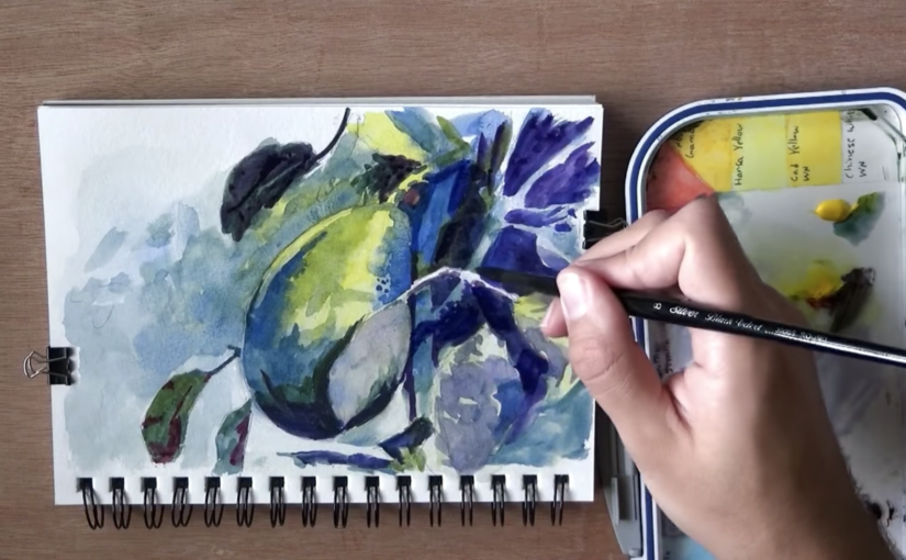
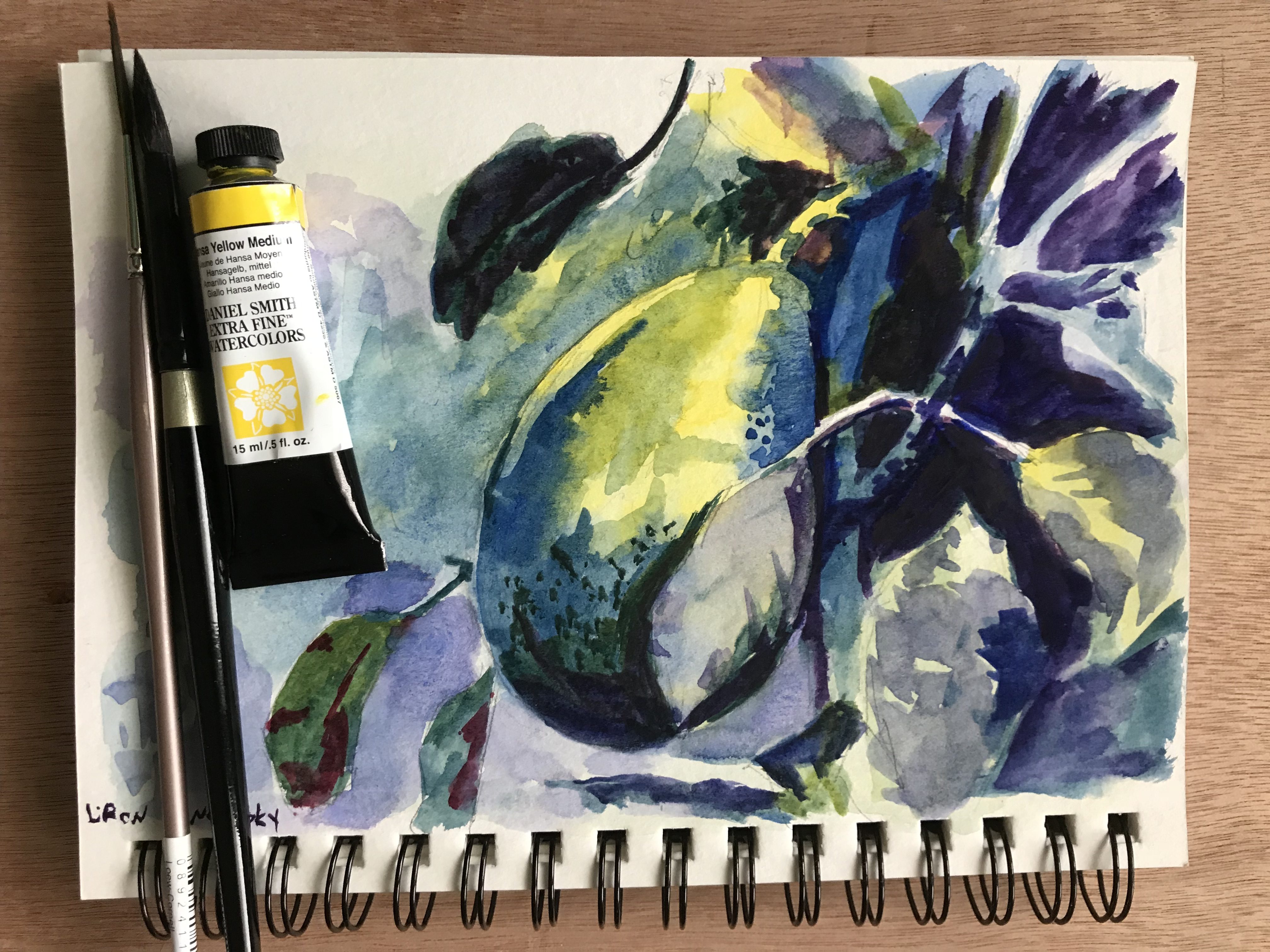
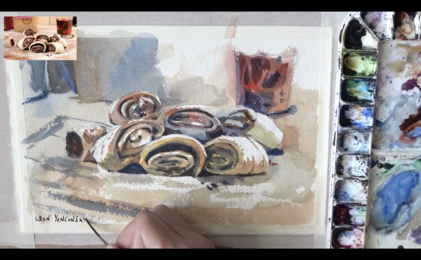
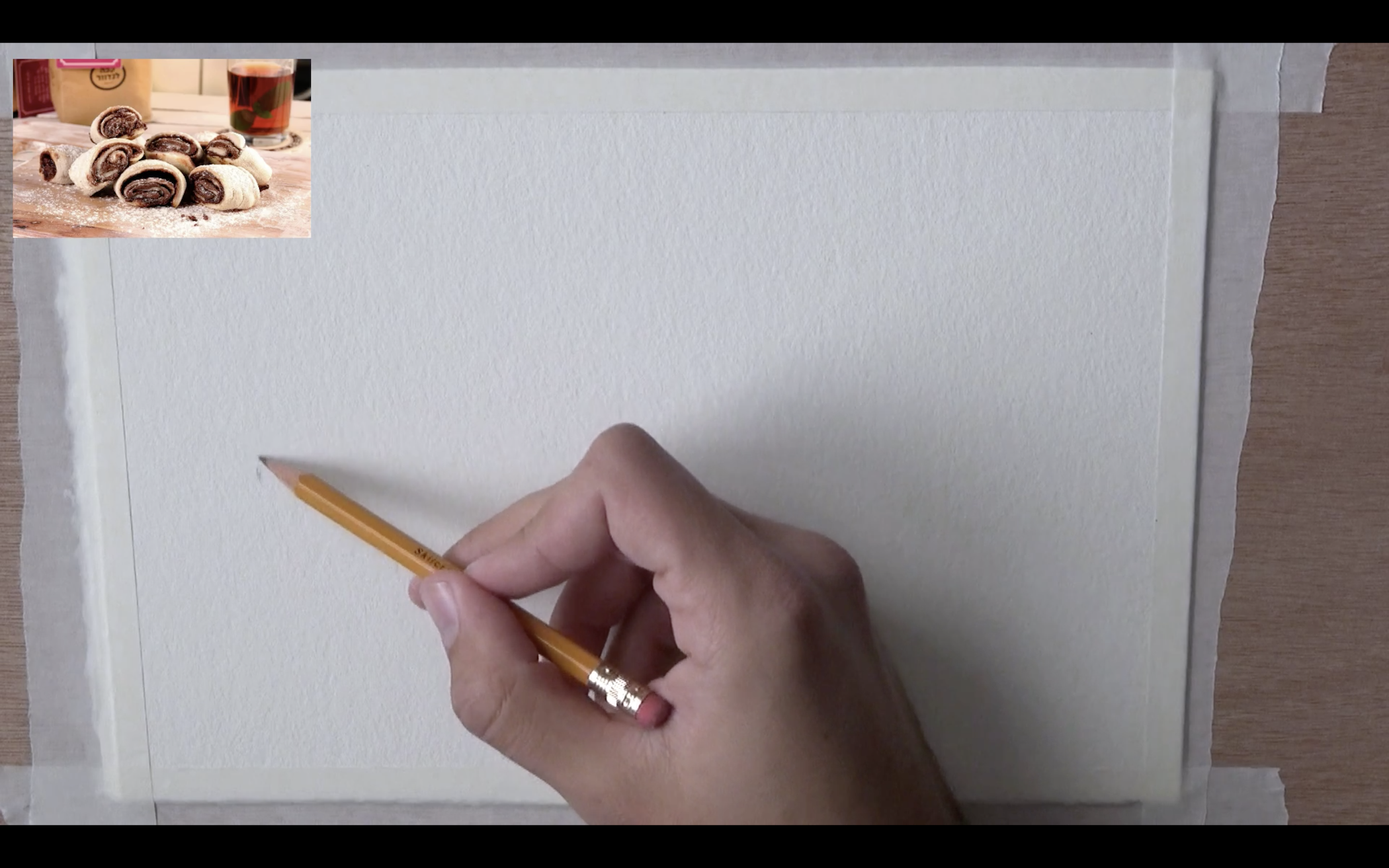
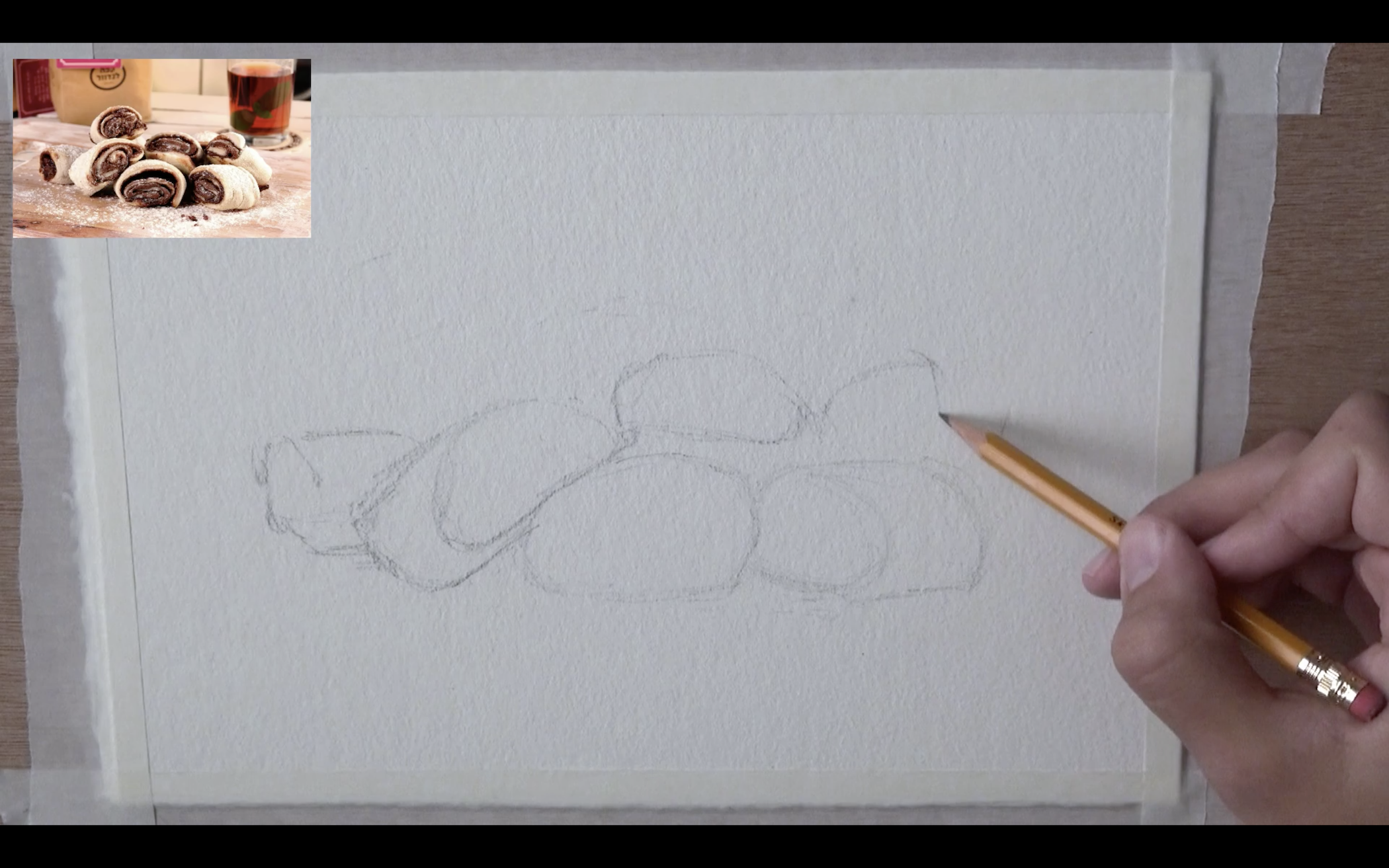
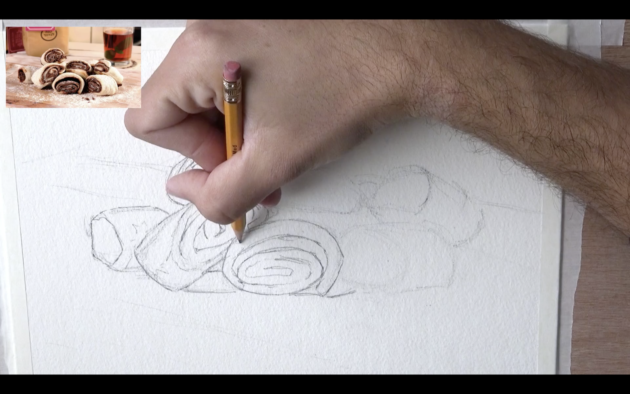
Over the last few months, many viewers mentioned how what they are missing are full painting tutorials. Meaning – they didn’t want time-lapse vids. They wanted to hear my thoughts as I painted.

Following these requests, I decided to give this a try for six videos, which are two weeks.

This means that for the past two weeks, I’ve been only posting longer (40+ minutes) tutorials.

Feedback I Got

The vast majority of feedback was very positive. People were commenting how hearing my thought process is really useful, and how real-time allows them to follow along the action.

On the other hand, there were probably one or two comments saying how the videos are too long, and how they preferred shorter vids.

Results on YouTube

This is more about my YouTube analytics. I noticed several interesting things here.

First, one of the videos has done really well, gaining over 10K views. This is a lot for me, as I average at around 2K views, I would say.

Aside from that one, two other videos show some promise, and will perhaps gain more views with time.

I did see an immediate increase in watch time, which makes sense – as I was posting much longer videos.

But with that, there were also more views in general. This could be attributed to the 10K views video, but I’m not sure about that.

Also, I did notice an increase in subscribers growth, which was very slow for a while now. I averaged for a while around 40-50 new subs a day, and then increase temporarily moved the average to around 70, with the peak at 100+.

These are great results.

YouTube Channel Future Direction

My main insight from this experience was that I MYSELF am interested in variety. After such a long time period of posting only these longer videos, I started craving making shorter videos.

Another insight was that you can’t please everyone, which is 100% okay. So I might as well do what interests me.

My plan is to now incorporate what I learned over the last two weeks into my routine. We’ll go back to the normal series (The Paint Show, Painting Masters), but I’ll also try and do at least 1-2 full processes every two weeks.

Conclusion

I hope this experiment pushed the needle a little more in the direction of me improving as an artist and a teacher. And I’ll keep you updated on future experiments and new ideas I get.

And now, it’s time for today’s Artist Corner!

Artist Corner

In this episode I talked about Jasmine Huang, an incredible Taiwanese watercolor painter.

Her paintings have a beautiful realistic vibe to them. She uses a very unique color palette and is very well-versed in wet-in-wet.

Coincidentally, she is also the wife of Chien Chung Wei, who I featured in a recent episode of Painting Masters. I believe I will dedicate an episode to her as well (:

The best place to check out here work would be Facebook:
Jasmine Huang on Facebook

Here’s where you can find me

Check out my YouTube Channel – Liron Yanconsky

Or ask me questions on Instagram – @LironYanIL or Snapchat – @LironYan3

I hope you enjoyed this one. Take care, and we’ll talk again really soon,

– Liron

Did you Mess up Your Painting?? How to Fix a Watercolor

Hi there, I hope you are doing great! Today we’ll talk about how to fix your painting when you messed something up (:

Here’s the full video, scroll down to read more.

Many Painting Mistakes Can be Fixed

People (myself included) make the assumption that in watercolor nothing is reversible. This is false.

Many, if not all mistakes can be corrected.

Only some types of mistakes can’t be corrected. These usually involve dropping dark paint in large quantities in an area that’s supposed to be light.

However, paint can be lifted. Brushwork can be improved. Things can be darkened and so on.

The Ugly Stage of a Painting

This is something worth mentioning. Most paintings, no matter the medium (oils, acrylics or watercolor) tend to go through an ugly / incomplete stage.

It may lead you to believe you are messing up, when in fact you are just early in the process.

I’d encourage you to NEVER give up on a painting. The it’s far likelier you’ll give up too soon than too late. So give it a chance!

Conclusion

I hope you enjoyed the video and vibed with the message.

Let me know if this helped!

And I’ll talk to you again really soon.

– Liron


Hansa Yellow Medium – Daniel Smith Watercolors | The Paint Show 26

Hi there! Today I want to review Hansa Yellow Medium, by Daniel Smith Watercolors.

You can view the full video review here, and scroll down to read more.

Hansa Yellow Medium

My story with this paint is so funny.

I originally got it with Daniel Smith’s Primary Set.

But I wasn’t too keen on the actual combination of paints in that set (together with French Ultramarine and Perylene Red – Which I reviewed here).

So I kind of stopped using it. For the longest time this tube took a nap in my drawer.

But then I decided to take it out and give it a try. And I re-fell in love with it instantly!

I guess I just needed more experience to see how useful it was.

Hansa Yellow Medium – Paint Info

Here’s some additional info about this tube.

Pigment: PY97 (Arylide Yellow FGL)
Series 2
Lightfastness: I (excellent)
Semi-transparent
Low-staining
Non-granulating

I find it to be quite useful. It mixes well with many different blues and reds.

My favorite yellows lean to orange, but if I had to go with a more neutral yellow, this would be my choice.

Results of Using Hansa Yellow Medium

Here are some quick paintings and sketches I did using this paint.

Quick avocado sketch with Hansa Yellow Medium

Hansa Yellow Medium and Hansa Yellow Light Tubes

Where to Purchase It

You can purchase a single tube here: http://amzn.to/2H4L0Md
Or the entire set here (very cost-efficient): http://amzn.to/2sjEv4C

I have to say a word about the set. It’s really useful, and very cost-effective. Each of the paints are useful on their own. I would highly recommend getting it.

Conclusion

If you love Daniel Smith paints, I’d look into this one. It’s a good, neutral yellow to have.

Despite me not liking the set AS A SET, I would recommend getting it. That is because the individual paints are great in their own right.

I hope you enjoyed this one, and I’ll talk to you again real soon!

– Liron

SAA Watercolor Paints | Review, Demo & First Impressions

Hi there! Today I want to talk to you about the SAA watercolor Paints.

I reviewed them extensively in this YouTube video:

If you want to read more, scroll below.

SAA Watercolor Paints

I was sent these by one of my followers, Chris. He recommended I give them a try and I absolutely loved them!

I’m writing this quite a while after publishing the video. With this larger perspective I can say these are really high quality.

These paints behave the way I want them to. I find I have great control with them, but they still do what they want.

They are strongly pigmented, easy to activate and are very fun to use. They also have great lightfastness.

The Paints I Got

I got three paints:

1. Indian Yellow
2. Alizarin Crimson Permanent
3. French Ultramarine

Individually they work great. I would, in terms of combos, maybe replace the French Ultramarine with a cooler Phthalo Blue, but that’s just my personal preference.

Detailed Paint info

1. Indian Yellow
A beautiful warm yellow.

Pigment: PY3 (Hansa Yellow)
Semi-transparent
Lightfastness: A (best)

2. Alizarin Crimson Permanent
A strong Alizarin Crimson.

Very well-pigmented and saturated.
Pigments: PR177 (Anthraquinone Red) and PV23 (Dioxazine Violet)
Transparent
Lightfastness: A (best)

3. French Ultramarine
A beautiful warm blue.

Pigment: PB29 (Ultramarine Blue)
Semi-transparent
Lightfastness: A (best)

The Results

Here are some still-life results I got with these. I really love them!

An apple still-life painting with SAA paints The three SAA watercolor paint tubes, next to the still-life painting A still-life of a pear and apple, done with Indian Yellow

Where to Purchase SAA Paints

These are very unique. SAA stands for The Society for All Artists. It is a UK based brand, that has a strong community around it.

They offer several plans that make their tools and paints significantly cheaper. They also don’t have series for their paints. All paints are priced equally.

If you reside in the UK I’d highly recommend giving them a try (although it’s worth mentioning they have an international plan as well).

You can learn more here: https://www.saa.co.uk/info/join-the-saa/

Conclusion

I’m really into these paints. I hope to share more artworks I did with these in the future.

I hope you enjoyed this review, and I’ll talk to you again real soon!

– Liron

How to Draw for a Painting – Still-Life Watercolor Painting Process

Hi there!

A while ago I worked on this painting of a pastry called Rozalach (which is insanely delicious!!).

I also recorded the entire painting process.

As I was watching the footage, I realised it would be great material to talk about DRAWING in the context of painting.

In other words, this is great content to explain how to draw for a painting.

so without further ado, here’s the video (and if you prefer to read – scroll on! 😉)

Drawing for a painting is different

Drawing for a painting is different from drawing when pencil is the final purpose in mind.

It requires to be as detailed as necessary, but not more than that.

With this process, I starting by marking the edges of the pile of Rozalach pastries.

You can see what these look like in the reference pic on the top left corner.

Once I finished indicating the edges, I was able to fill up the space with quick sketches, representing the shapes of the tasty doughy rolls.

This is the hardest part. Once you get those guidelines in, it’s only a matter of filling in the gaps with the finer details.

Here you see me filling in those details. The main things I’m looking for are strong changes in values (meaning darks and lights).

When drawing for a painting, this is extremely important.

Here is the final drawing!

This is a good indication of how a typical drawing that’s ready to paint will look.

Some prefer to be more detailed, while others prefer less details.

I will tell you what – I recommend experimenting with both. Trying different levels of detail has its utility.

More detailed – may allow for more realistic results.

Less detailed – allows you to practice using the brush more, and “drawing” with the paint (rather than just “coloring” the areas between the lines).

And now is my favourite part – The drawing is ready to be painted! At this stage I can already imagine the colors I’ll be using, and the transparency of watercolor (which I love).

Painting

List of colors:

  • New Gamboge
  • Quinacridone Burnt Orange
  • Pyrrol Scarlet
  • French Ultramarine

Here is the very first wash.

My main concern is achieving an even result that’s “flowing” properly, and a variety of interesting colors.

Sometimes I go really wild with my colors (especially with portraits), but this time I decided not too.

I was afraid the colors will make it harder to communicate what I painted (a pastry that not everyone will be instantly familiar with).

And so I decided to go with an interesting range of yellows, oranges, reds and some blues.

Notice how I also made sure to connect the Rozalachs with the background. The purpose is to ensure they don’t appear to be “cut off” from the background. We want them to look like an integral part of the setting.

I find this extremely important at times, especially with painting people as a part of a scene.

After that, I move onto the second wash, where we’ll put in the darker shades.

This immediately breaks the painting down into more discernible shapes that actually have a meaning.

In most paintings, I find this to be the most difficult stage. That’s because you really need to start paying attention to the drawing.

There’s one cool effect I think I was able to get at this stage.

The pastries are covered in sugar powder. To indicate that powder’s texture I made use of the paper’s texture (I’m using a cold-press paper for this one).

Notice the areas just under the Rozalachs in particular. I used dry brush strokes that will preserve the paper’s texture and create a powder-like effect.

And here’s the final result!

There was actually a third layer as well. Make sure to watch the full video to see it.

I’m very pleased with how this painting turned out. I love the color selection, composition, temperature and overall feeling.

I hope you enjoyed this quick lesson, and I’ll talk to you soon!

– Liron