I recently published a ShinHan PWC watercolor review video.
I wanted to share it here as well, and show you what these paints look like.
My first impression of these is really positive. I actually I ended up purchasing 3 more tubes that I also share in this video – ShinHan PWC Primary Colours Review.
ShinHan PWC Line of Watercolors
ShinHan have 3 different lines of watercolor – the PWC (also known as “Extra fine”, the Professional and the SHAMI (which I heard is more suitable for children).
PWC seems to be significantly superior to the “Professional” line (a slightly misleading name), that is of student great.
PWC paints are better pigmented, have superior lightfastness and are composed of single pigments.
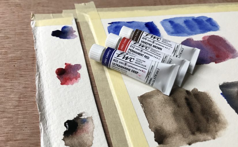
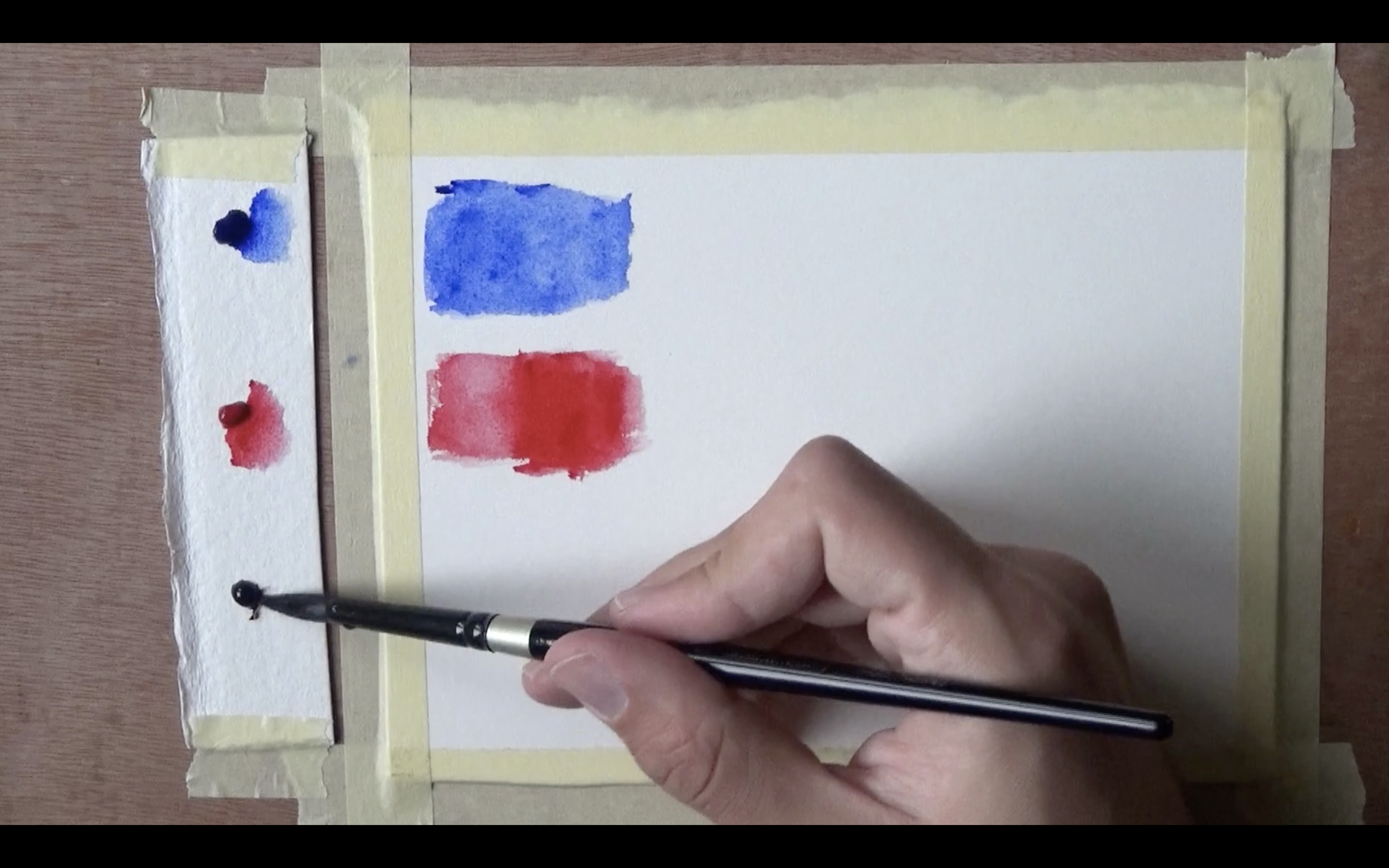
The Tubes
I got these in a free sample pack. It had three colors.
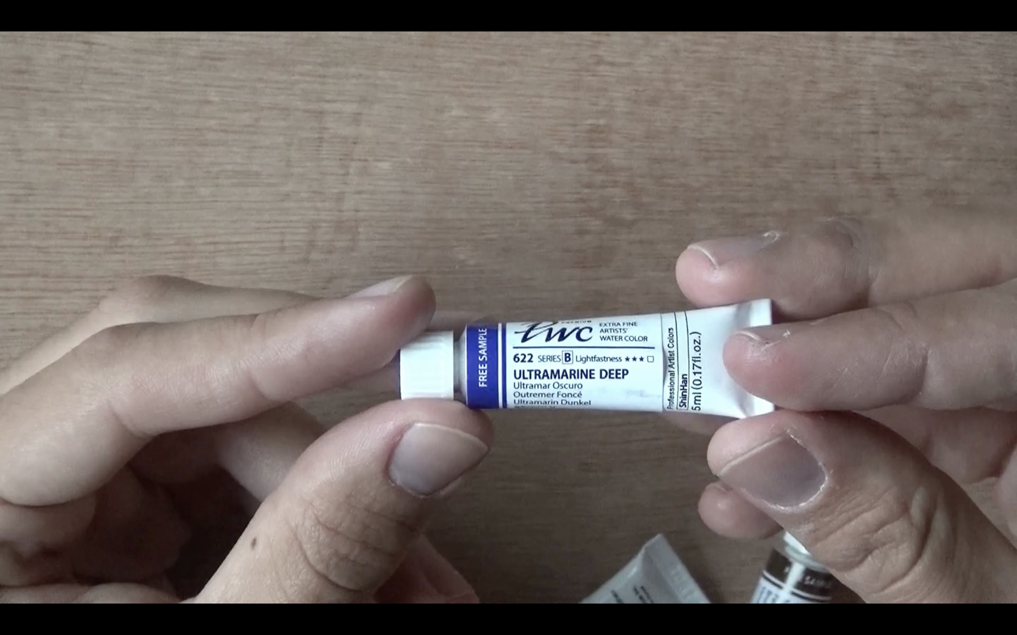
Ultramarine Deep
Pigment: PB29 (Ultramarine Blue)
Series B (A is cheapest, E most pricey)
Lightfastness 3/3 (high)
Transparent.
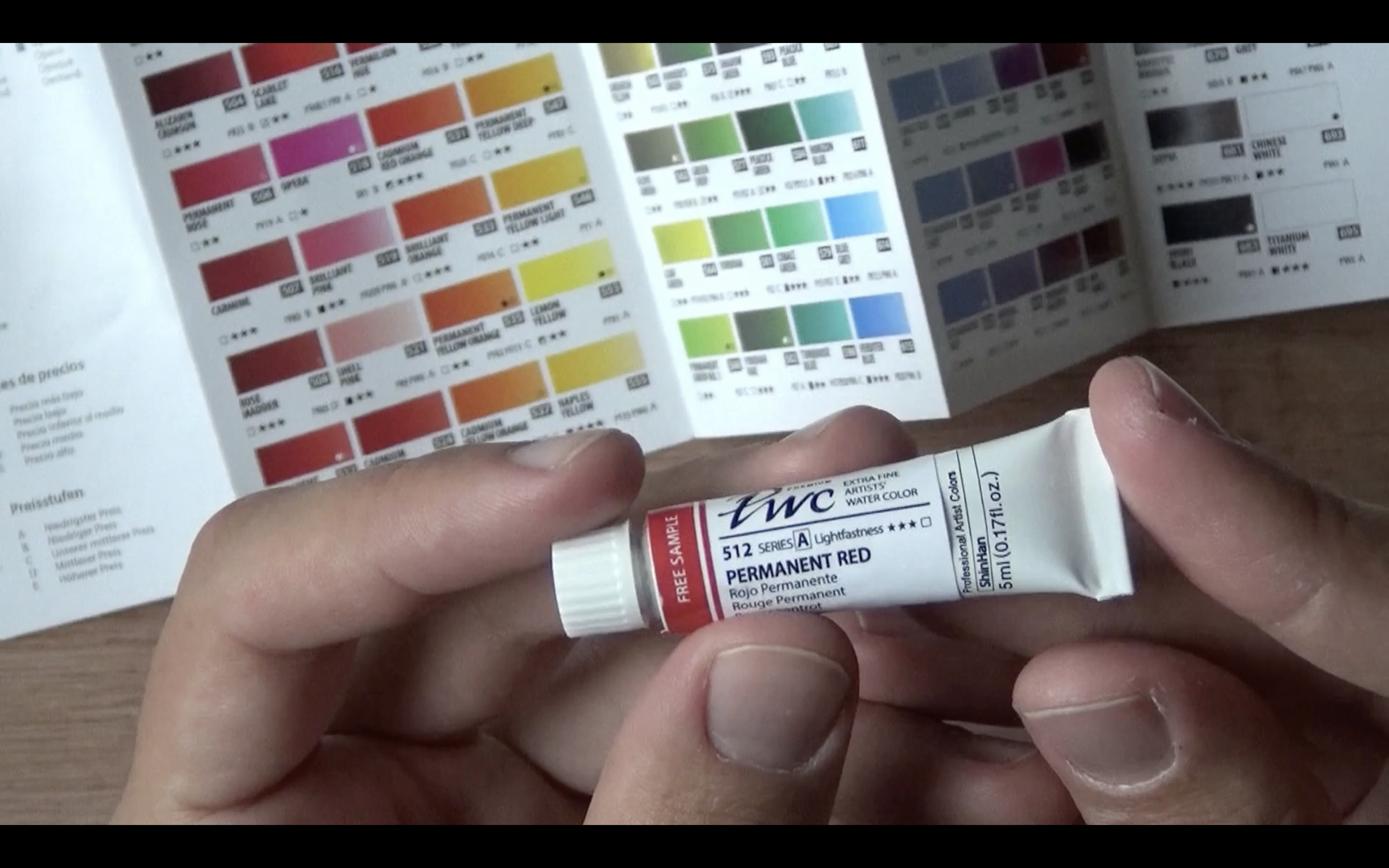
Permanent Red
Pigment: PR209 (Quinacridone Red)
Series A
Lightfastness 3/3
Transparent
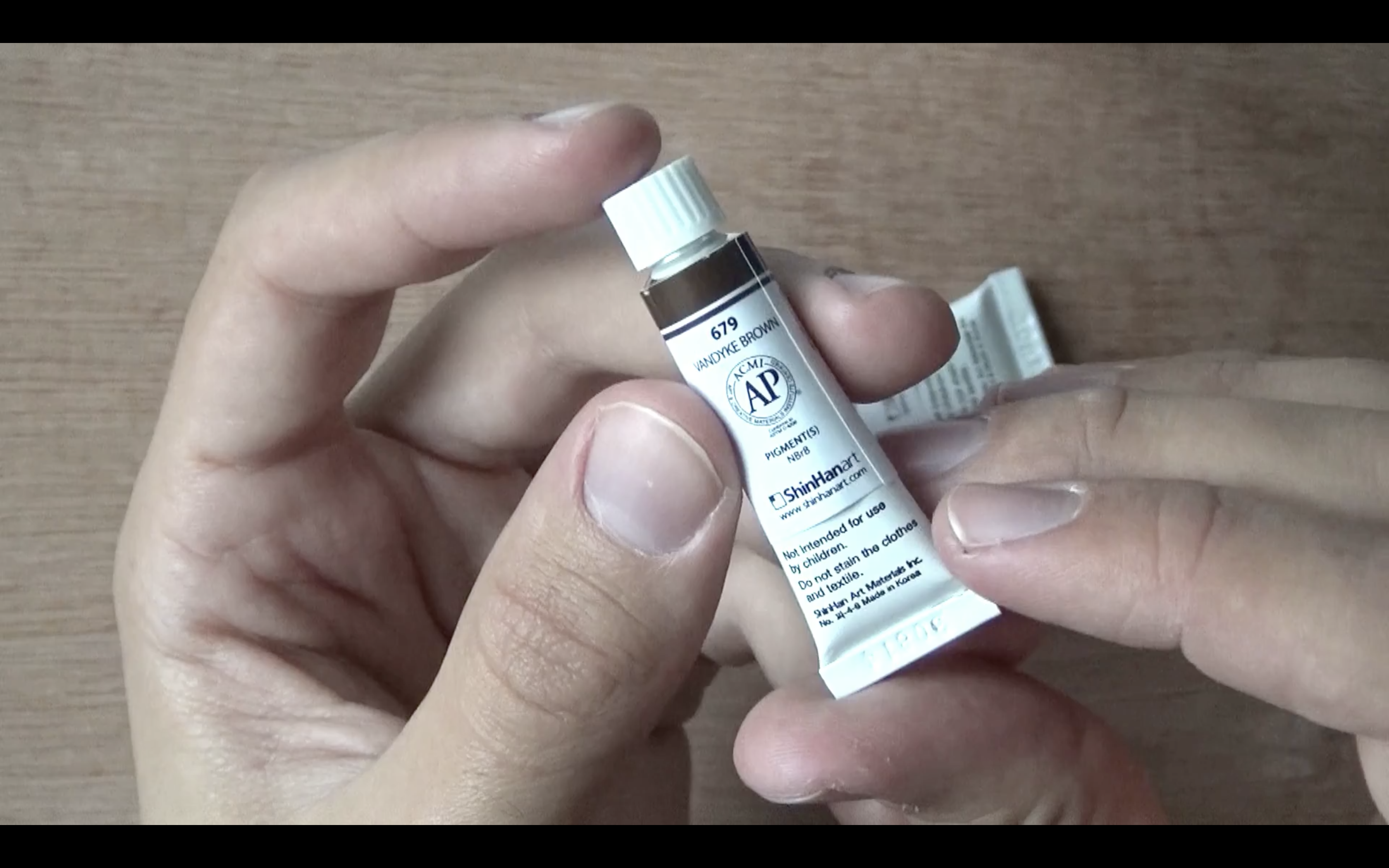
Vandyke Brown Pigment: NBr8 (NBr stands for Neutral brown, Vandyke Brown)
Series B
Lightfastness 2/3 (normal)
Transparent.
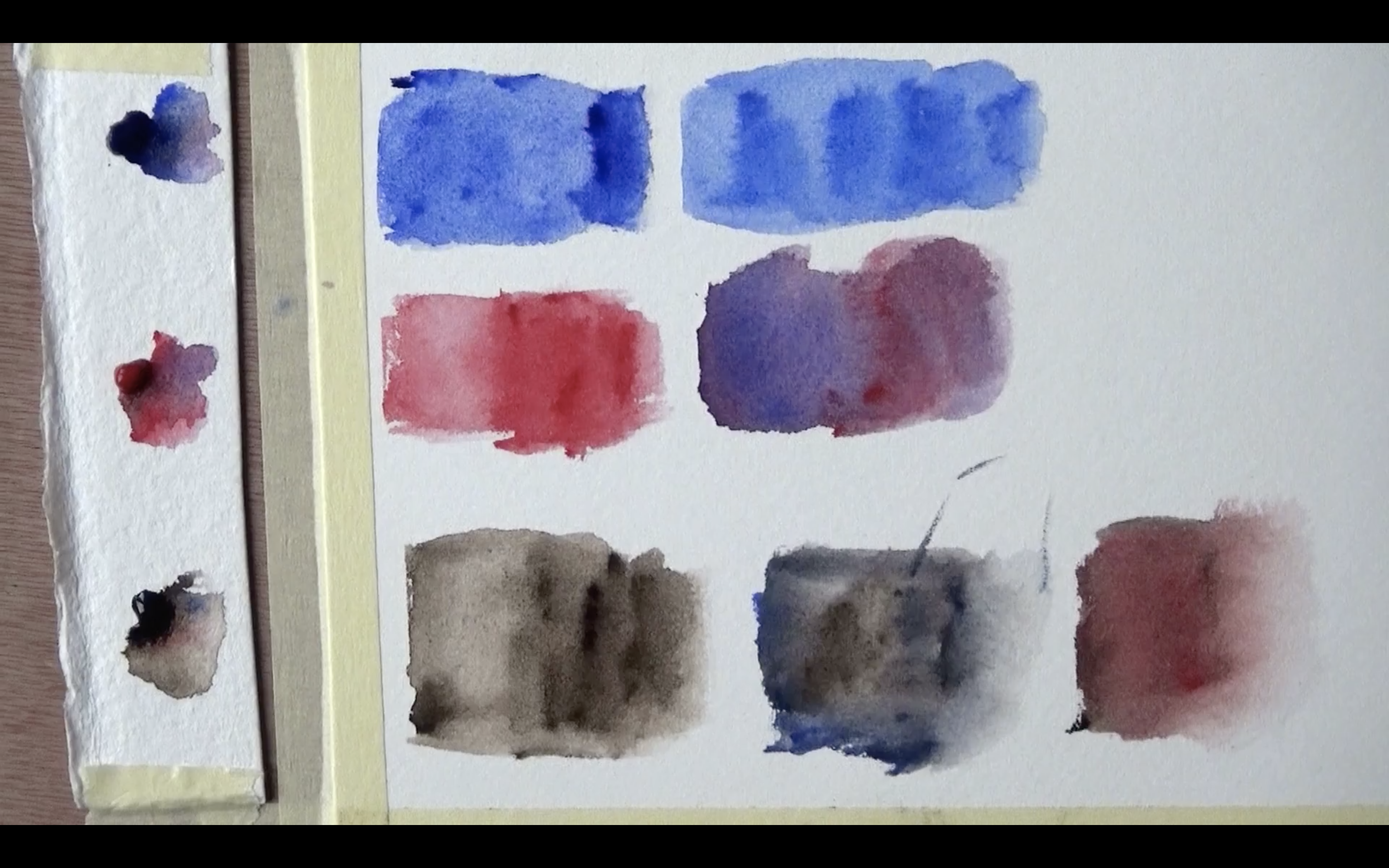
I noticed these are very soft and nice to pick up using the brush.
I liked the way the colors look (when wet and dry). I also liked the mixes I got.
As I mentioned, this encouraged me to buy additional tubes (which I’ll also share in an upcoming post).
I hope you enjoyed this quick review. Be sure to check out the full video to seem ore of the demo itself.
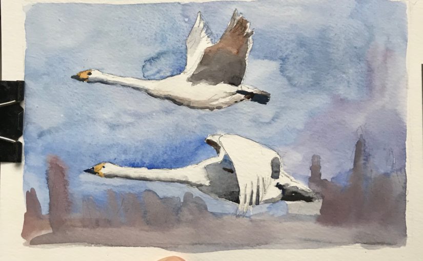
Recently I find myself being “punched in the face” by watercolor. What I mean by that is that just when I think I “got it”, I create a few terrible paintings with completely unexpected results.
I experience this most significantly with landscape painting, or with scenes that require a lot of “interpretational” work, and simplification.
The Solution
I find an interesting way of dealing with this issue – I sidestep it.
Instead of smacking my had against the wall, I simply focus for a while on different things. These things are mainly composition and portrait painting.
These are two different areas where I feel more comfortable, or that I have more to learn.
Sometimes you can’t force your way to success. You have to allow yourself to take some distance from the obstacle, and then, without even noticing, you’ll find you were able to get past it.
I hope this helps and encourages you!
Let me know what you think by leaving a comment below (:
Artist Corner
In this episode I mention talked about Eudes Correia. Eudes is a fantastic Portuguese watercolor artist.
I love how he merges realism and a great sense of light and shadow, with some impressionism and looseness. He work in a style I find very unique, and I recommend you check out his work.
Lastly, if you want to see some of my works in progress, as well as final pieces, Instagram’s where it’s at. This is also a great place to DM me with questions you may have.
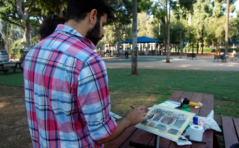
In this episode of my podcast I’m talking about creating indoors VS outdoors. I elaborate on how these are different, and what the benefits are of doing both.
I focus mainly on the implications for visual artists – painters, sketchers, sculptors and so on.
Working outdoors is messier, more dynamic, full of changes, distractions and so on. However, it’s much more immersive, and sucks you into the scene.
Working indoors is cleaner, more well-organised. But it does take you out of the environment to some extent, and “weaken” some of your senses and perception.
I believe you can get the most benefit by practicing to alternate between the two. This means working outdoors, and then indoors.
I also aspire to do both. That way my skills in one are will flow to the other.
Artist Corner
In this episode I mention James Gurney. He is an amazing artist and creator, most well know for creating the Dinotopia book series.
But the reason I personally love him is his tutorials on YouTube, where he paints mostly with gouache paint. This actually got me really interested in gouache myself, and I’ll probably give it a try in the future!
Be sure to check out his YouTube channel here: James Gurney
(If you buy using these links you pay the exact same price, and I get a commission).
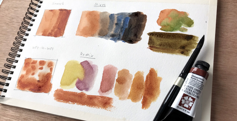
Paint Information
Here’s some more information about this paint.
Pigment: PO48 (Quinacridone Orange)
Series 2
Excellent Lightfastness
Transparent
Granulating
Low Staining
As this is a series 2 paint, it’s not the cheapest. On Amazon it goes for about 17$ (and the set is 24$, so you can understand why I recommend that…).
I love this paint’s transparency too. I usually use heavier and darker wash from the get (not aiming for multiple glazings), but this one just may make me try some of that.
I also like the relatively gentle granulation texture, and the fact it’s more easily liftable, as it’s low staining.
If I recall correctly PO48 should be staining. I’m not sure what Daniel smith did here, but this one seems to be low staining.
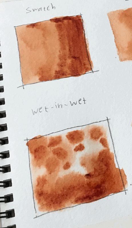
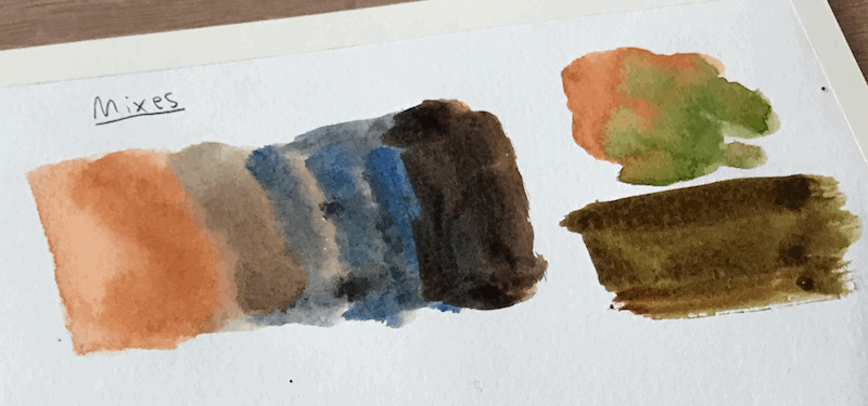
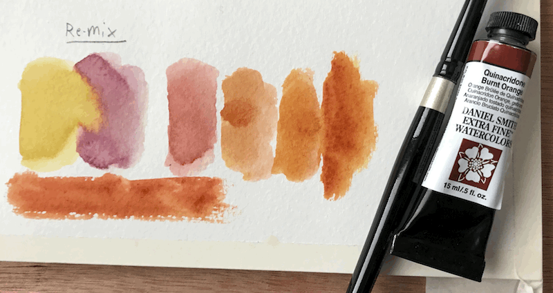
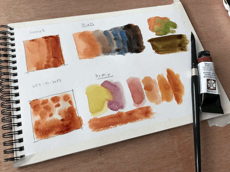
Demo
Here are some things I show in the video review…
A basic swatch and a quick wet-in-wet swatch.
Mixes with French Ultramarine and Sap Green (which Daniel Smith recommends doing).
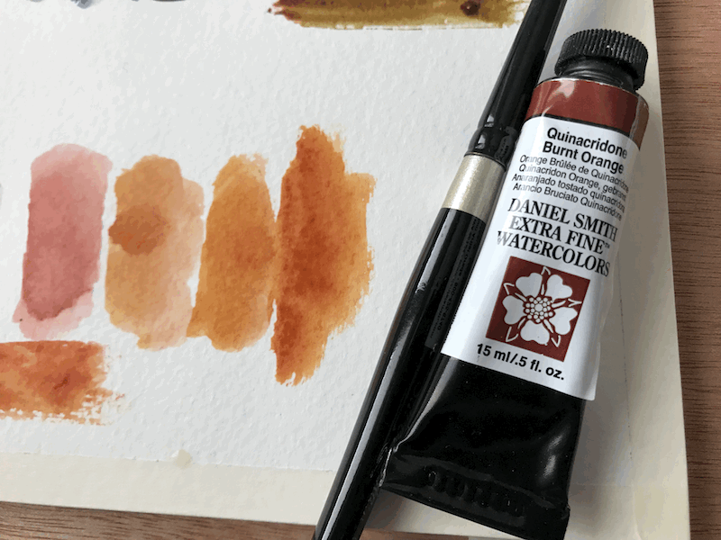
And lastly, I attempt to recreate the paint. According to information I found online, this can be remixed by combining a yellow similar to PY150 and a red such as Quinacridone Rose (PV19) or Maroon Red (PR179).
I didn’t have a suitable yellow (PY150 is somewhat neutral), and so I used a combination of Lemon Yellow and New Gamboge, and mixed it with Quinacridone Rose.
The result is pretty nice!
Pretty similar, right?
Conclusion
I really enjoyed making this review for you. Let me know what you think by leaving a comment under the video or here on my website.
A few days ago I published a YouTube vid that I think a lot can benefit from.
I want to share some highlights in this post.
If you want to watch the full video, you can check it out here:
The Stages of Watercolor Painting
When I got started in watercolors, I ran into some issues I couldn’t find a solution for.
They mainly revolved around the actual process of painting, on a macro level.
What should I start with?
Do I cover everything up in the initial wash?
Should I use wet-in-wet? When?
This video and tutorial are my attempt of answering some of these questions.
I’ll do this using this painting’s process:
So let’s talk about the different stages of watercolor painting…
Introduction
This is MY personal approach. I encourage you to learn from it, and then seek out advice of others.
This way you’ll learn what works best for YOU, and what’s most suitable to your style and desired final result.
I personally like to finish a painting in as few layers as possible.
This means I don’t do a huge amount of glazes. I usually wrap a painting up in 3-5 layers.
Also, as I like to make the most out of each layer, I make a lot of use of wet-in-wet and lifting when necessary.
I do these in every layer, as I see fit.
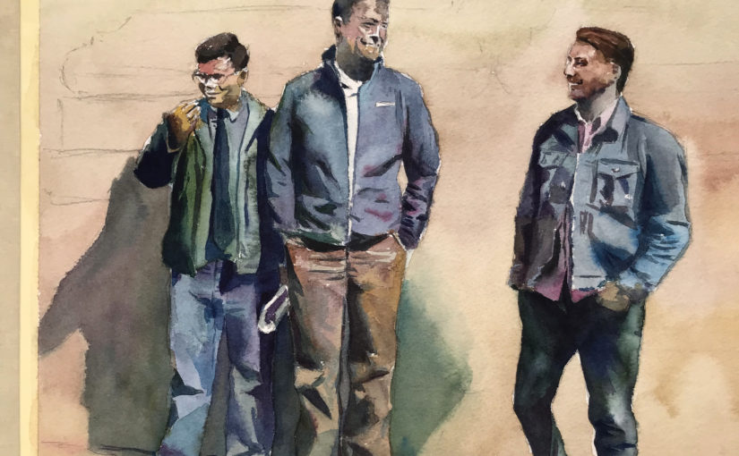
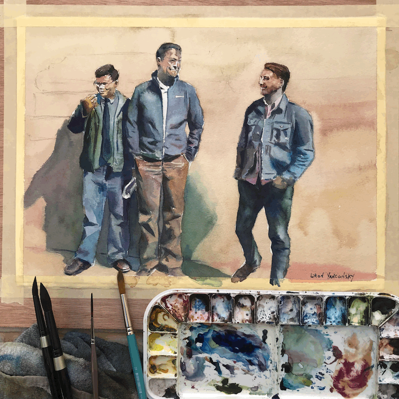
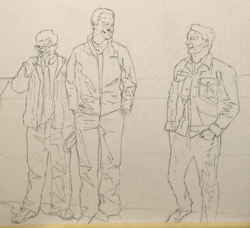
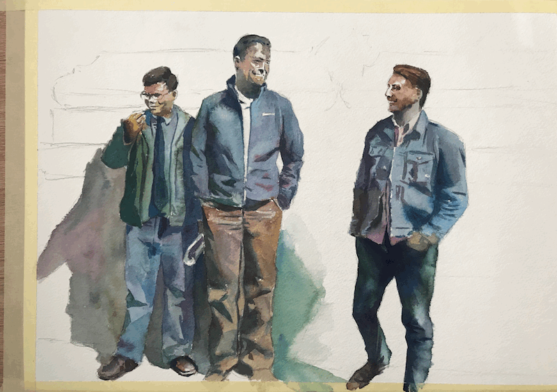
So here’s the initial drawing, ready to be painted.
My approach to this is going to be fairly simple.
The figures are my focus of attention.
The background is going to be secondary and simplistic.
This is why I decided on first painting the figures fully, and only then attending to the background.
Every “type” of painting is going to be different.
If this was a landscape painting, my initial wash would have probably covered much more of the paper.
More on that near the end of the post, under Conclusion…
The first stage is the initial wash.
The Initial Wash (AKA First layer)
This is the first layer we will paint.
With this one, my main concern is to keep things flowing and even.
I don’t care about the colors mixing into one another.
I know I can tighten things up and even correct some mistakes in the next washes.
This is what my initial wash looks like.
Do you see all the blooms and cauliflowers?
This is cause by wet paint “bleeding” into a somewhat dry paint.
I really don’t care about it!
The first wash, to me, is adventure time. This is perfectly fine.
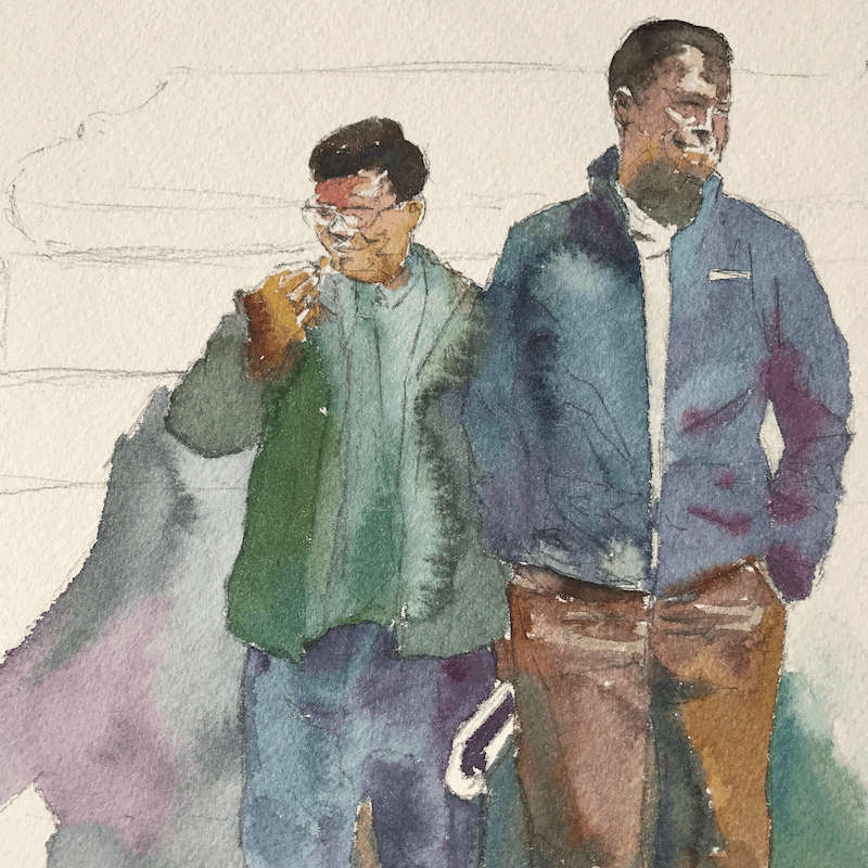
Here’s a close up of how some of the colors blended.
I’m really pleased with this result.
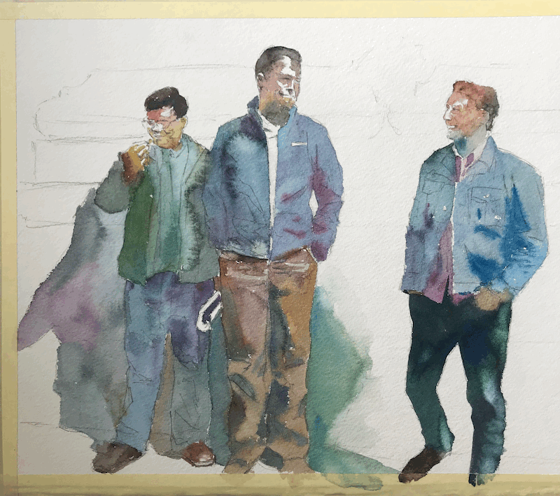
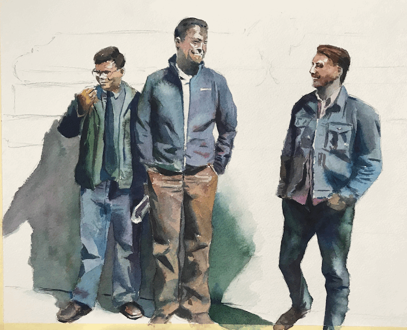
The 2nd Wash
This is the time to paint in all the mid-values.
This is basically everything that’s darker than the initial wash.
Here’s my 2nd wash for this one.
I usually find this to be the most difficult wash.
This is because this one REALLY sets the tone for the entire painting.
It’s a really important one that will start building the shapes of the people in the painting, as well as the feeling of light and shadow.
The 2nd wash also demands more attention to edges.
You want a nice mix of soft and hard edges. This really helps create interest.
Here’s the 2nd wash done.
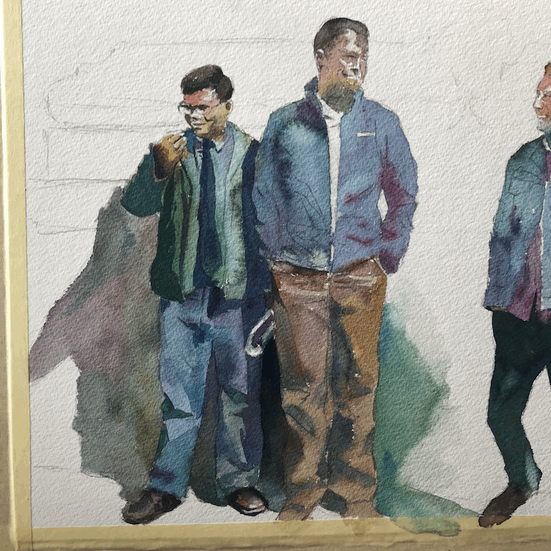
The 3rd Wash
This is the time to put in the richest, darkest shadows.
You will probably also go over many areas you already covered earlier, in the 2nd wash.
You want to make sure to push the value range as much as necessary.
Most realistic scenes have a very wide range of values, from the lightest whites to some really dark blacks.
Notice how this stage really makes things pop.
This is because by painting the shadows, we actually paint the lights and highlights.
4th Wash and Beyond
For me, this stage is for darkening things that are supposed to be darker.
At this point I also add some final details that perhaps I didn’t get the chance to so far.
In this particular painting, all I did for the 4th wash was to add that background.
And we are done!
Conclusion
This is it for the process.
I want to mention something important. Every painting is different.
I use different approaches for each painting, and for every “type” of scene.
So for landscapes, I’ll probably cover everything up.
For portraits or people, I’ll probably work on them and only add the background in the end.
With time, you’ll learn what works best for you, for each type of subject and painting.
It’s almost like you’ll have a blueprint for each type of painting.
If you are a beginner, don’t worry.
This will come with time and experience
I hope you enjoyed this tutorial.
If you have, make sure to check out the full video to see more of the process: The Stages of Watercolor Painting
And this is it!
Let me know what you think in a comment below.
Is this similar to your approach?
Do you treat the stages differently?